
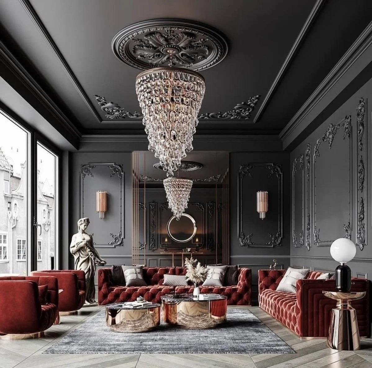
dark + moody….and oh so good!
One thing I constantly hear as a professional architectural designer from many residential clients besides the need of transformation + change of course is what they think and perceive as being too dark as it pertains to their home’s color palette. I hear ‘that’s too dark’ sooooo much, that I just had to speak on it, plus completely provide another design perspective on just how beautiful and fabulous a dark + moody aesthetic can actually be in your dwelling. Just how appealing and comfortable and livable a dark + moody aesthetic can precisely deliver, is exactly the reason I want to share some inspiration your way.
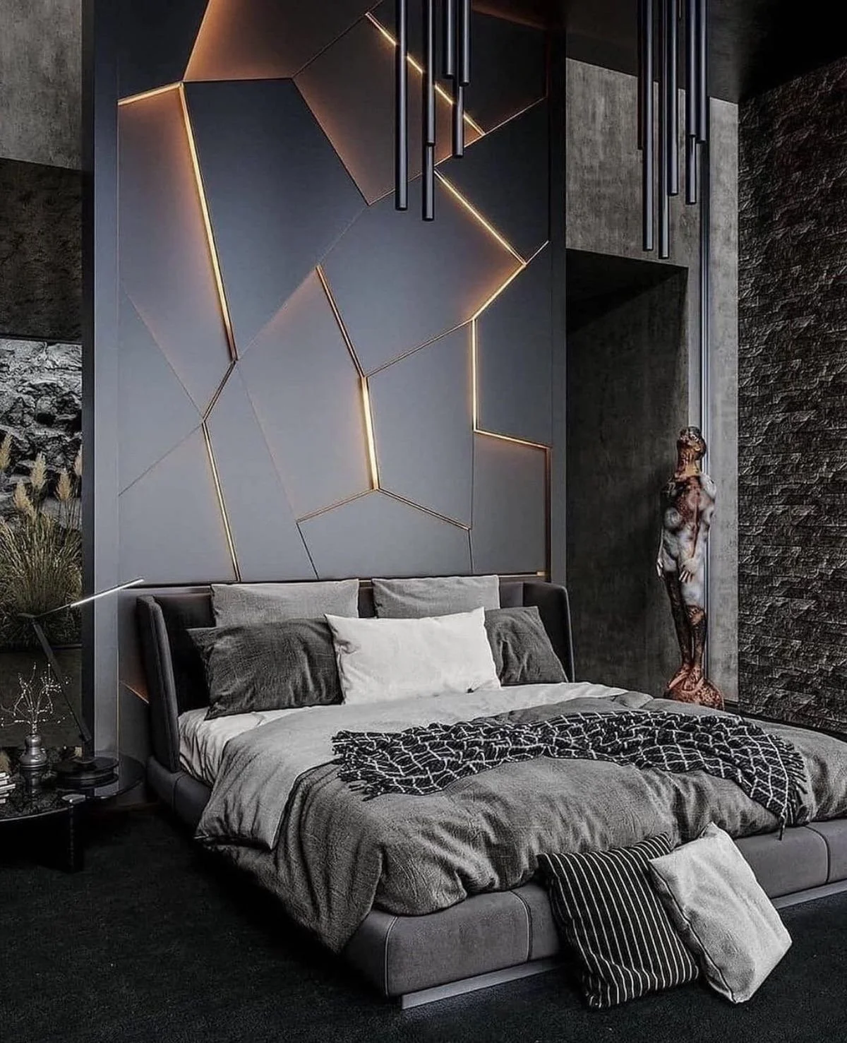
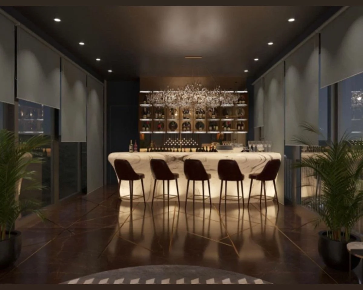
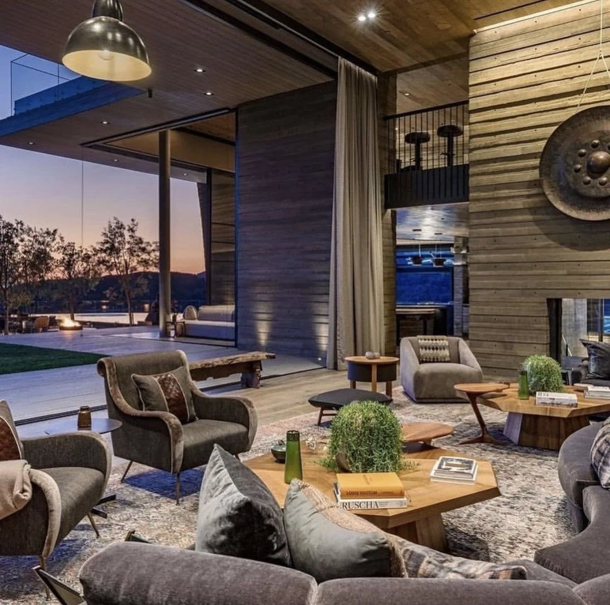
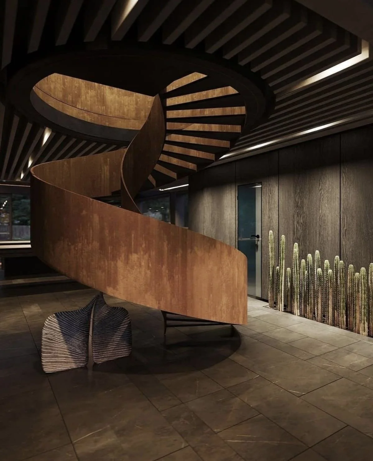
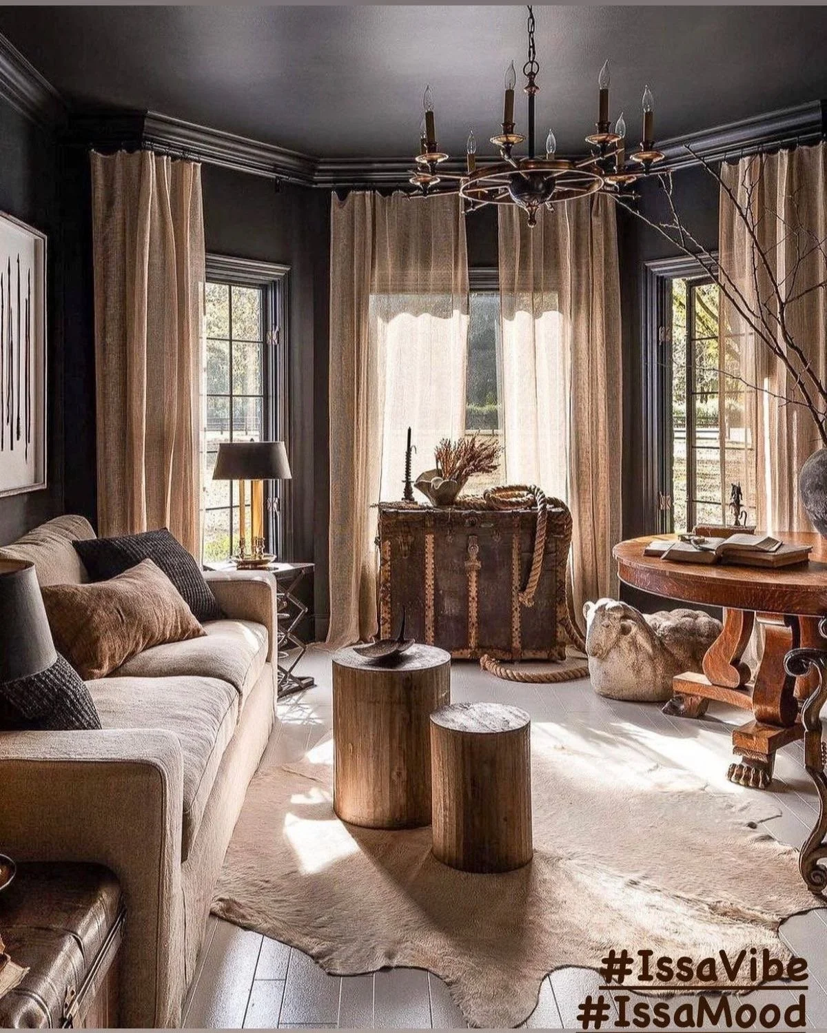
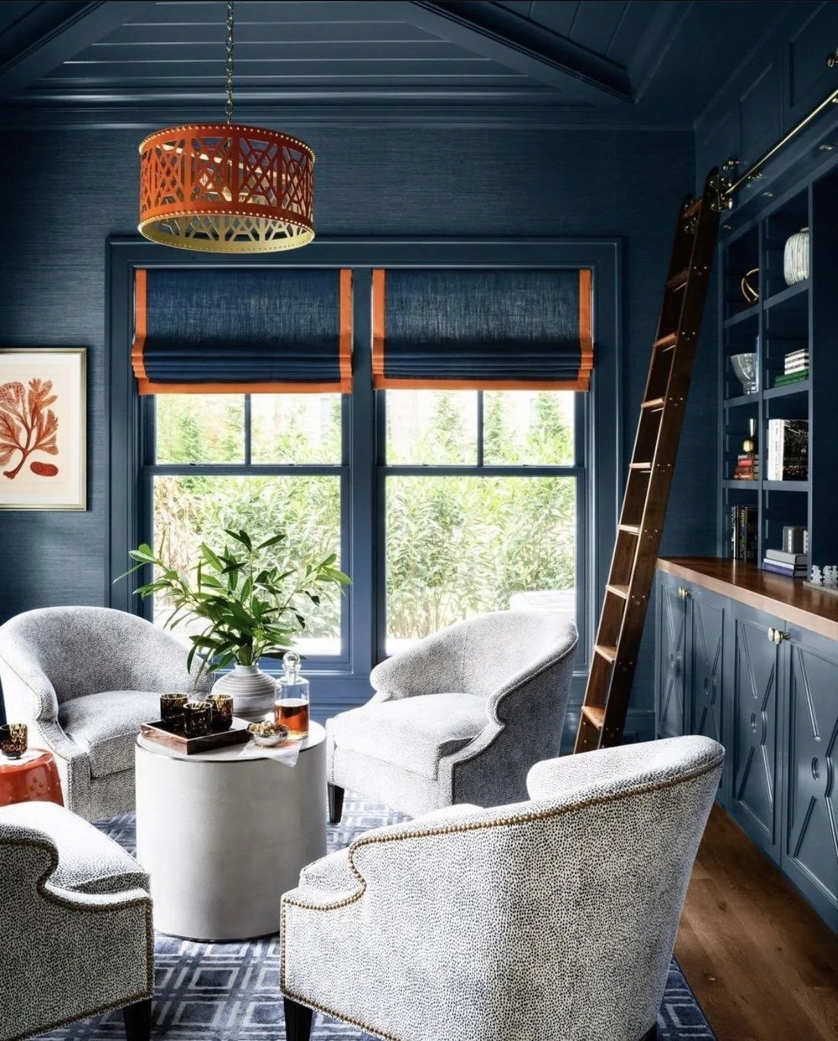
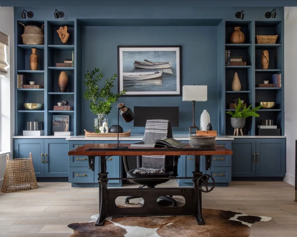
Yes, darkness is a mood. Issa vibe. But, did you know that with any and everything in life and beyond requires balance? Of course you knew! So with darker aesthetics, designers, including myself have to balance the space with lighting, contrast, movement to create an arrangement in a way that does not allow any one element to overpower another….and that is strategically accomplished through the design principles.
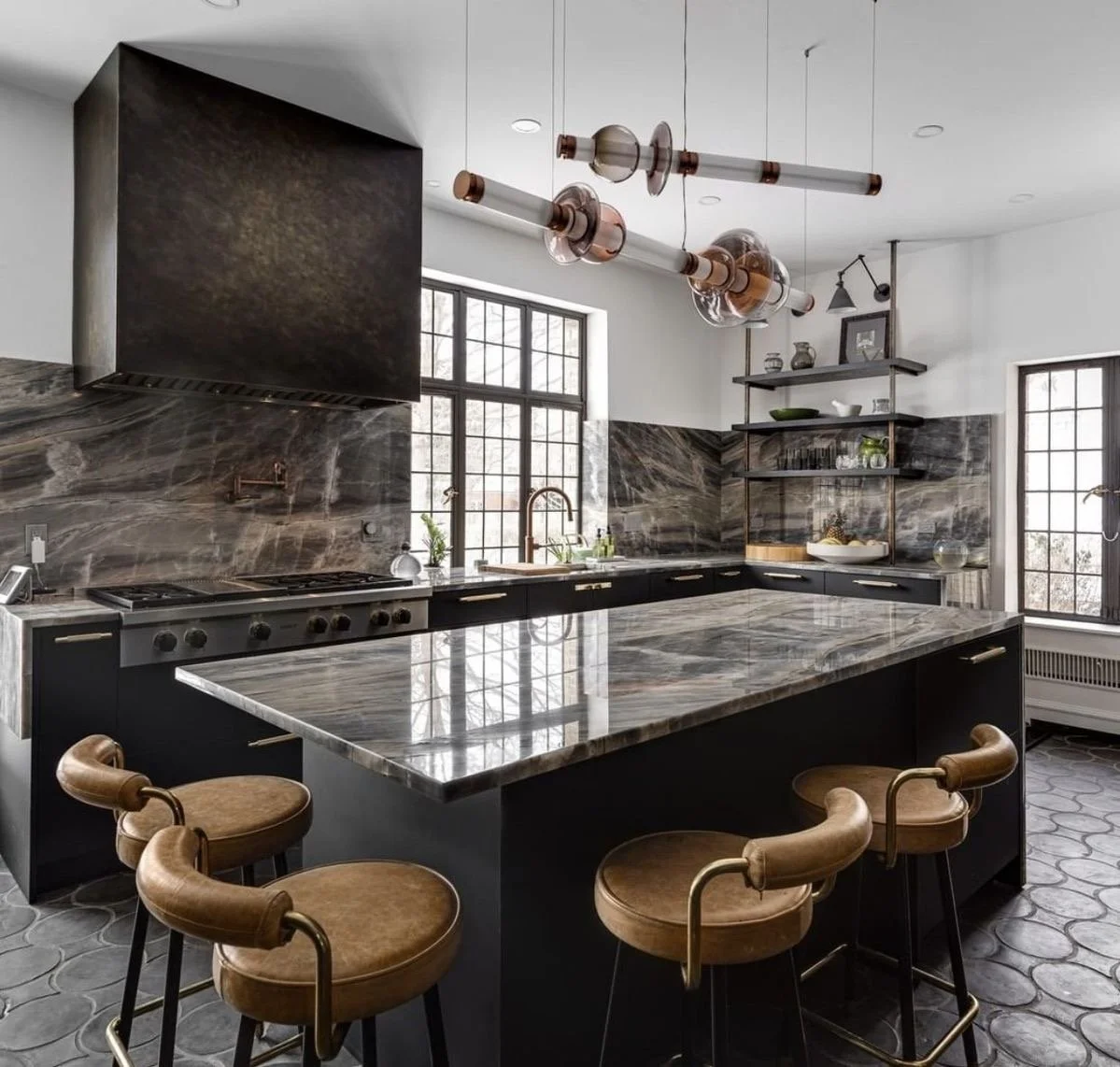
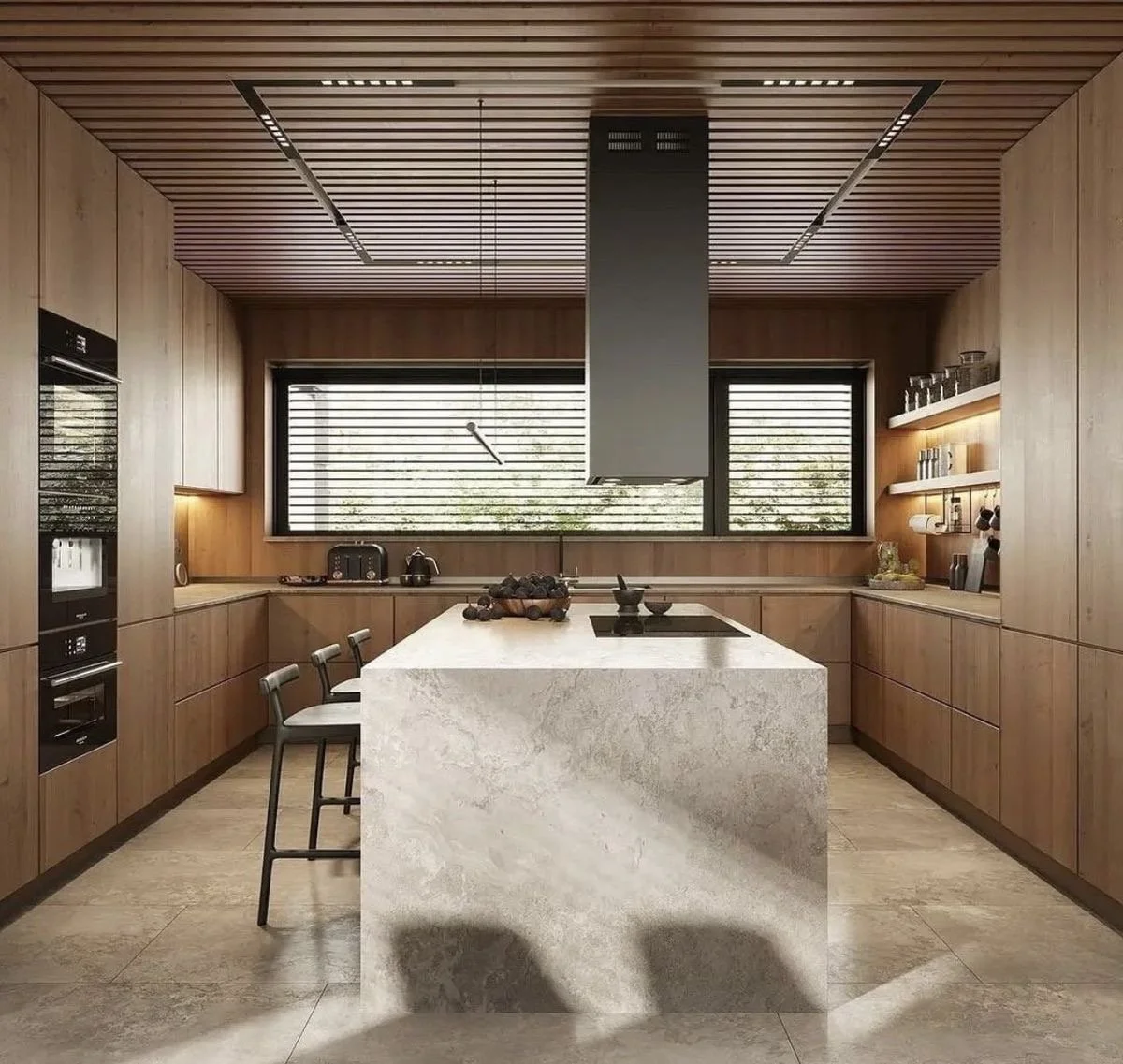
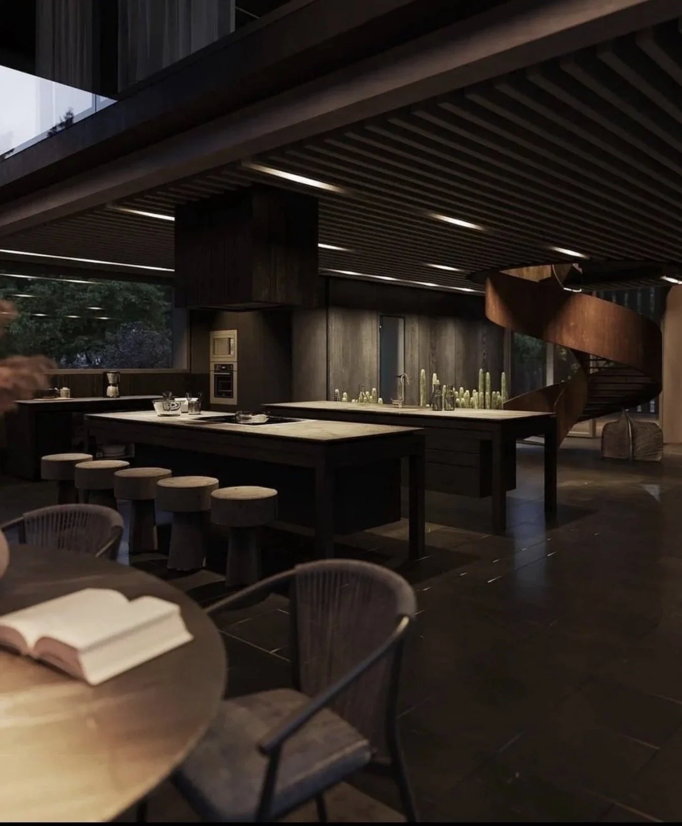
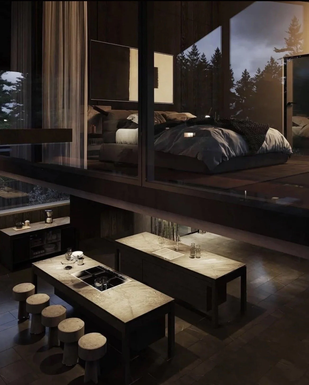
Let’s say bye bye to the all white kitchens. Yesssss! Even the most beautiful white kitchen needs some type of contrast to make it pop, make it sing, make it timeless. I mean let’s be completely honest, what exactly were we thinking, an all white kitchen is not even practical. But, I know that most love white kitchens, so what I propose is simply adding layers, contrast, and textures to give depth and set a mood. White upper cabinets will do the trick. It will help create a light and airy space, but ground that baby with darker base cabinets and if you have an island, try a dark + moody color to ground the island as well. Your cleaning routine will thank me later.
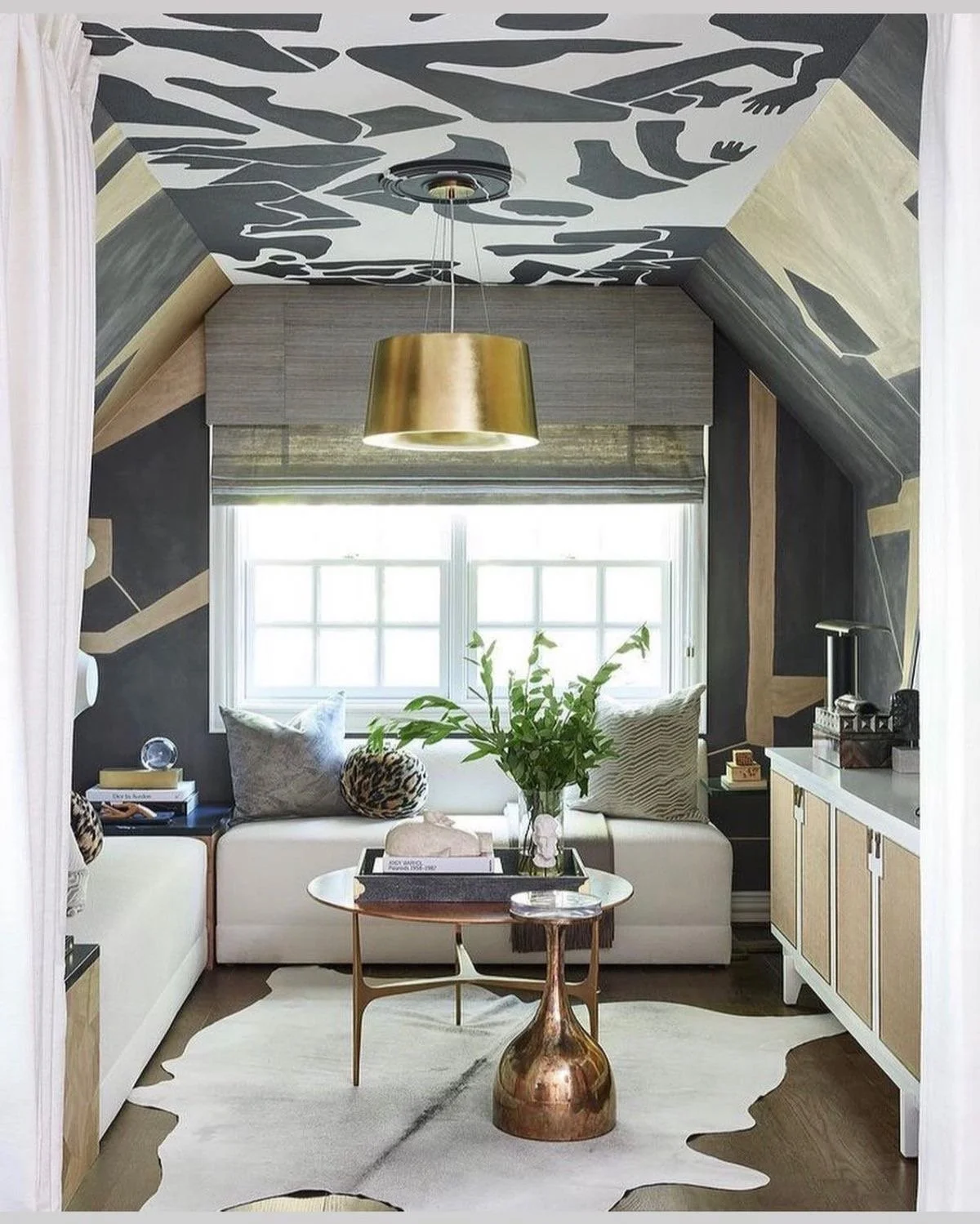
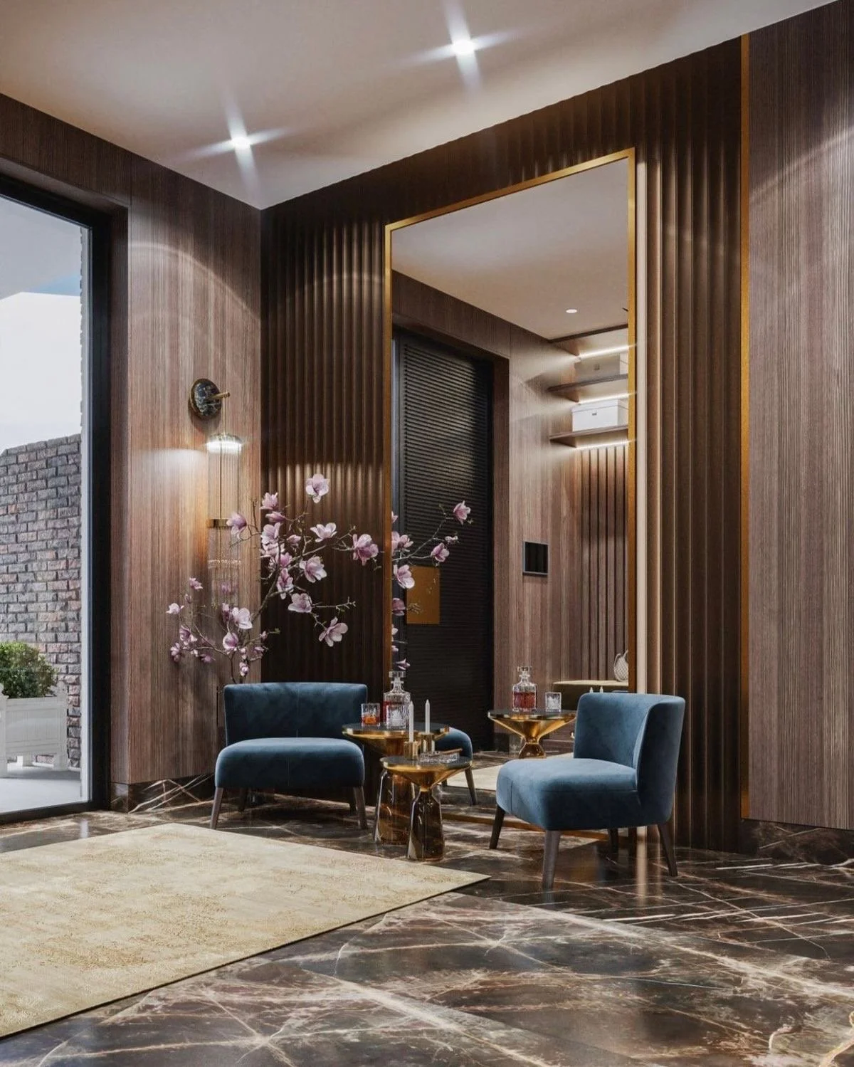
I mentioned textures + contrast before….when you are creating a dark + moody aesthetic, offset with mixing textures throughout the space as well as adding contrast with the furnishings to make the space pop.
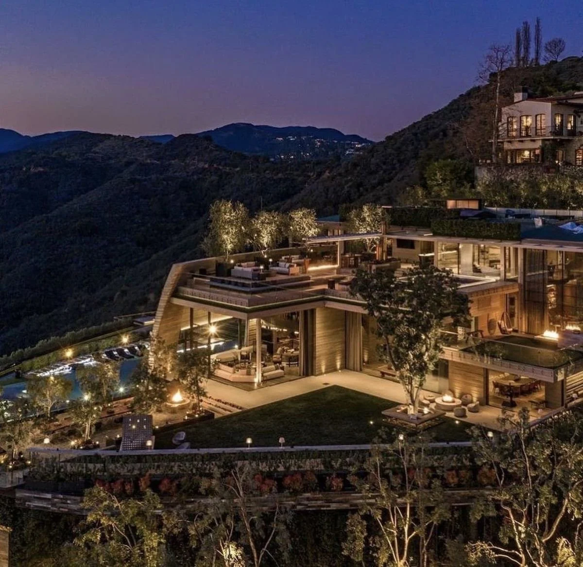
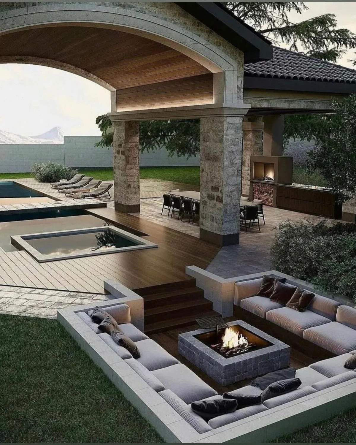
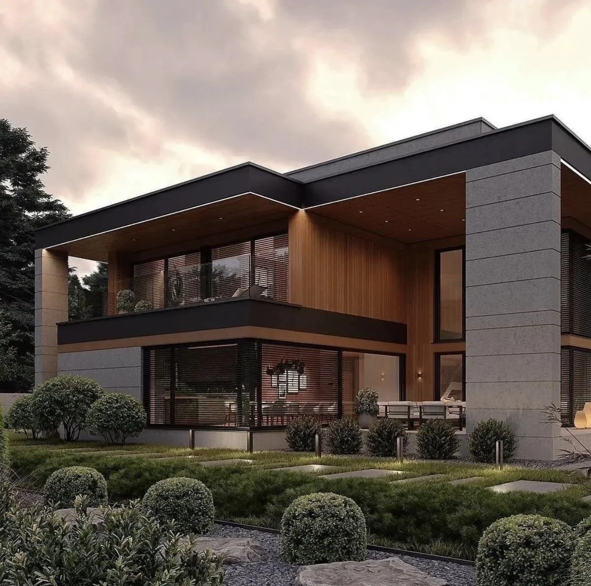
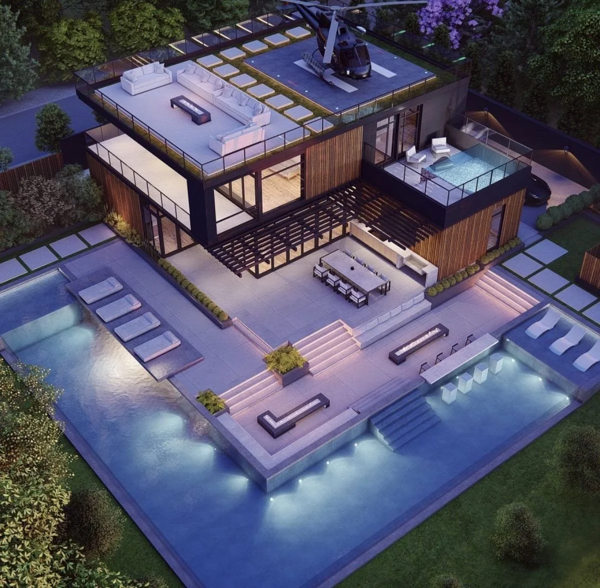
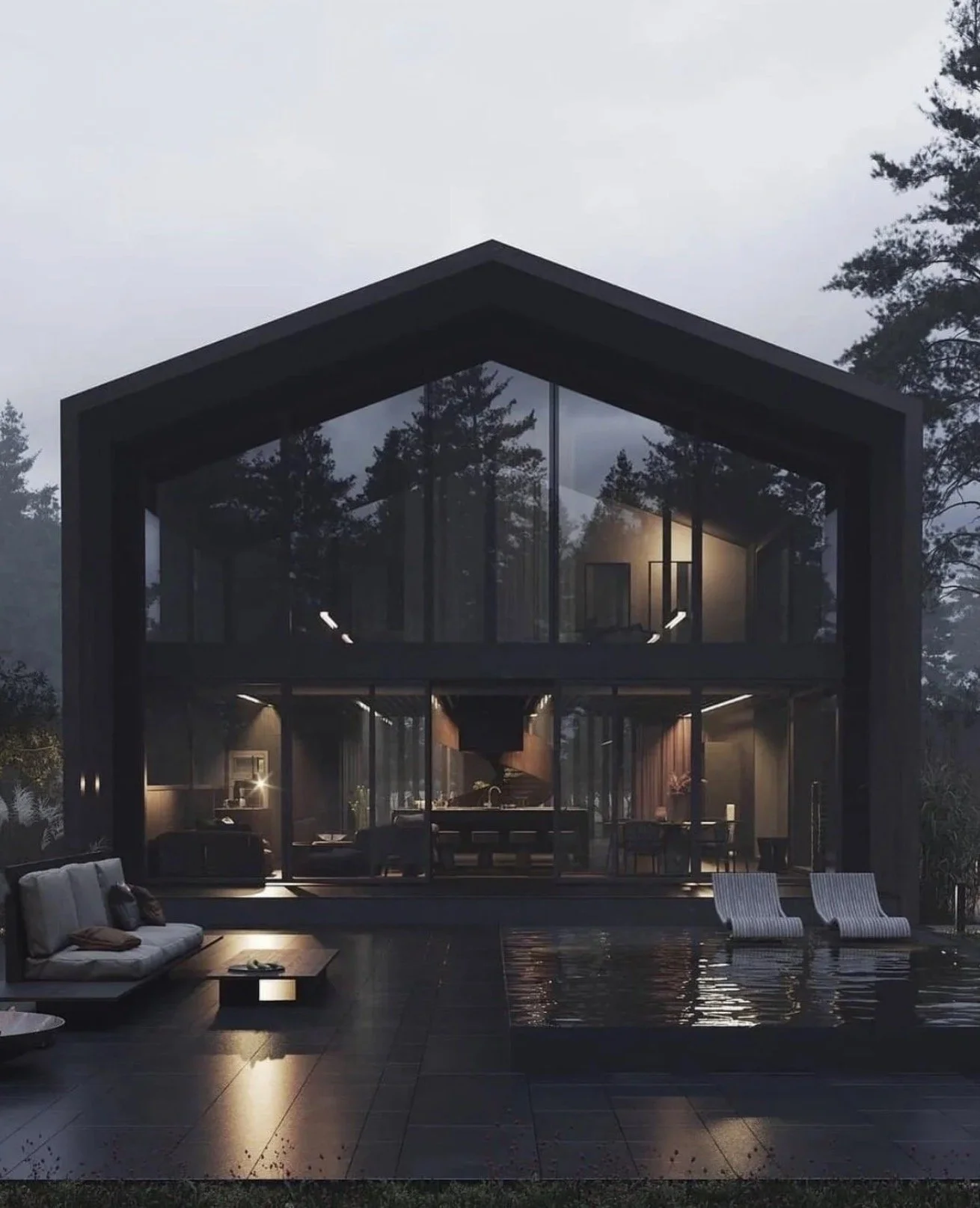
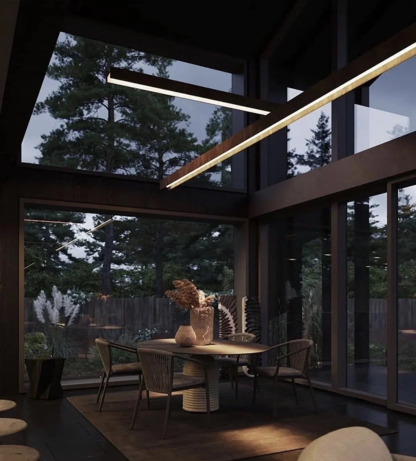
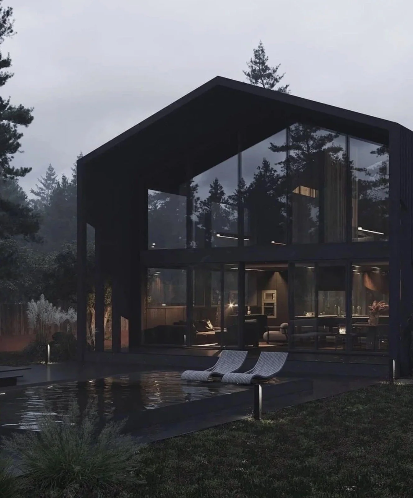
This also applies to the exterior of your home. Dark + Moody strikes again! #Yessssss
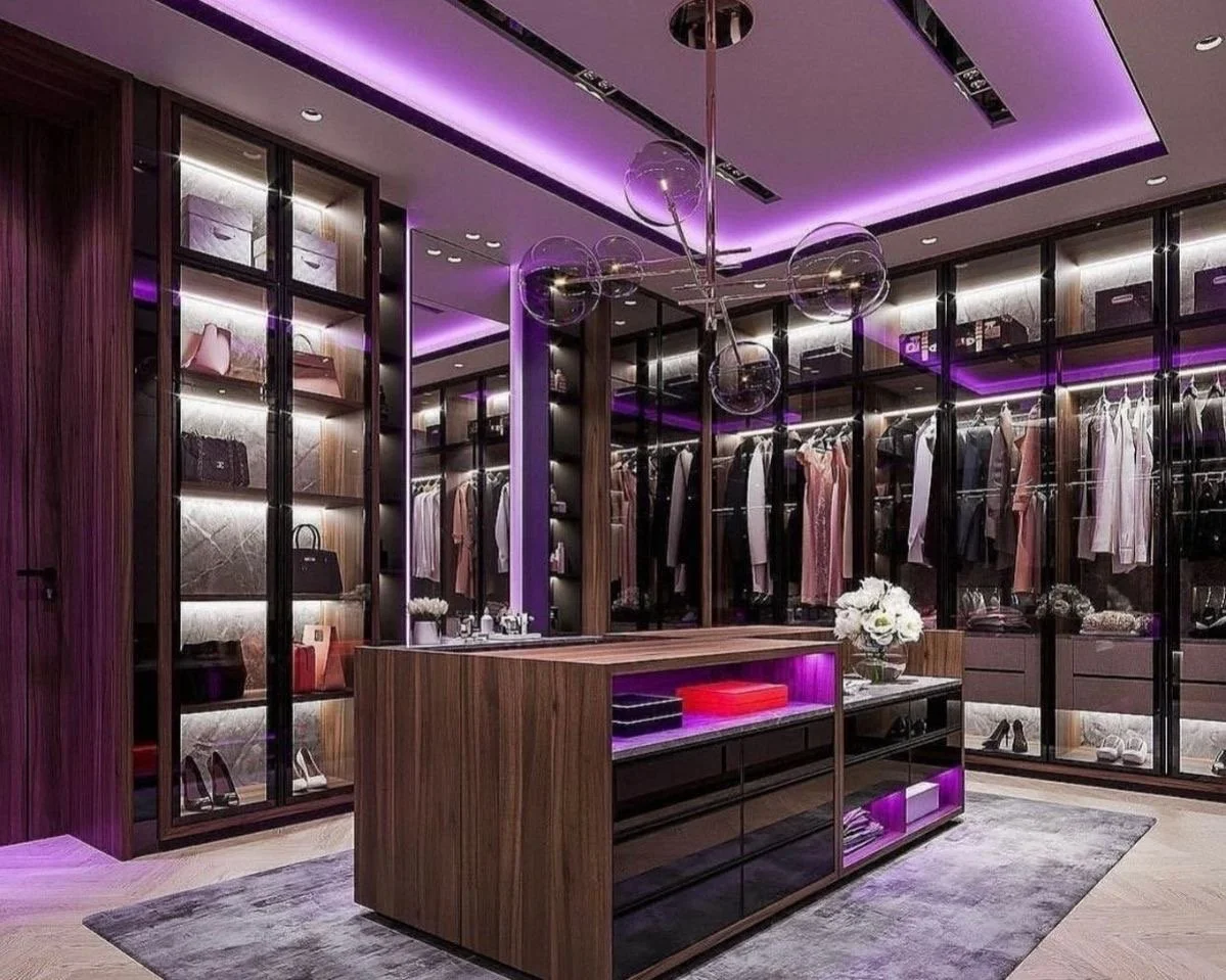
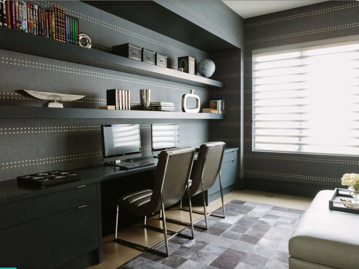
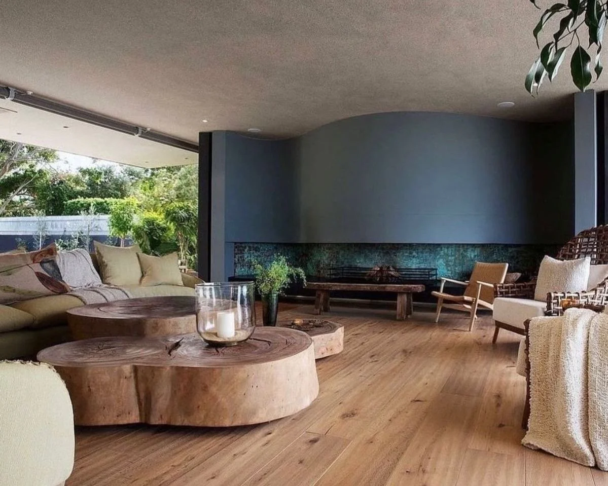
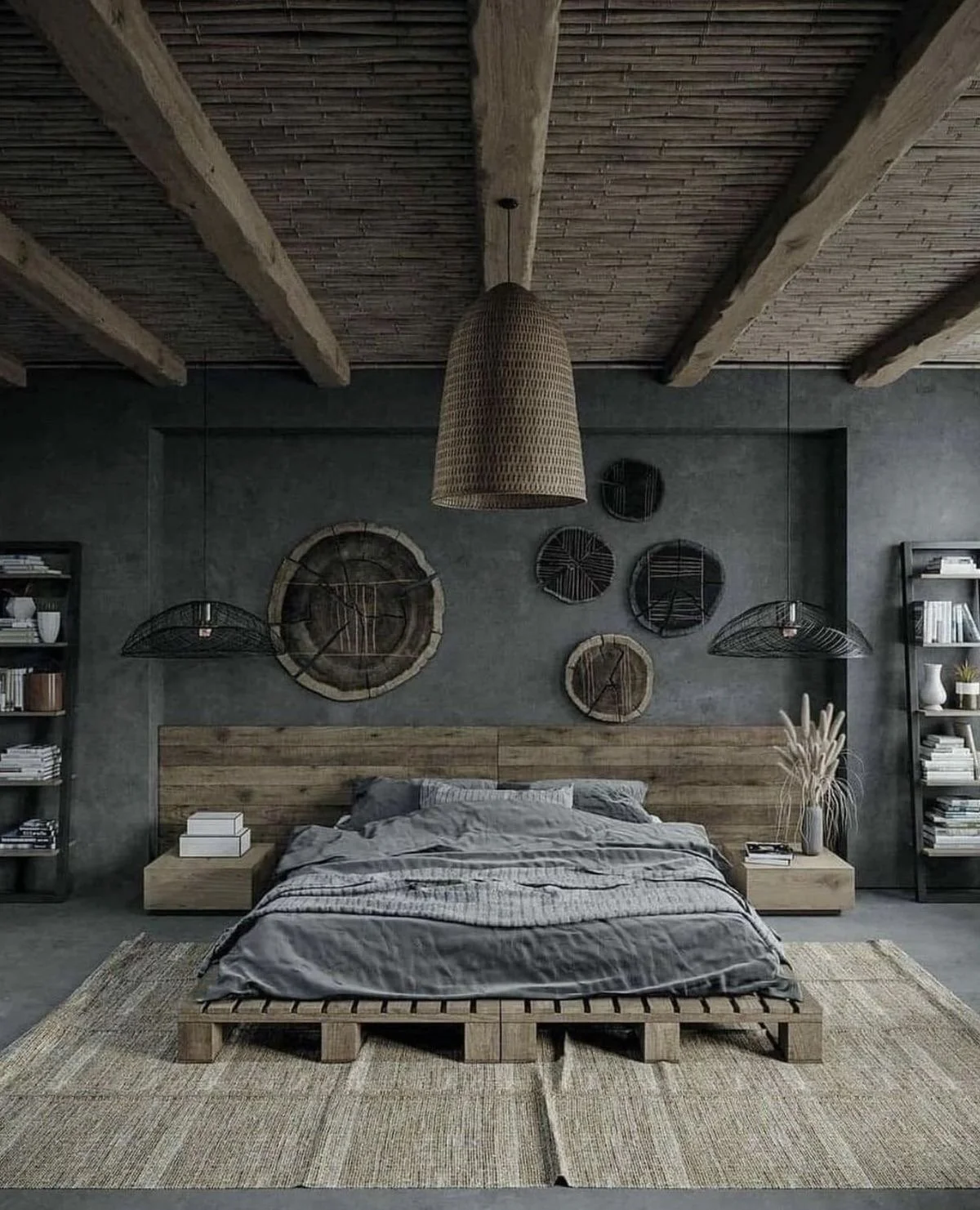
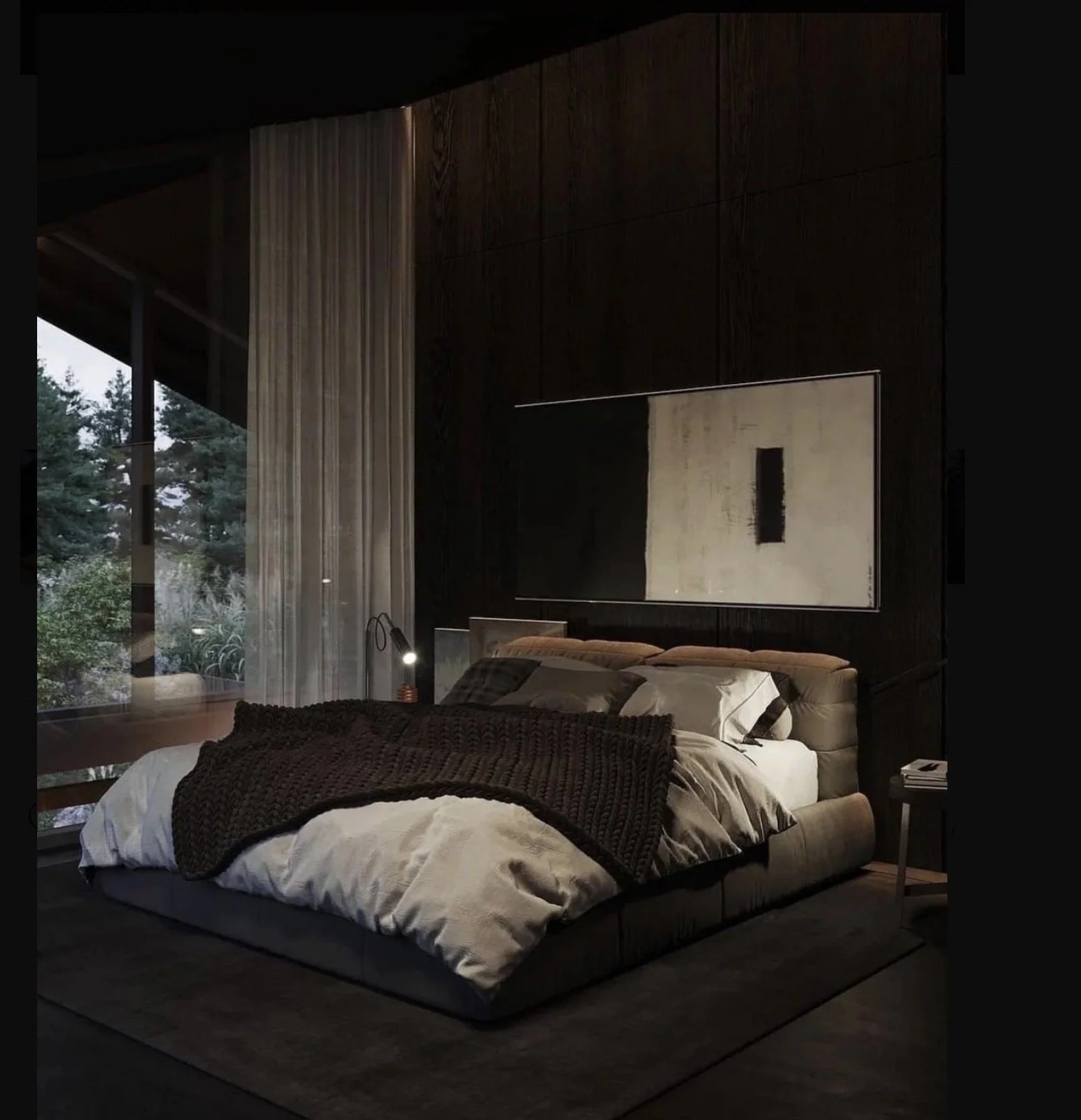
The energy that exudes from these darker hue palettes is calming, sensual, relaxing, chill….and I am hear for all of it! Grown + Sexy.
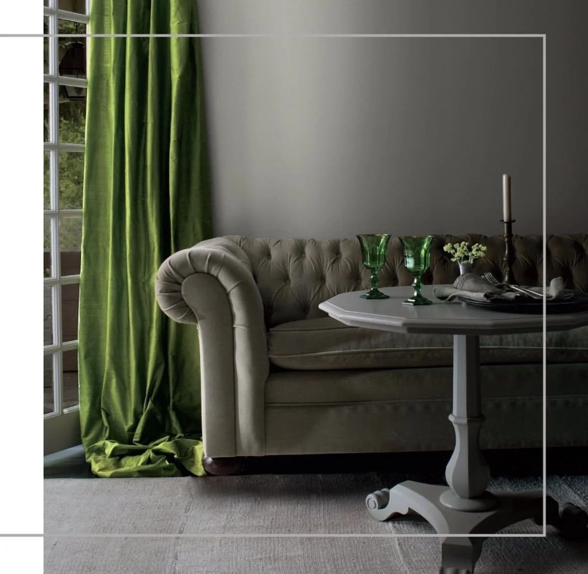
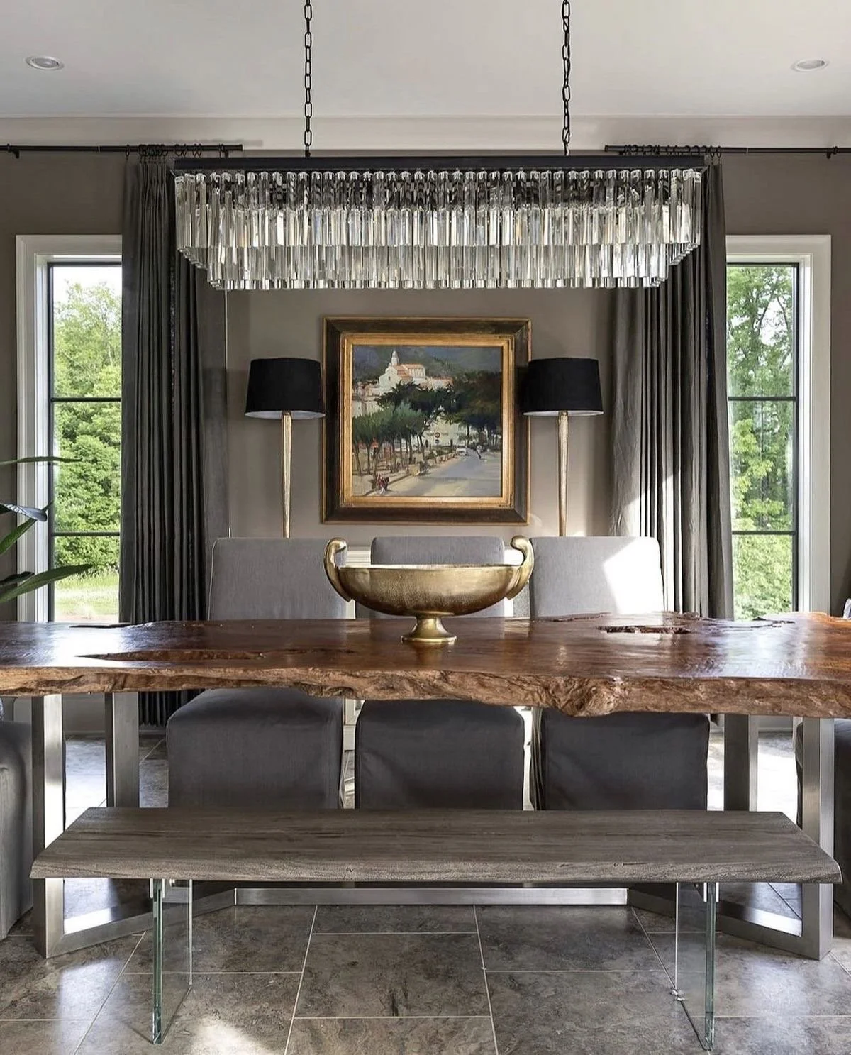
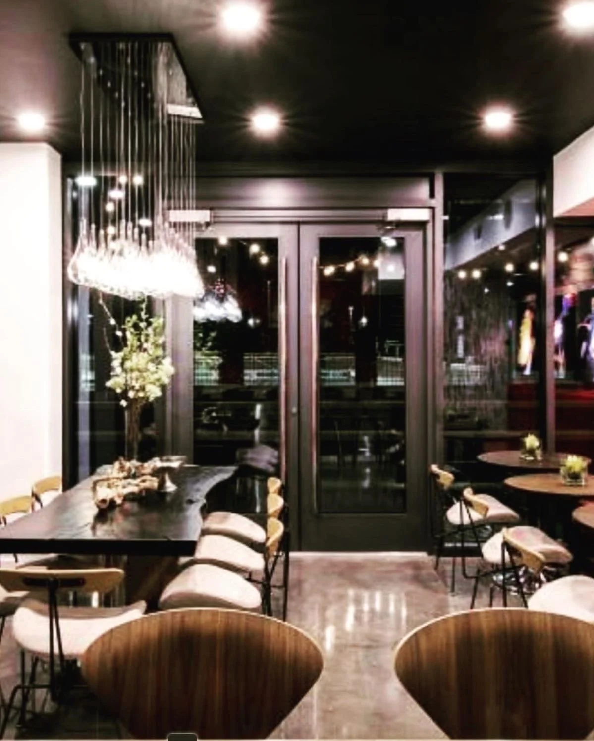
Would you live here?
Ok, so when I create a custom color palette for my clients, I can specifically determine and curate where a dark + moody aesthetic can play well in your home. It may be in small batches, like furnishings or accessories, or on your trim and molding, or simply as an accent wall, but if you are open to creating drama using a darker hue, I will find the perfect solution for you. Oh snap! I rhymed.
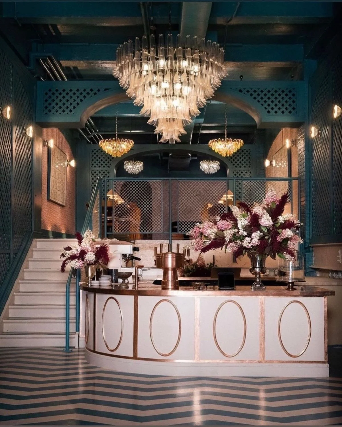
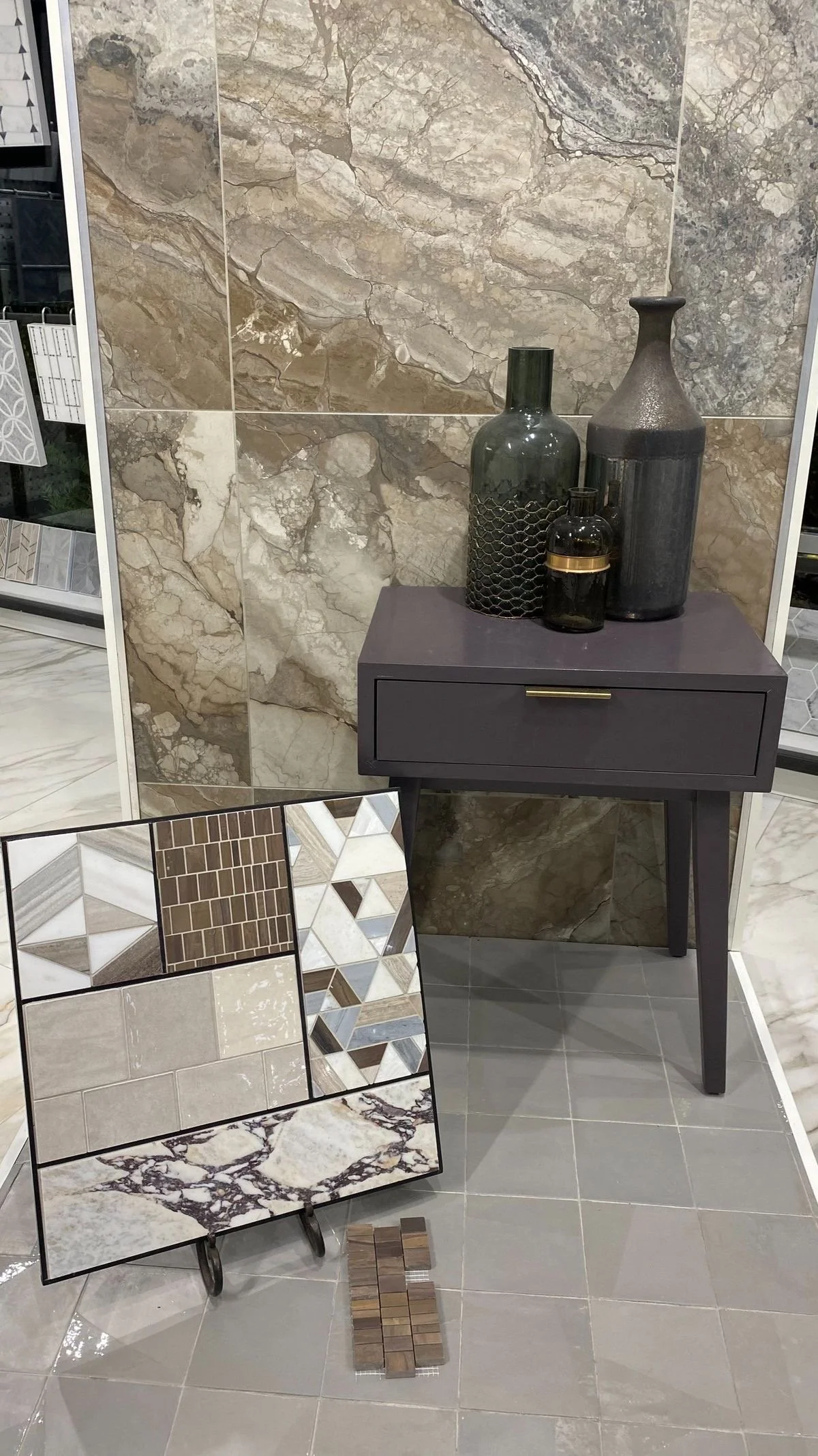
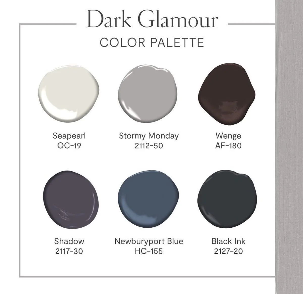
Color saturation, shades, hues, and tones all play critical roles in selecting your perfect dreamy moody palette for your space. Based on natural or artificial lighting, architectural features, existing interior materials, I will most definitely assist you with selecting the perfect color balance that will deliver that mood or that vibe you are seeking to achieve. In design school, color theory was extremely important and still is. I use the science of color theory every single day, because particular hues and colors can create different types of feelings, emotions, moods, etc. so I’m strategic in where and what intensity I propose the color to be utilized. As your design professional, I can set the mood you are wanting to achieve in the space and there is a darker hue for almost every mood, hence, dark + moody aesthetics. See, we are definitely going full circle.
Well, I hope you kinda shifted your perspective on what is ‘too dark’. However, if you haven’t, I’d like to add that just a touch can go a long way. You do not have to go to deep end to simply enjoy a dark + moody aesthetic, but you can definitely see that the amazing use of these customized color palettes can successfully impact different effects while creating the desired emotions in your space.

Say hi Jaedon!