
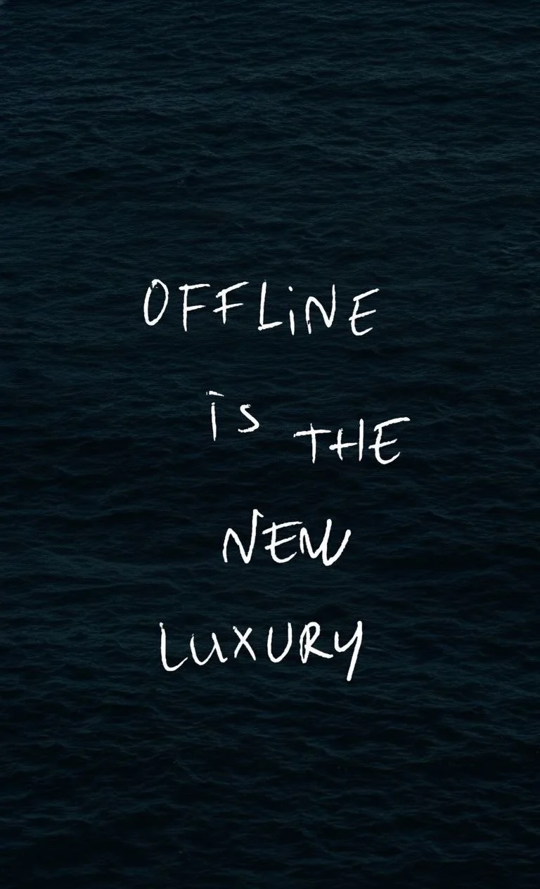
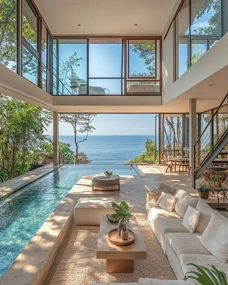
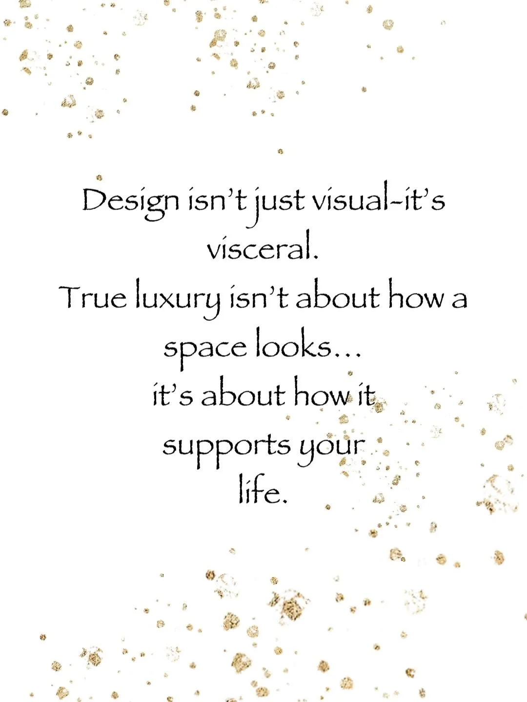
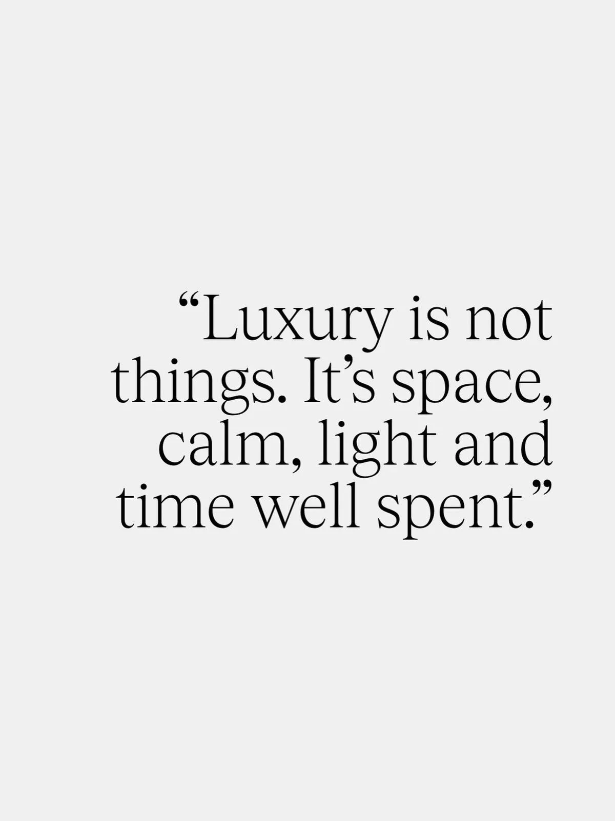
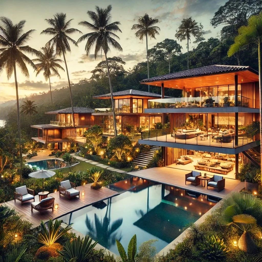
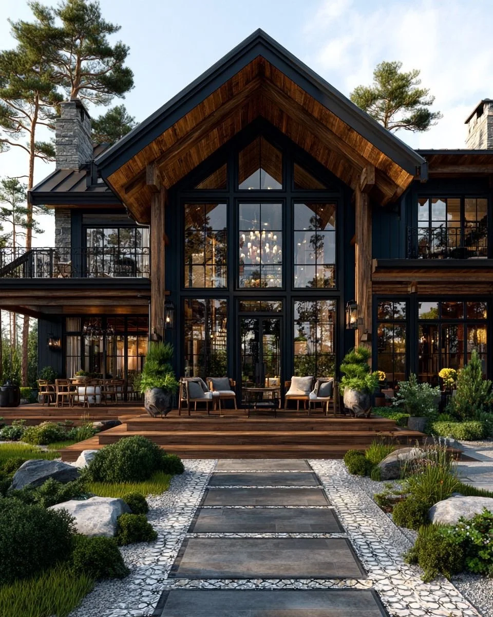
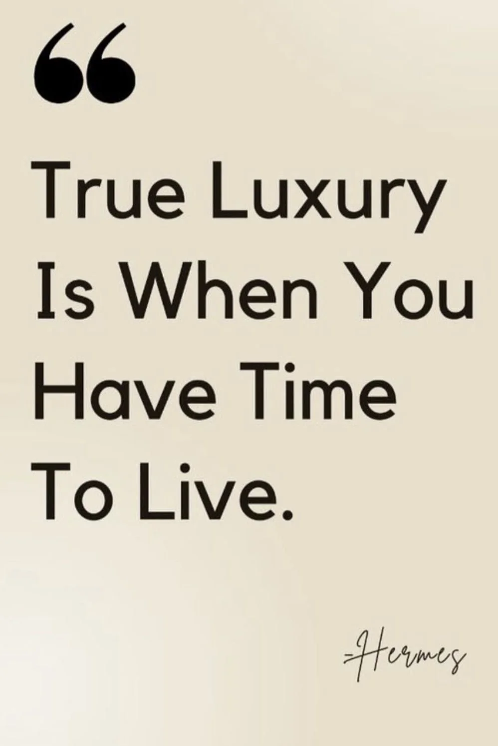
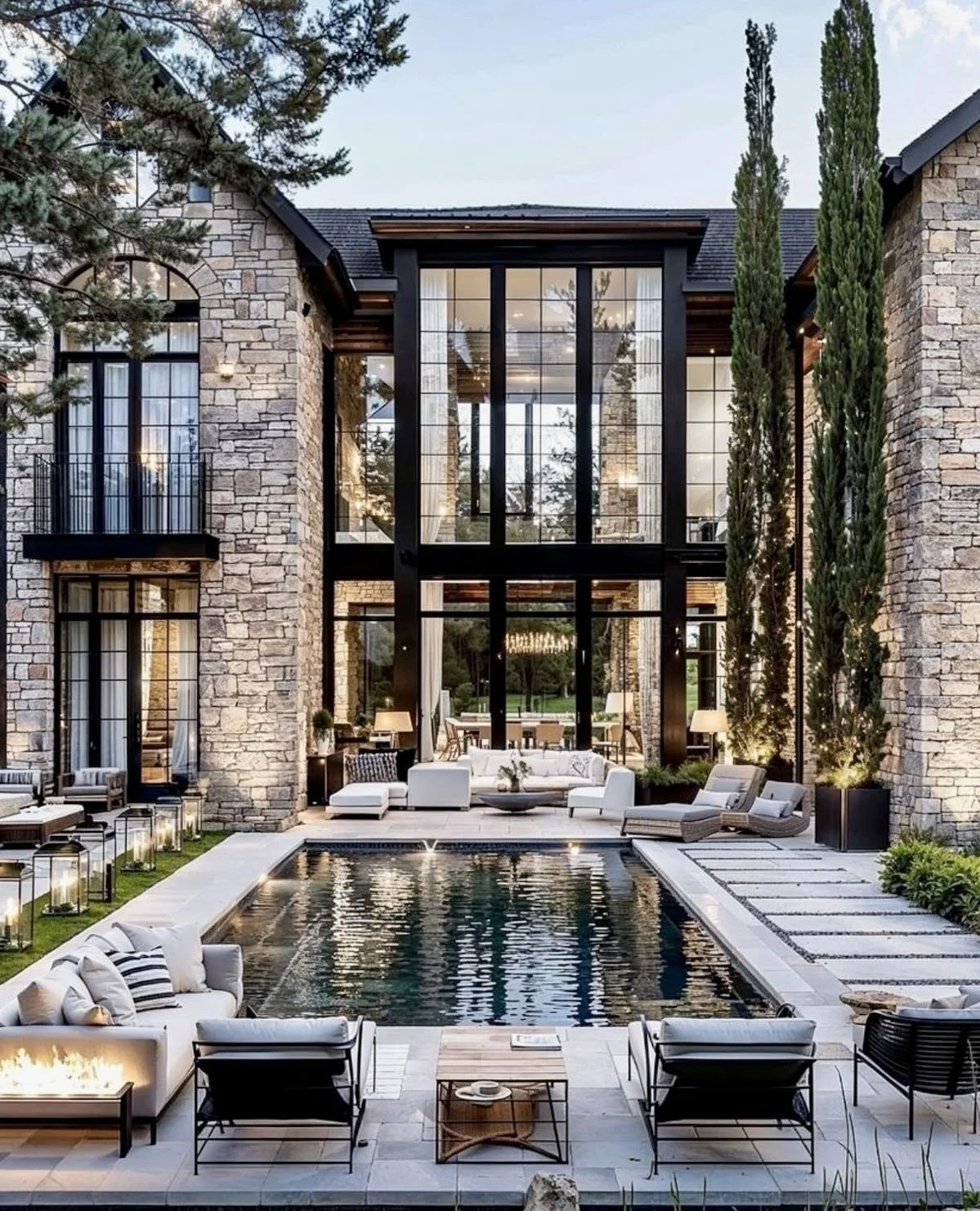
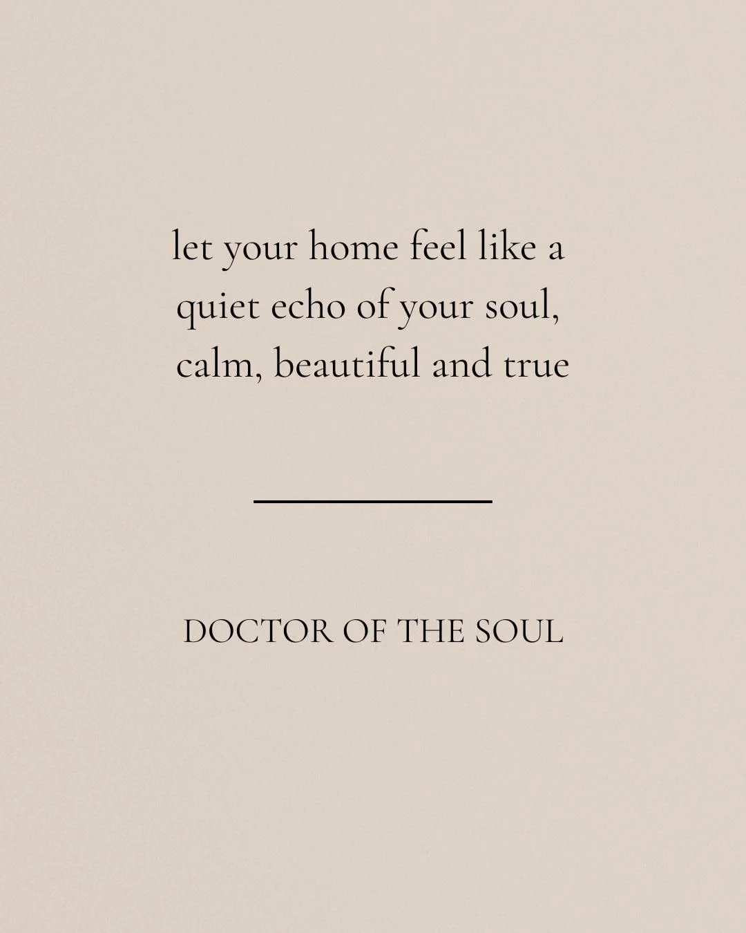
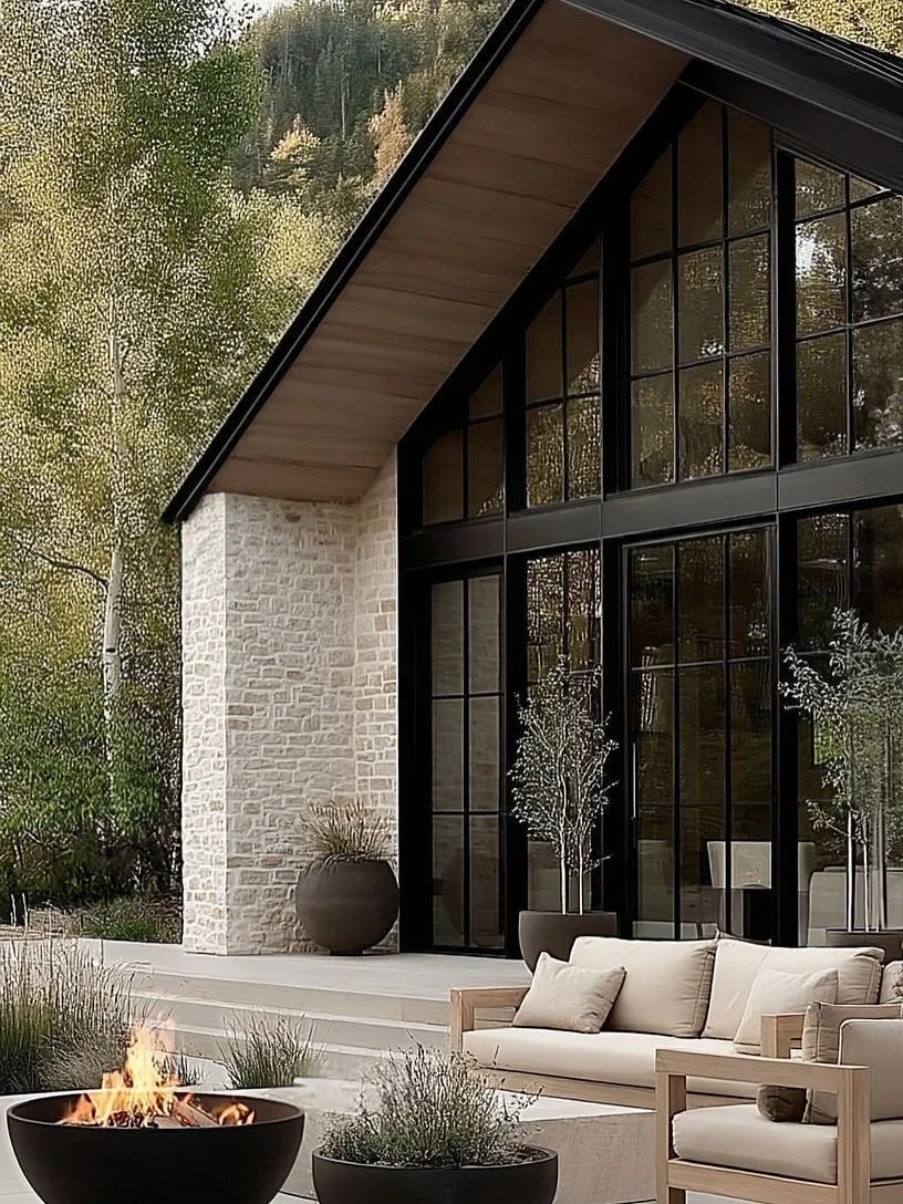
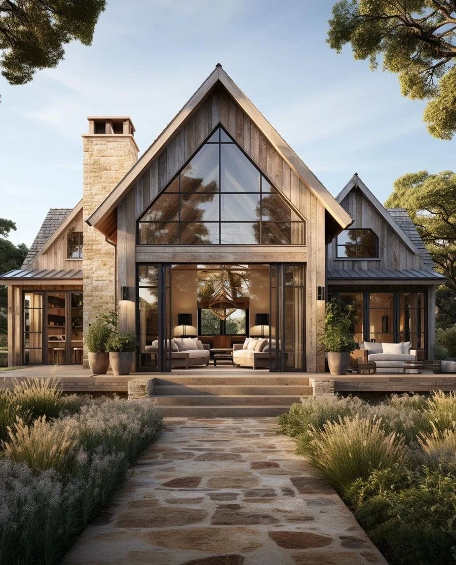
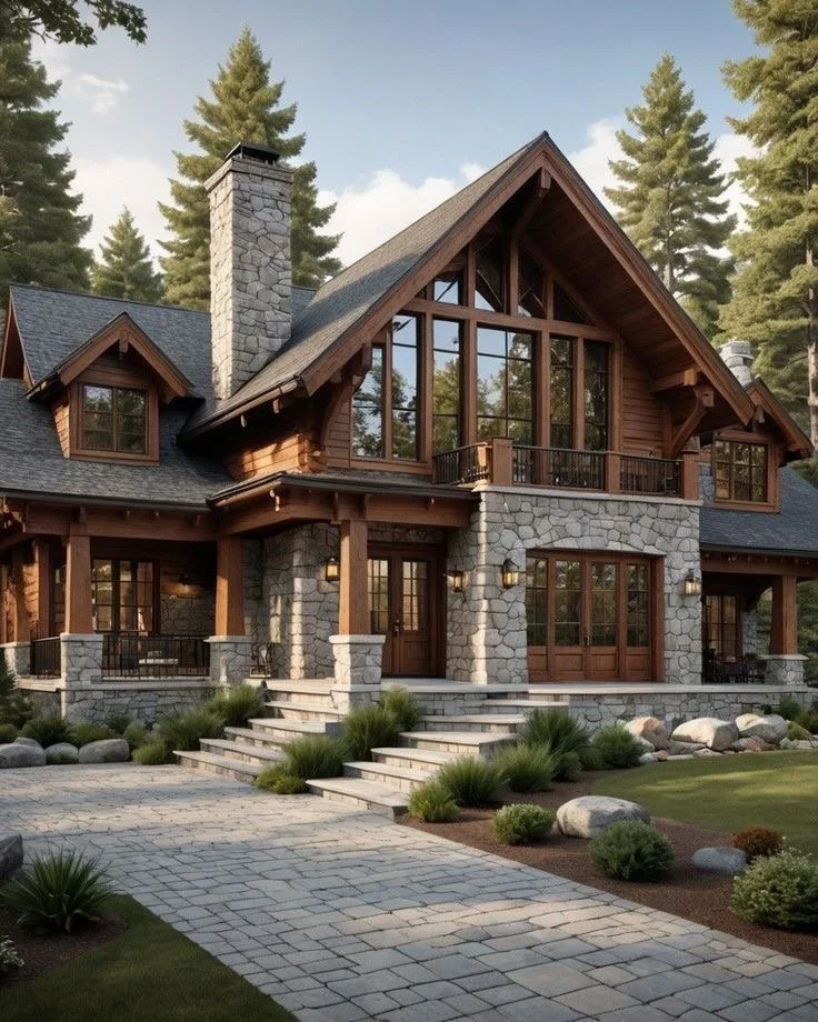
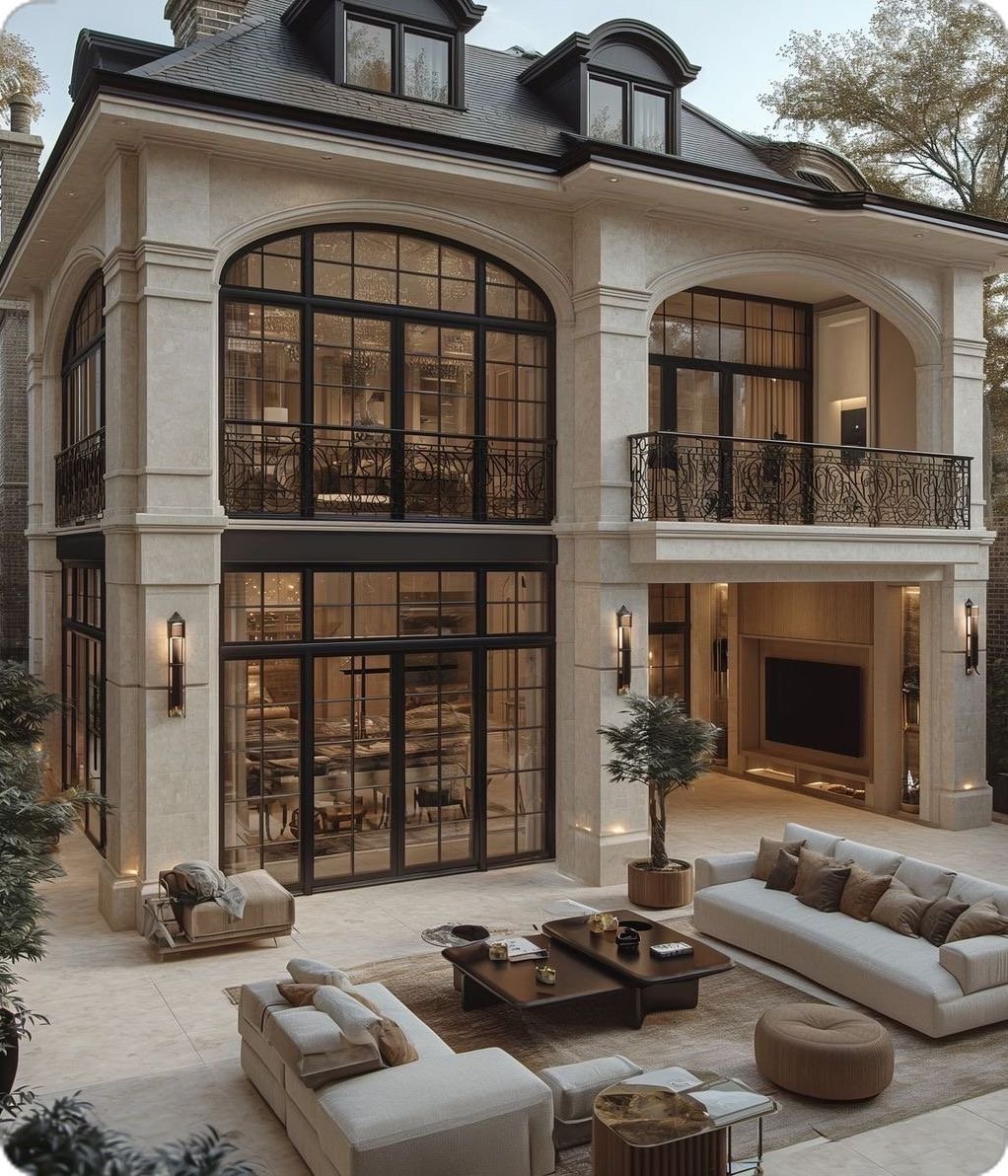
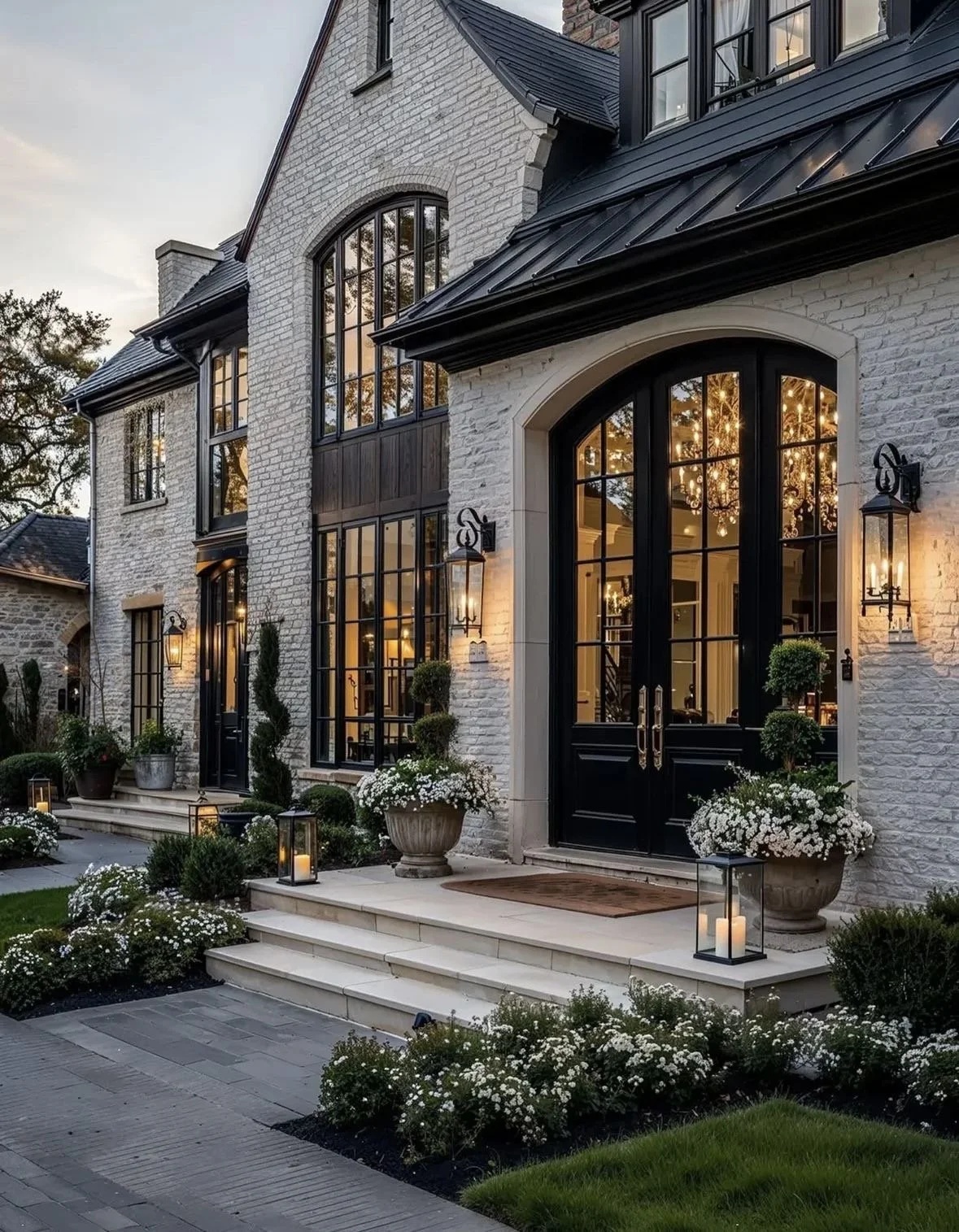
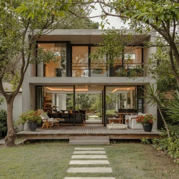
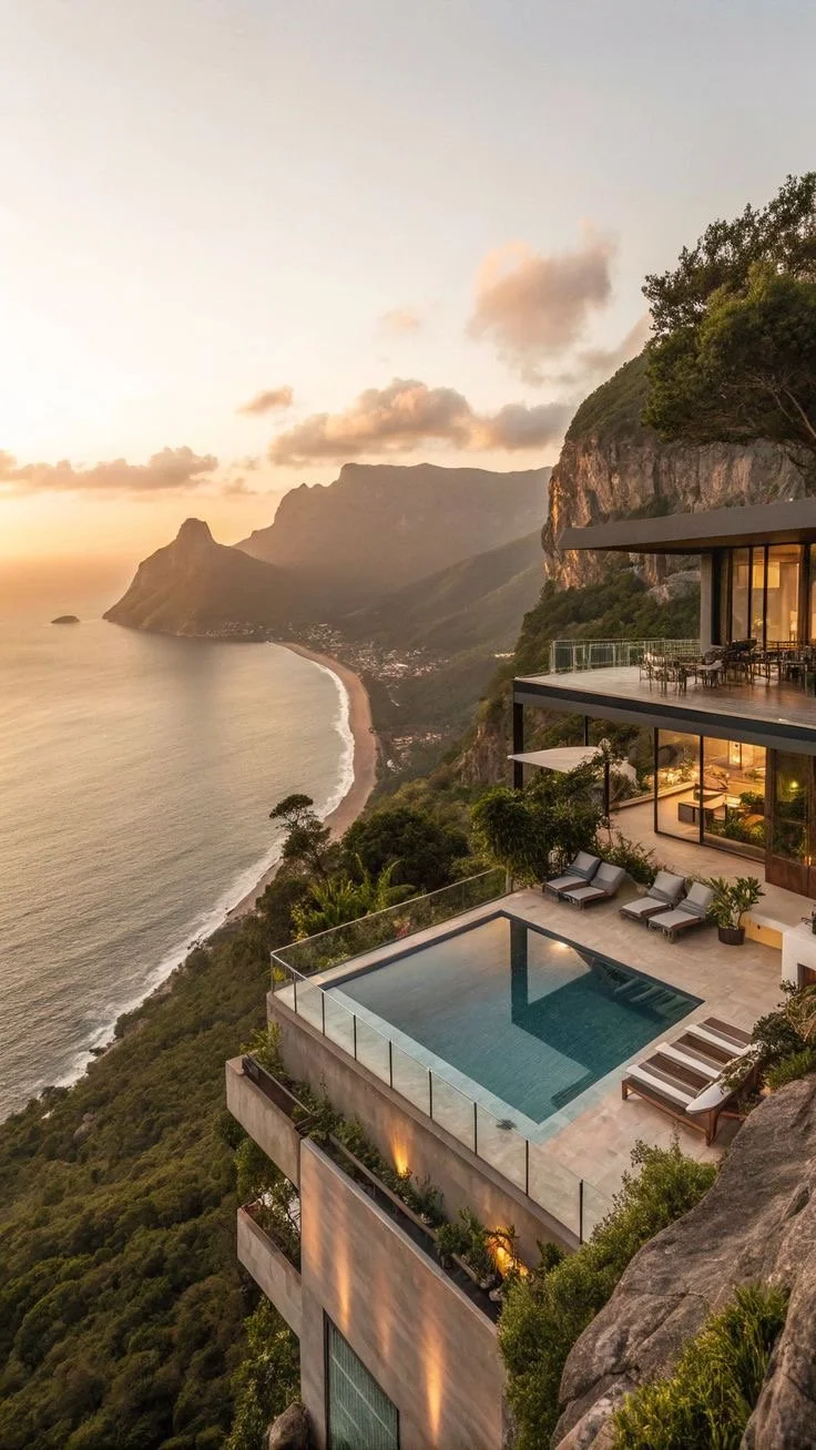
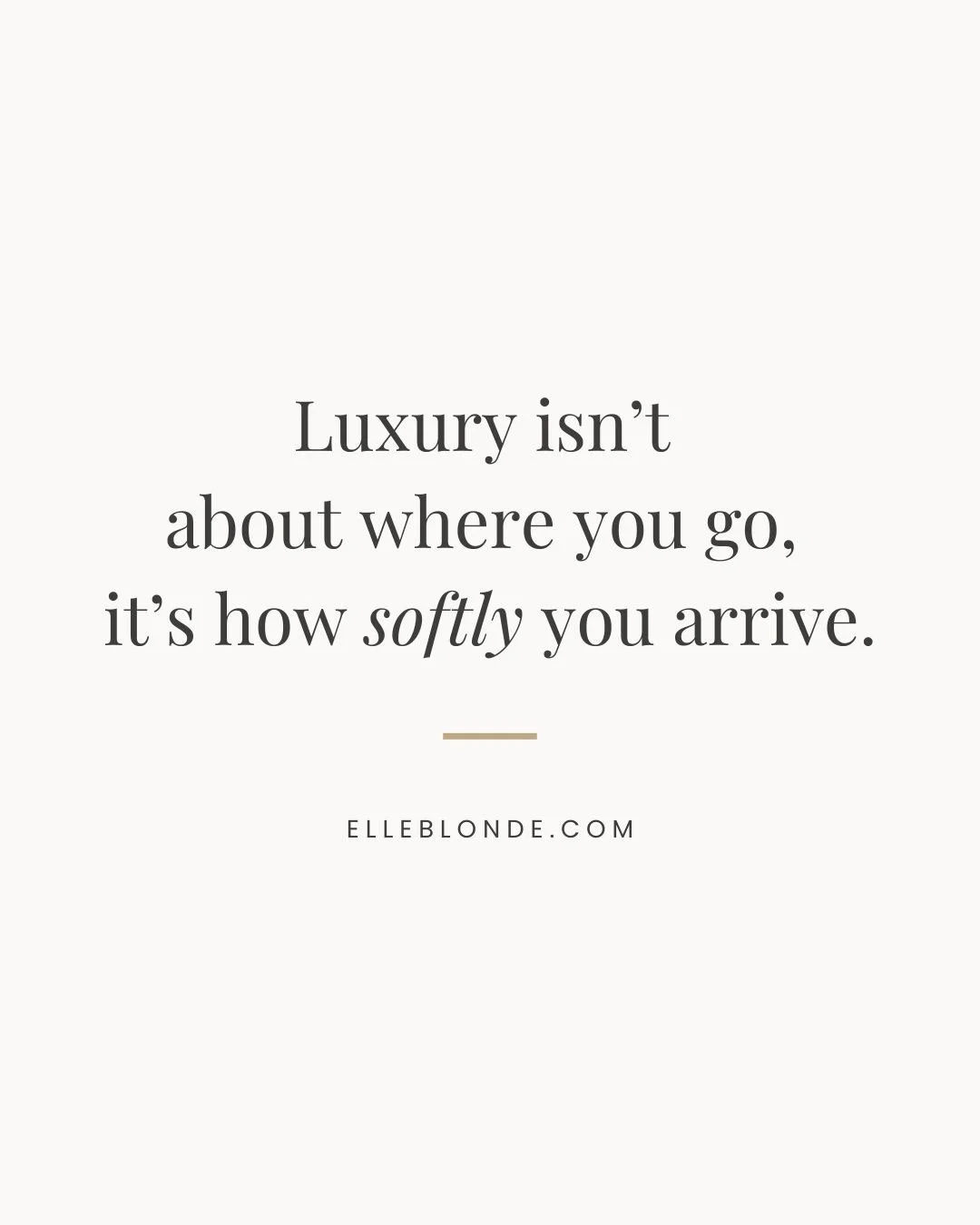
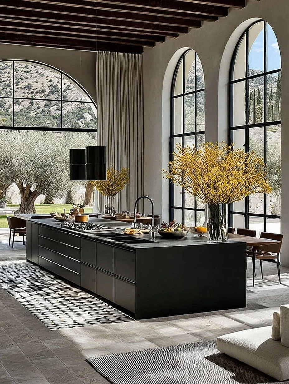
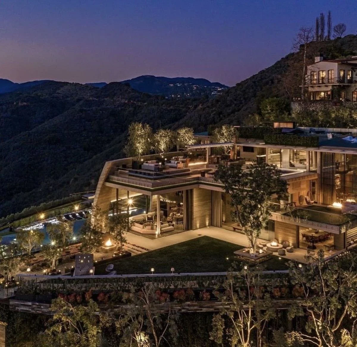
The Art of Outdoor Living: elevating pools, patios, + terraces in luxury properties…
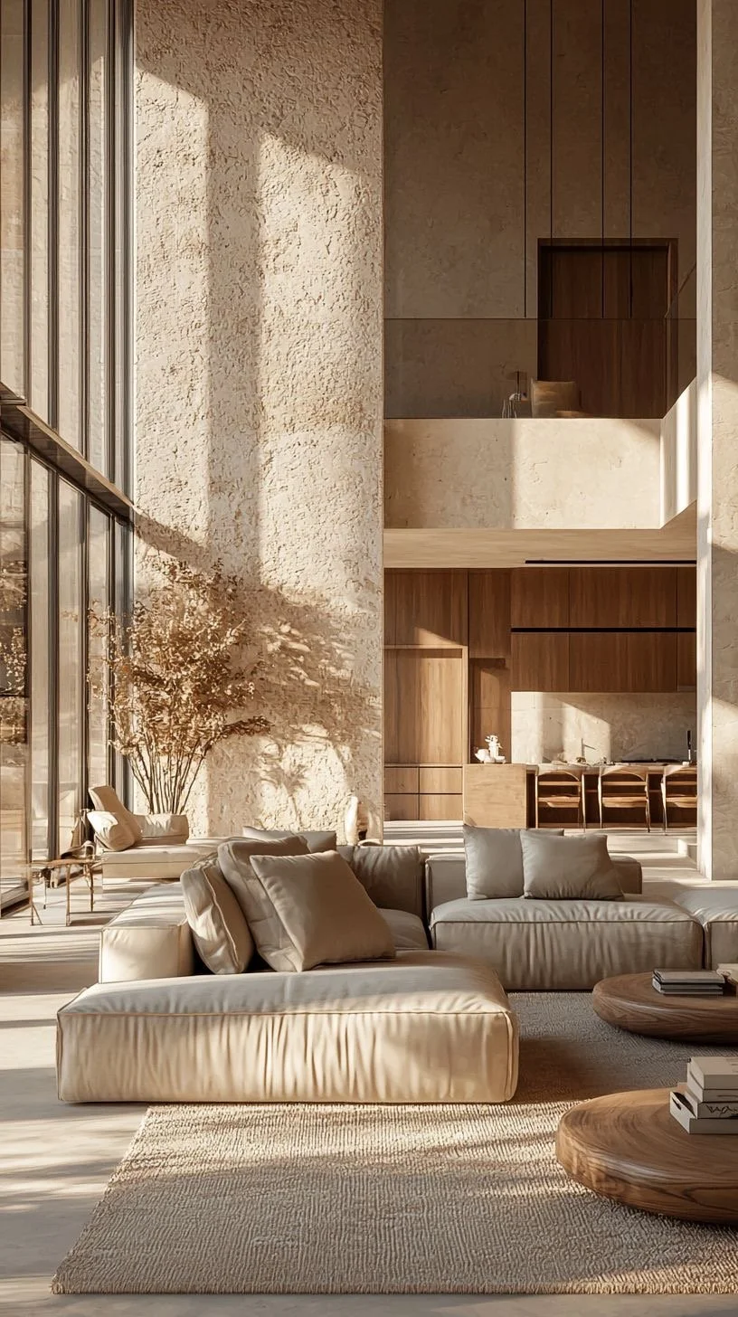
There's a difference between having a backyard... and having an outdoor living environment.
If you've traveled to places like Amalfi Coast, Cabo San Lucas, or Napa Valley, you've experienced outdoor living at its highest level.
The light, the materials, the seamless flow between interior + exterior — nothing feels accidental.
The mistake I see many homeowners make?
They approach pools, patios, + terraces as add-ons instead of architectural extensions of the home.
If you want to invest wisely, your outdoor spaces must be designed with the same rigor as your interiors.
Let's walk through how to do just that. I got you! #Trust
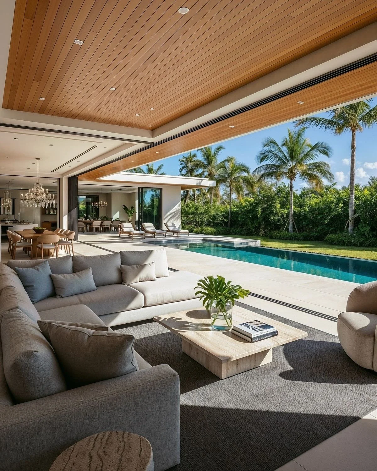
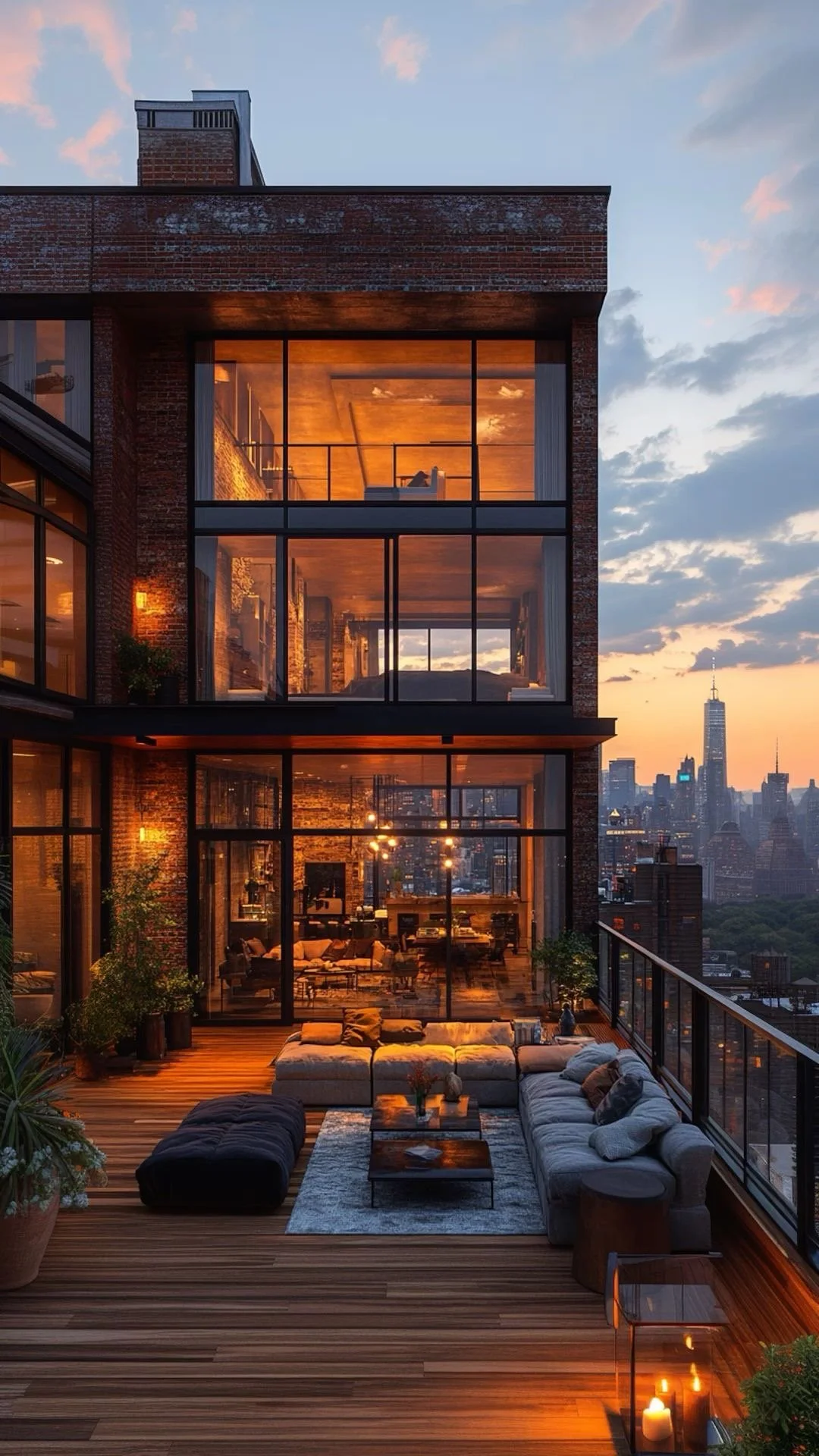
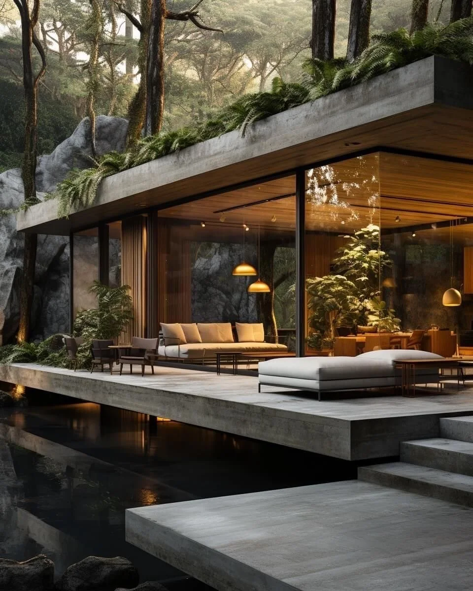
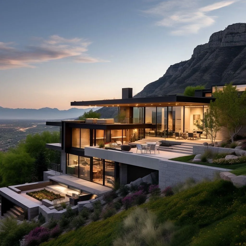
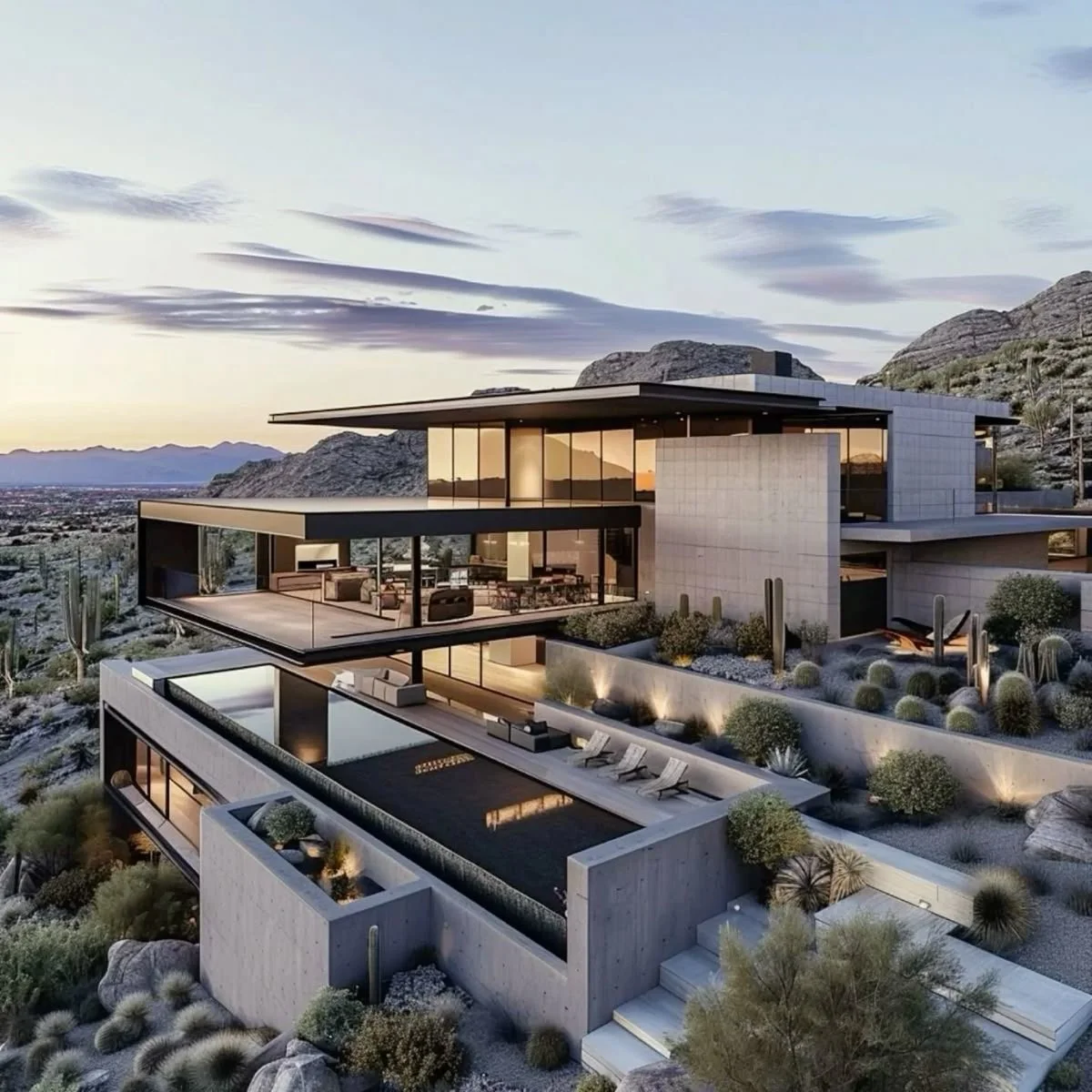
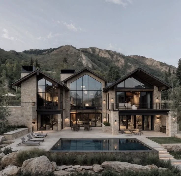
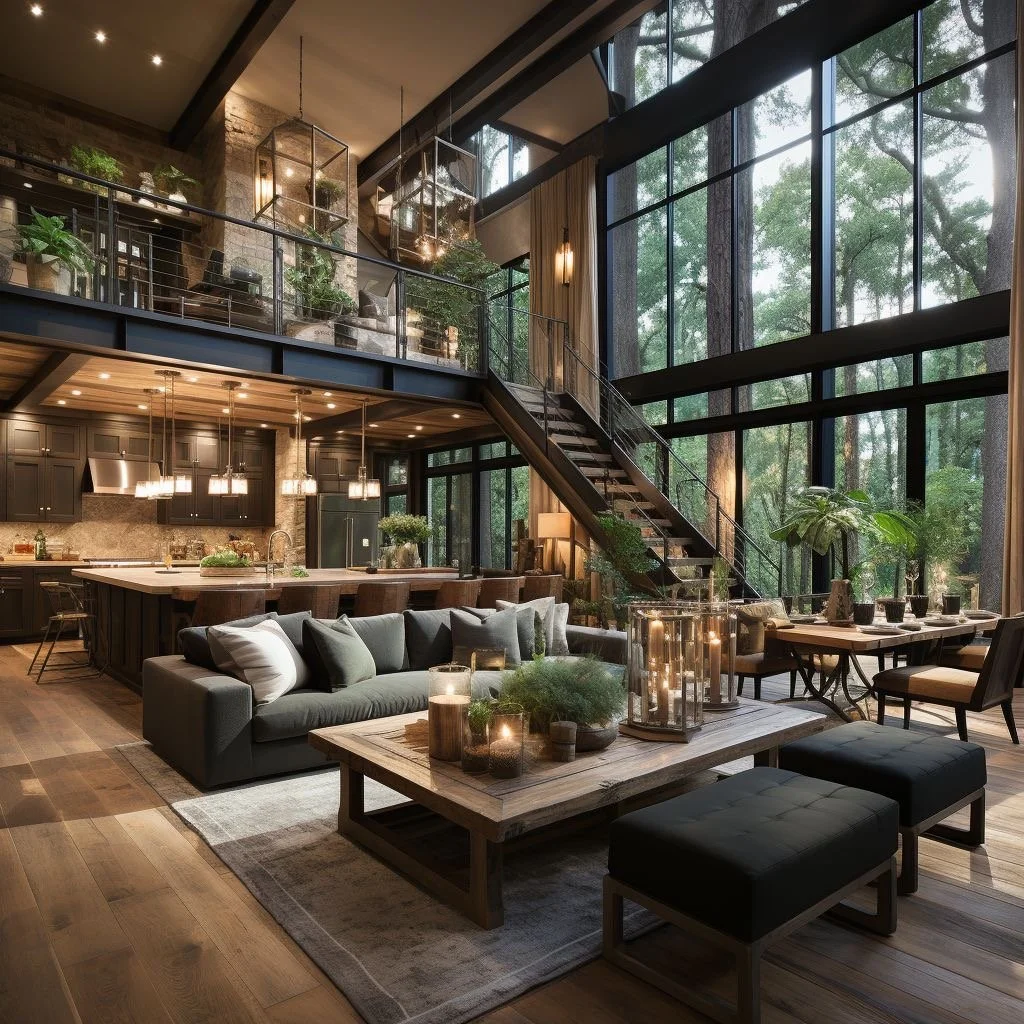
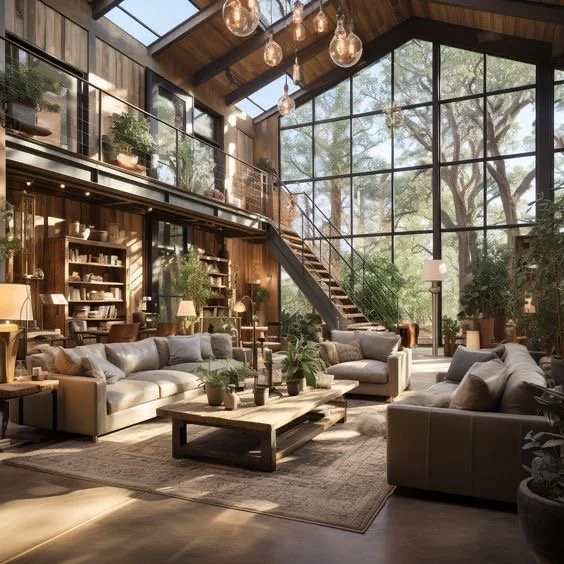
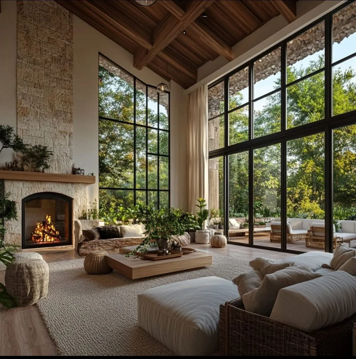
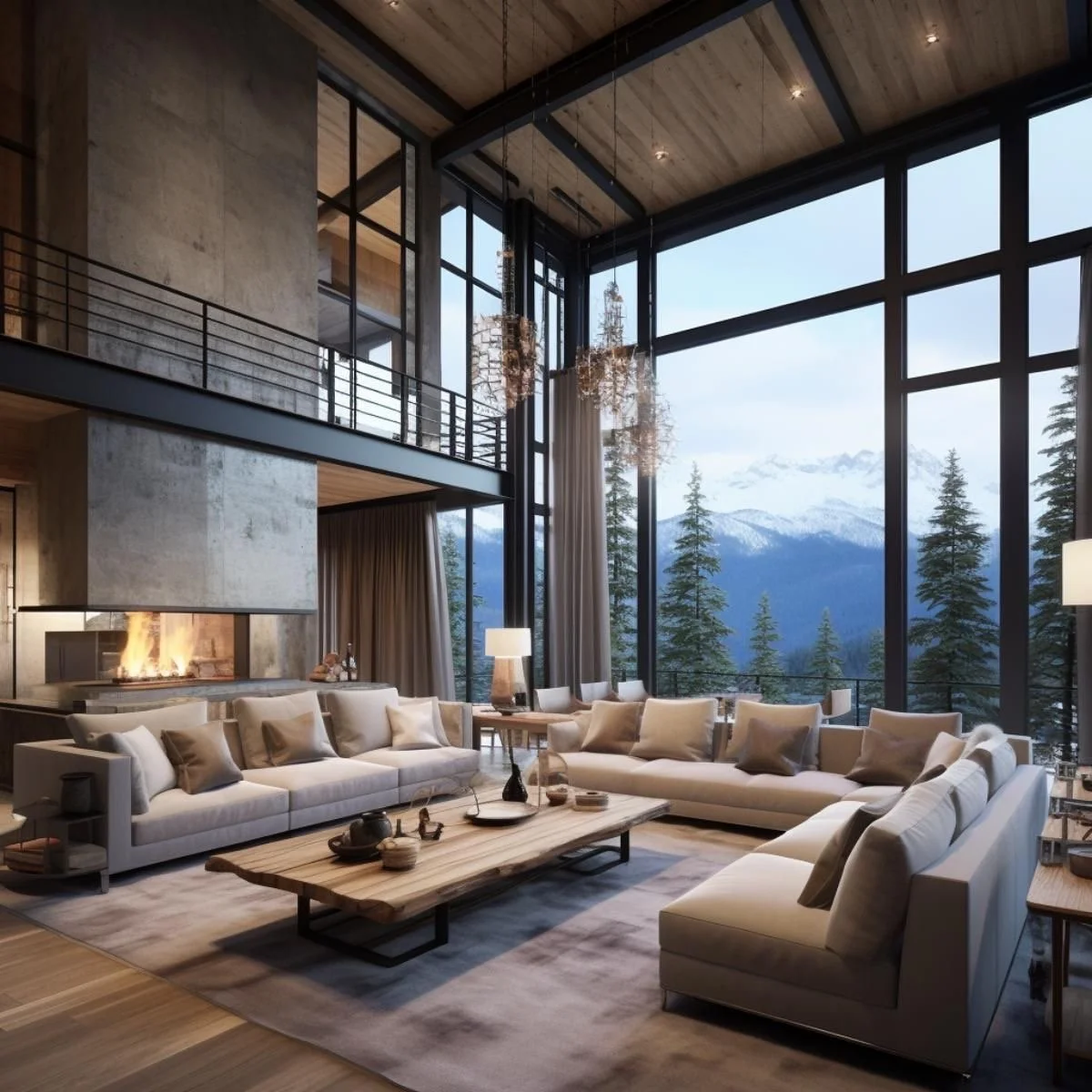
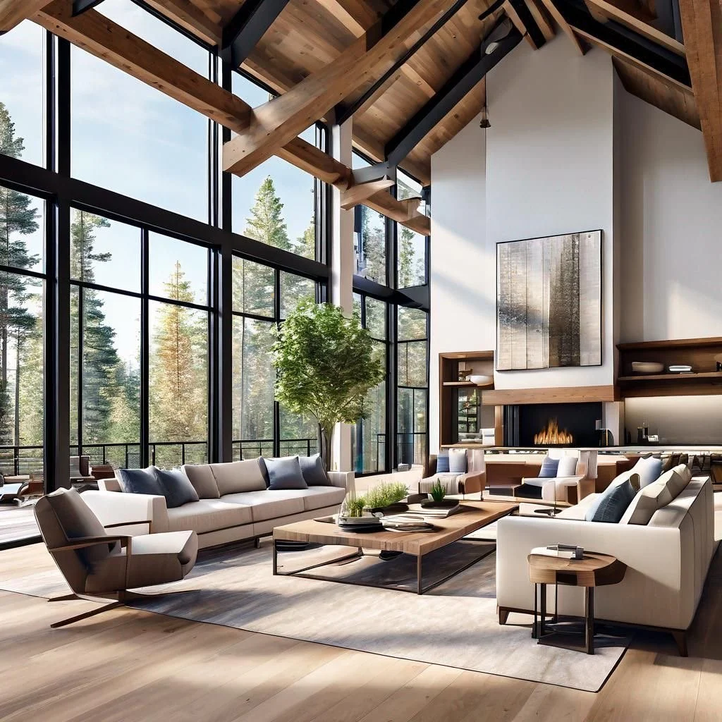
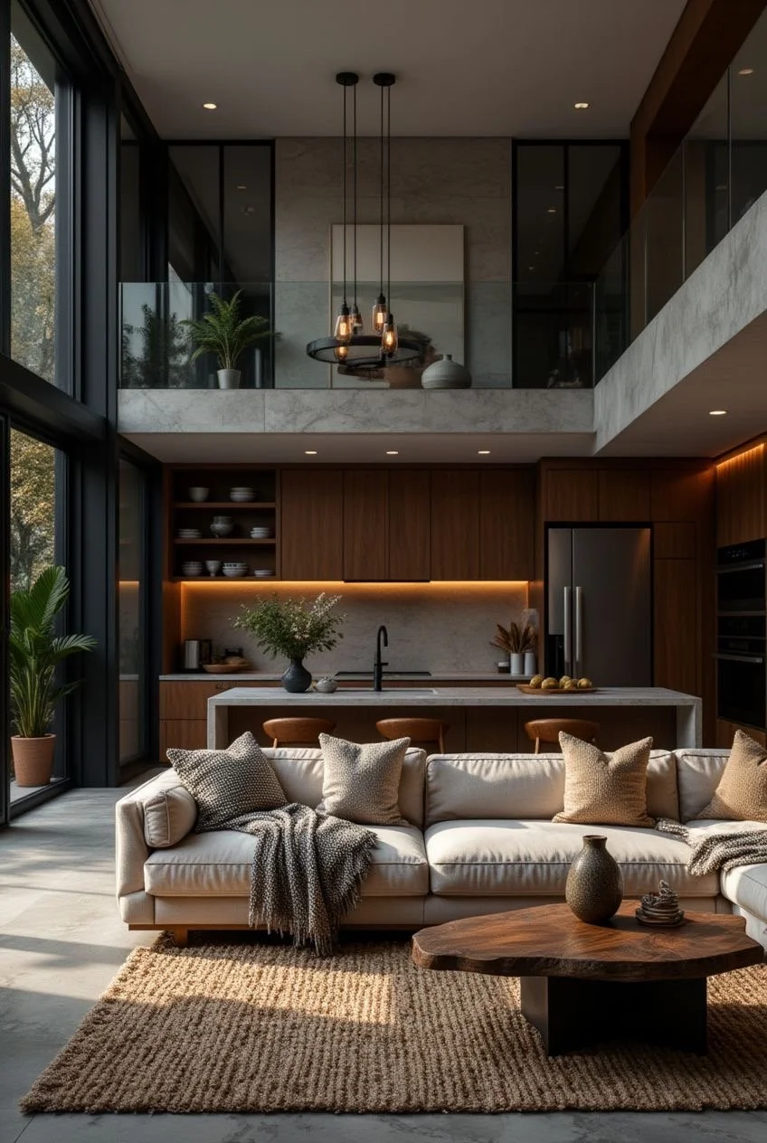
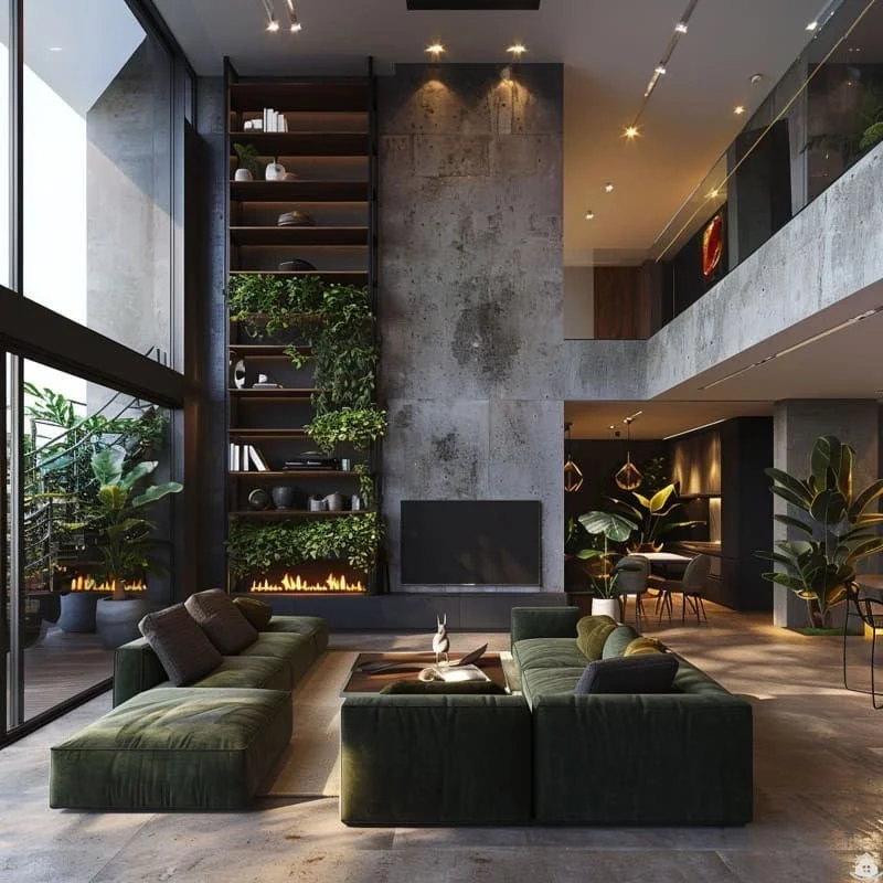
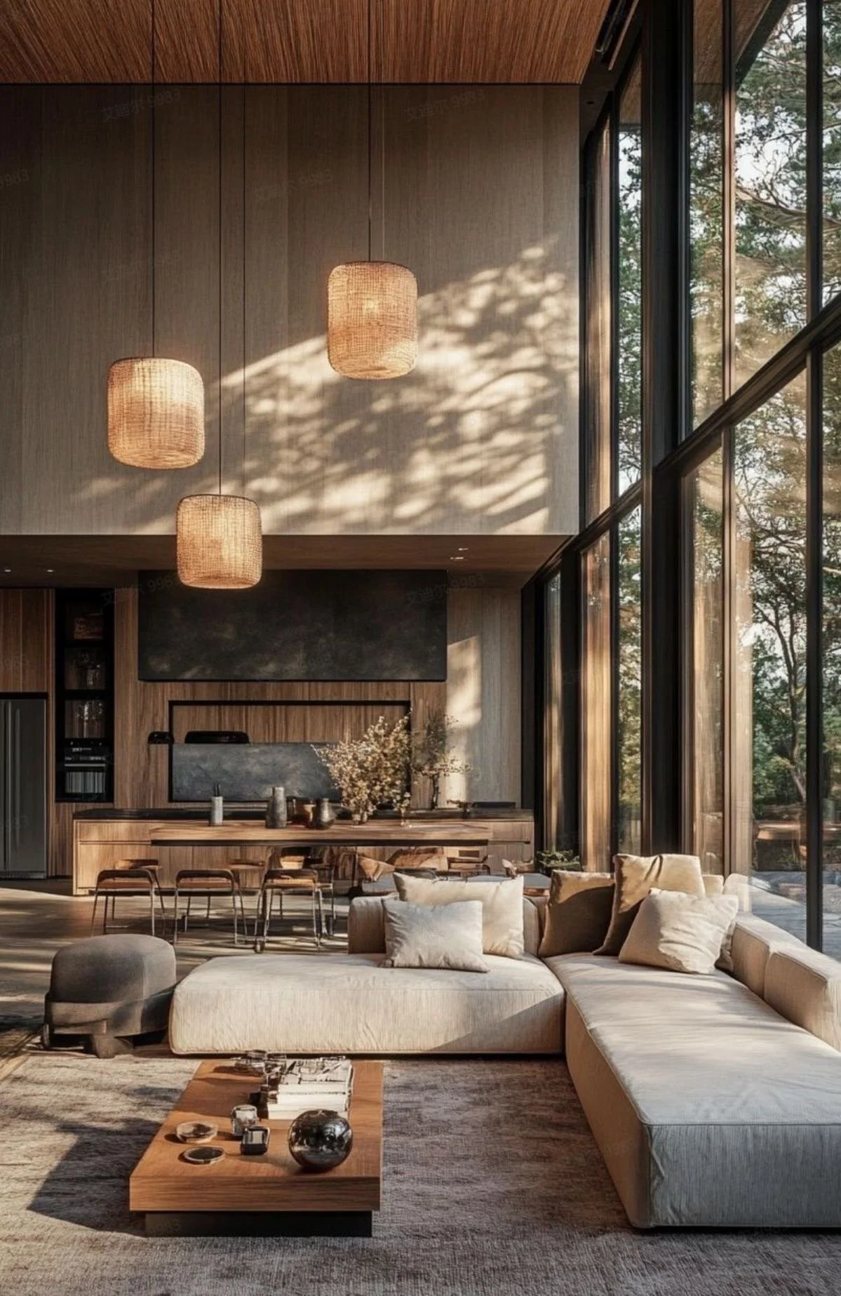
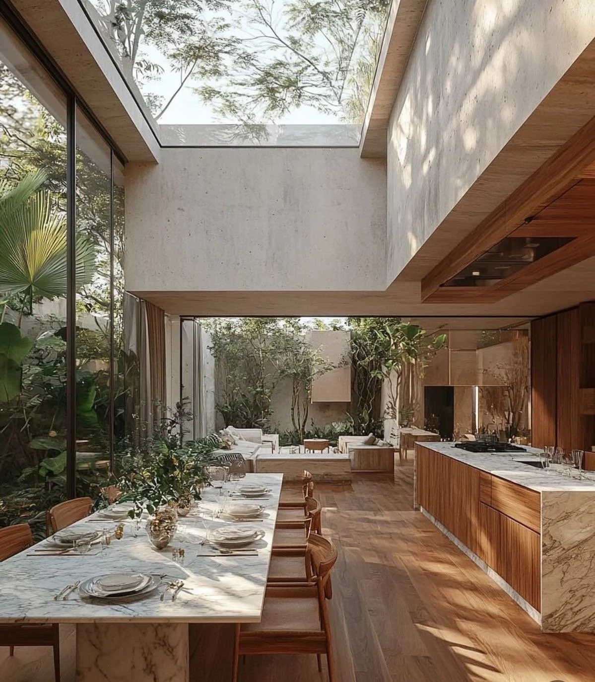
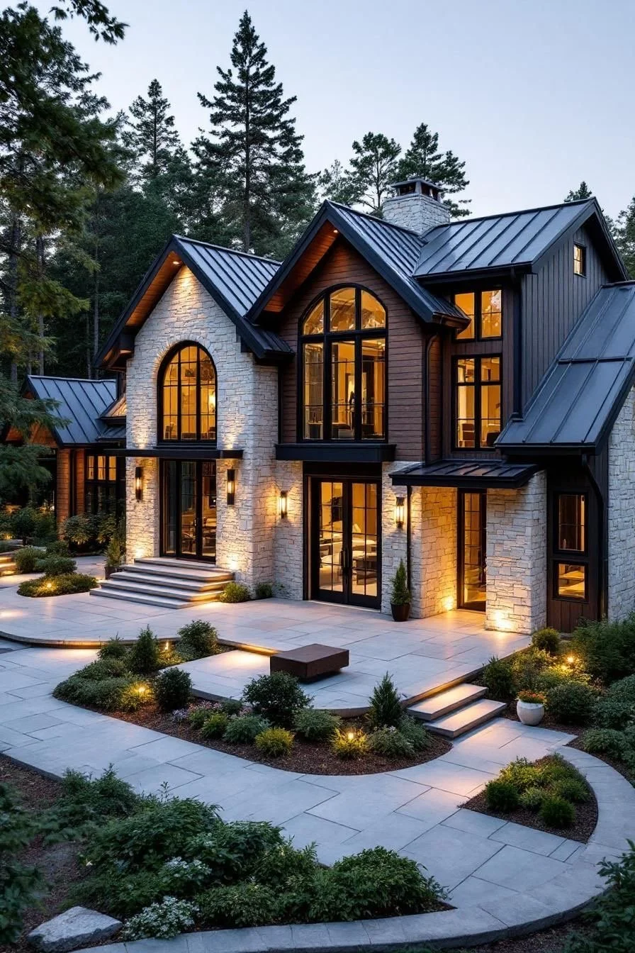
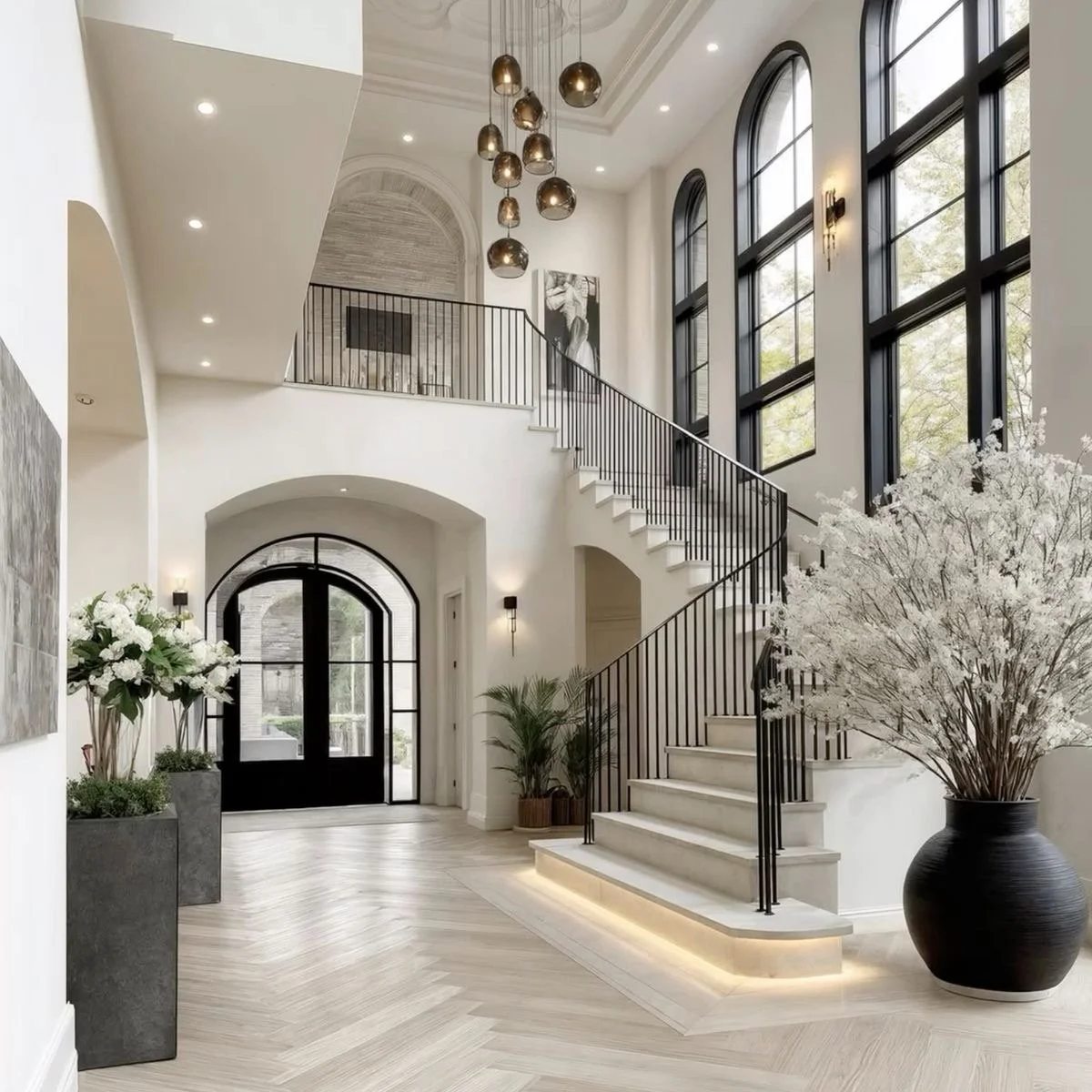
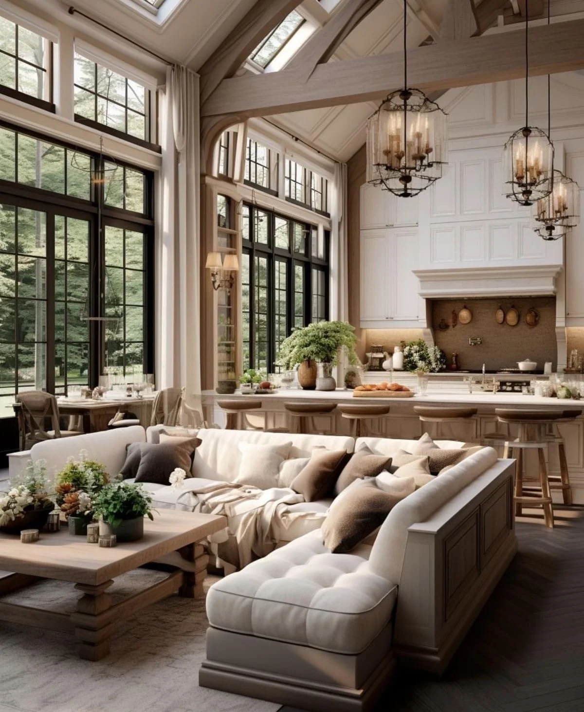
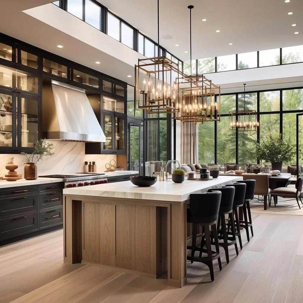
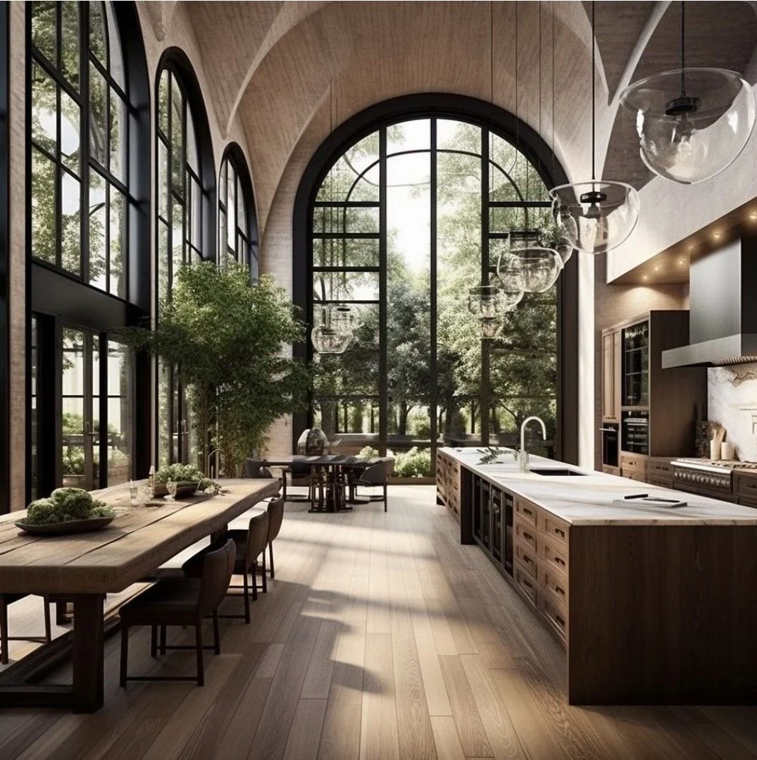
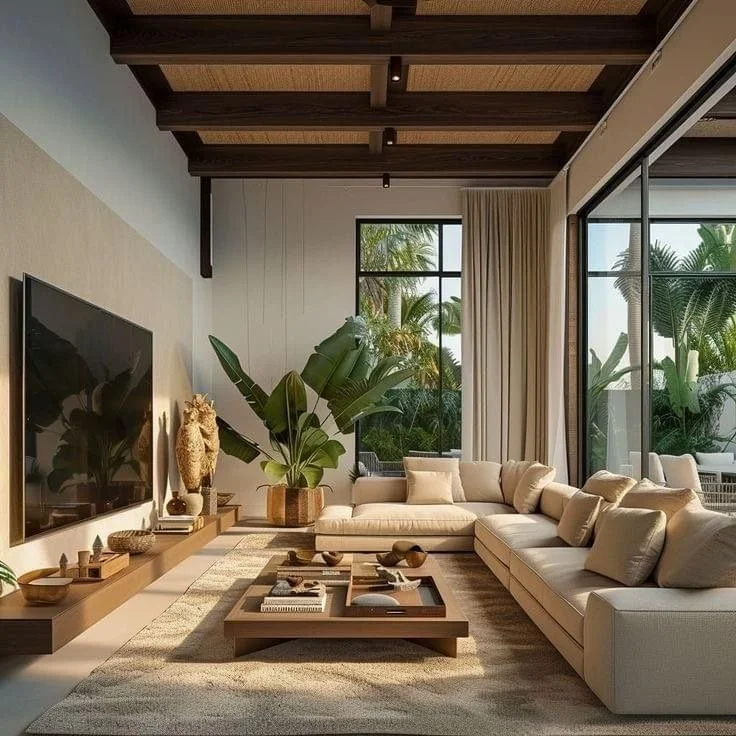
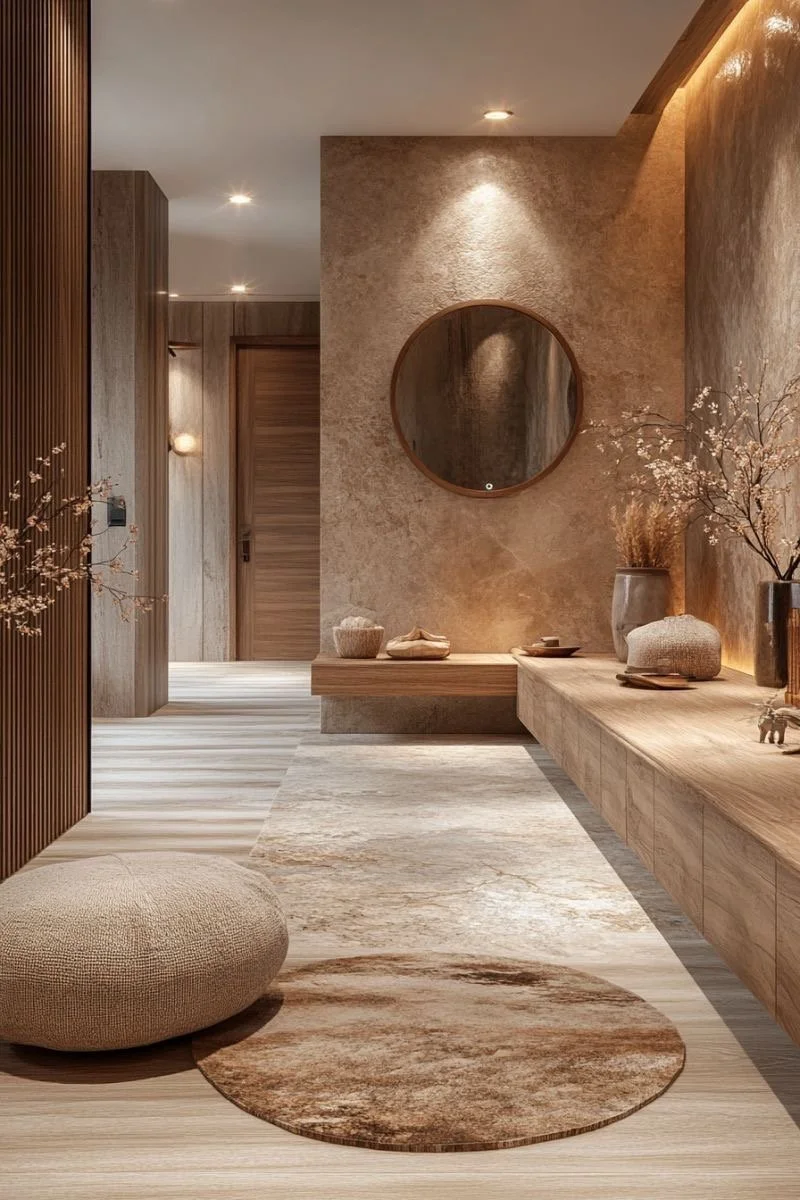
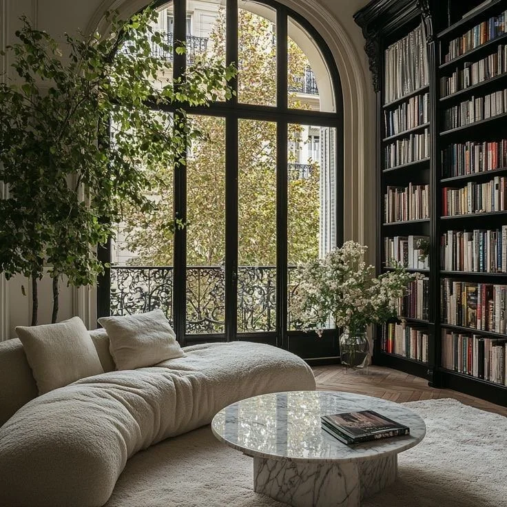
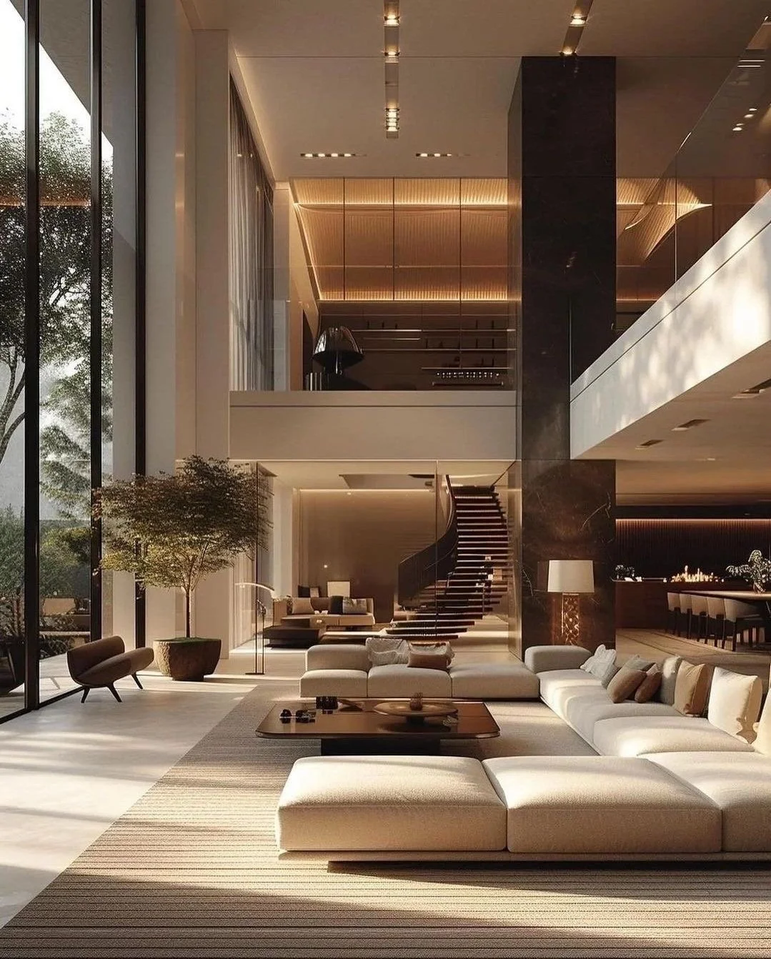
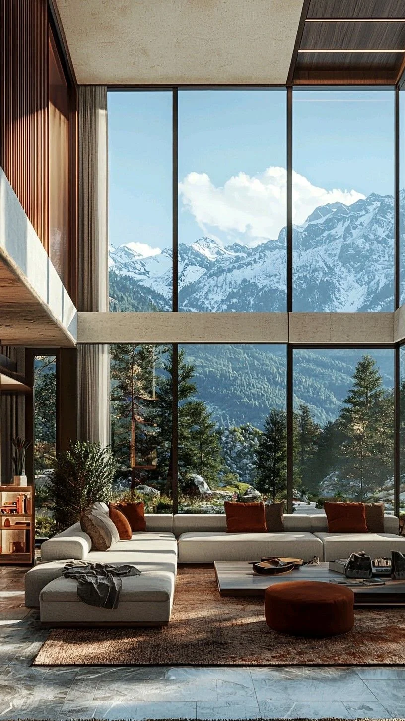
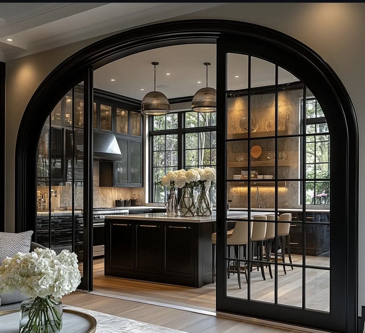
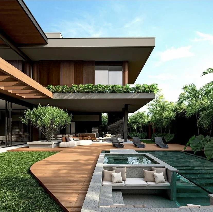
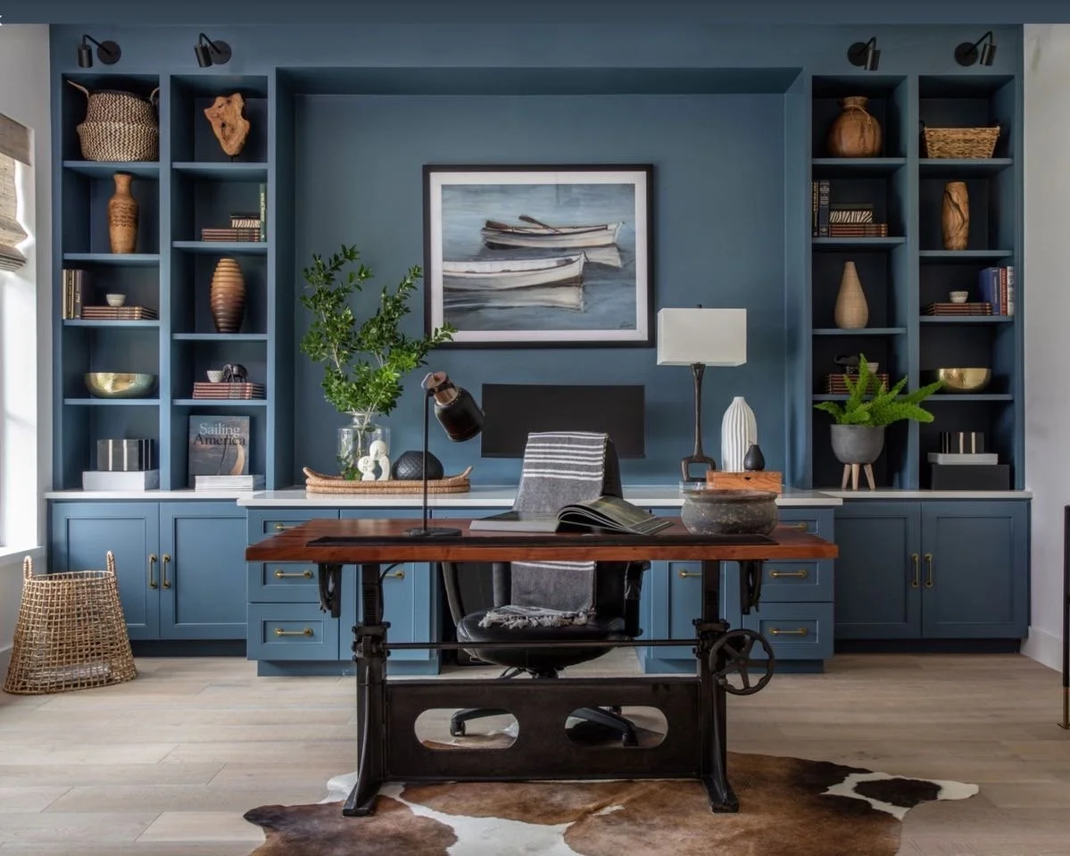
1. Start With Architecture — Not Furniture
Before selecting a single chaise lounge, ask yourself:
Does this outdoor space feel like it belongs to the house?
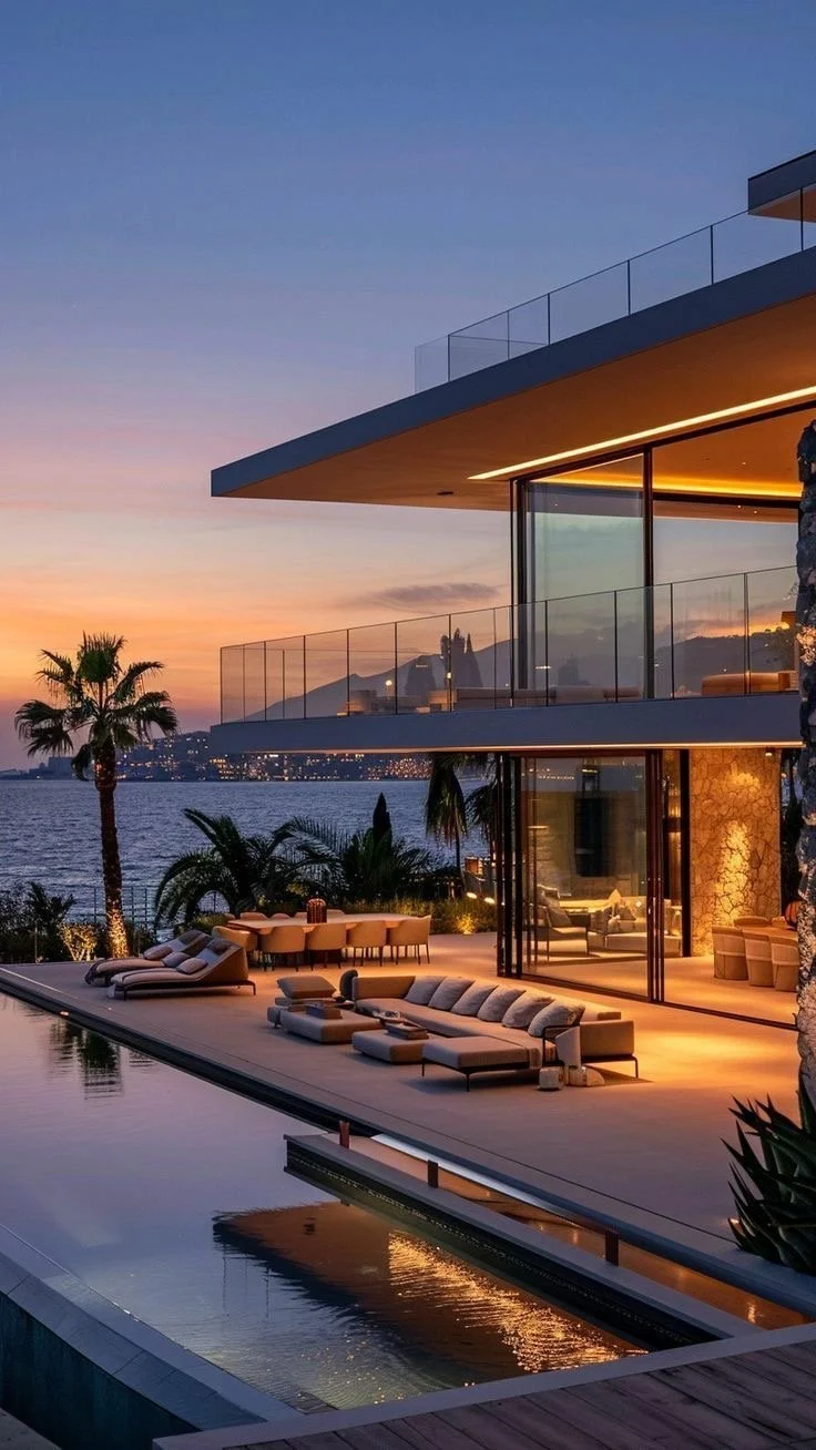
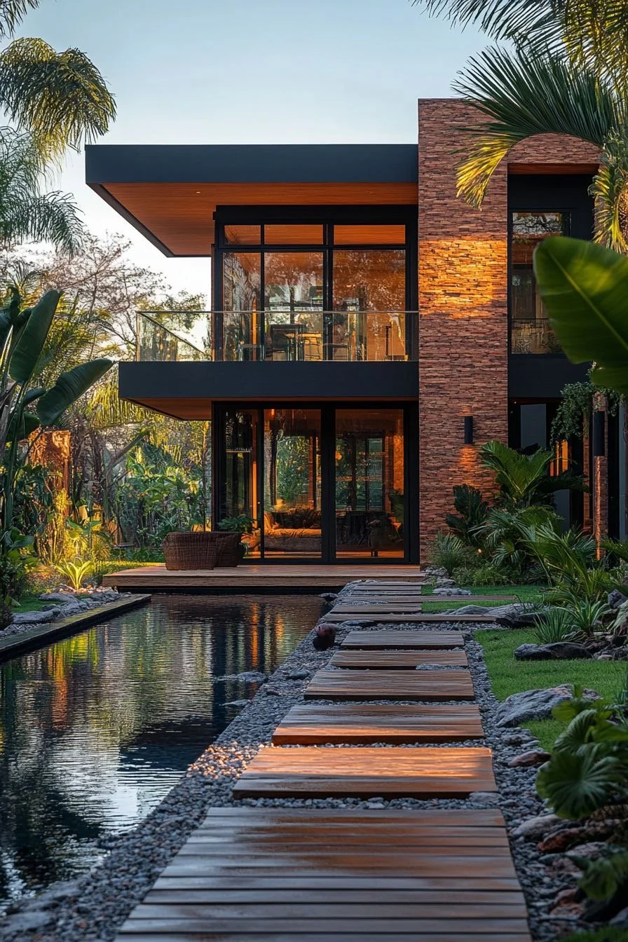
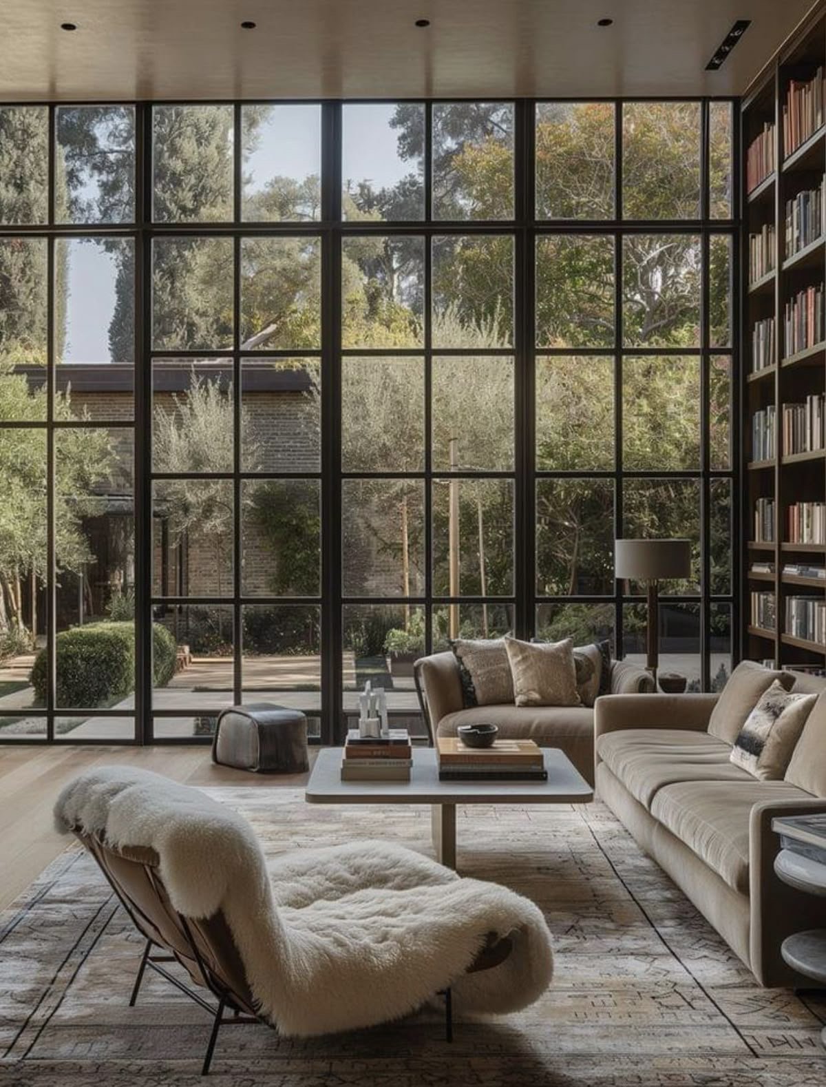
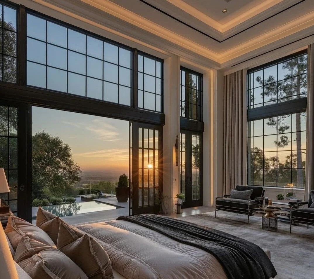
In true luxury residential architectural design, outdoor areas are conceived during the architectural phase — not after construction.
Key Principles:
Align rooflines + ceiling heights with interior volumes
Continue flooring materials or complementary textures
Frame views intentionally (not randomly)
Integrate structural shade: pergolas, deep overhangs, arcades
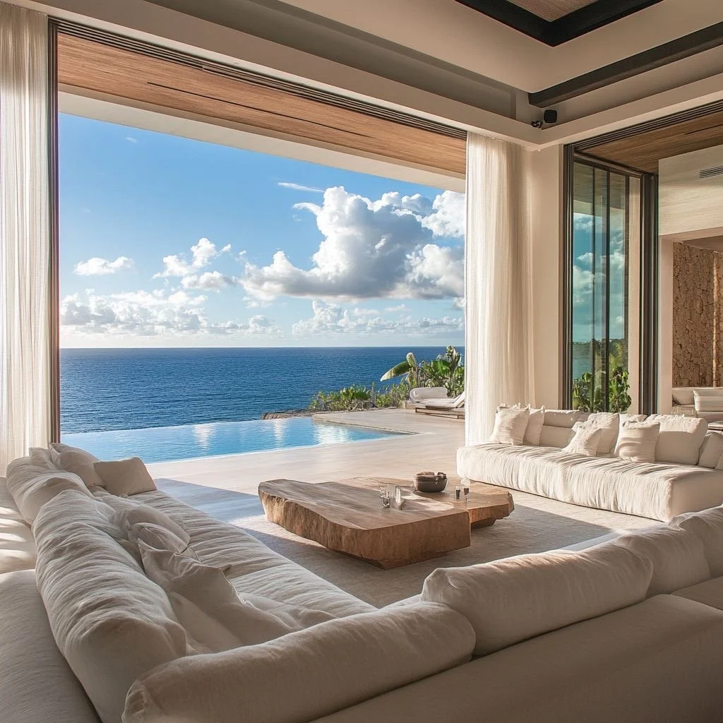
When the transition from inside to outside feels effortless, your home instantly feels larger — without adding square footage.
Investment insight: Architectural integration increases perceived value far more than decorative upgrades ever will.
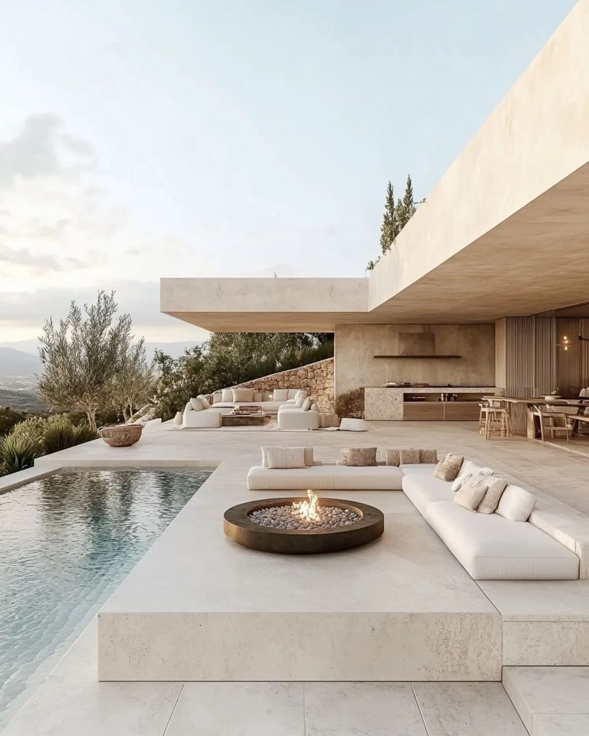
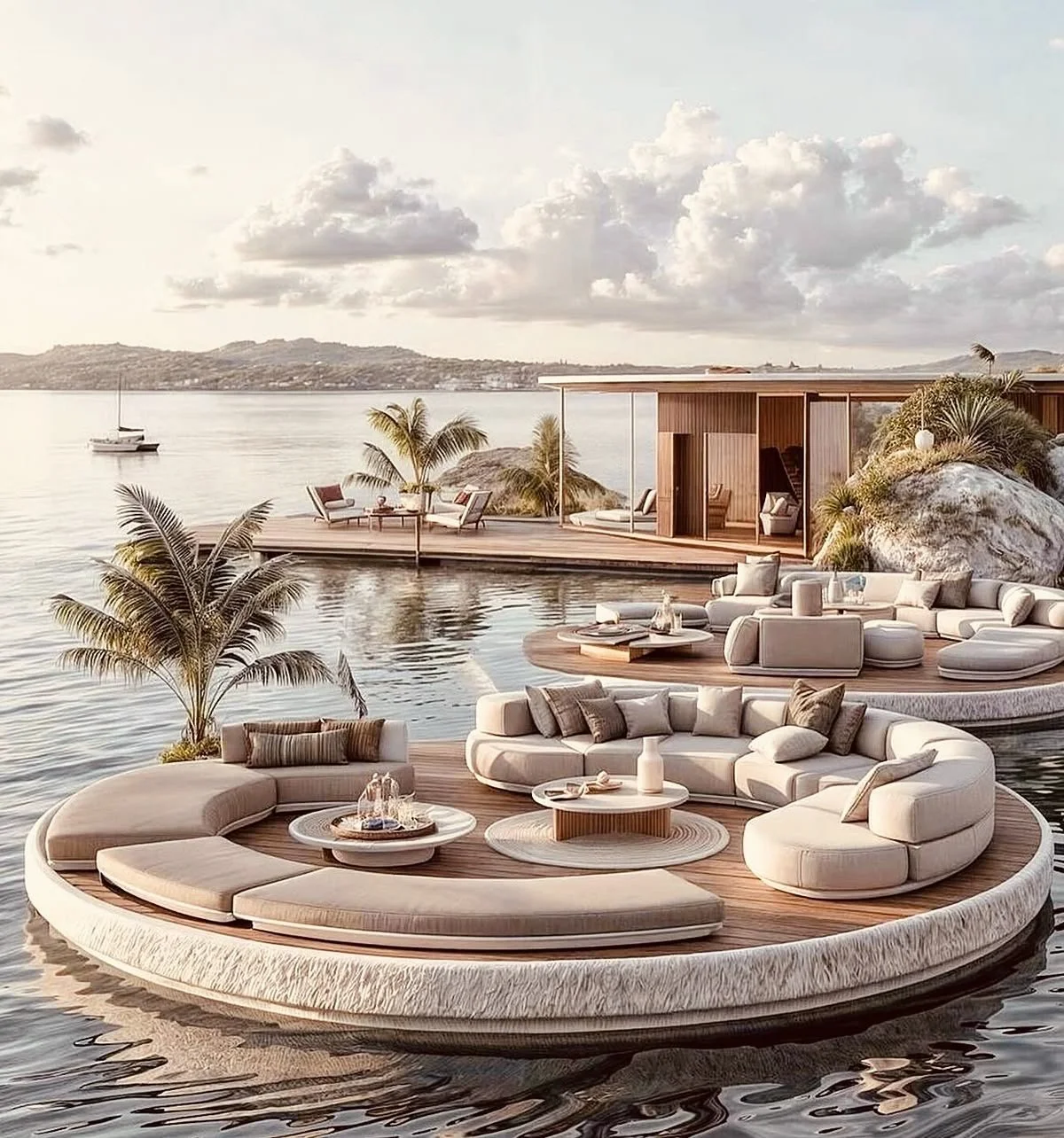
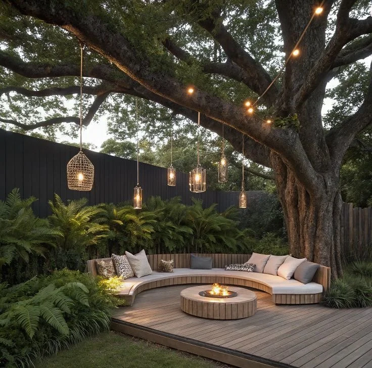
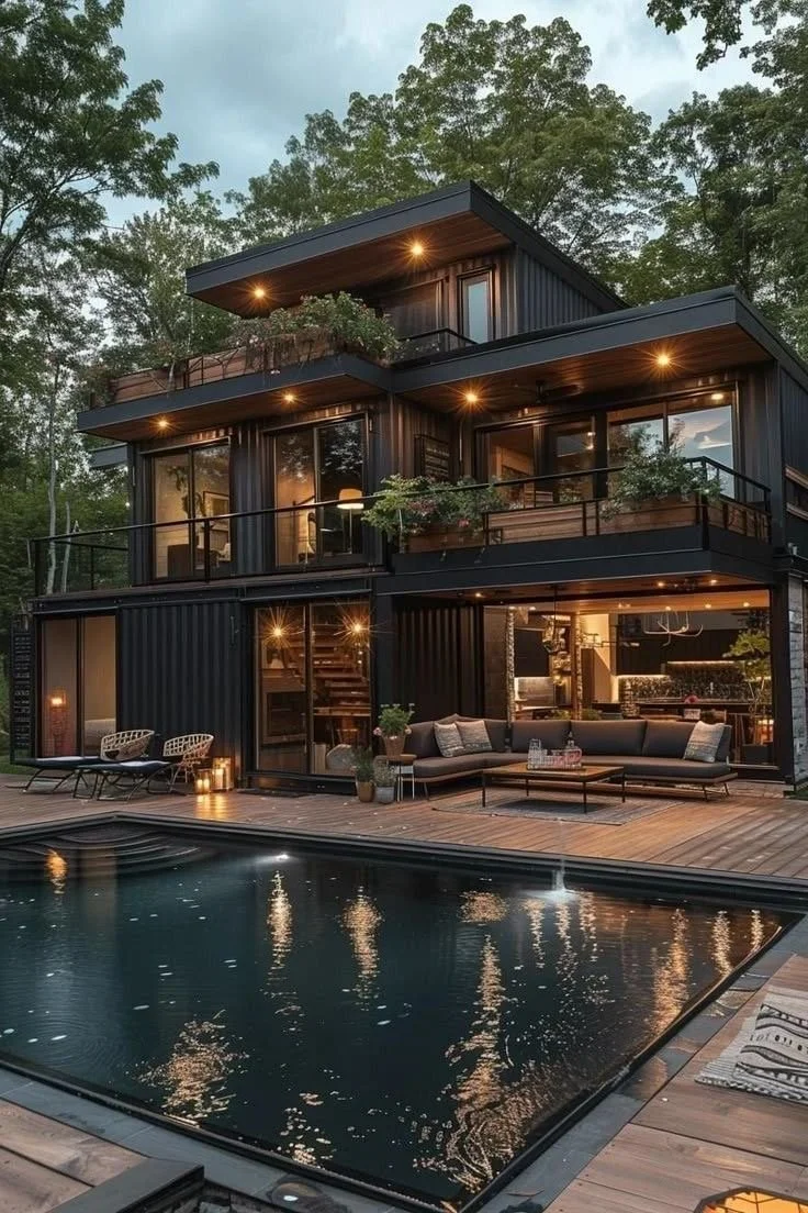
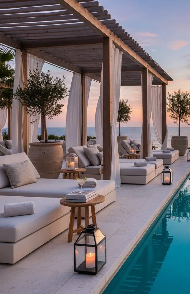
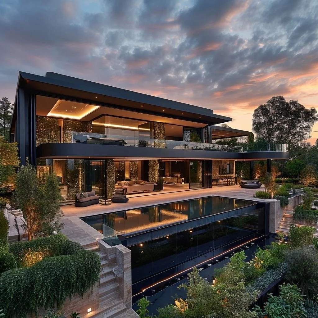
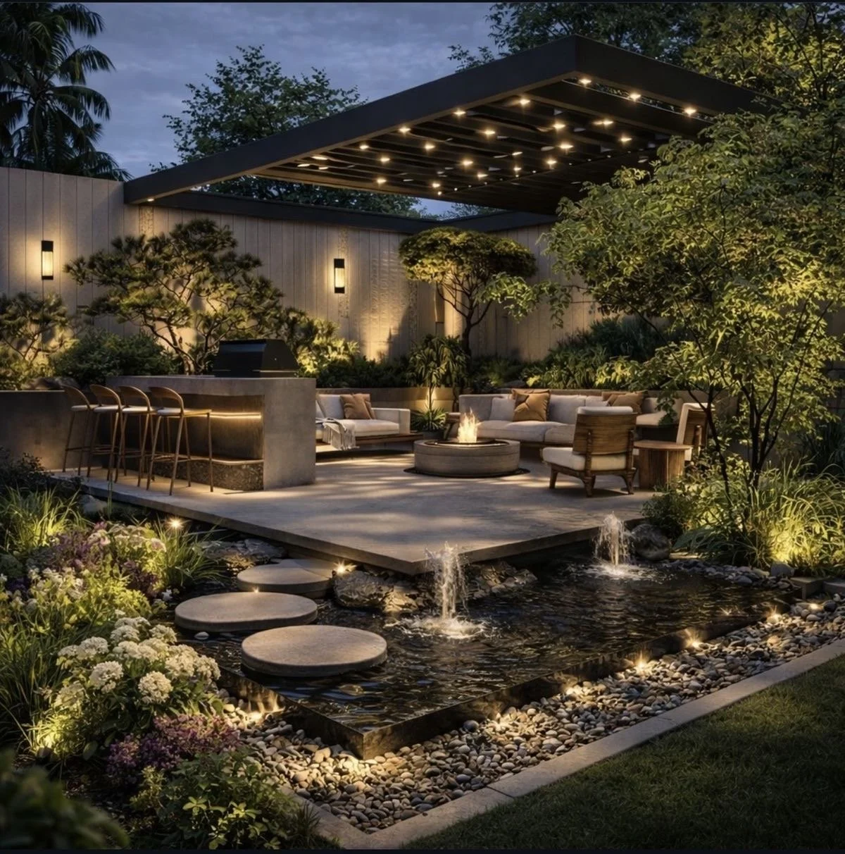
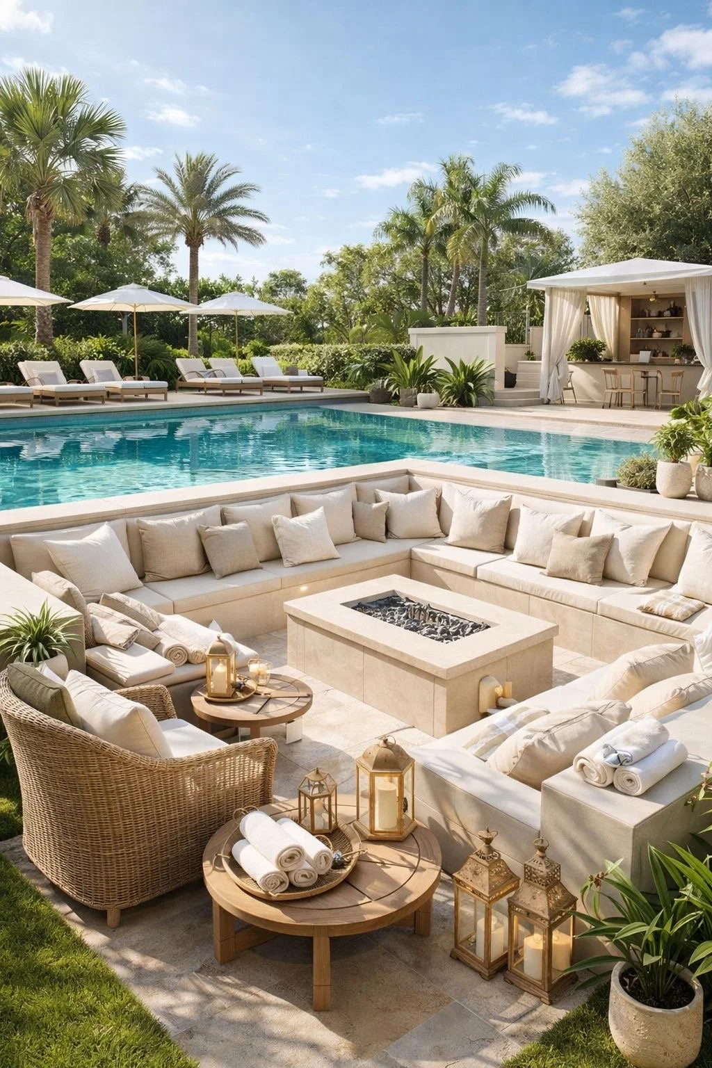
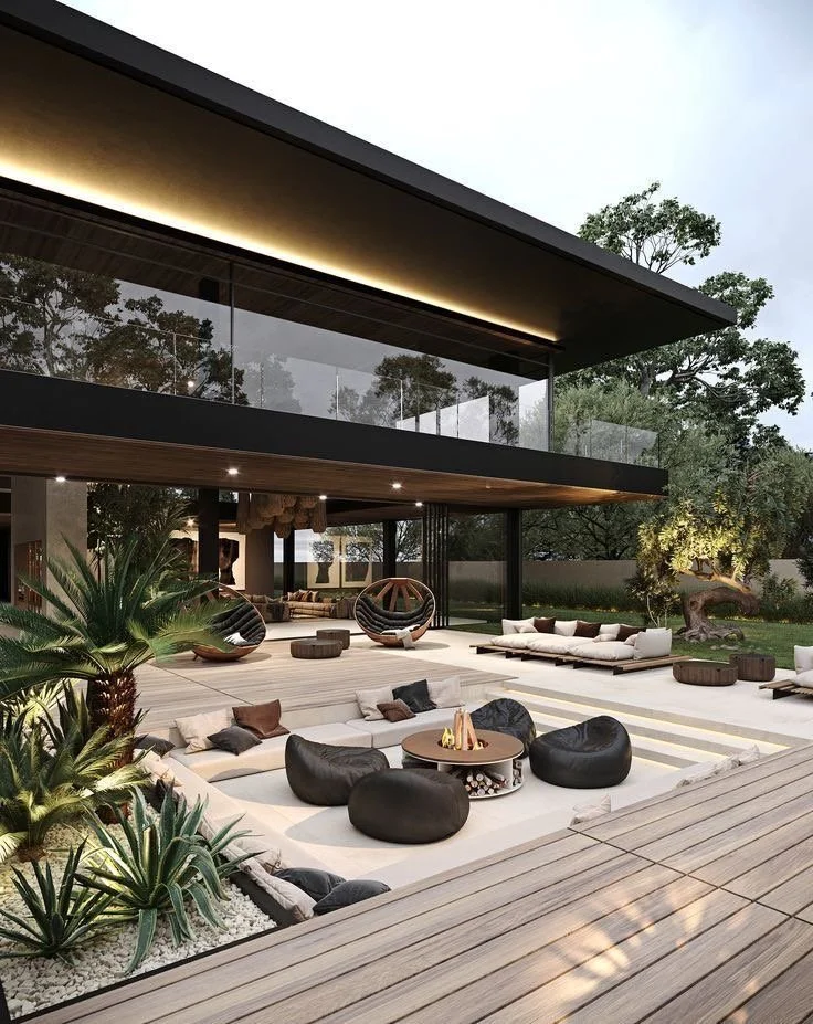
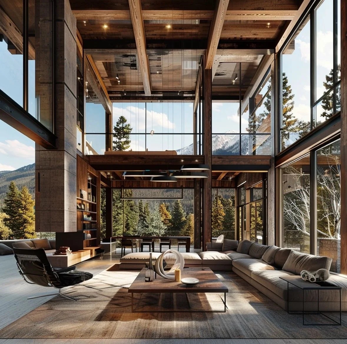
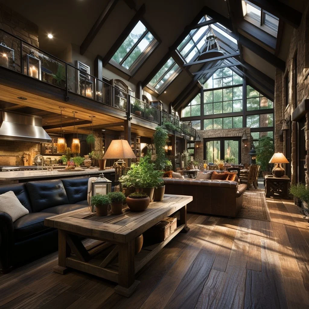
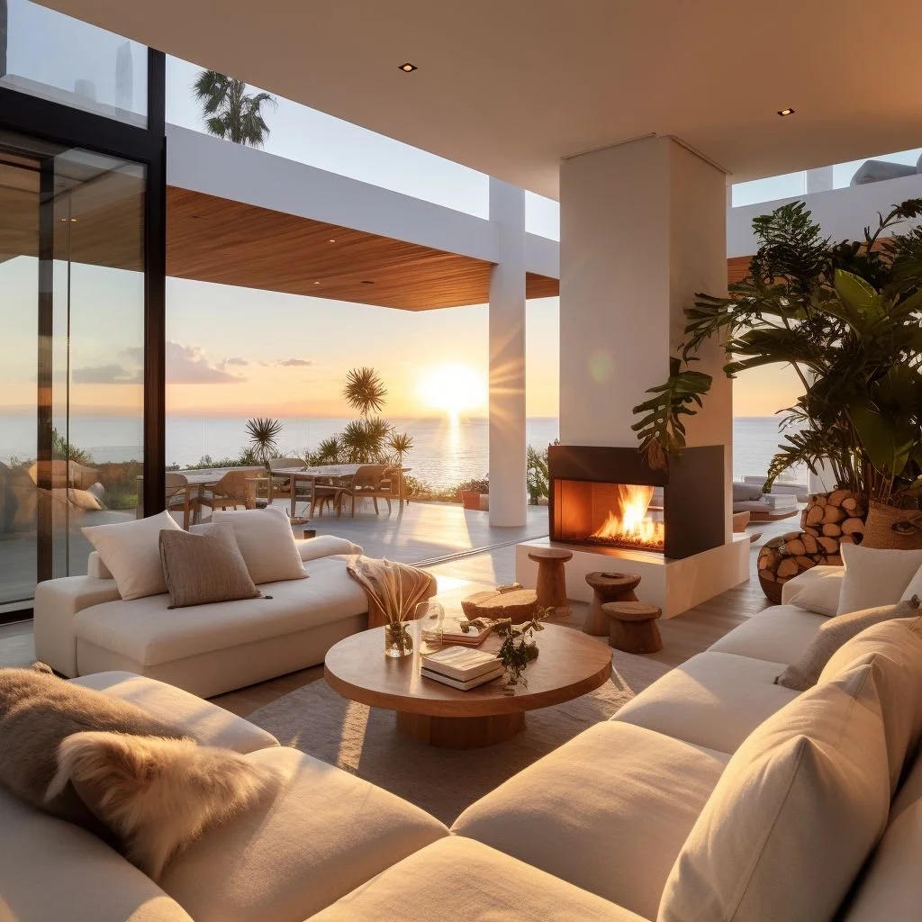
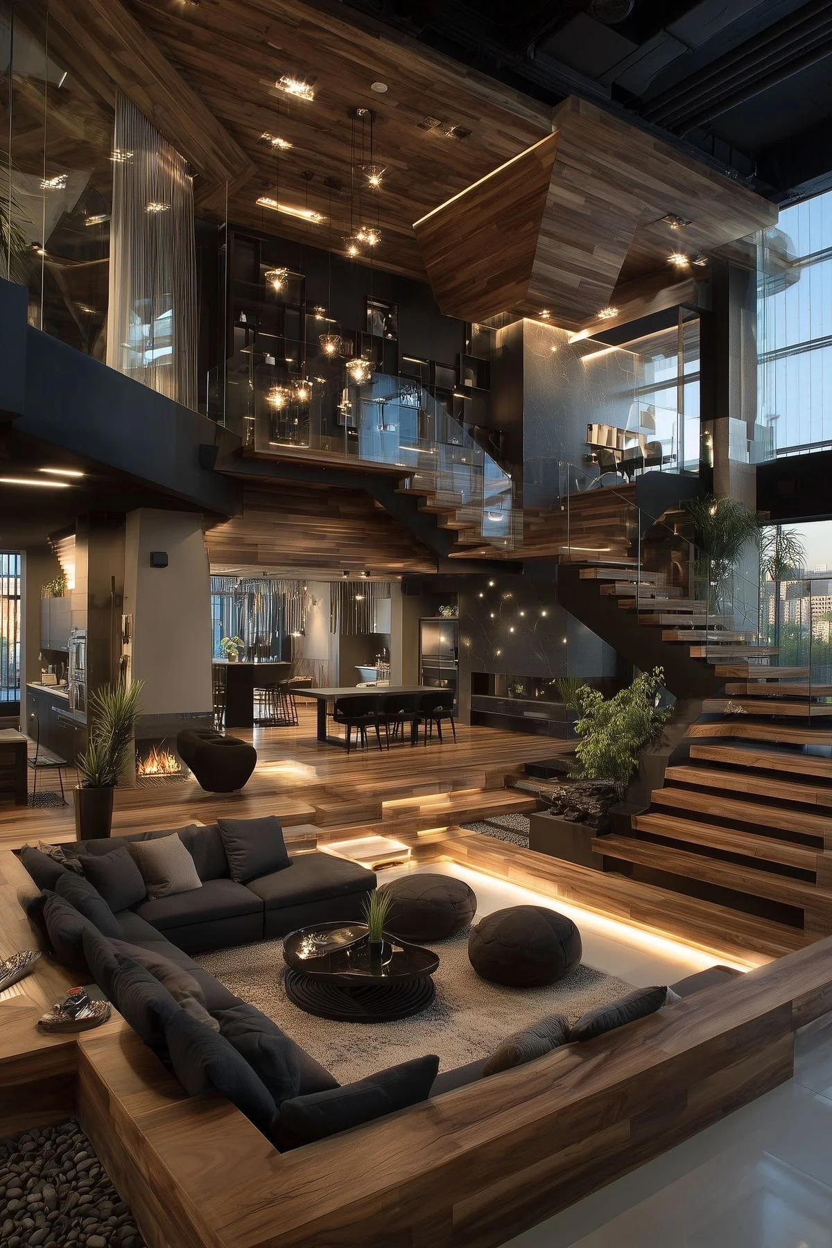
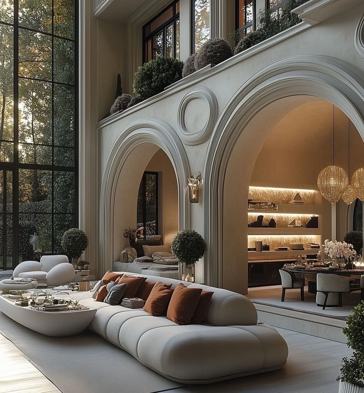
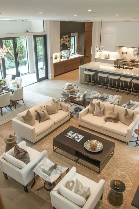
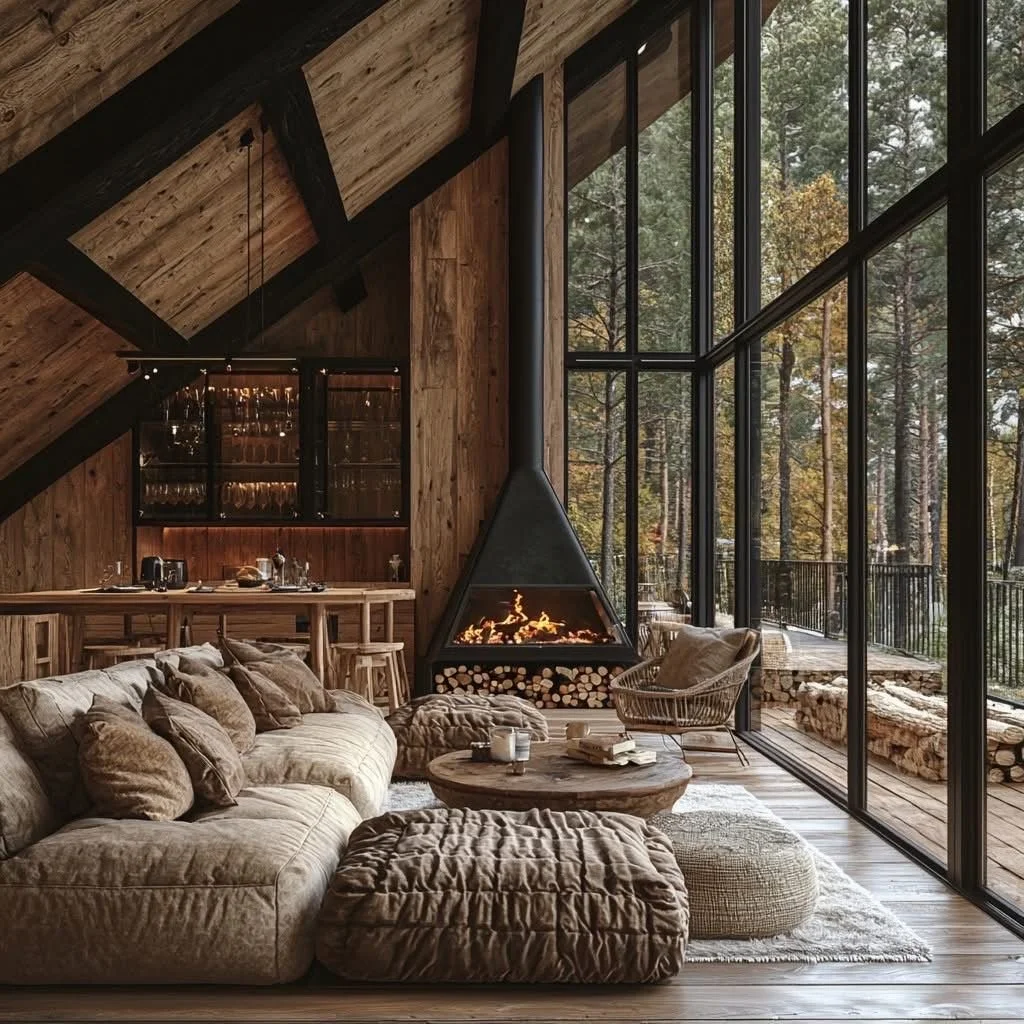
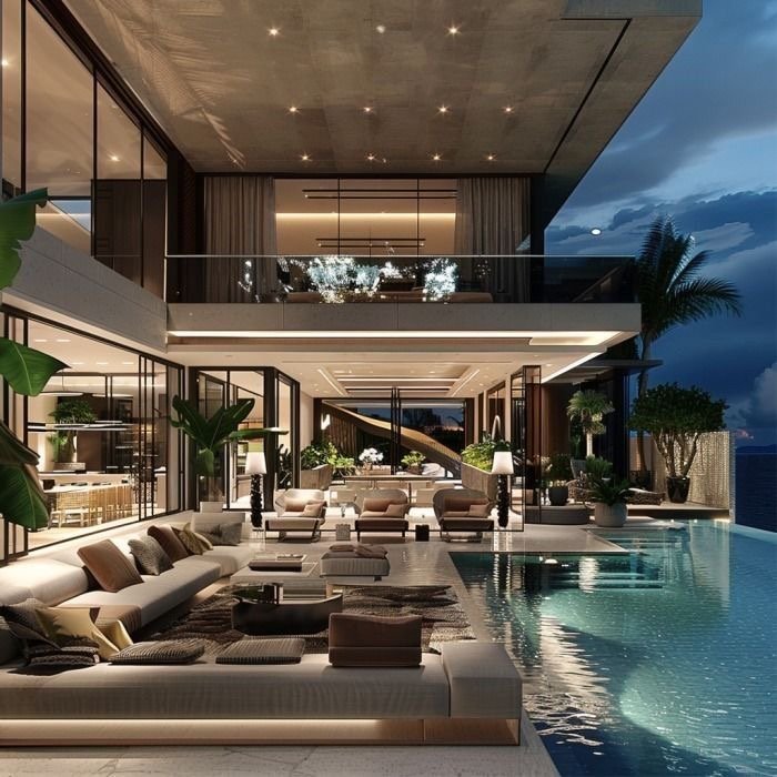
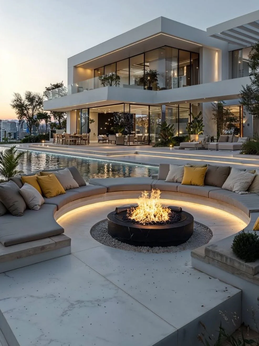
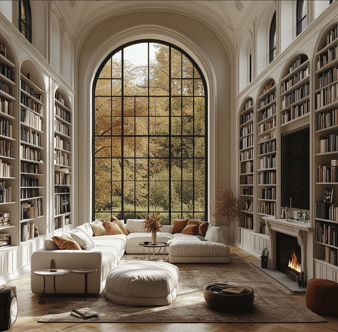
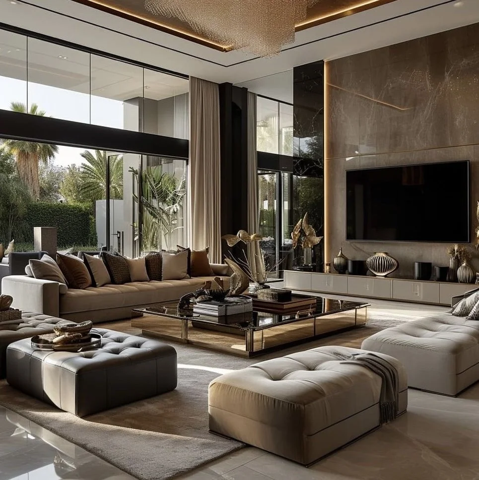
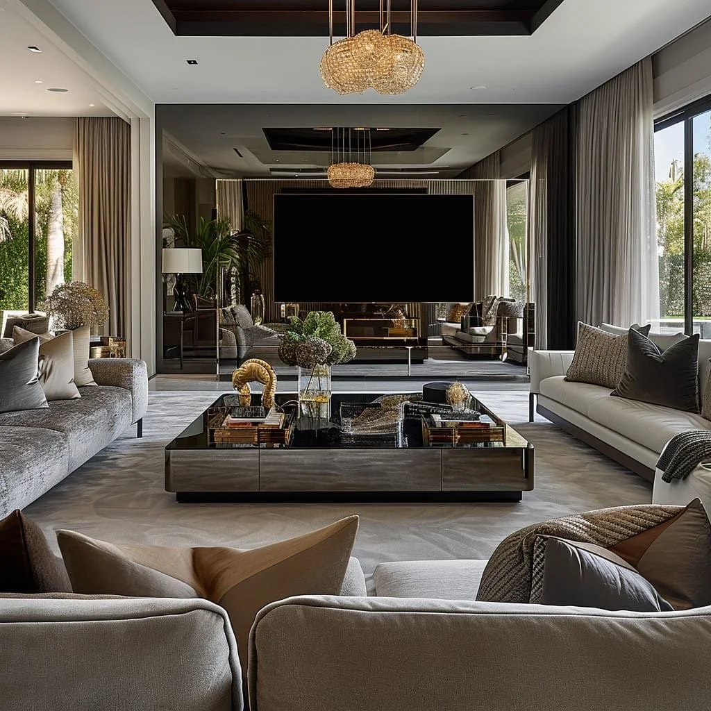
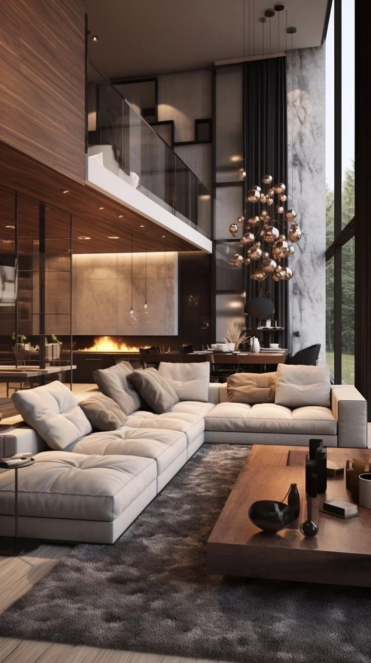
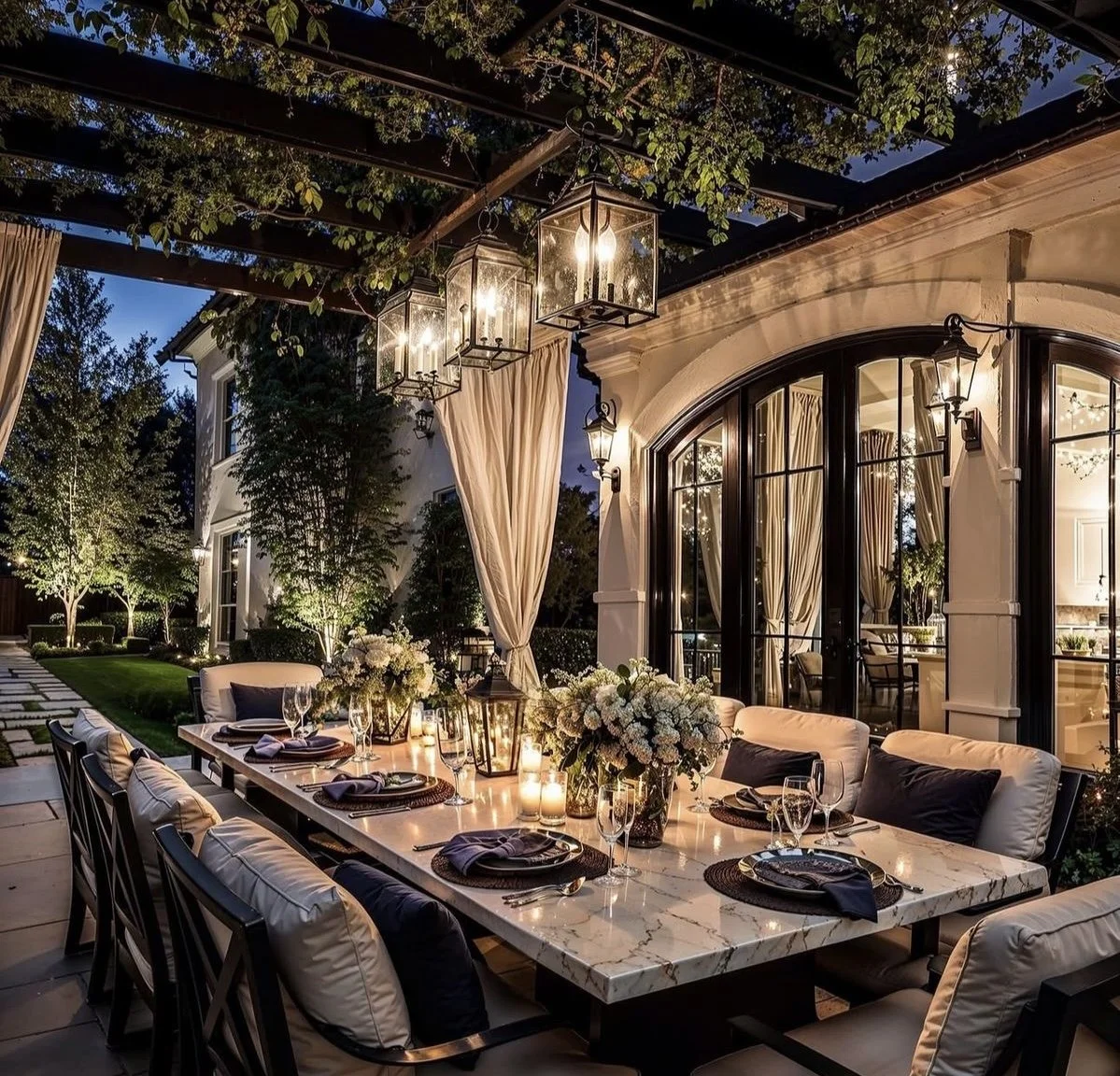
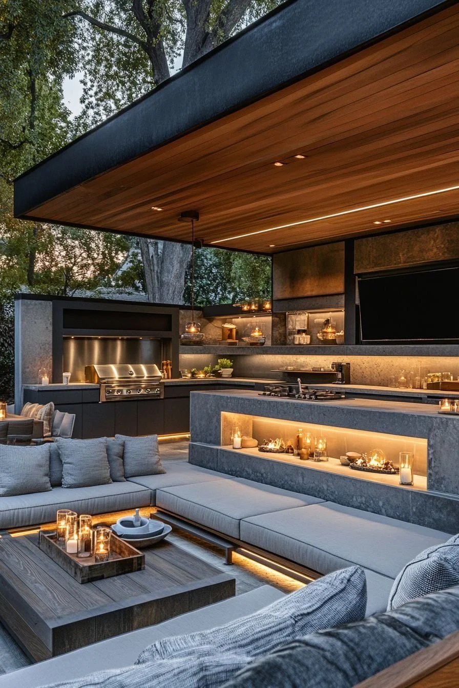
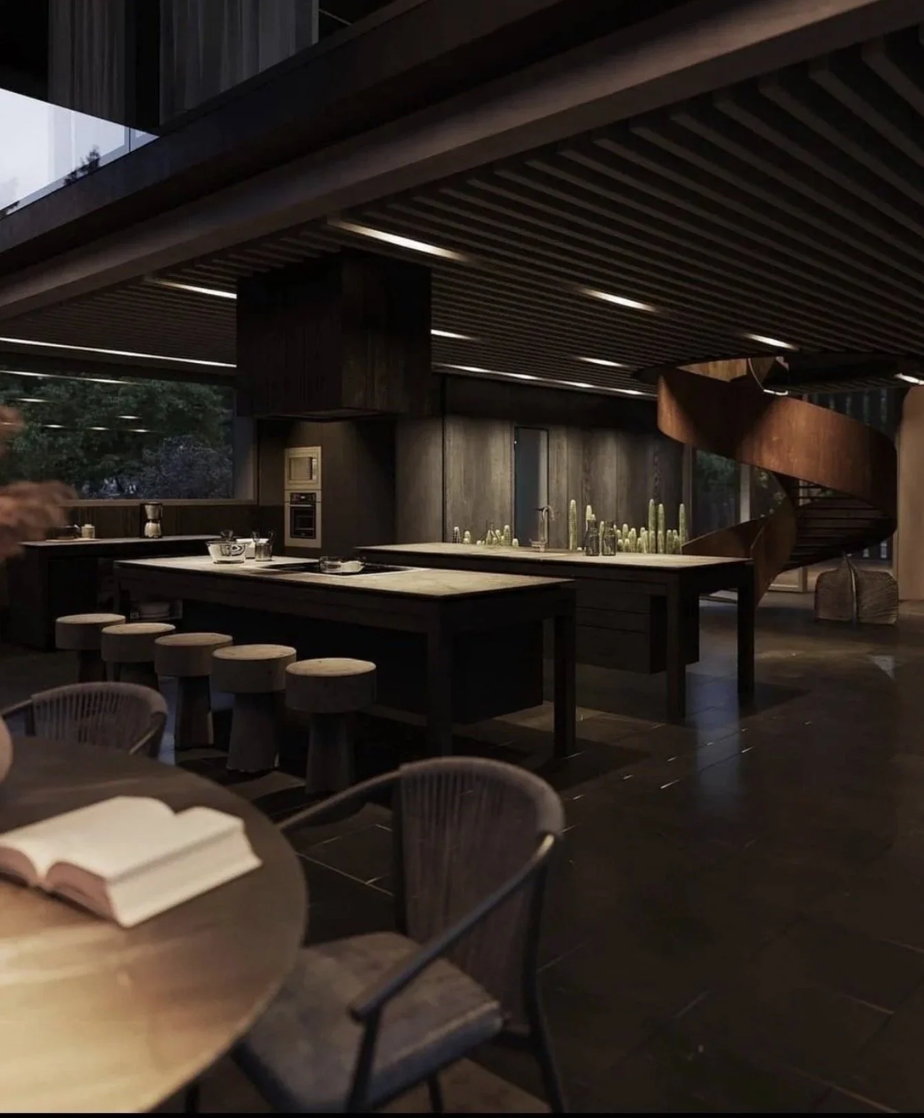
2. Design Outdoor Rooms, Not Open Slabs.
High-end home design treats exterior space like a series of intentional "rooms."
Think in zones:
Covered lounge with fireplace
Al fresco dining pavilion
Poolside sun terrace
Garden courtyard for quiet retreat
Each should have:
Defined edges (walls, planters, elevation changes)
Purpose-driven lighting
Integrated seating or millwork
Clear circulation paths
If your patio currently feels exposed or undefined, that's not a furniture problem — it's a spatial planning issue.
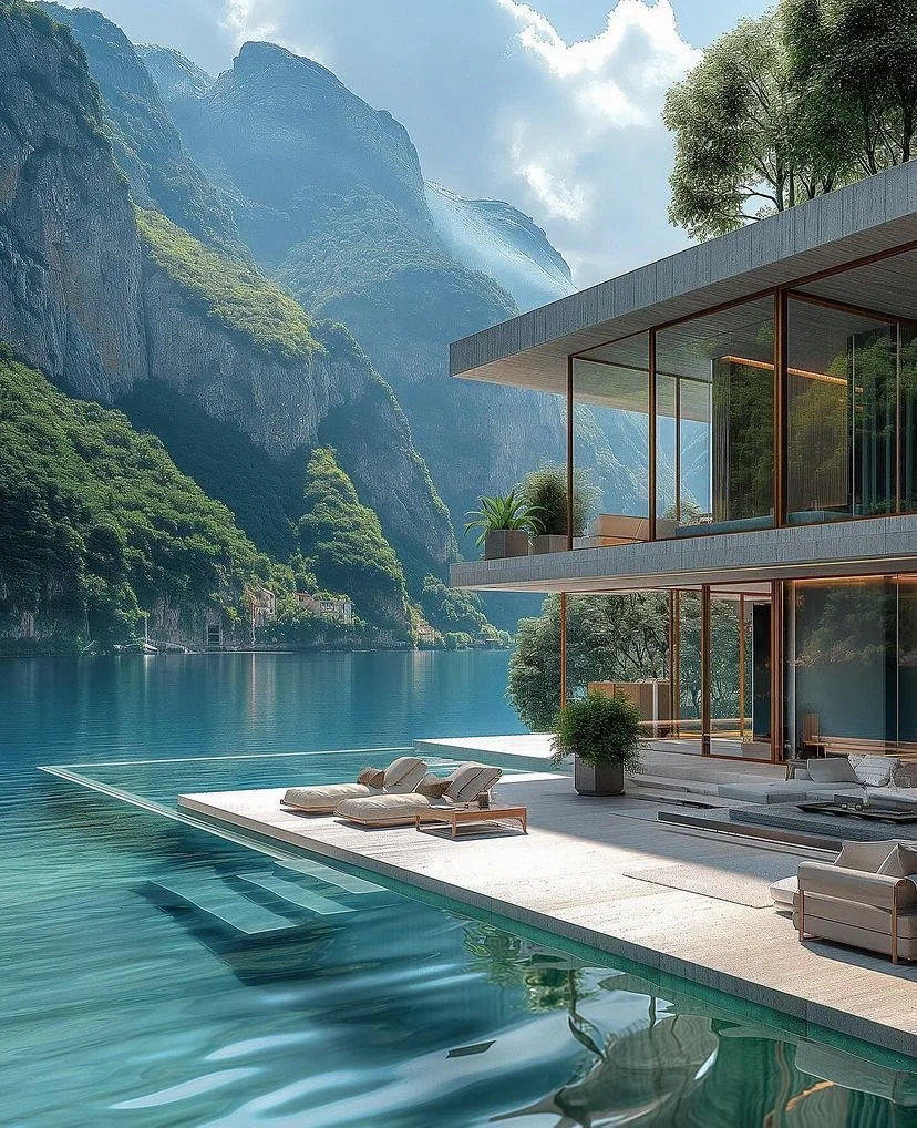
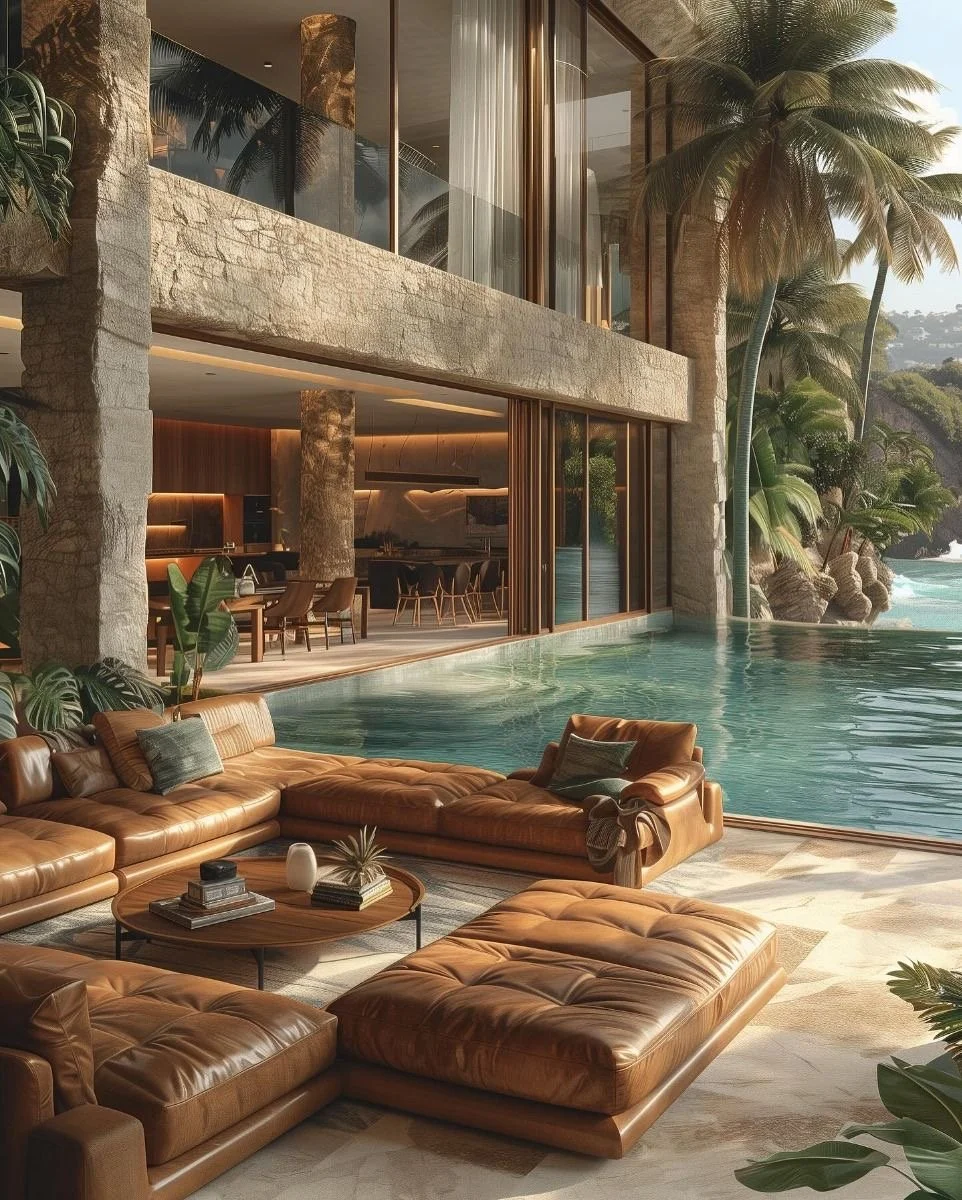
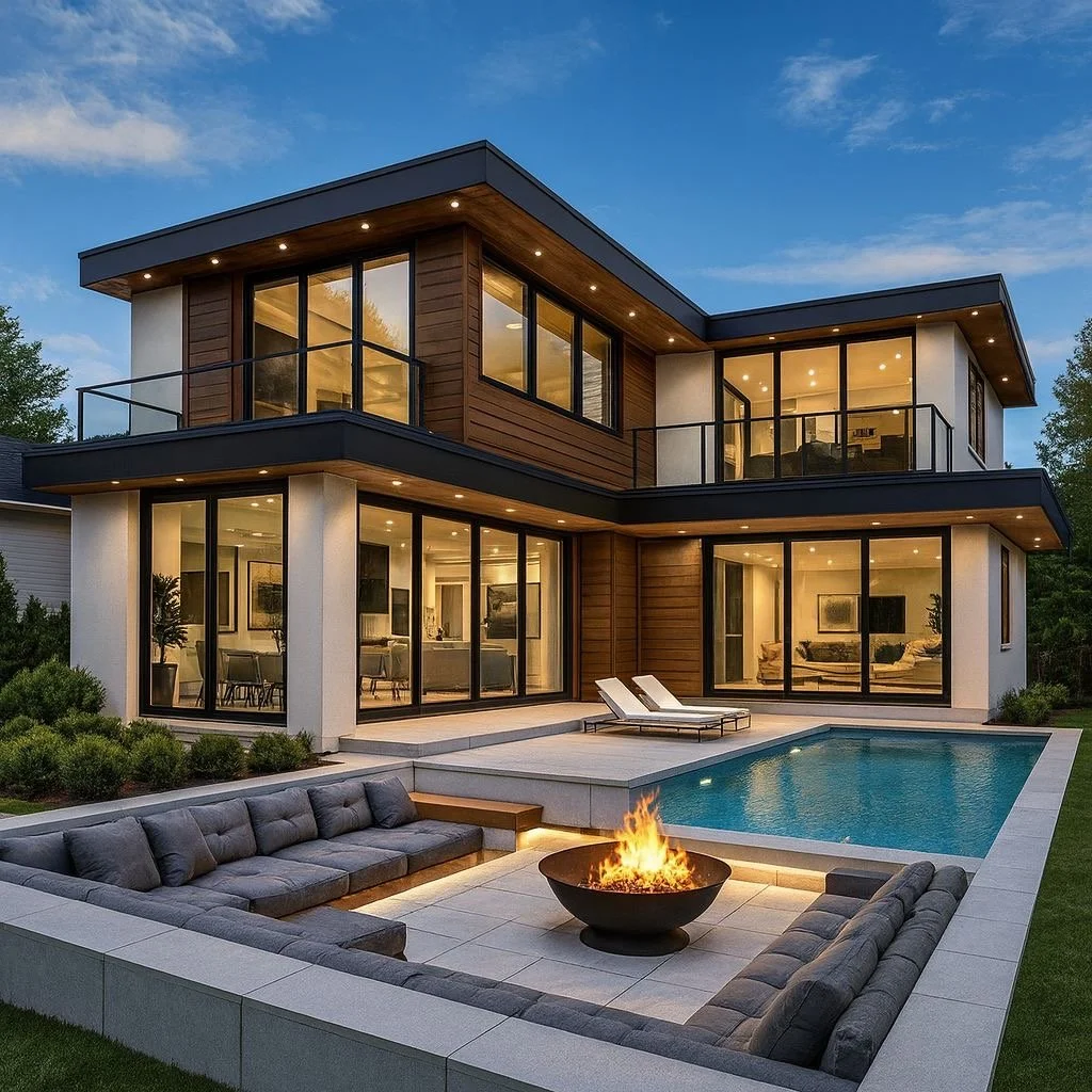
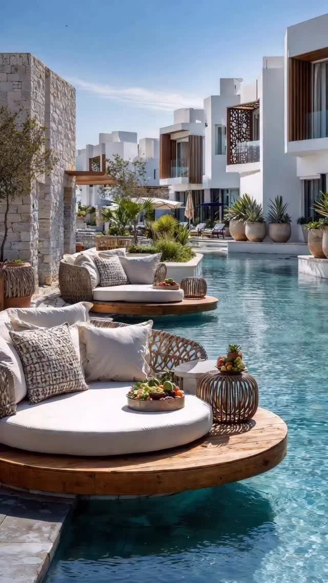
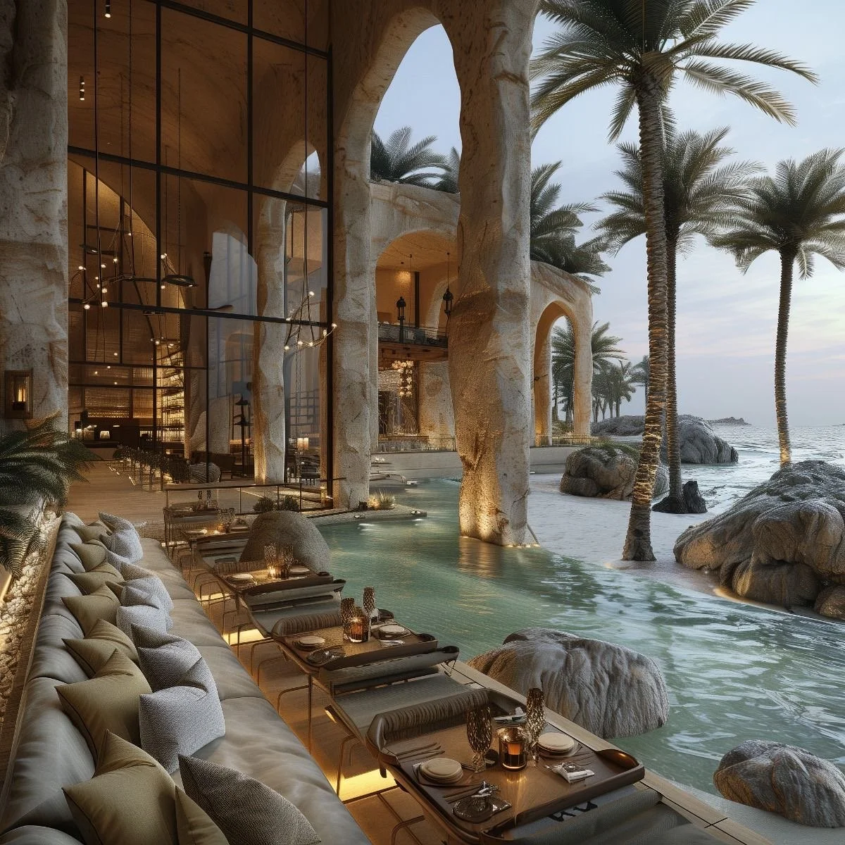
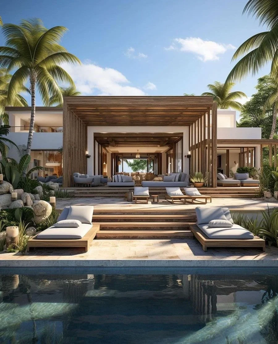
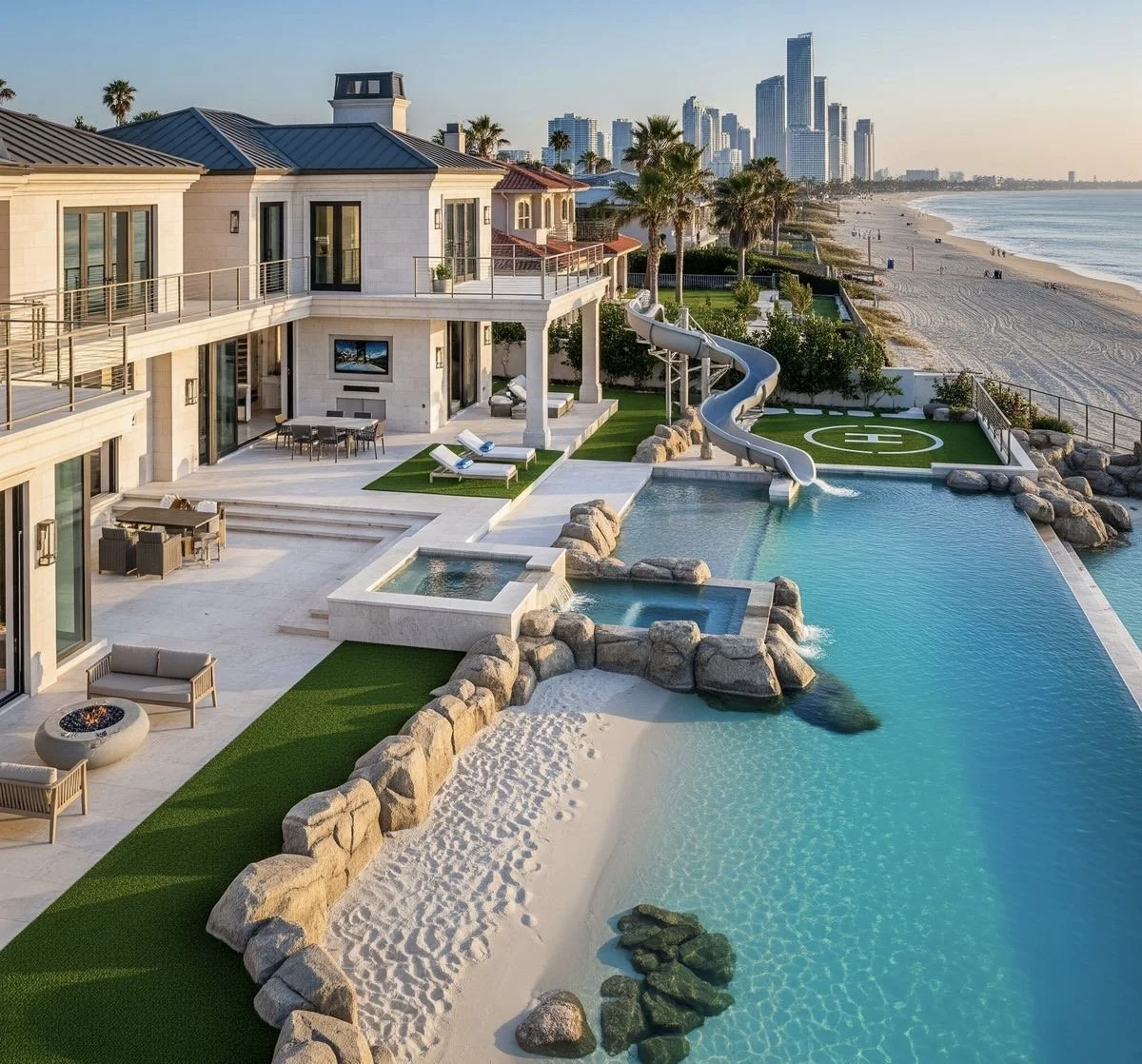
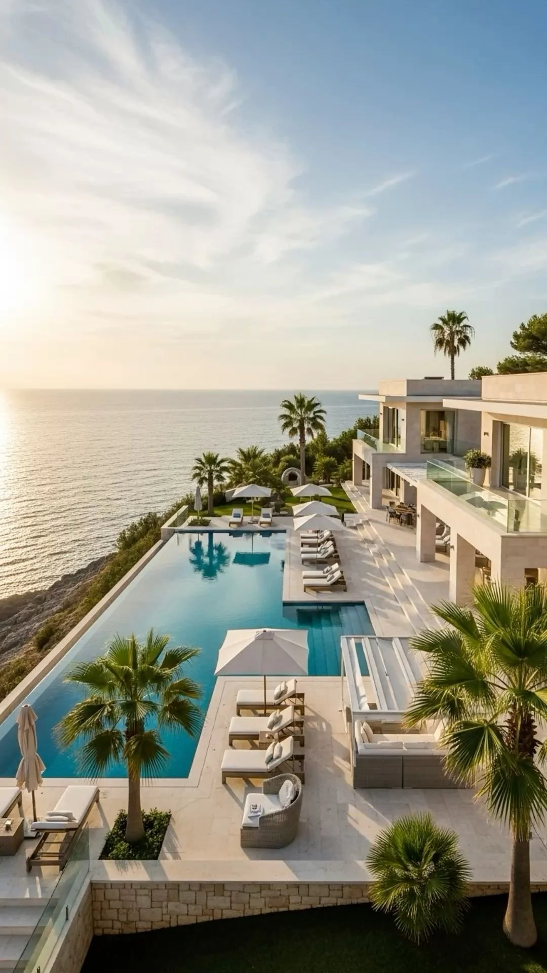
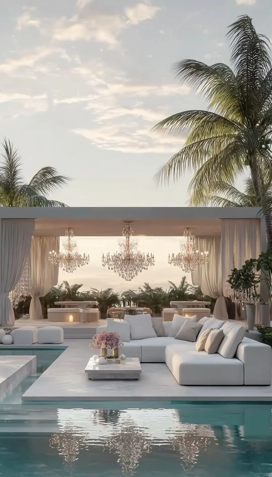
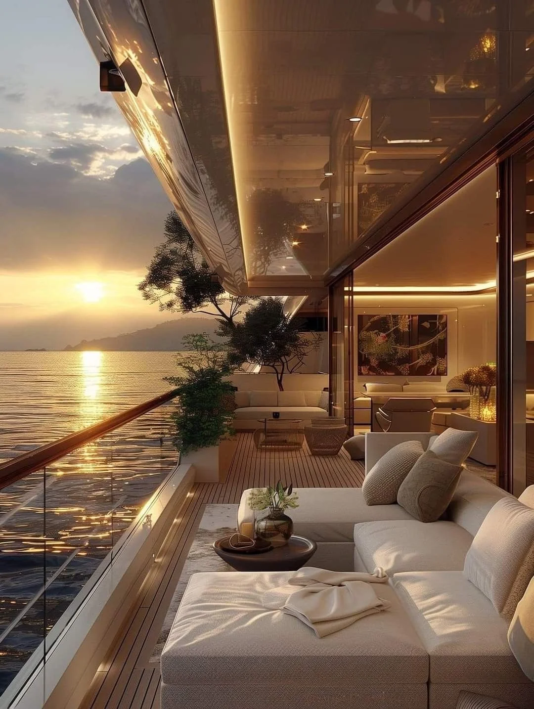
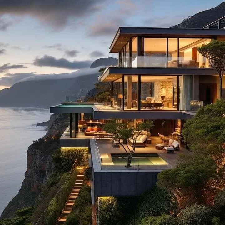
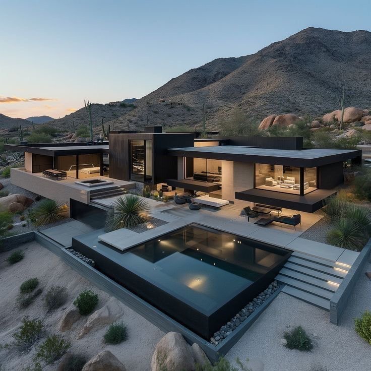
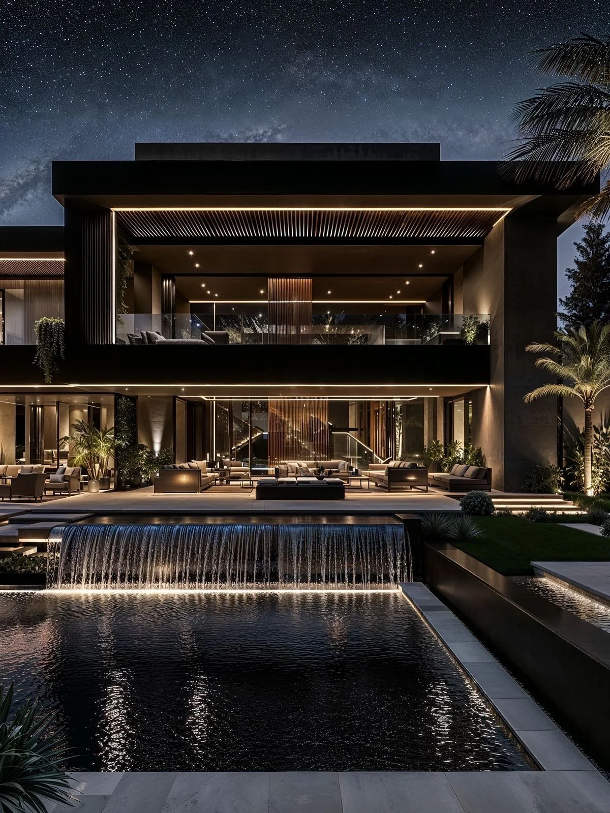
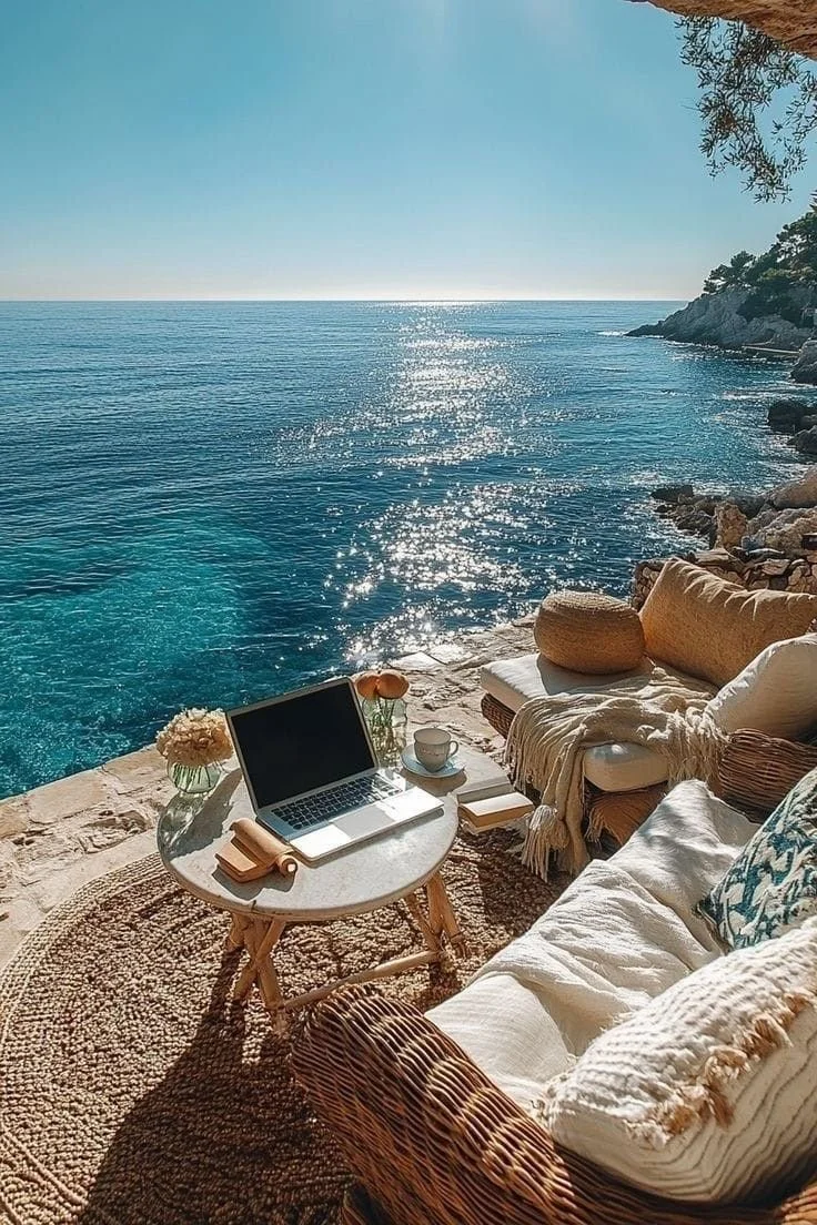
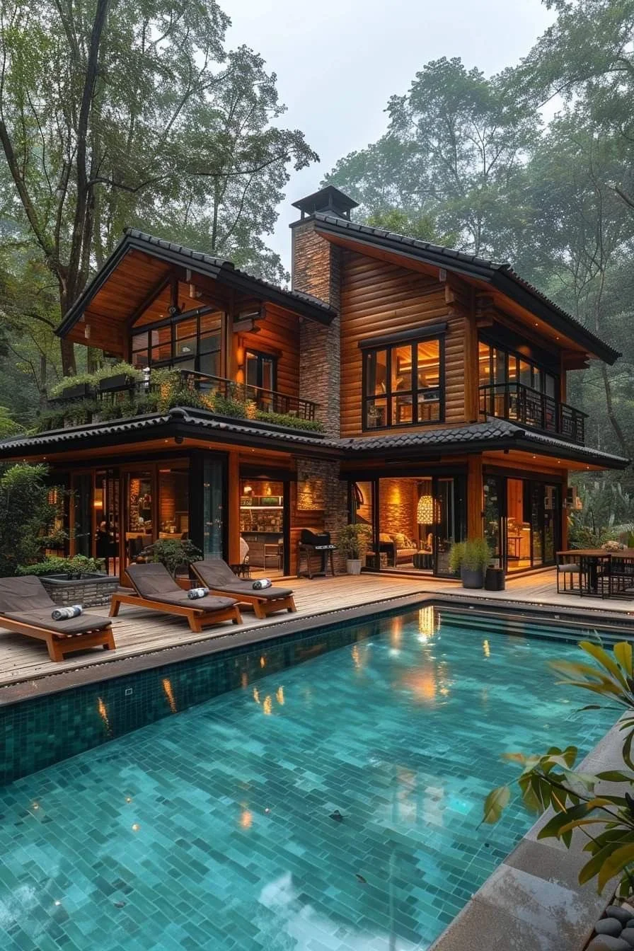
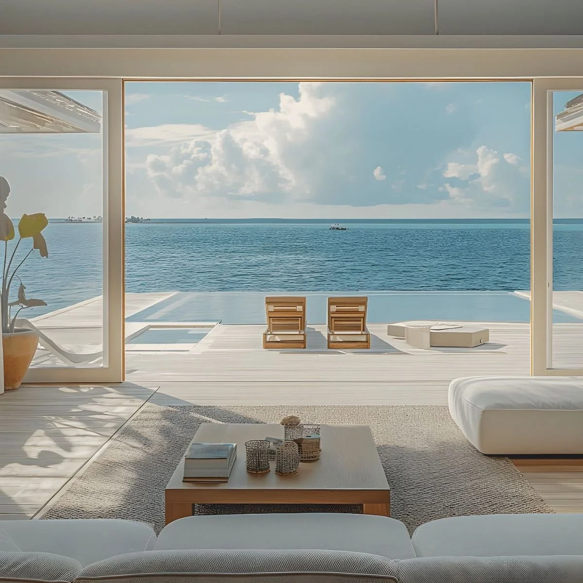
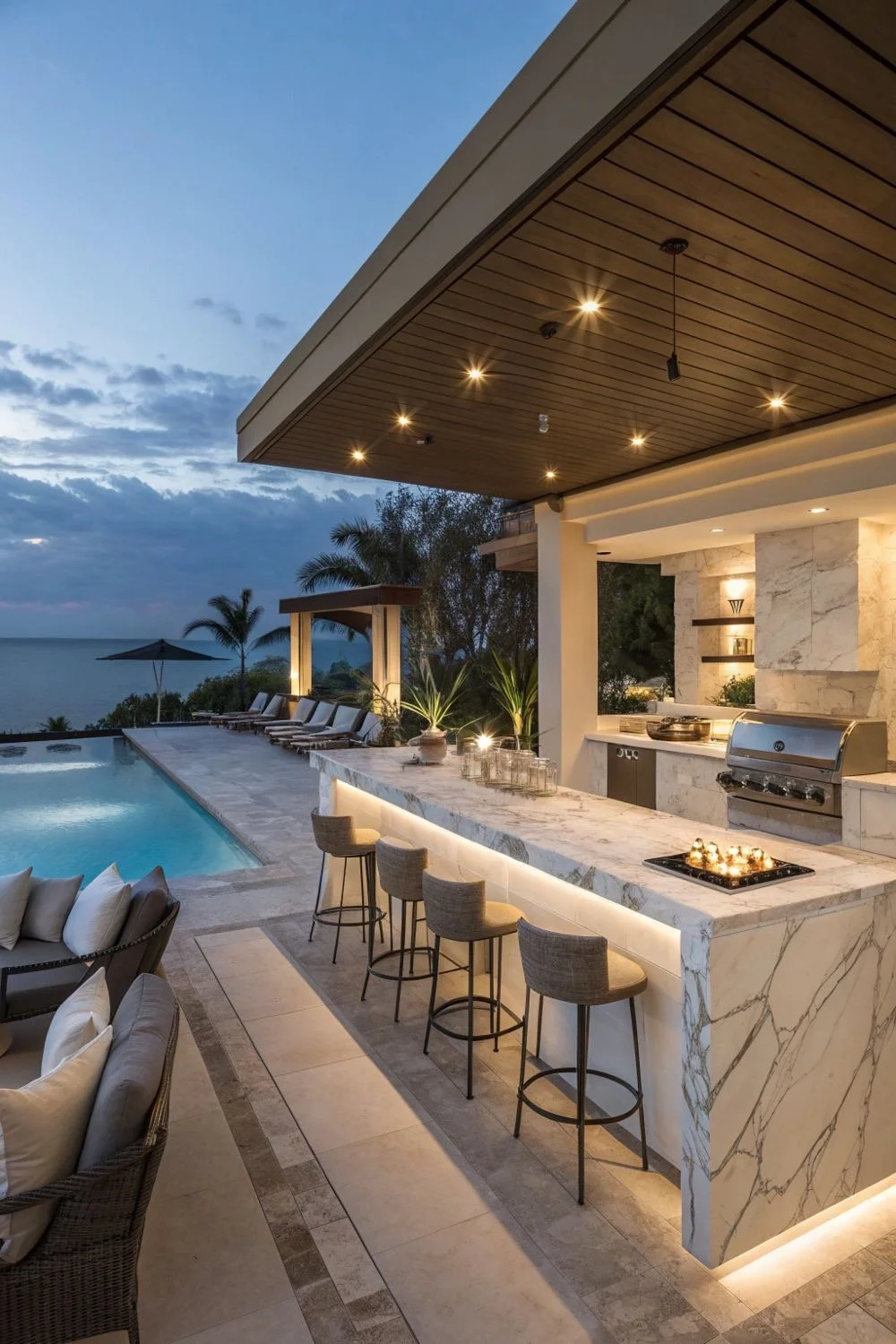
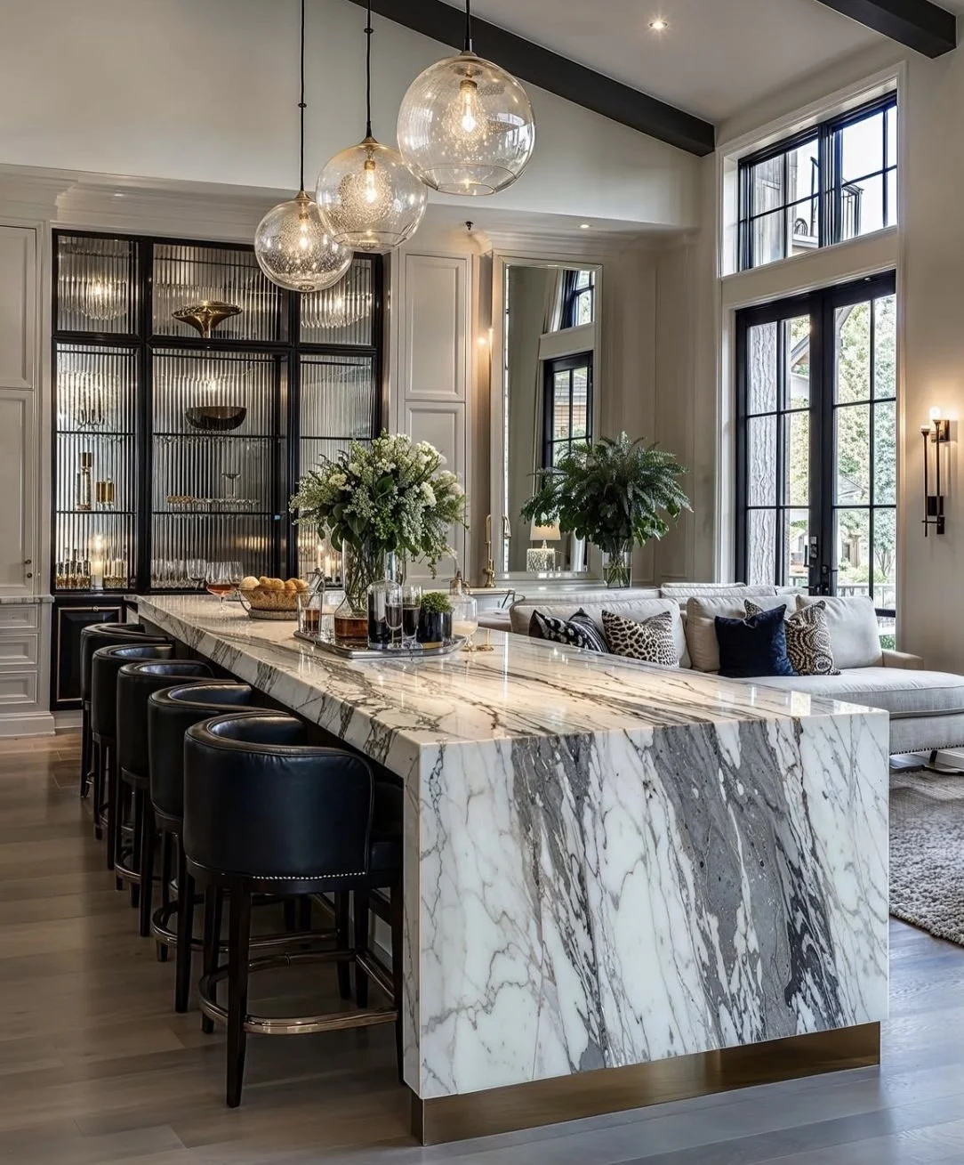
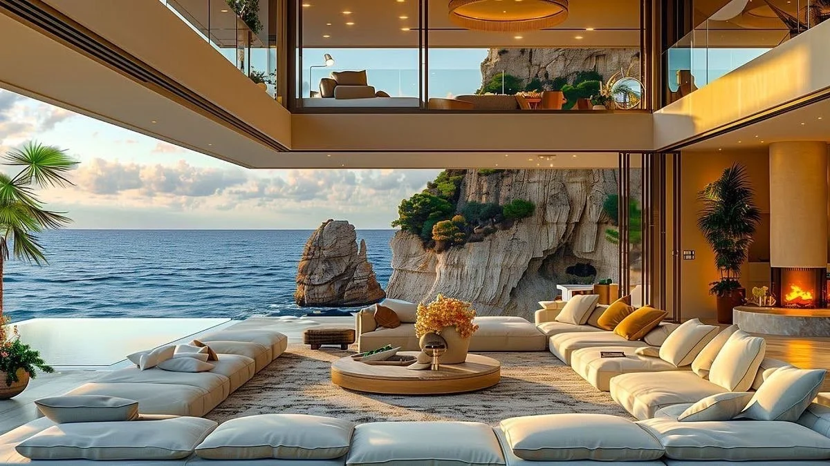
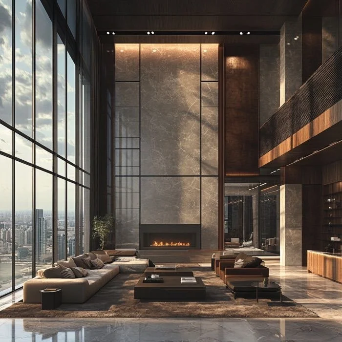
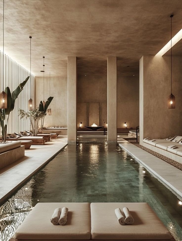
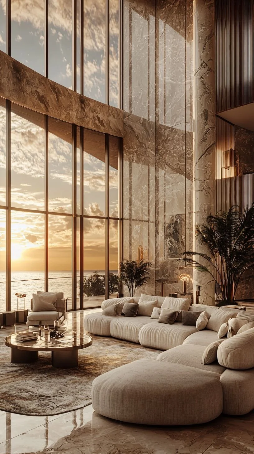
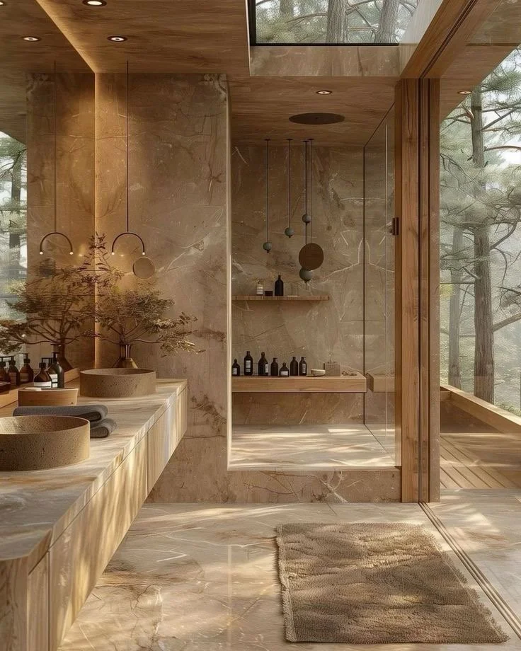
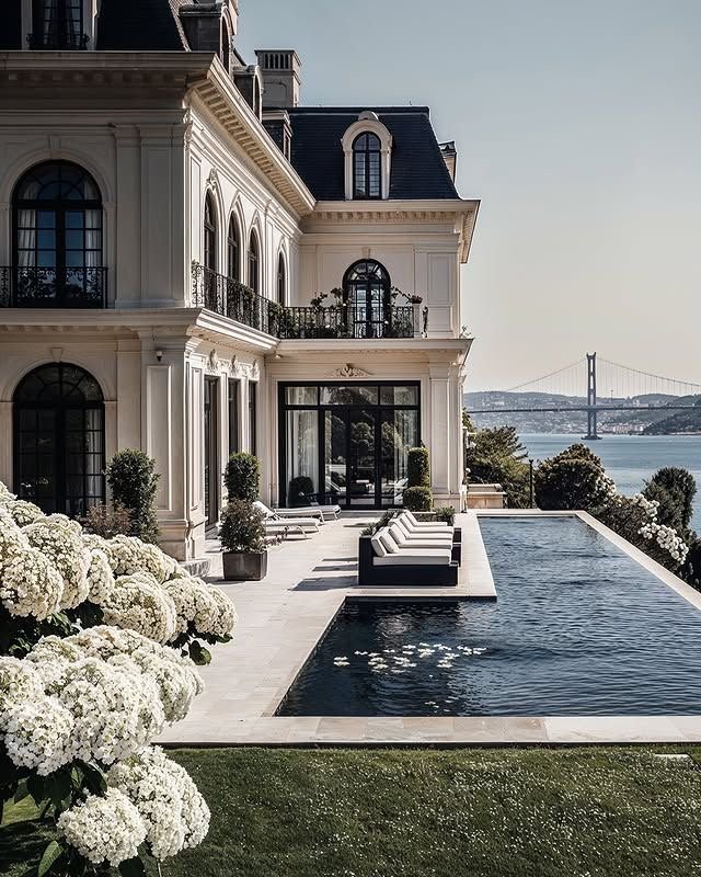
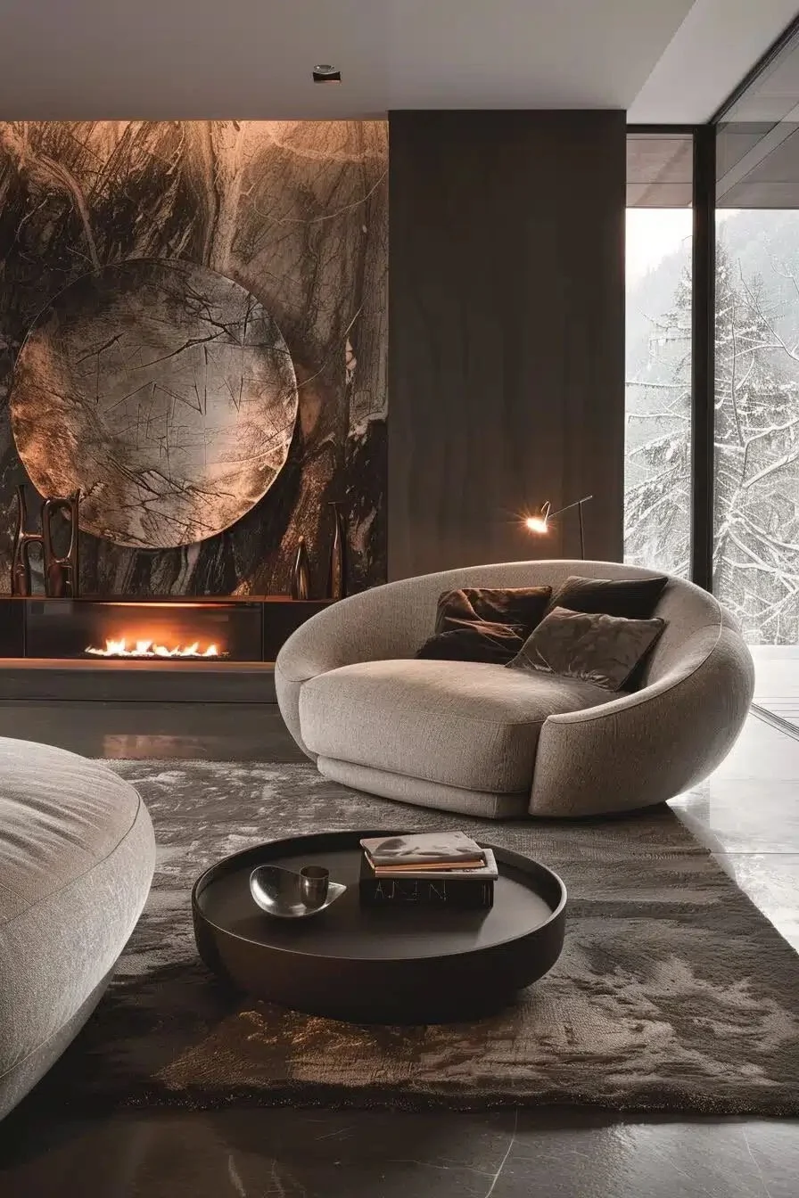
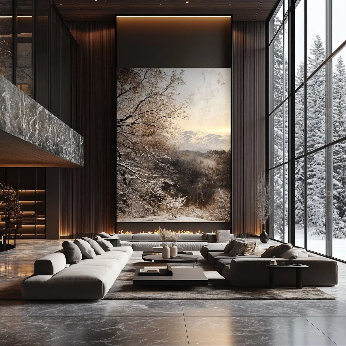
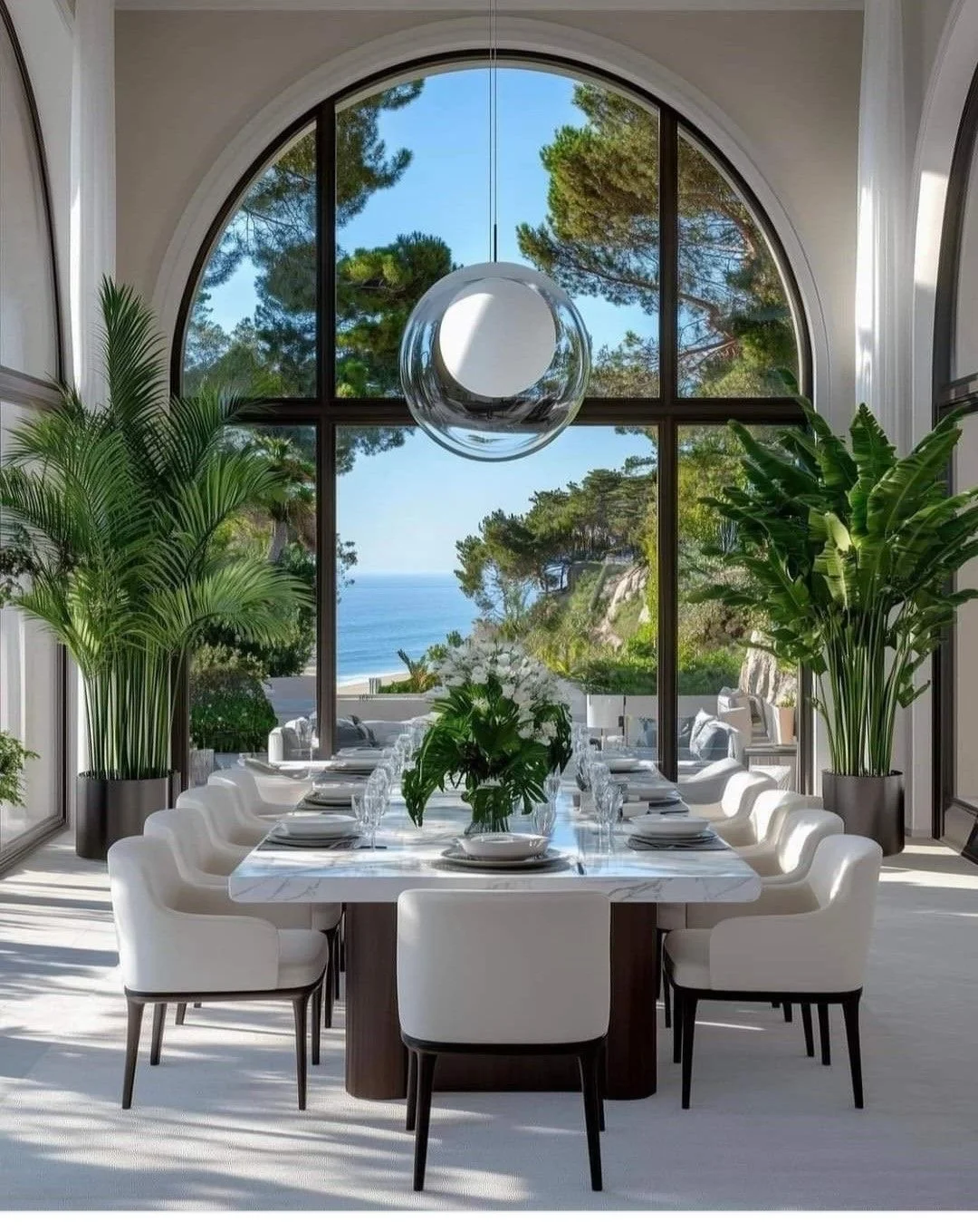
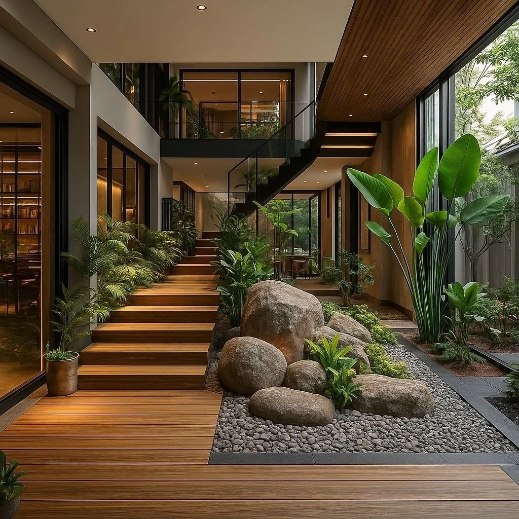
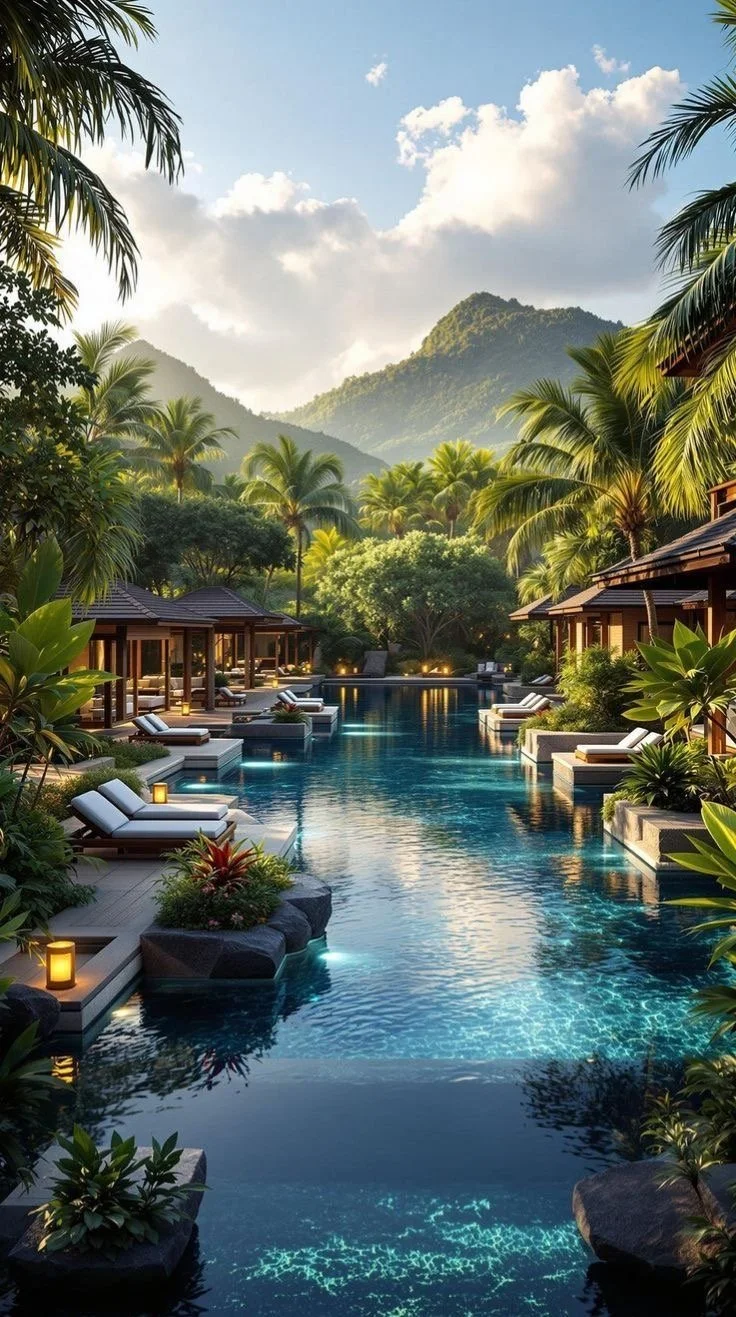
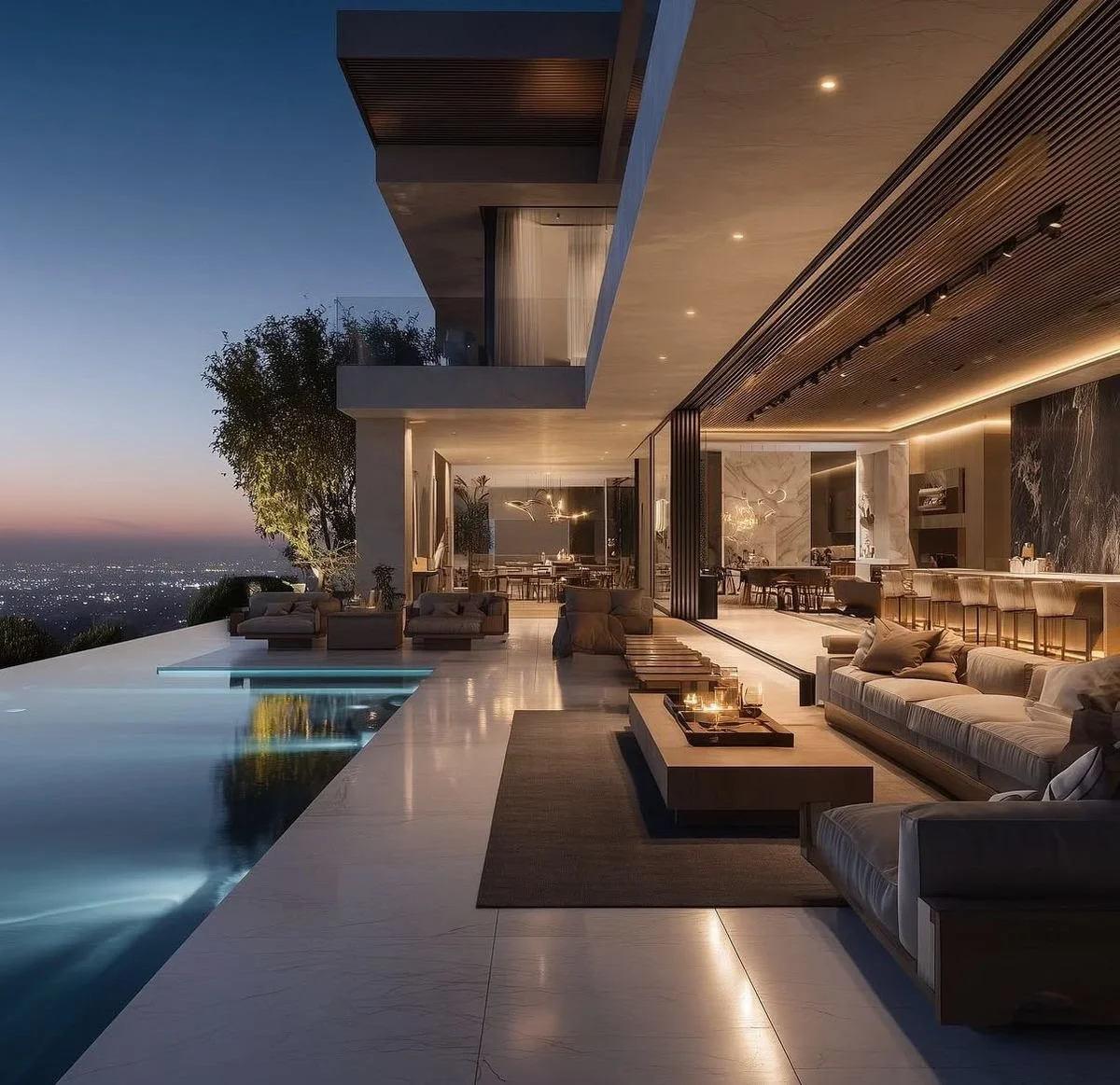
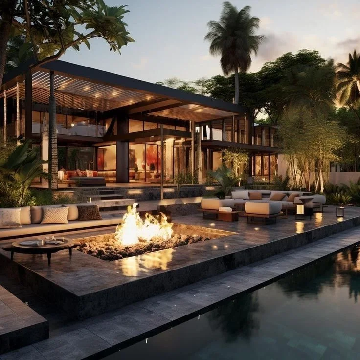
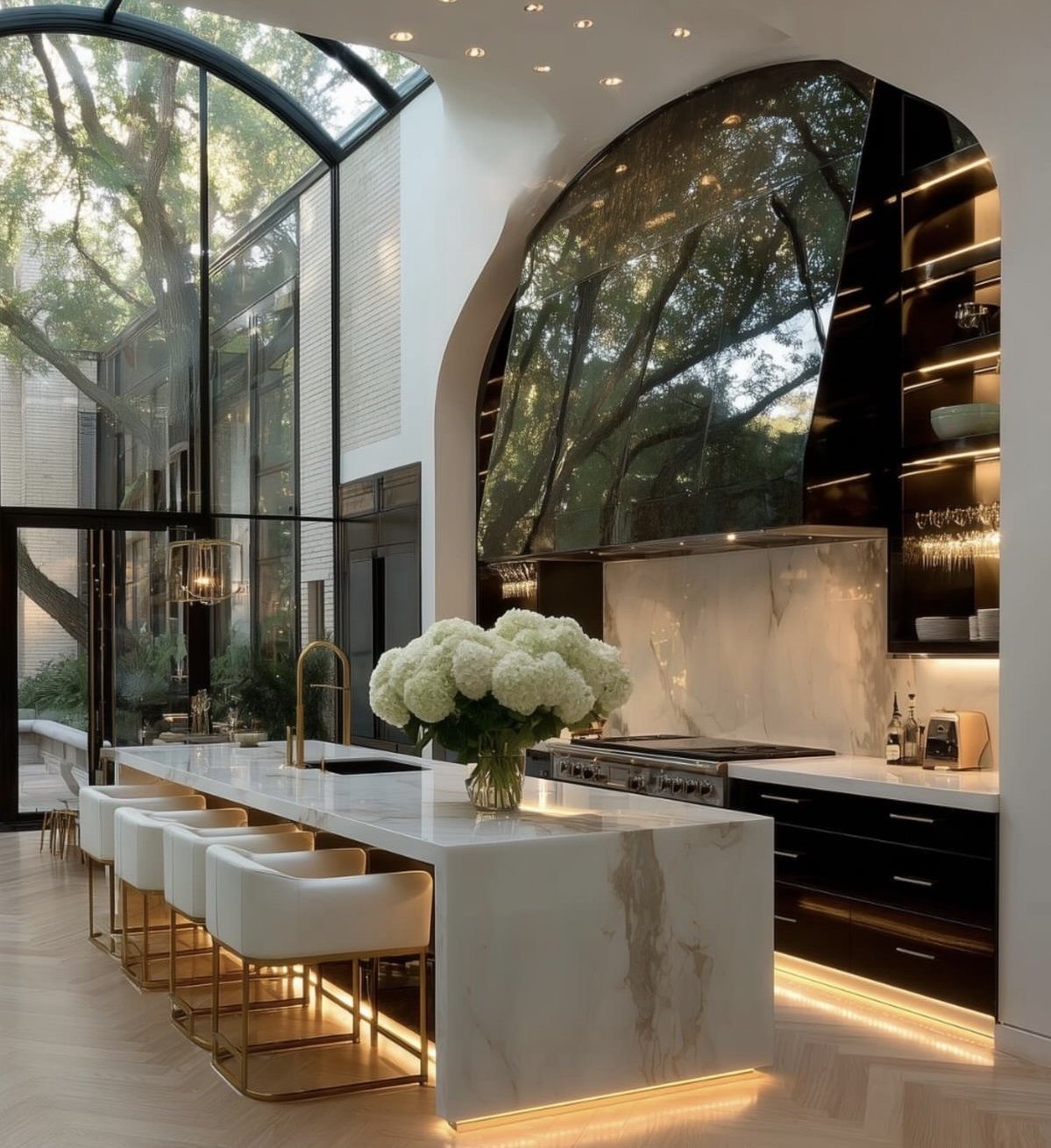
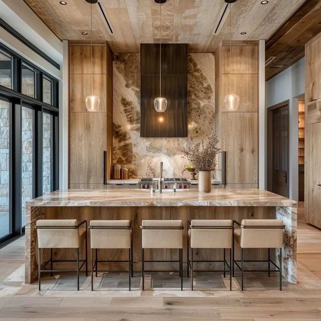
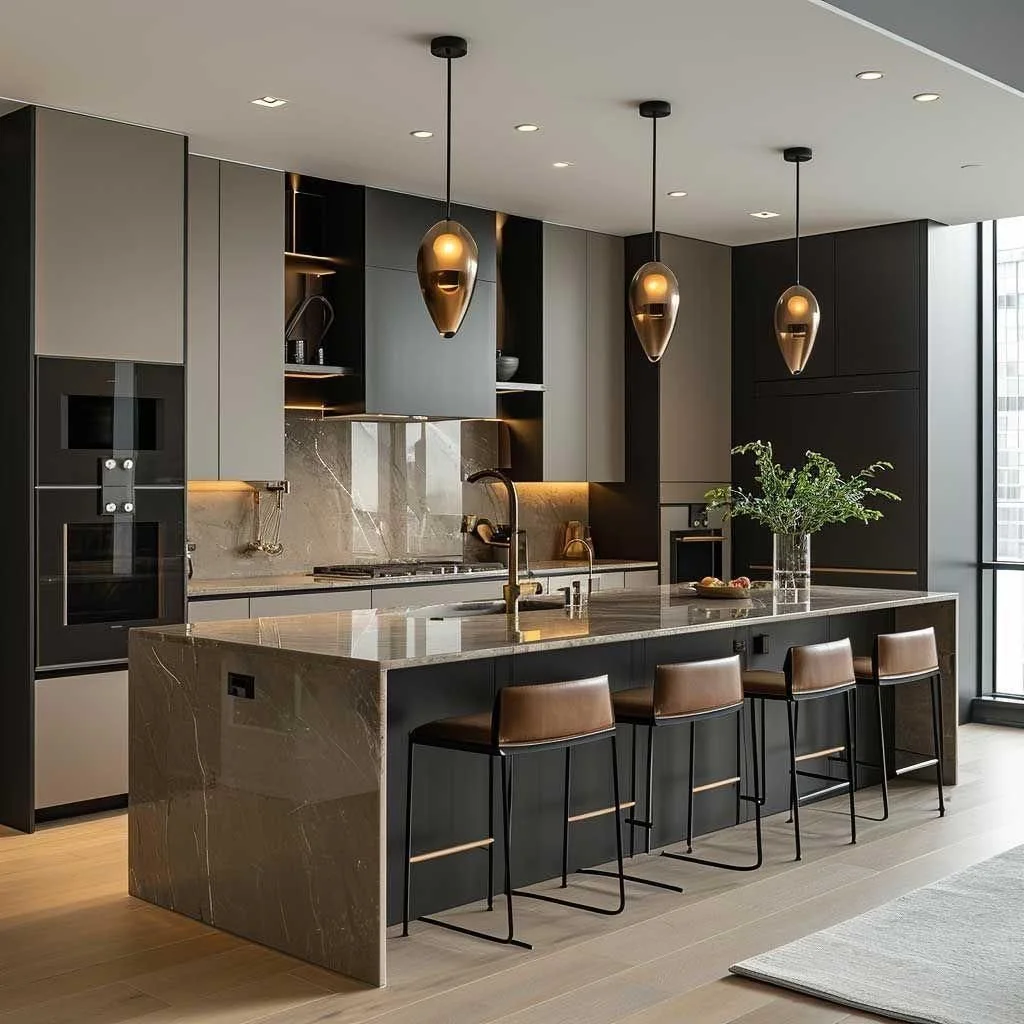
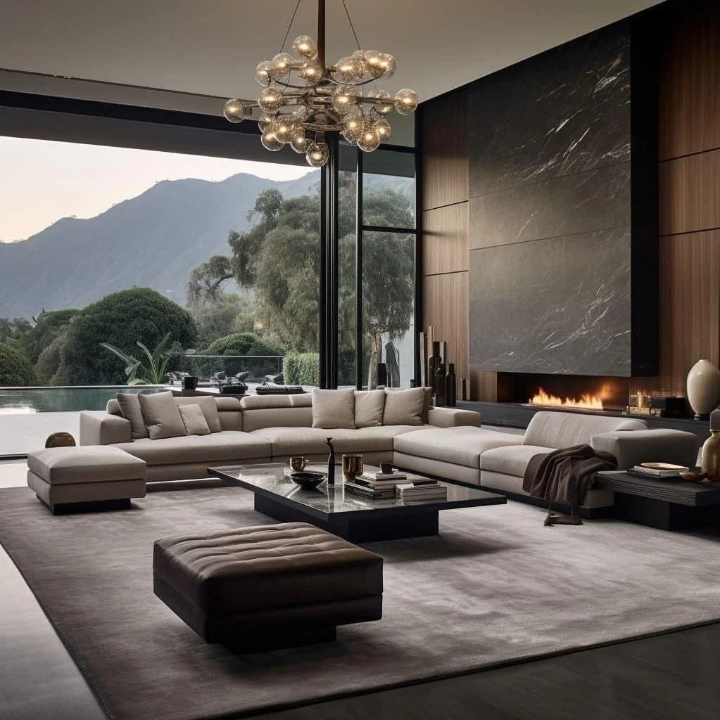
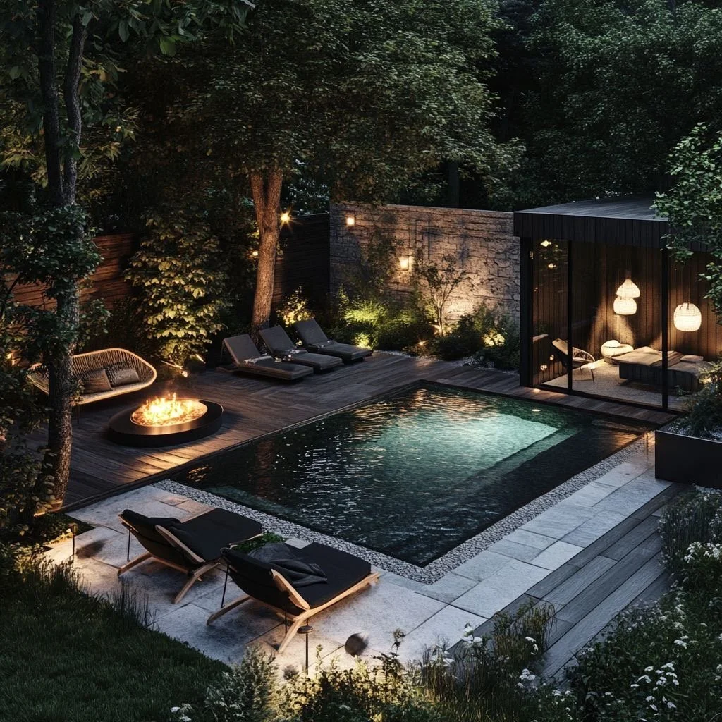
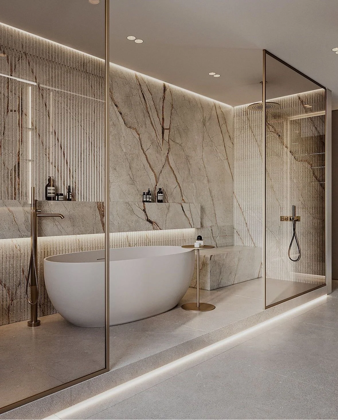
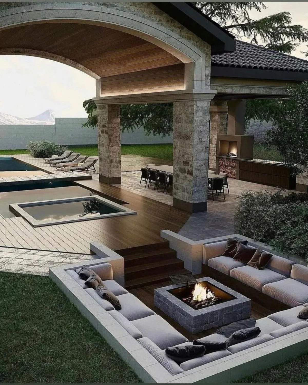
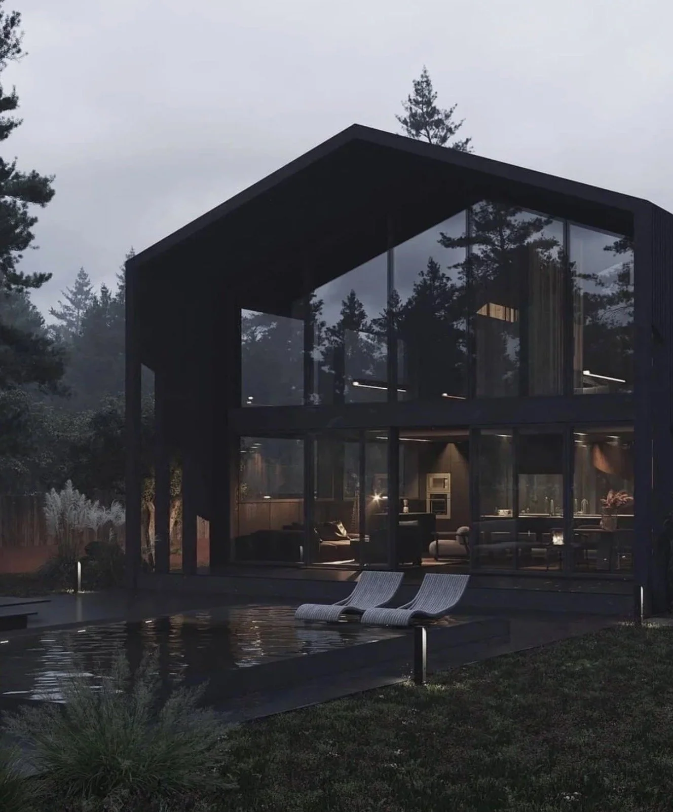
3. Elevate the Pool From Feature to Focal Experience
A luxury pool is not a rectangle of water.
It's an experiential composition.
Consider:
Geometry
Does the pool reinforce your architecture's lines? A modern home demands precision. A Mediterranean-inspired estate may invite curvature.
Water as Sound
Sheer descents. Scuppers. Reflecting edges.
The auditory layer transforms ambiance from suburban to resort-level.
Night Presence
Underwater lighting temperature matters.
Too blue feels commercial. Too white feels harsh.
Warm, calibrated illumination feels sophisticated.
Strategic advice: Spend money on structural design and lighting before adding oversized water features. Timeless restraint outperforms trend-driven spectacle.
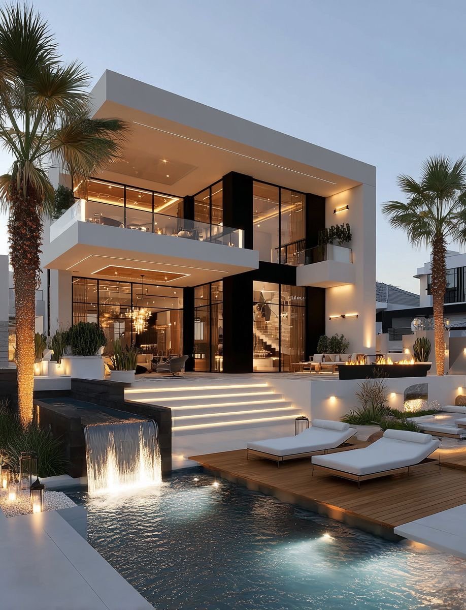
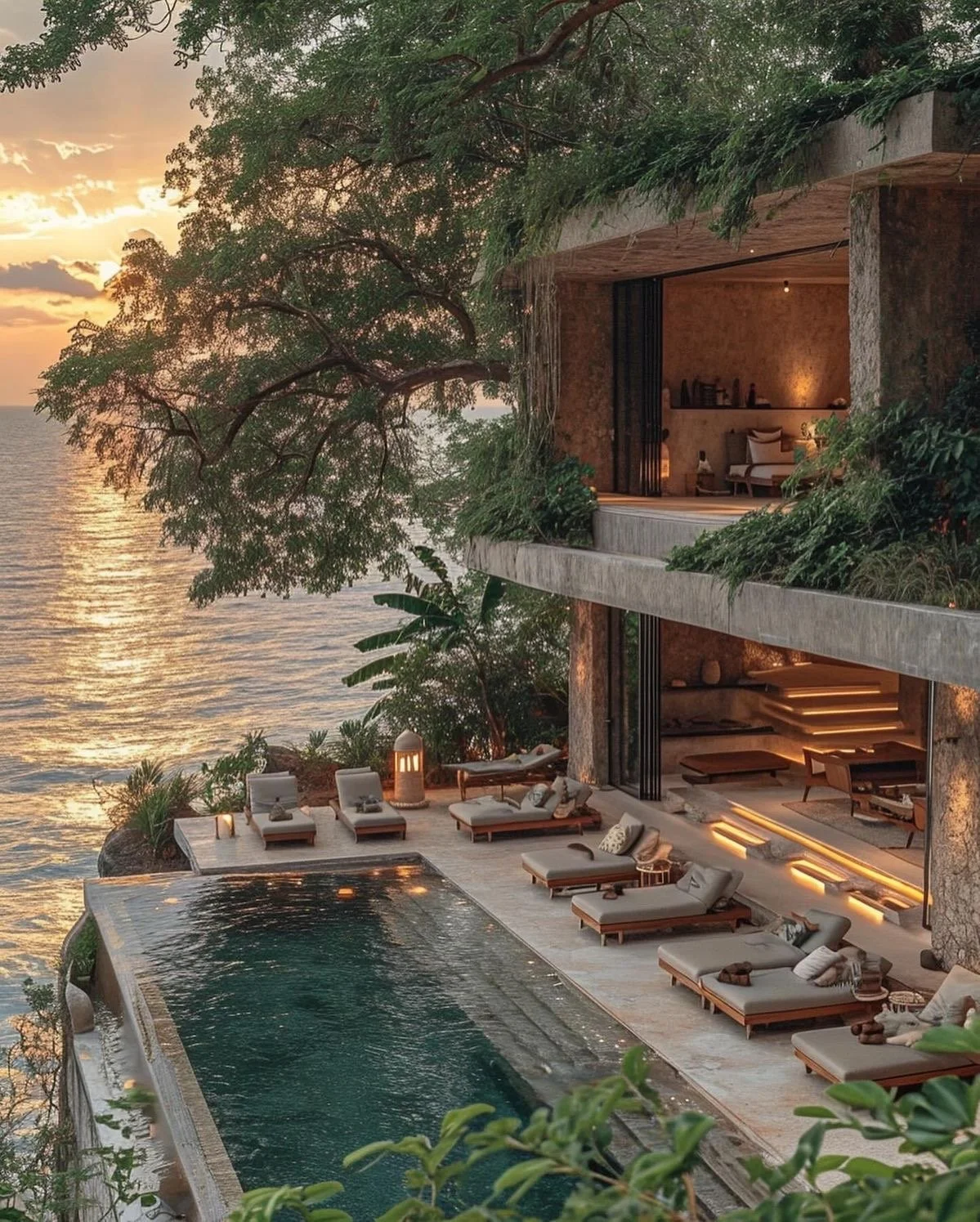
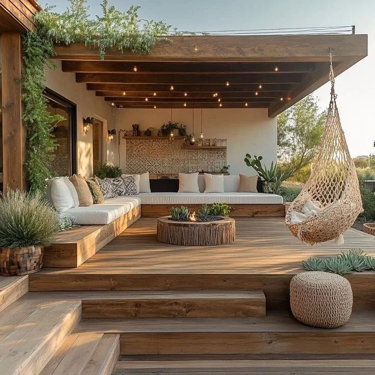
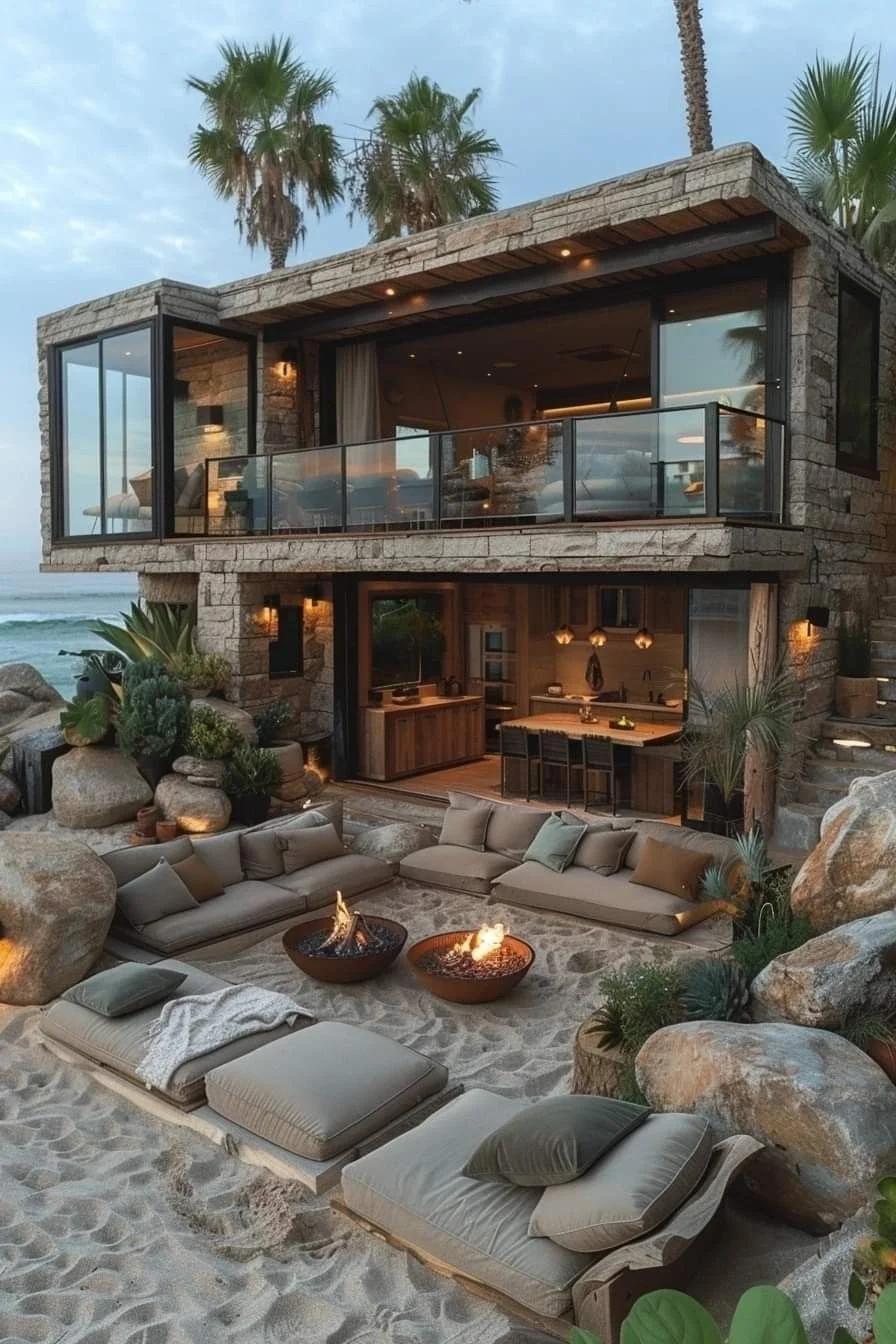
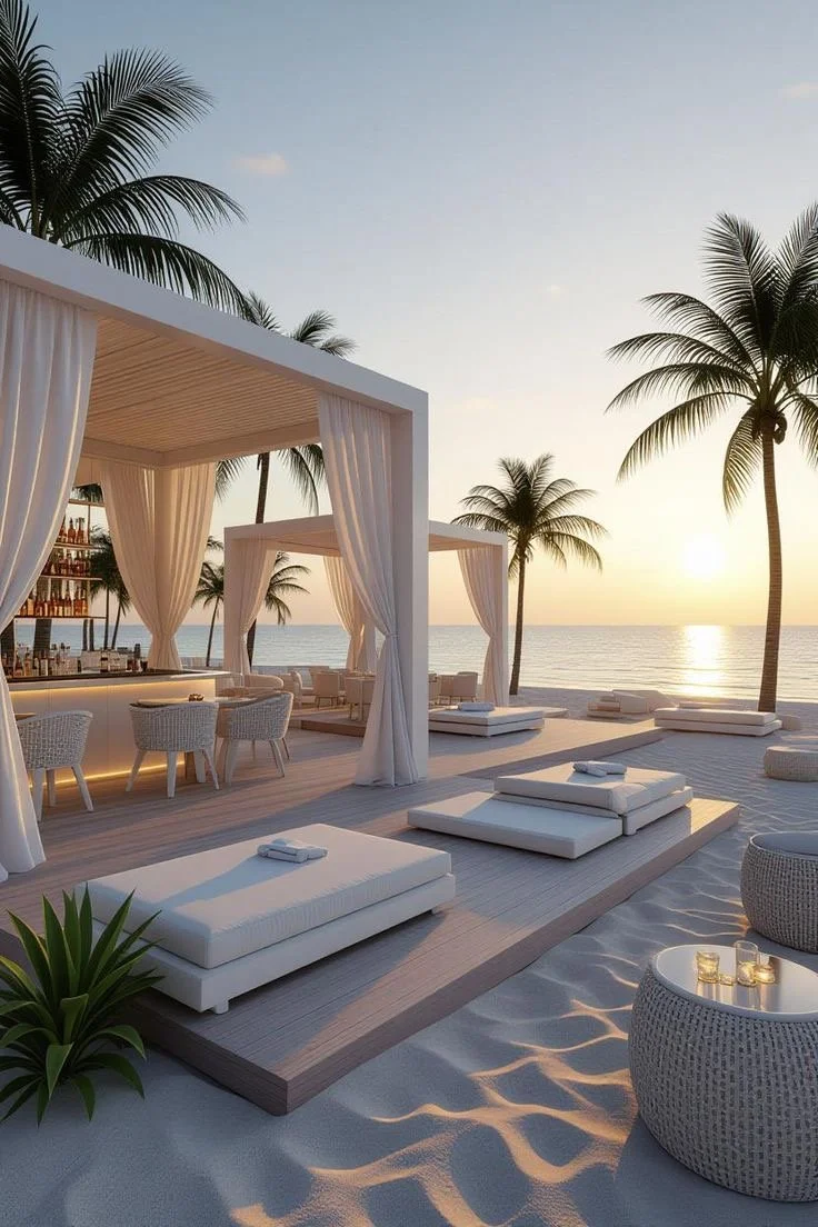
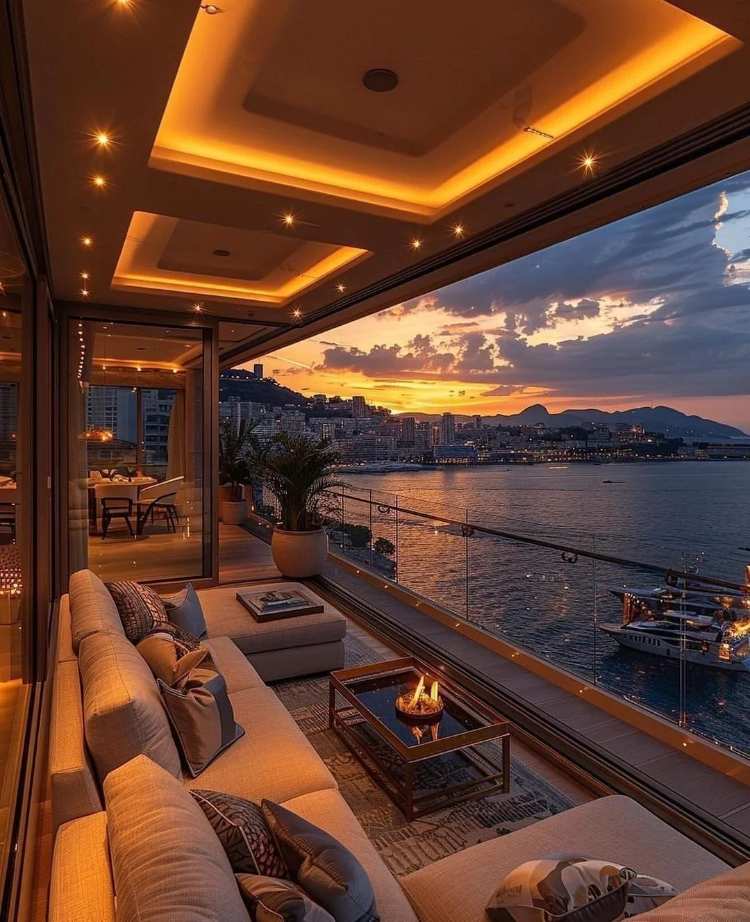
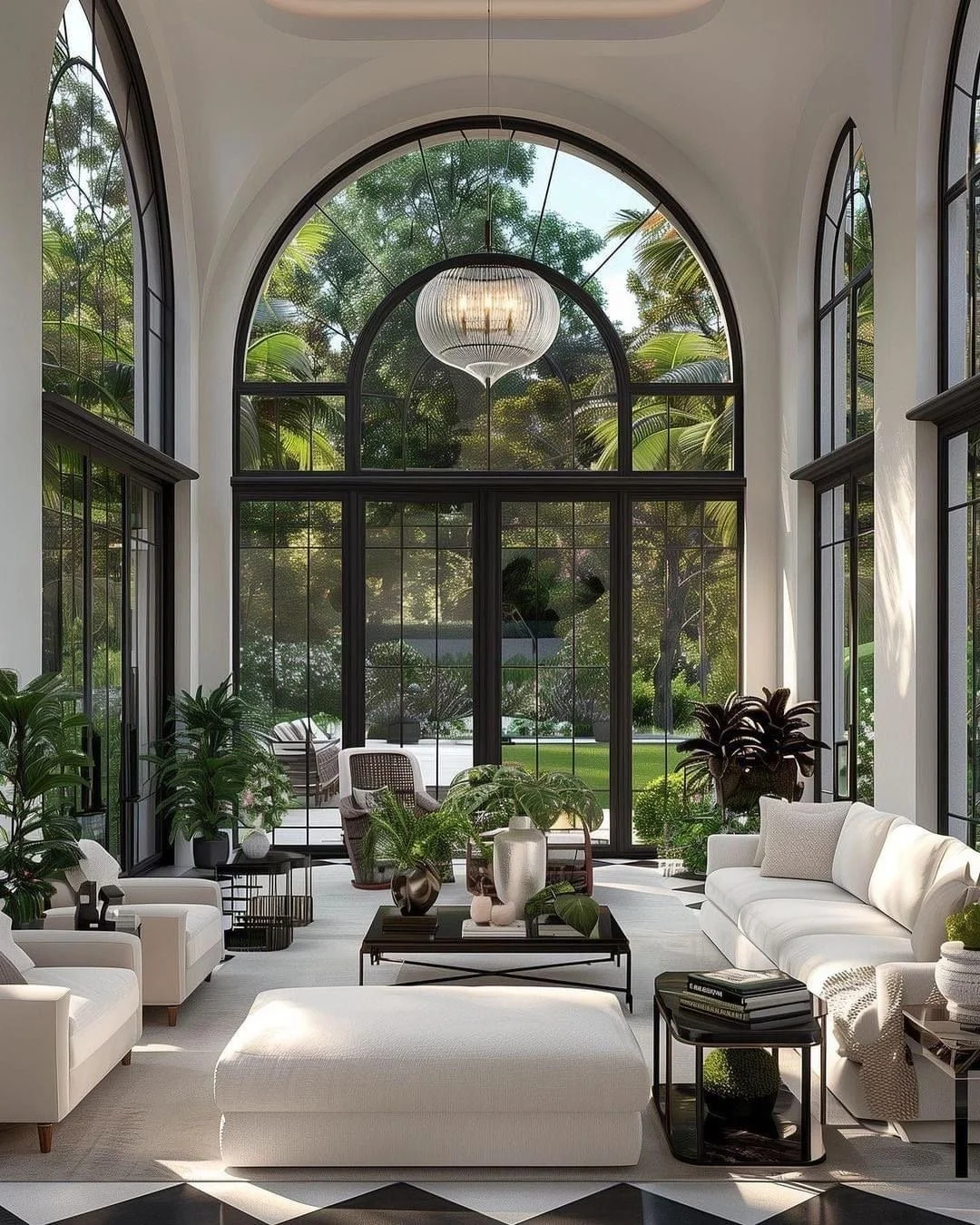
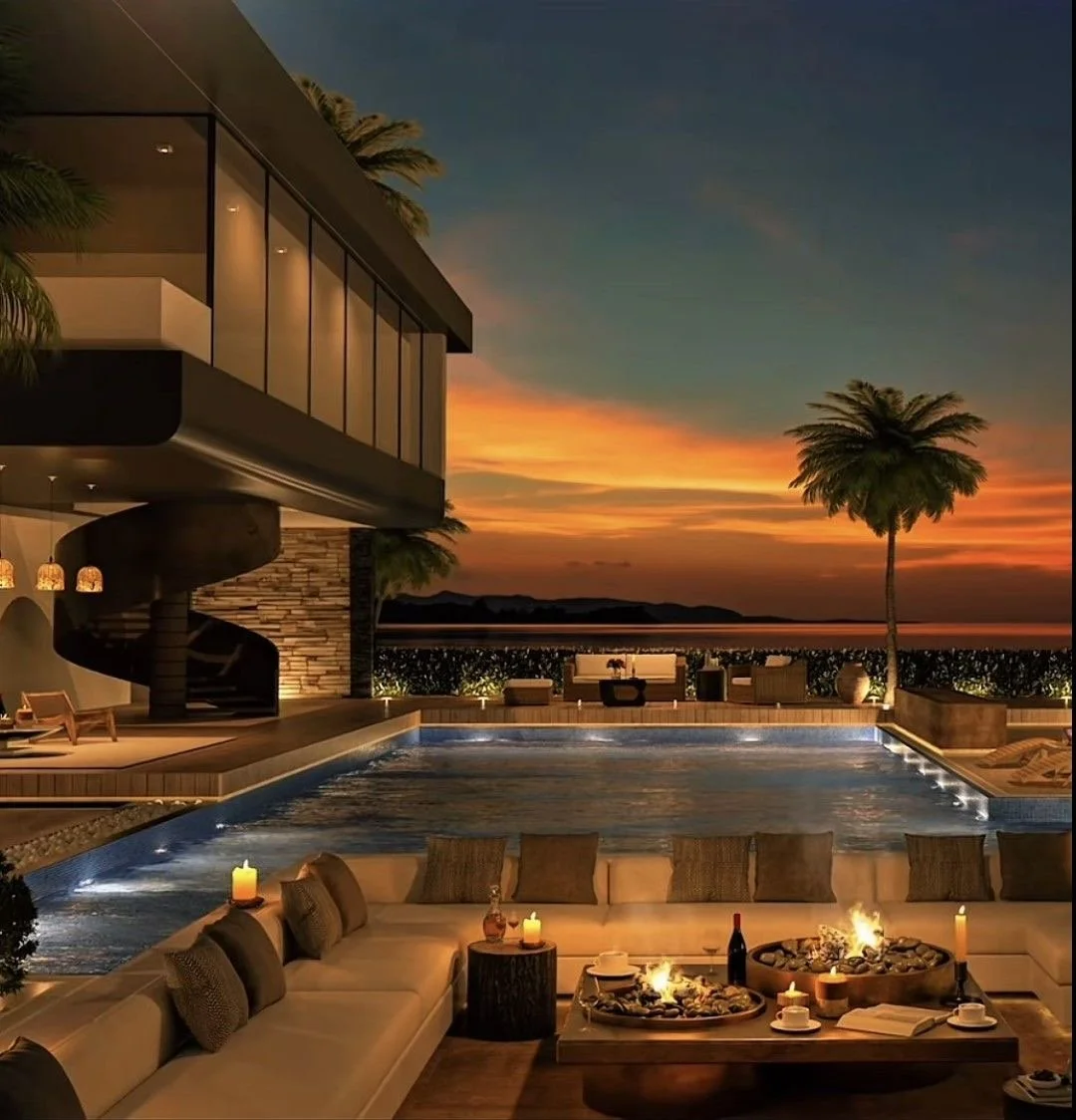
4. Shade Is Luxury
Full sun exposure is not luxury. Comfort is.
Smart outdoor living incorporates:
Deep covered terraces
Motorized screens
Retractable canopies
Mature tree planning
In climates like Scottsdale or Palm Beach or Hotlanta, shade is not optional - it's foundational.
If you can't comfortably use the space at 2 p.m., the design has failed.
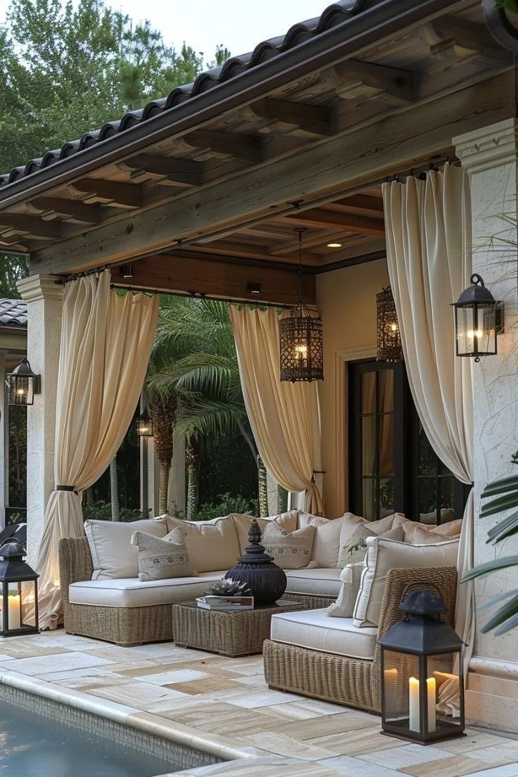
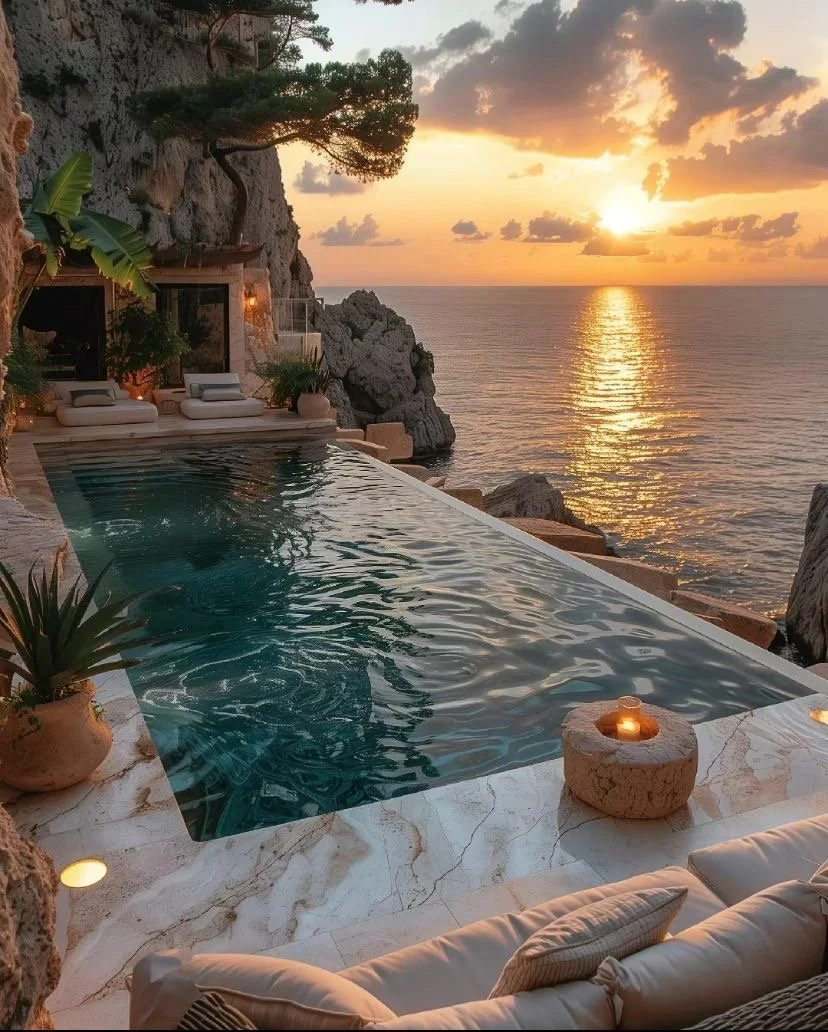
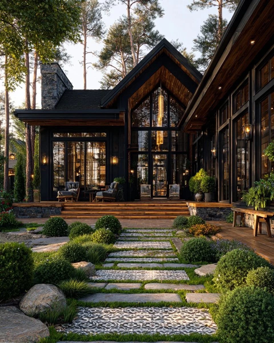
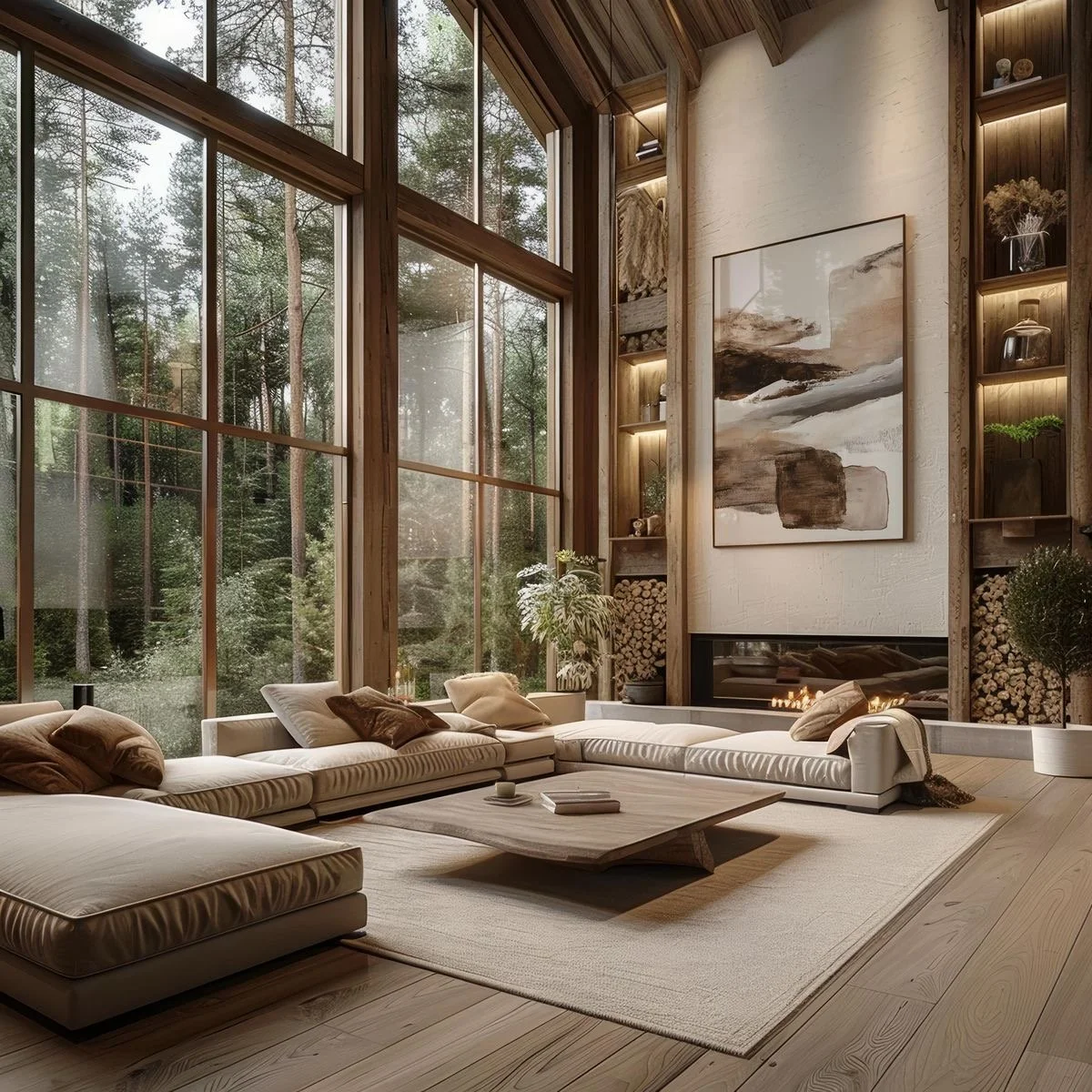
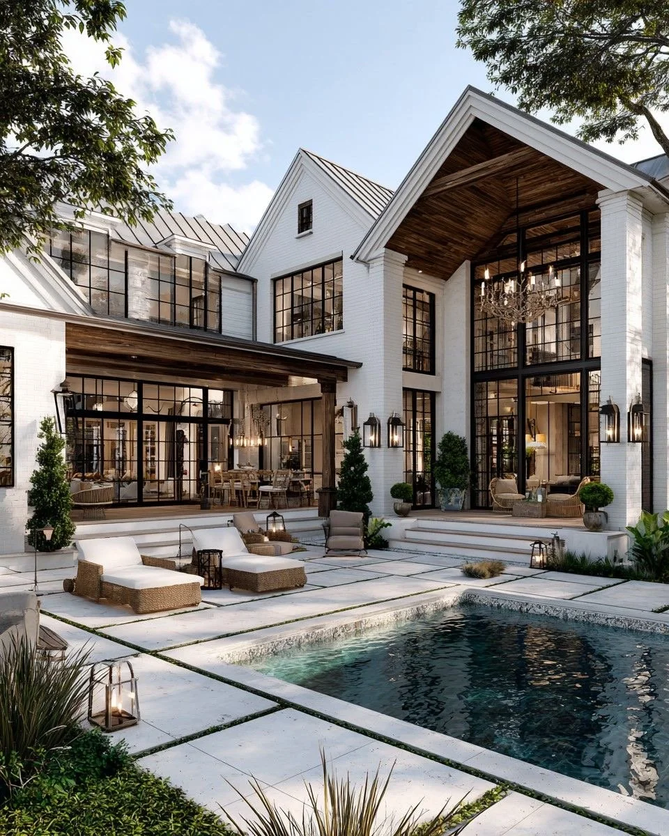
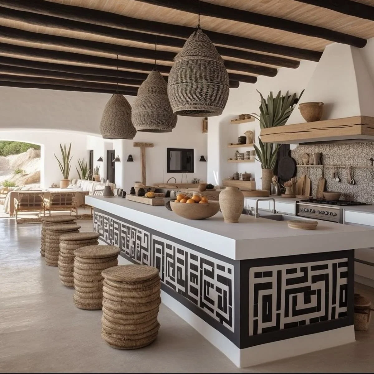
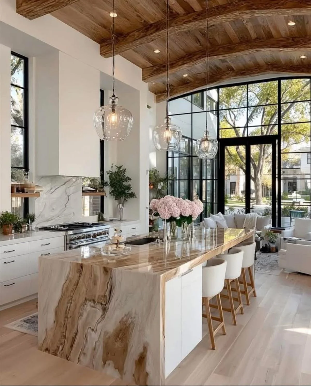
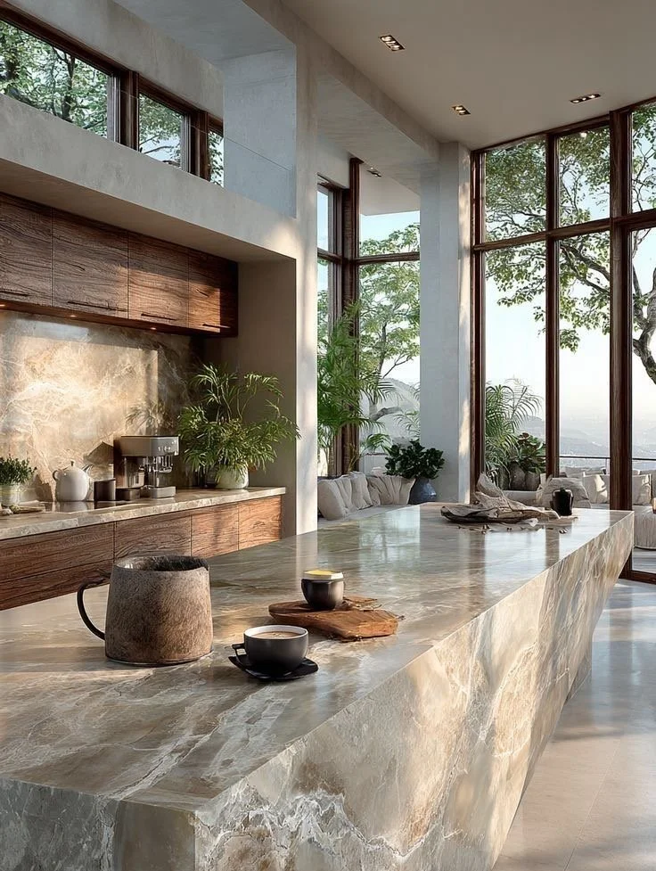
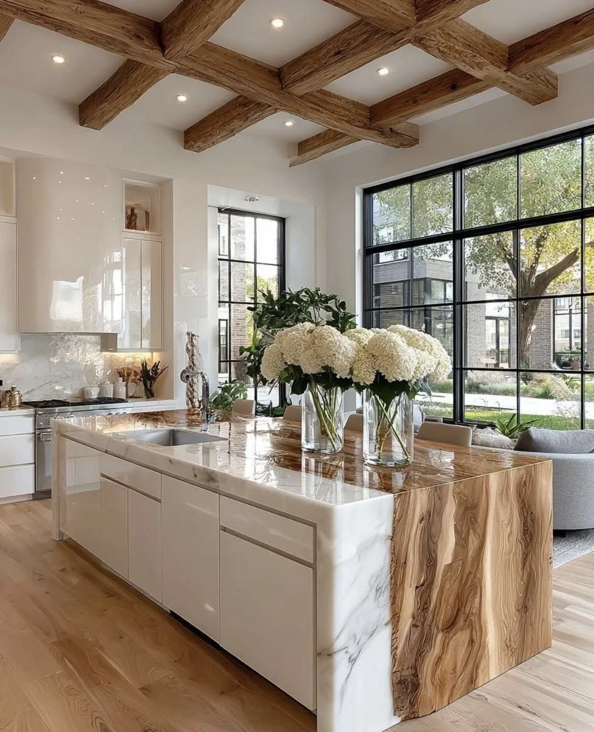
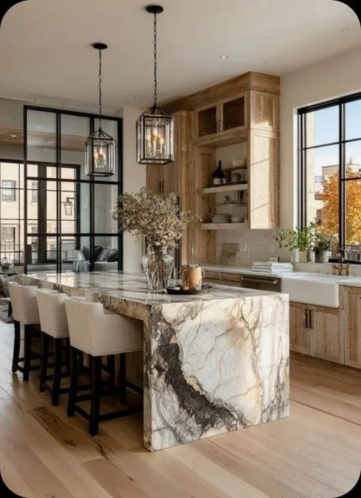
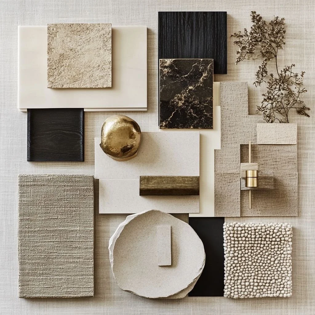
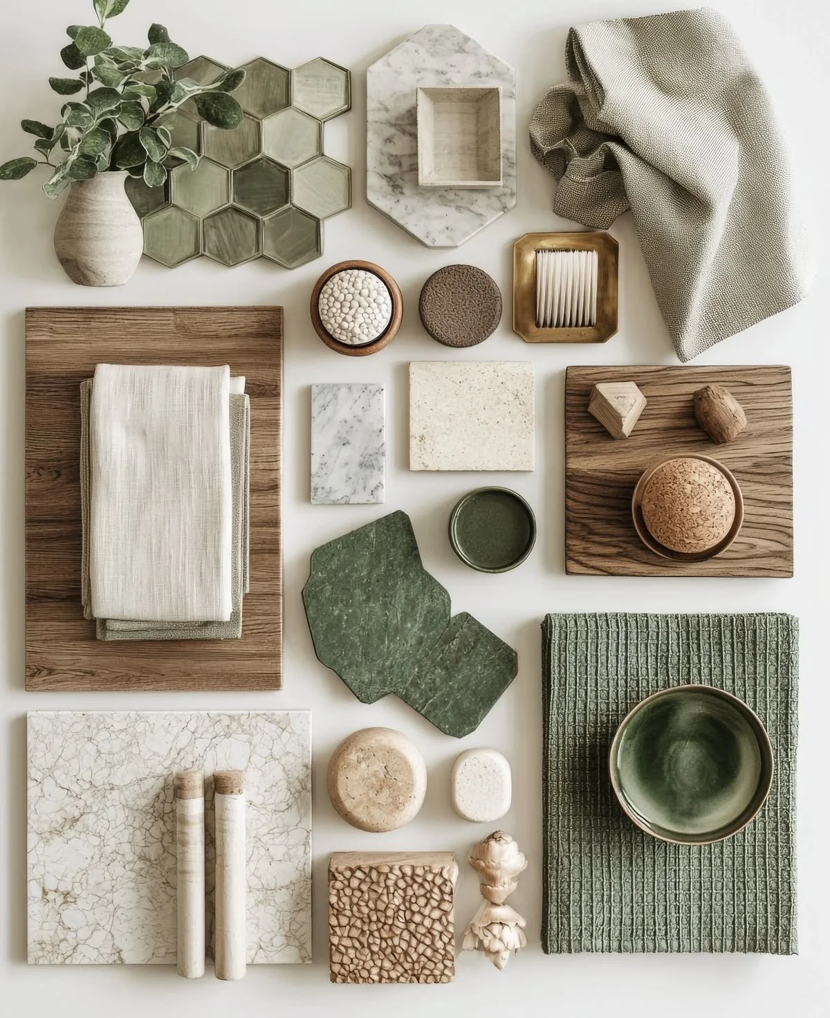
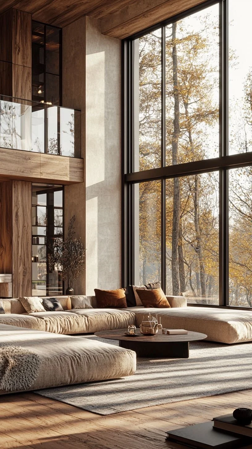
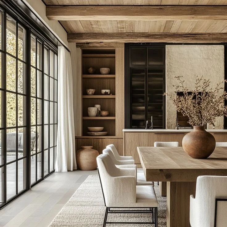
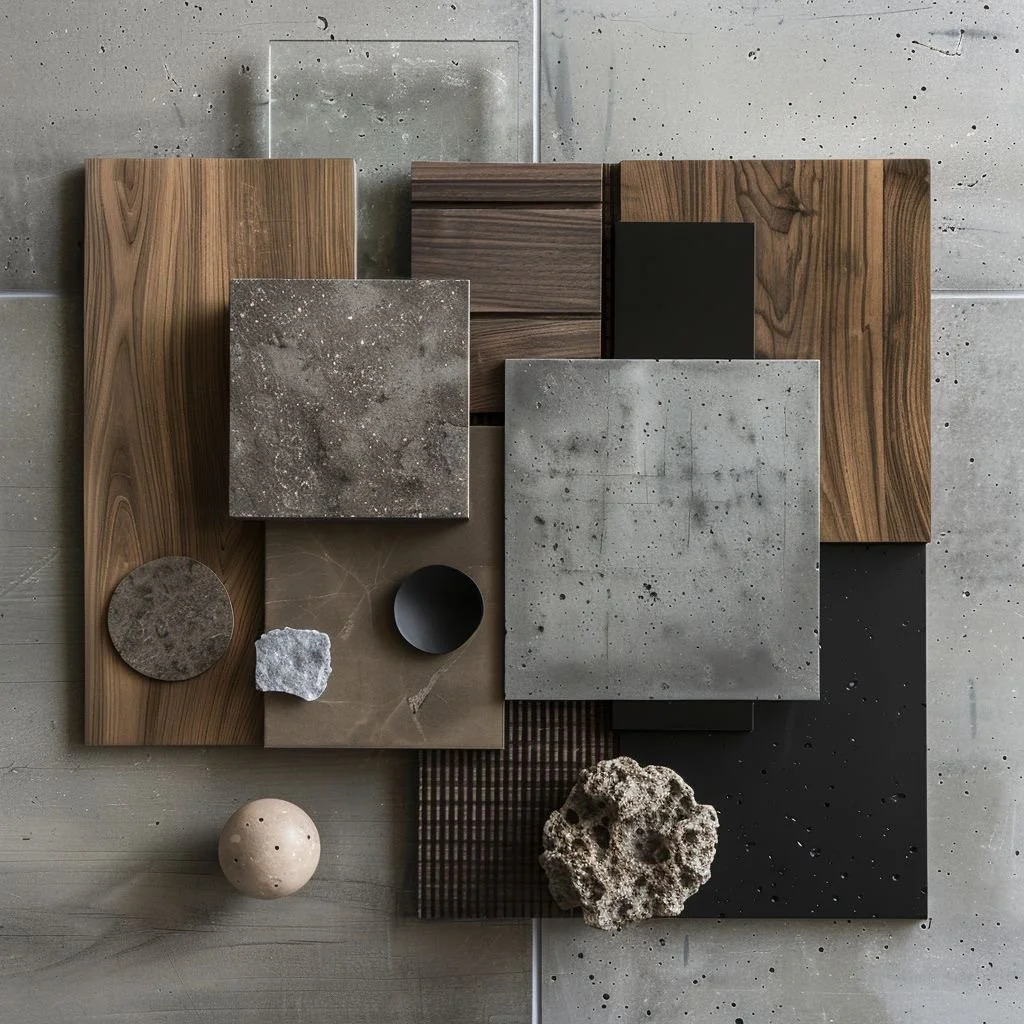
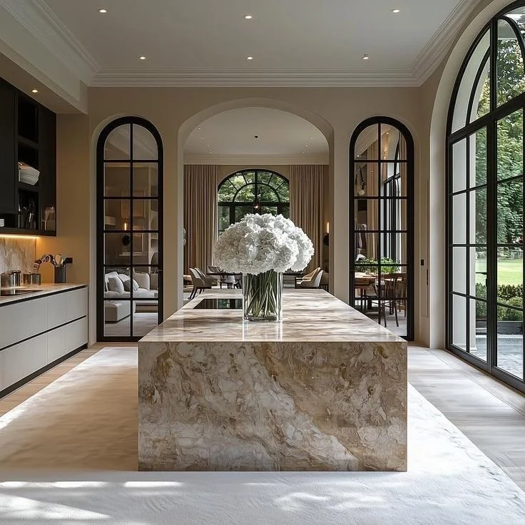
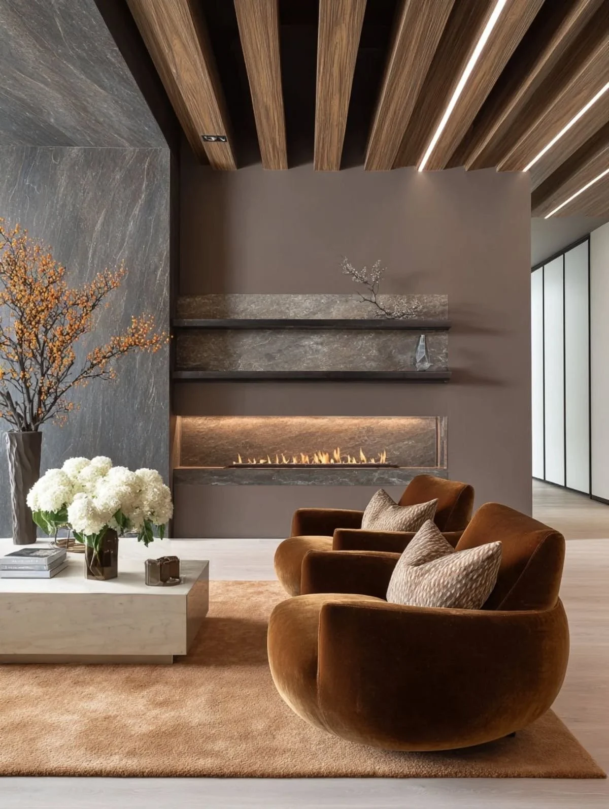
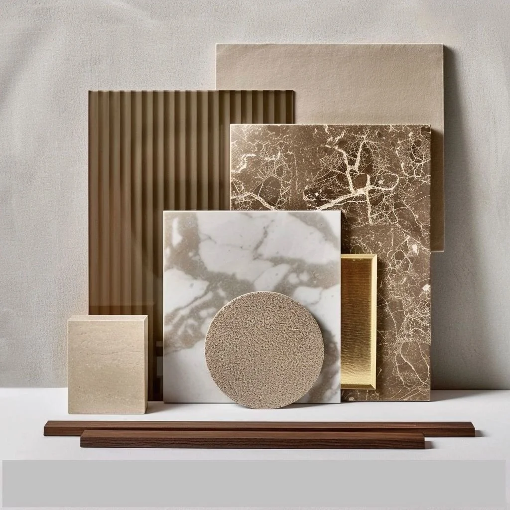
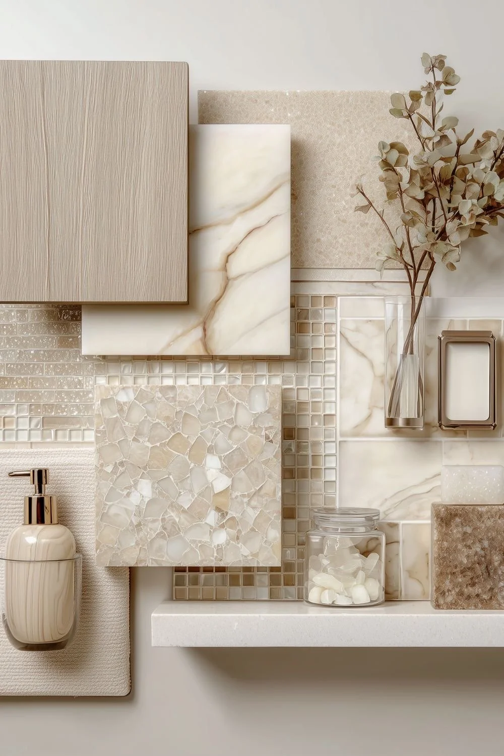
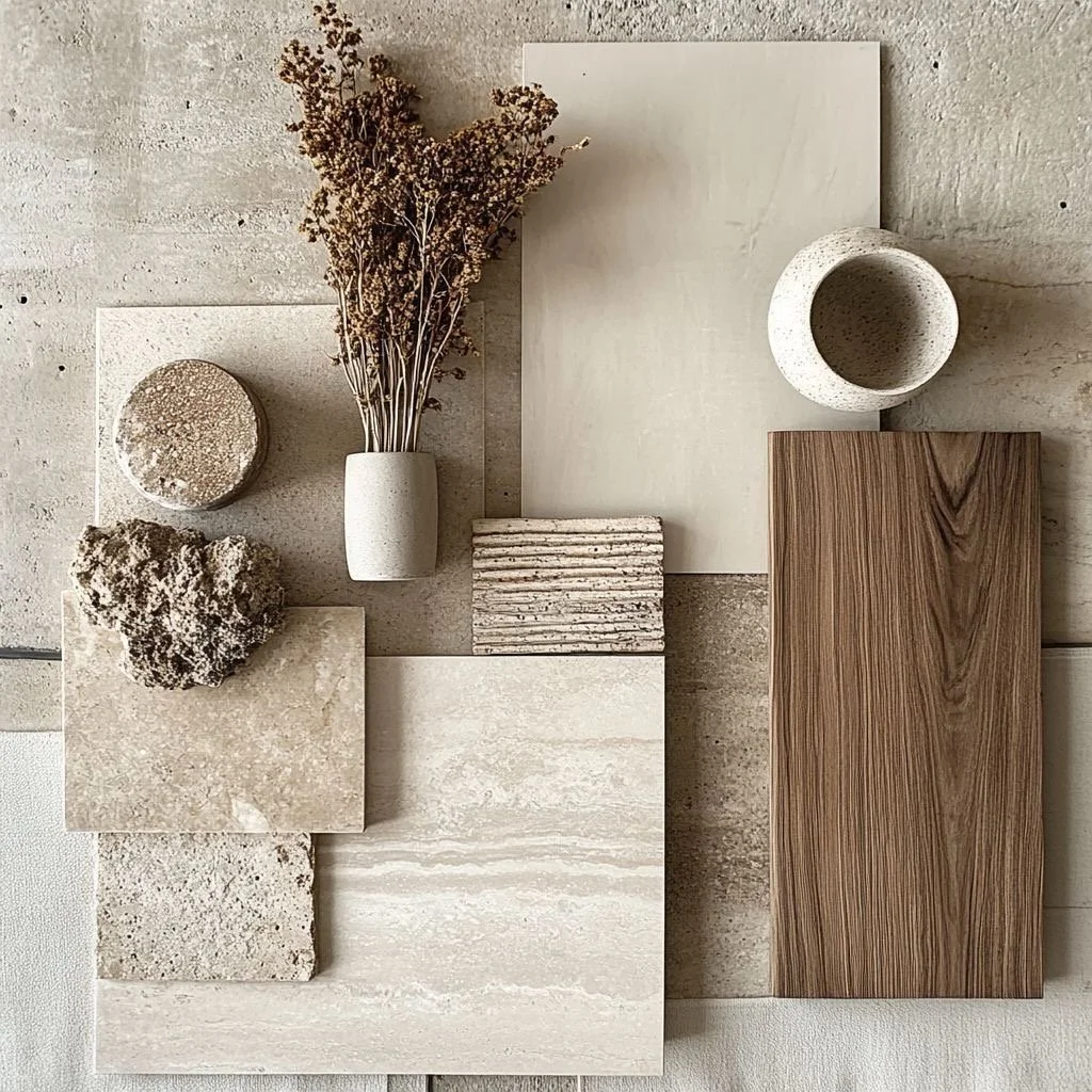
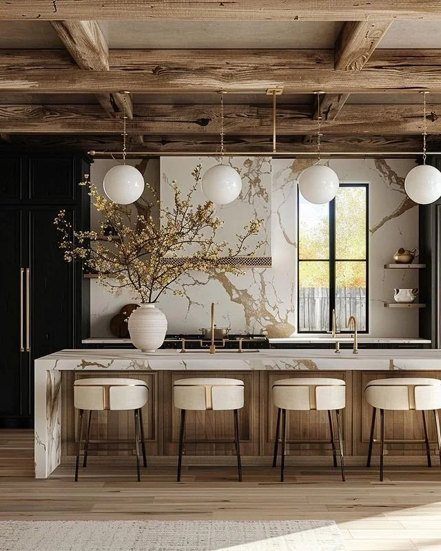
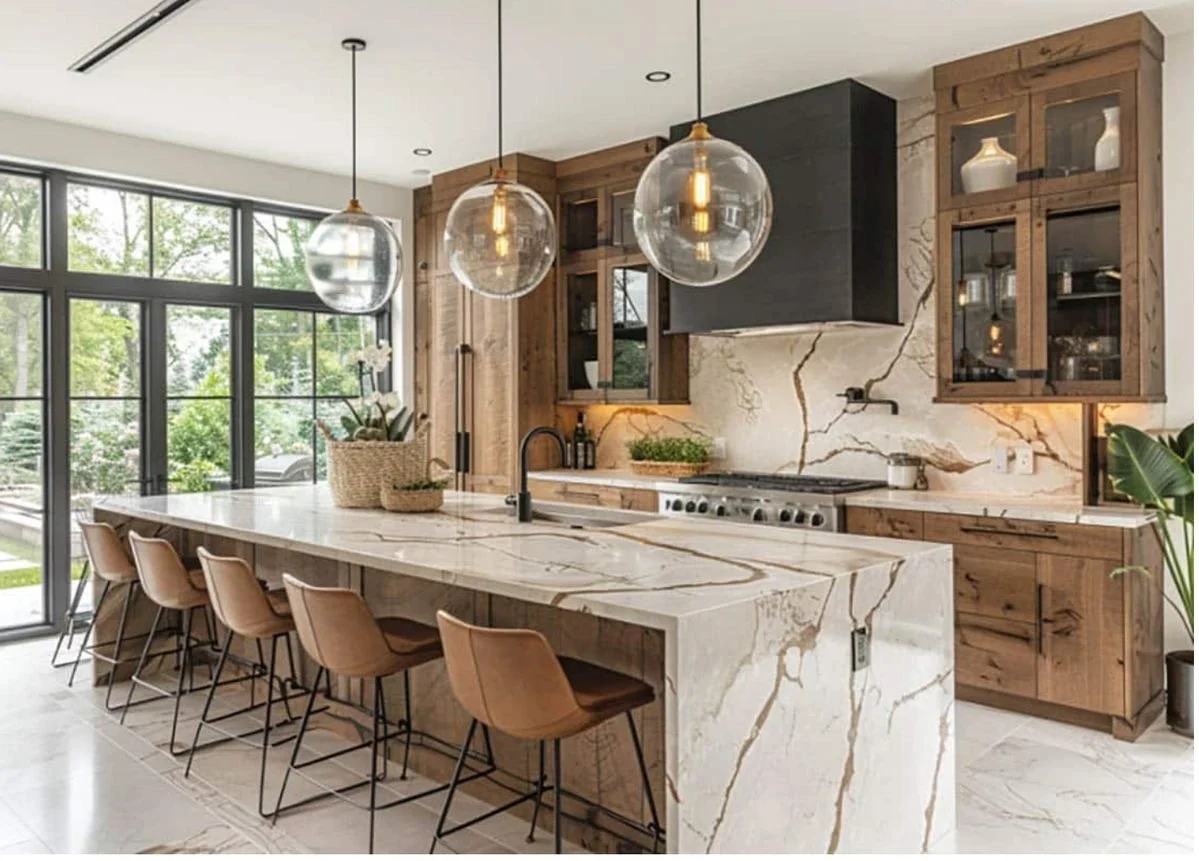
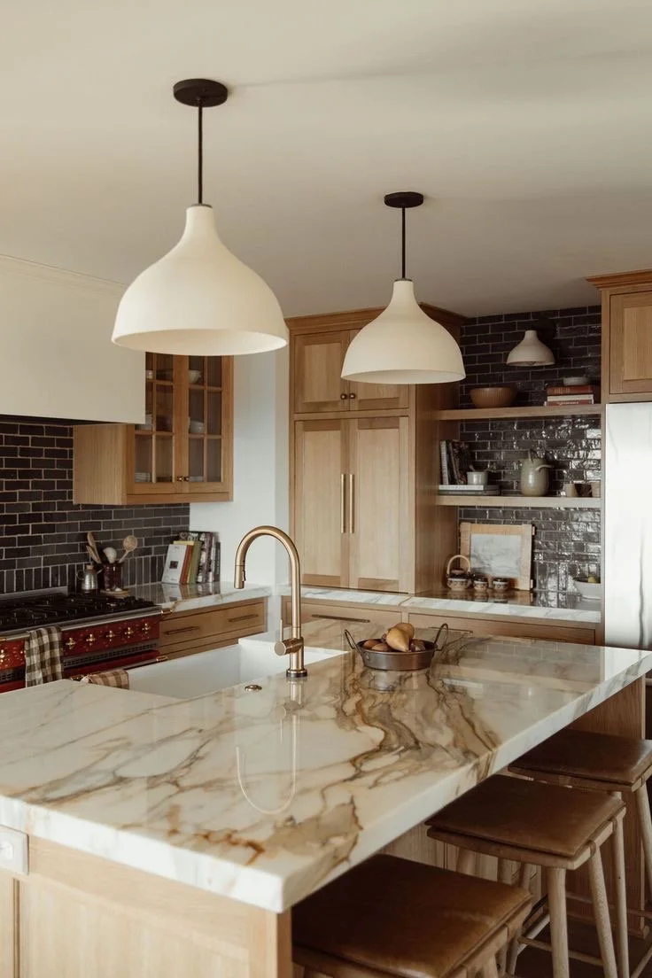
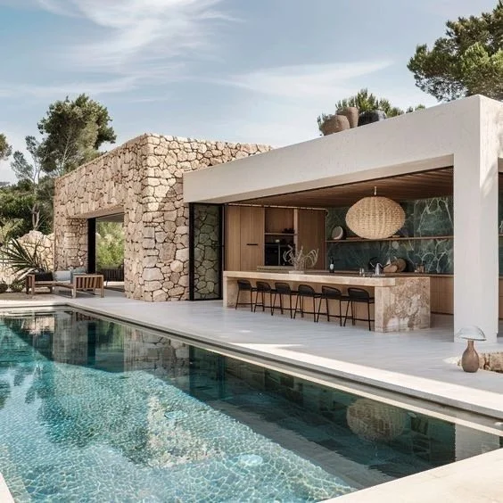
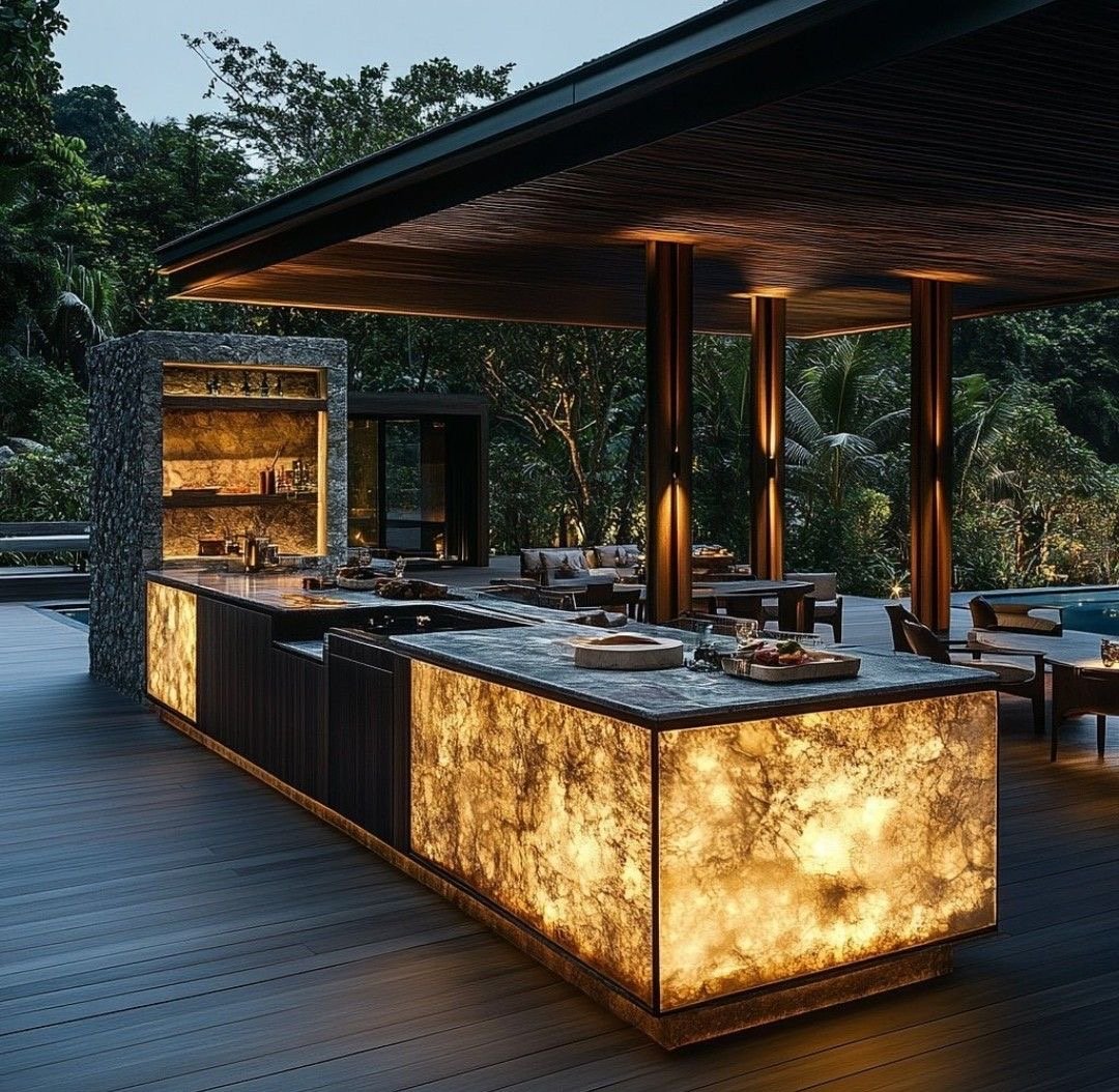
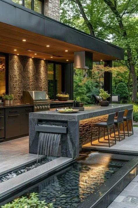
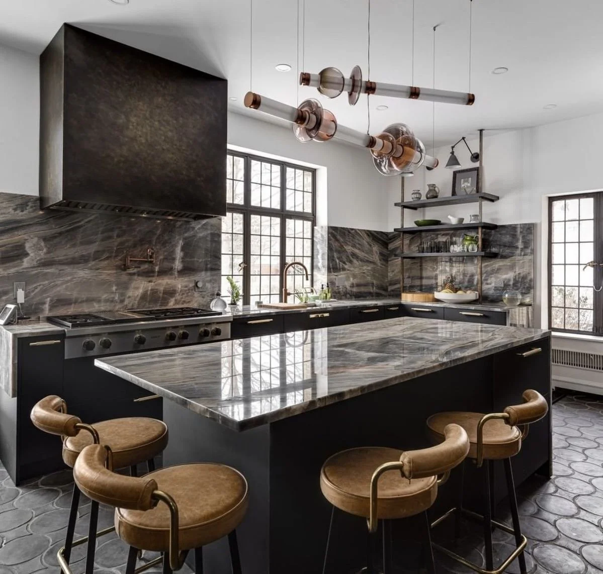
5. Materials Matter More Than You Think
Luxury is felt through texture + permanence.
For elevated patios and terraces, consider:
Honed limestone
Textured porcelain slabs
Thermally modified wood
Architectural concrete
Natural stone with subtle variation
Avoid:
Shiny finishes
Overly patterned pavers
Thin veneers that read as decorative rather than structural
Your materials should age gracefully. If they look better in five years, you chose well.
6. Integrate Technology — Quietly
True high-end outdoor living hides its intelligence.
Think:
Discreet landscape lighting
Integrated audio
Automated pool systems
Outdoor heating
Seamless indoor-outdoor AV control
Nothing should feel "tacked on."
Technology should support the experience — not announce itself.
“I couldn’t agree more with Nōka Studio…”
7. Landscaping Is Architecture's Partner
Planting design is not decoration. It's spatial architecture.
Use landscape to:
Frame sightlines
Create privacy
Soften structural edges
Direct movement
In some estates, the landscape carries as much emotional weight as the built form. The most refined properties blur that distinction entirely.
A Practical Self-Assessment for Discerning Homeowners
If you're evaluating your current outdoor space, ask:
Does it feel cohesive with my home's architecture?
Is there true comfort at multiple times of day?
Are materials aging well?
Is lighting layered and intentional?
Does the space invite lingering — or quick exits?
If you answered "no" to more than two, there's meaningful opportunity to elevate.
Where to Invest (and Where Not To)
High-Return Investments:
Architectural shade structures
Integrated lighting plans
Thoughtful spatial zoning
Quality hardscape materials
Custom millwork and built-ins
Lower-Return Spending:
Trendy fire features
Excessive decorative tile
Oversized standalone outdoor kitchens
Statement furniture without architectural support
Your return on investment in luxury properties is rarely about flash.
It's about coherence.
The Bigger Perspective
Outdoor living is no longer a seasonal amenity — it's a lifestyle extension.
When designed well, pools, patios, + terraces:
Expand functional living space
Increase property desirability
Improve wellness + daily rituals
Strengthen entertainment capacity
Elevate resale positioning
But only when they are conceived as architecture - not accessories. That’s authentic truth speaking. #Trust
Final Thought
Discerning homeowners don't ask, "How do we make the backyard nicer?"
They ask:
"How do we make our outdoor living equal to the interior in beauty, performance, + permanence?"
That shift in mindset changes everything.
If you're planning to invest in your property, wholeheartedly approach your outdoor spaces with the same discipline you would a kitchen renovation or primary suite addition.
Because when done properly, the art of outdoor living doesn't just add value.
It reshapes how you experience home. #Yessss

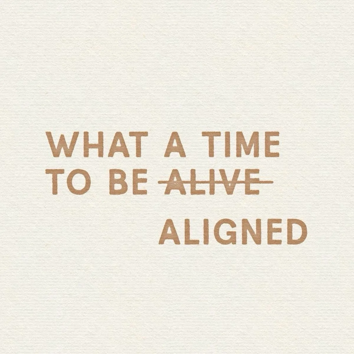
Love this @bycarelle…I’m purposely driven this time, which feels so genuine + grounding + aligned. Trusting God to guide me through every project, leading with love, kindness, skill, + strategy with a serving spirit. #Yessss
So grateful for you guys continuing to rock with me. I do not take that for granted. I’m blessed in many ways, however, always grateful. I was wholeheartedly entertained sharing tidbits with you + if you are planning to invest in your property, do not hesitate to reach out to see if we’re aligned with one another. As always, be well + chat soon!
Until next time,
Live.Love.Design.
xo Renae
(All pics are courtesy of my Pinterest)

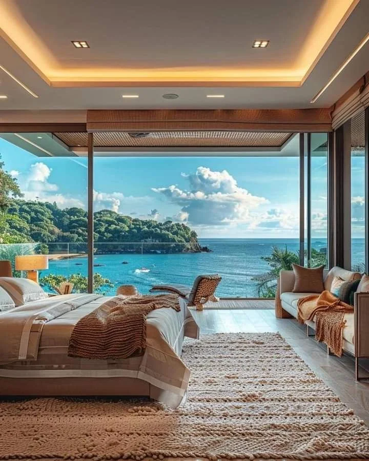
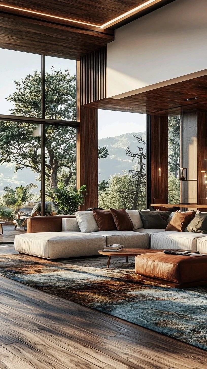
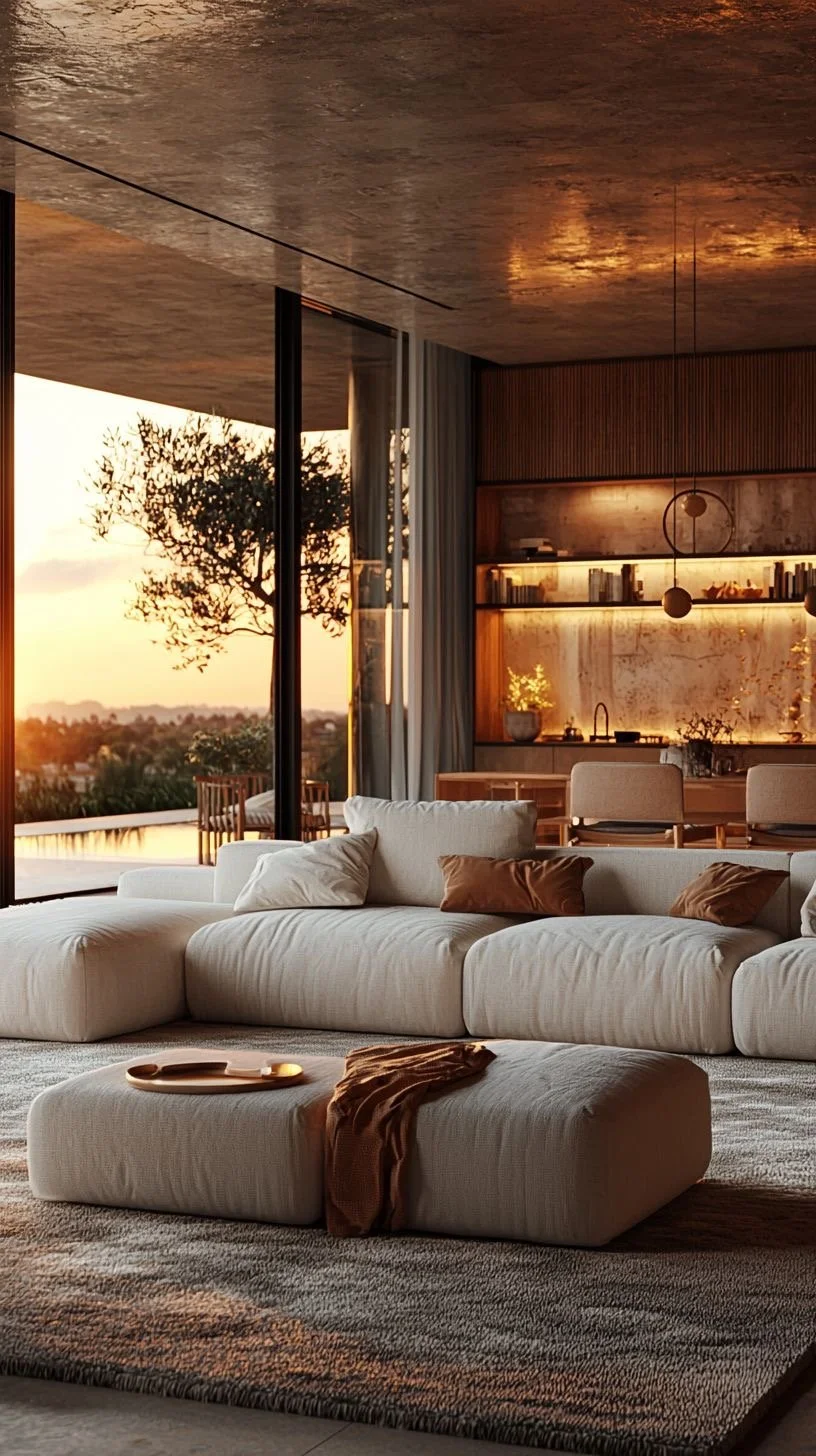
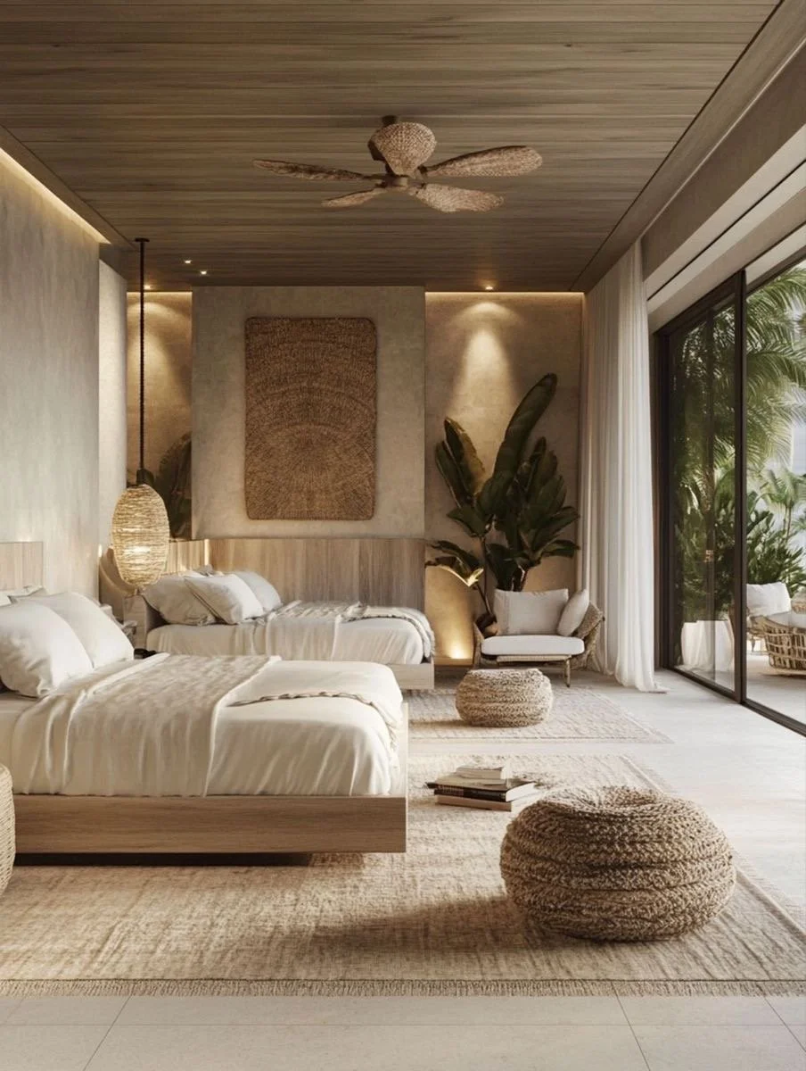
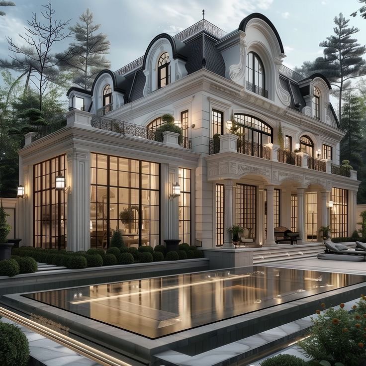
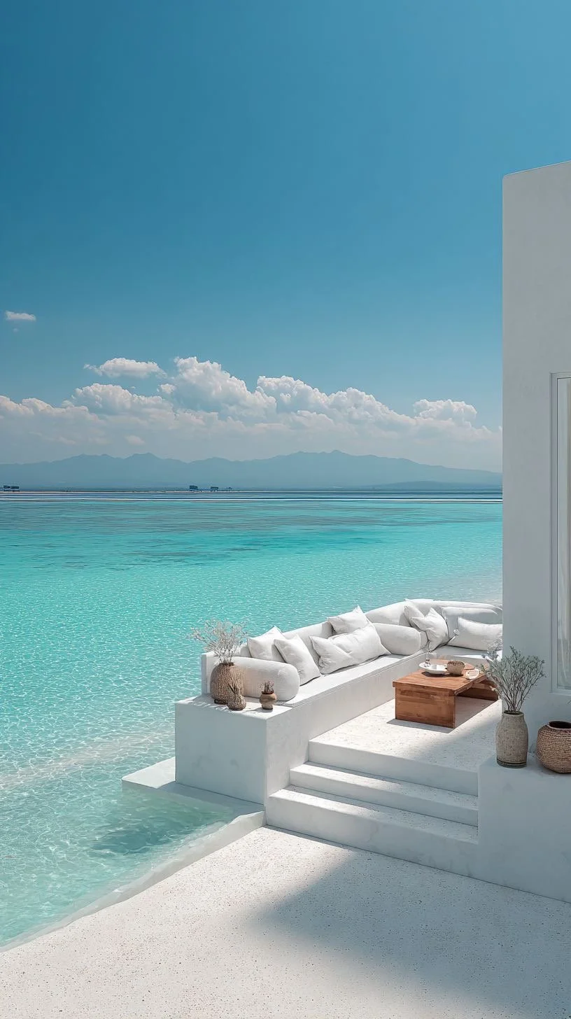
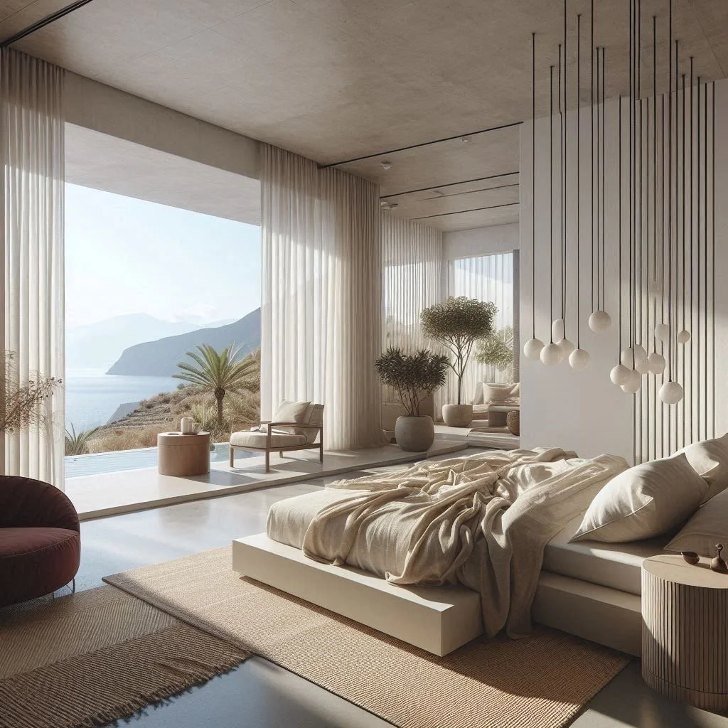
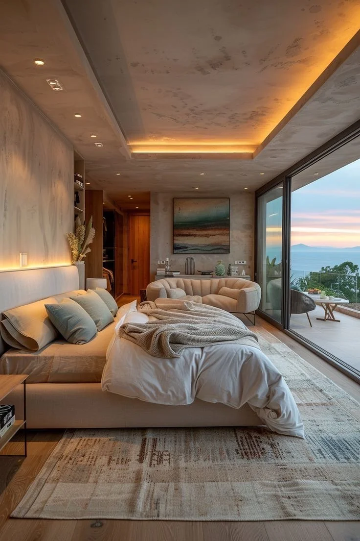
Bringing the Resort Home: how to infuse vacation luxury into everyday living….
As a luxury residential architectural designer, I've learned that what we're really responding to isn't extravagance—it's thoughtful design that supports how we want to live.
You know the feeling.
The moment you step into a world-class resort or luxury short-term vacation villa-where time slows, your shoulders drop, + everything feels intentionally effortless.
As a luxury residential architectural designer, I've learned that what we're really responding to isn't extravagance—it's thoughtful design that supports how we want to live.
The good news? You don't need to book another flight to feel that way.
You can design it-right at home.
This interactive guide will help you translate the best elements of travel-inspired luxury into a residence that feels restorative, indulgent, + deeply personal-every single day. Yesssss!
Step 1: Identify Your Signature Resort Experience
Before we talk materials or layouts, let's start with intention.
Think about your favorite place you've ever stayed.
Not the most expensive-the most memorable.
👉🏾 Interactive Prompt:
Which experience resonates most with you?
A serene coastal retreat with endless light + ocean air
A European boutique hotel rich in texture, history, + intimacy
A wellness-focused spa resort grounded in nature
A modern desert escape with seamless indoor-outdoor living
Your answer becomes the design compass for your home.
Luxury design succeeds when it reflects your emotional response to space, not a trend.
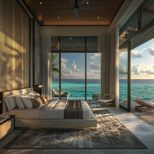
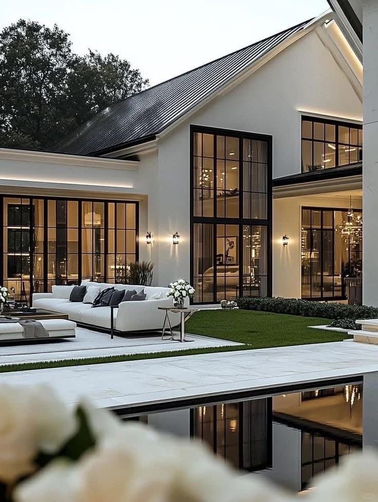
Step 2: Design for Arrival (The Check-In Effect)
Exceptional resorts or luxury short-term villas don't begin at the pool—they begin at the arrival sequence.
At home, the entry is often overlooked, yet it sets the emotional tone for everything that follows.
Resort-Inspired Design Moves:
Layered lighting that shifts from day to evening
Natural materials (stone, wood, plaster) that immediately ground you
A sense of progression-never revealing everything at once
👉🏾Ask Yourself:
When I walk through my front door, do I feel welcomed... or rushed?
A thoughtfully designed entry should feel like crossing a threshold into calm.
Step 3: Create Spaces That Encourage Slowing Down
Luxury resorts + short-term vacation villas are masters at giving us permission to pause.
Your home should do the same.
Architectural Strategies That Change Daily Behavior:
Wider hallways + softened transitions between rooms
Purposeful "pause points" like window seats or reading alcoves
Furniture layouts that encourage conversation—not just TV viewing
👉🏾 Interactive Exercise:
Which room in your home should be used more slowly—but isn't?
That's your opportunity for transformation.
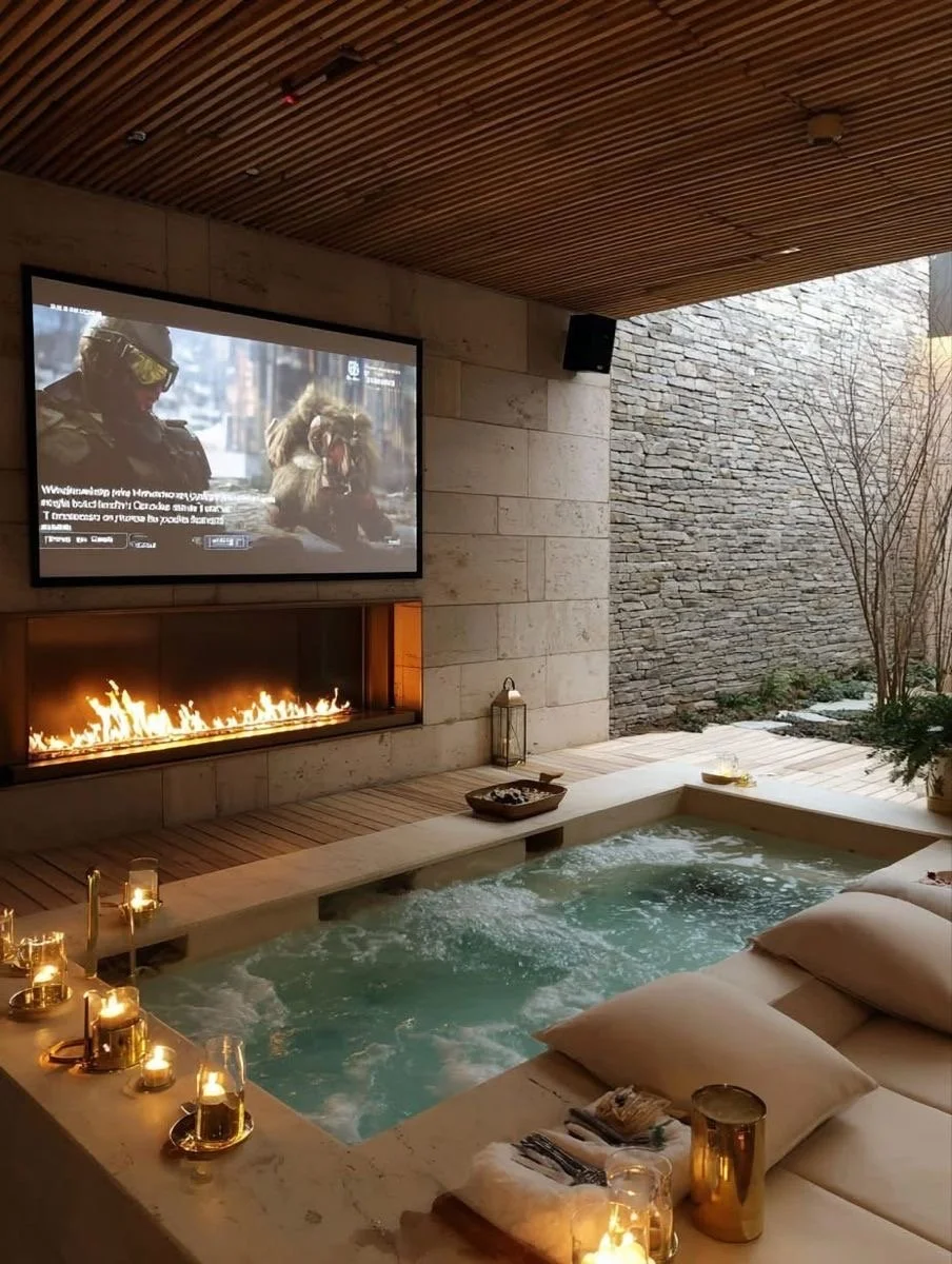
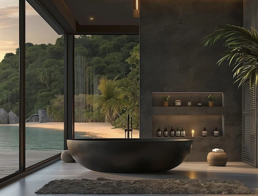
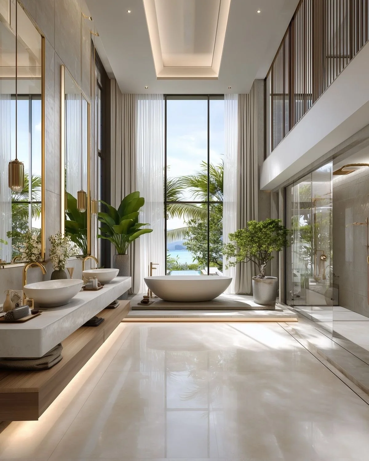
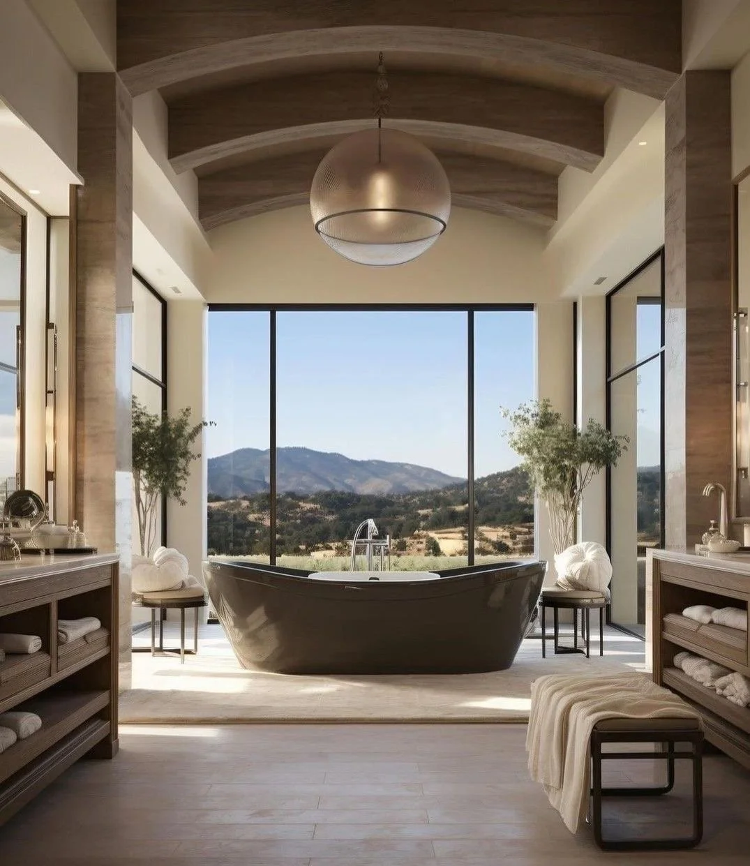
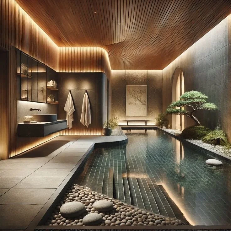
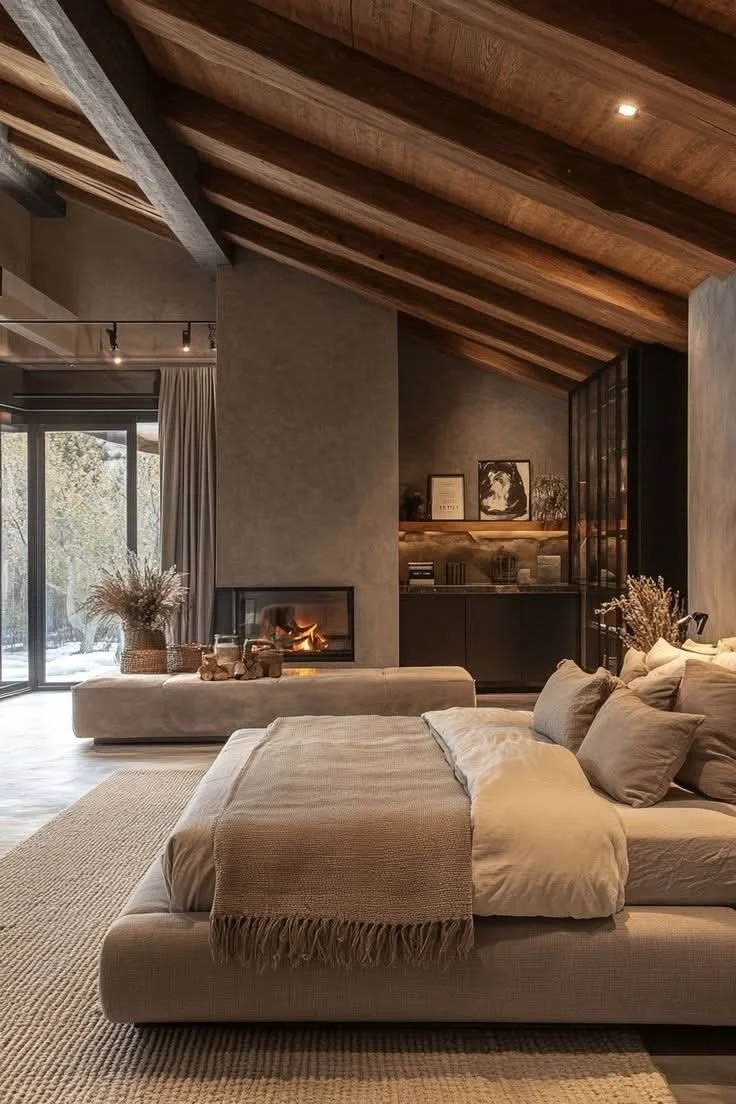
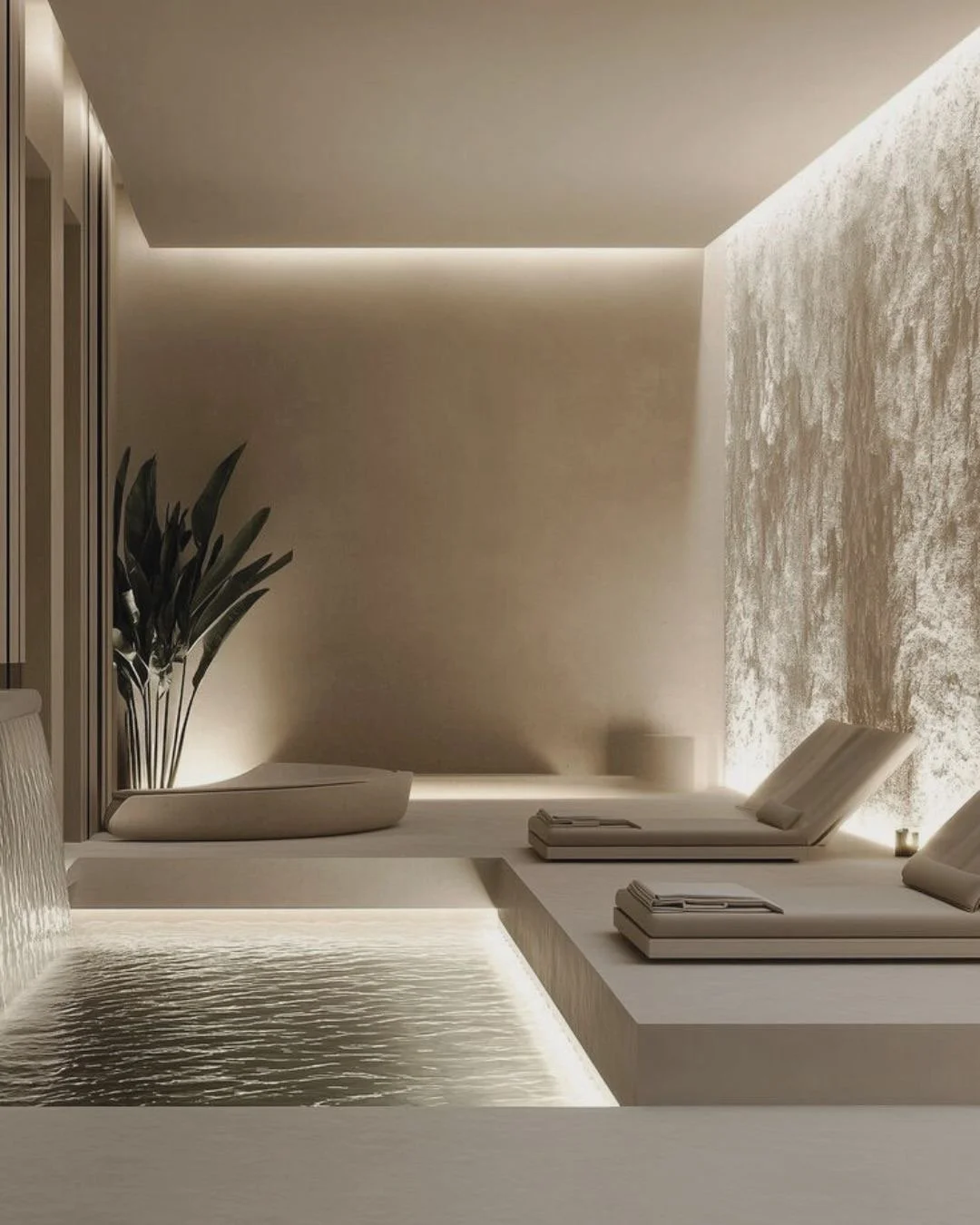
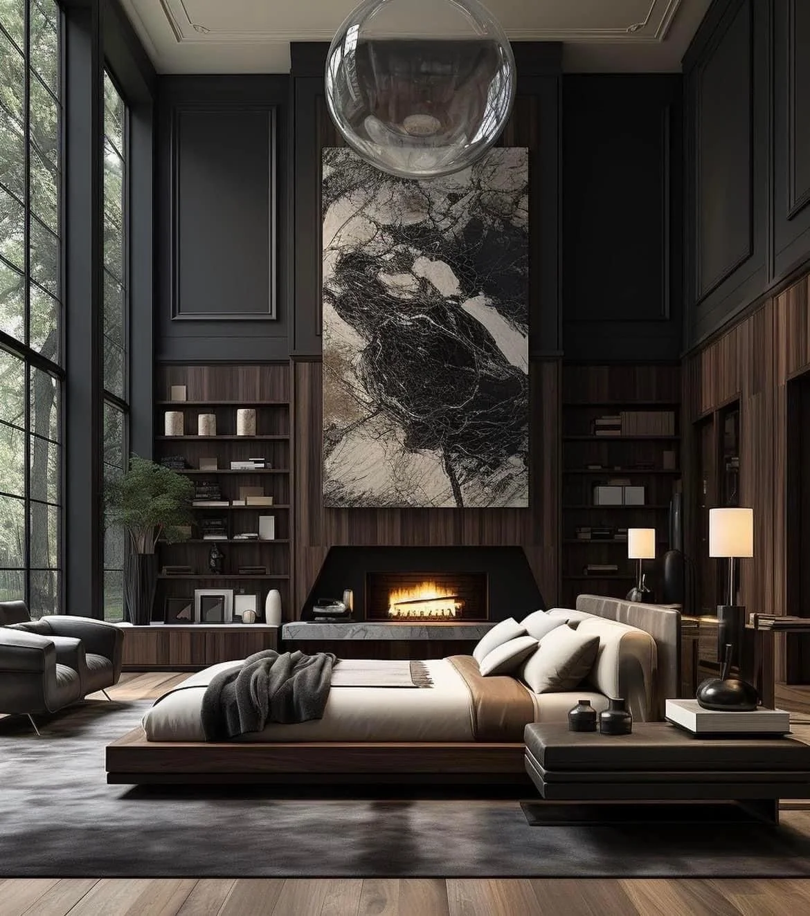
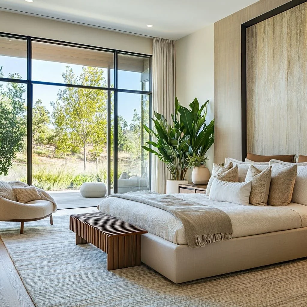
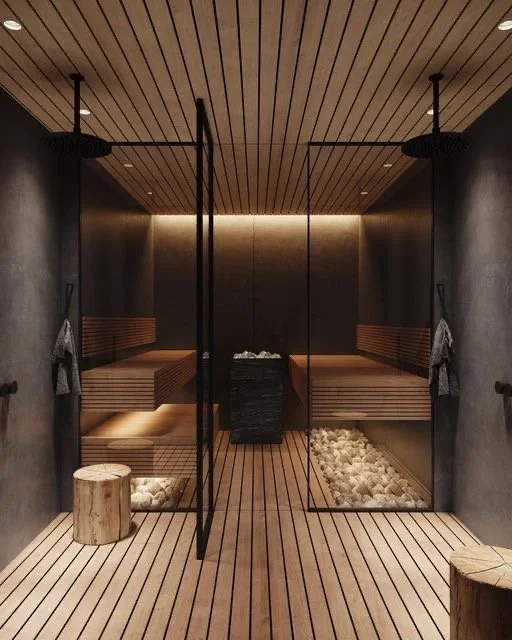
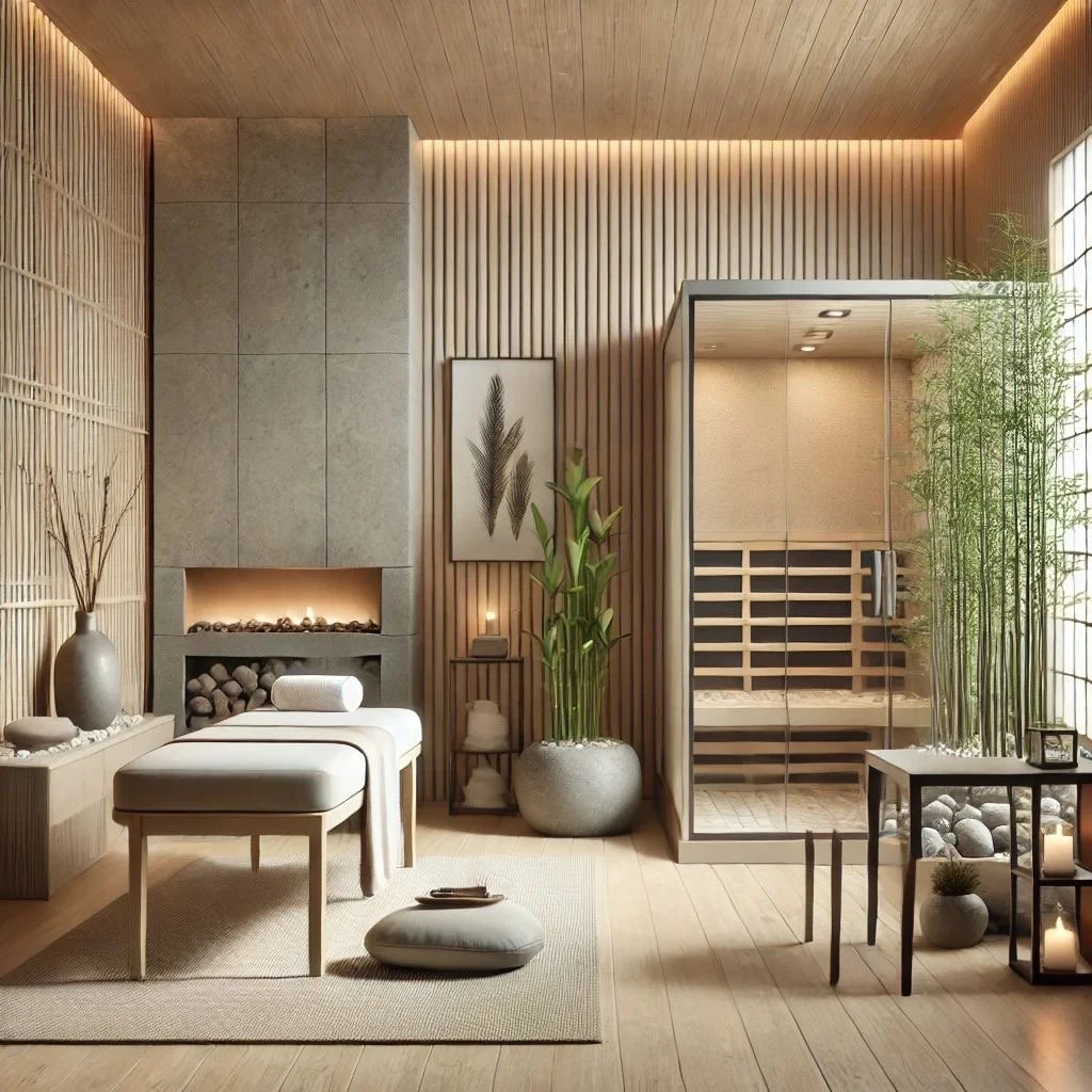
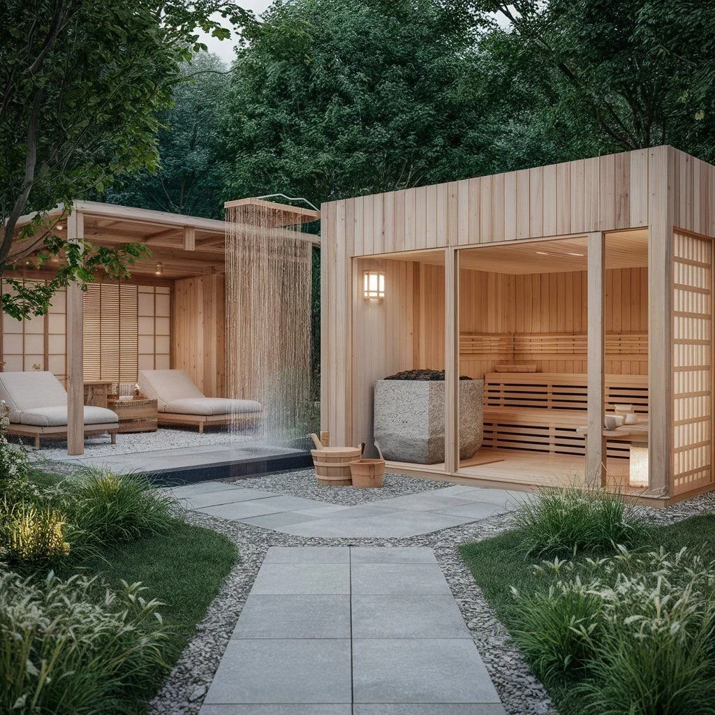
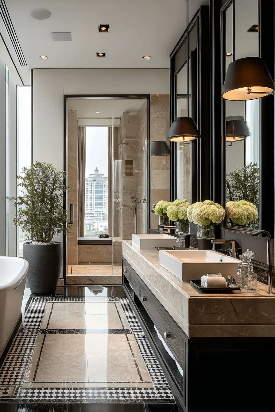
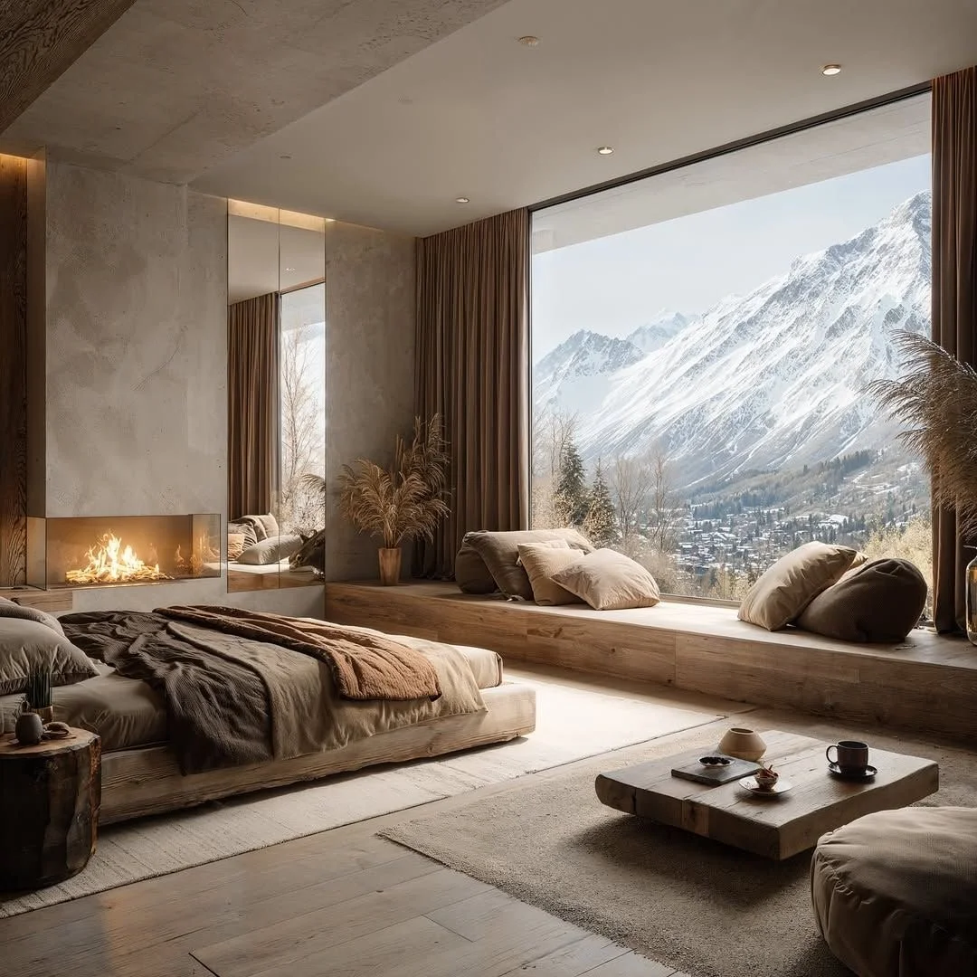
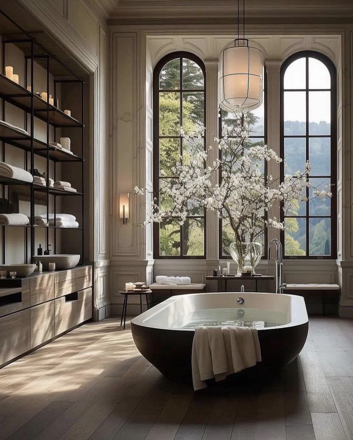
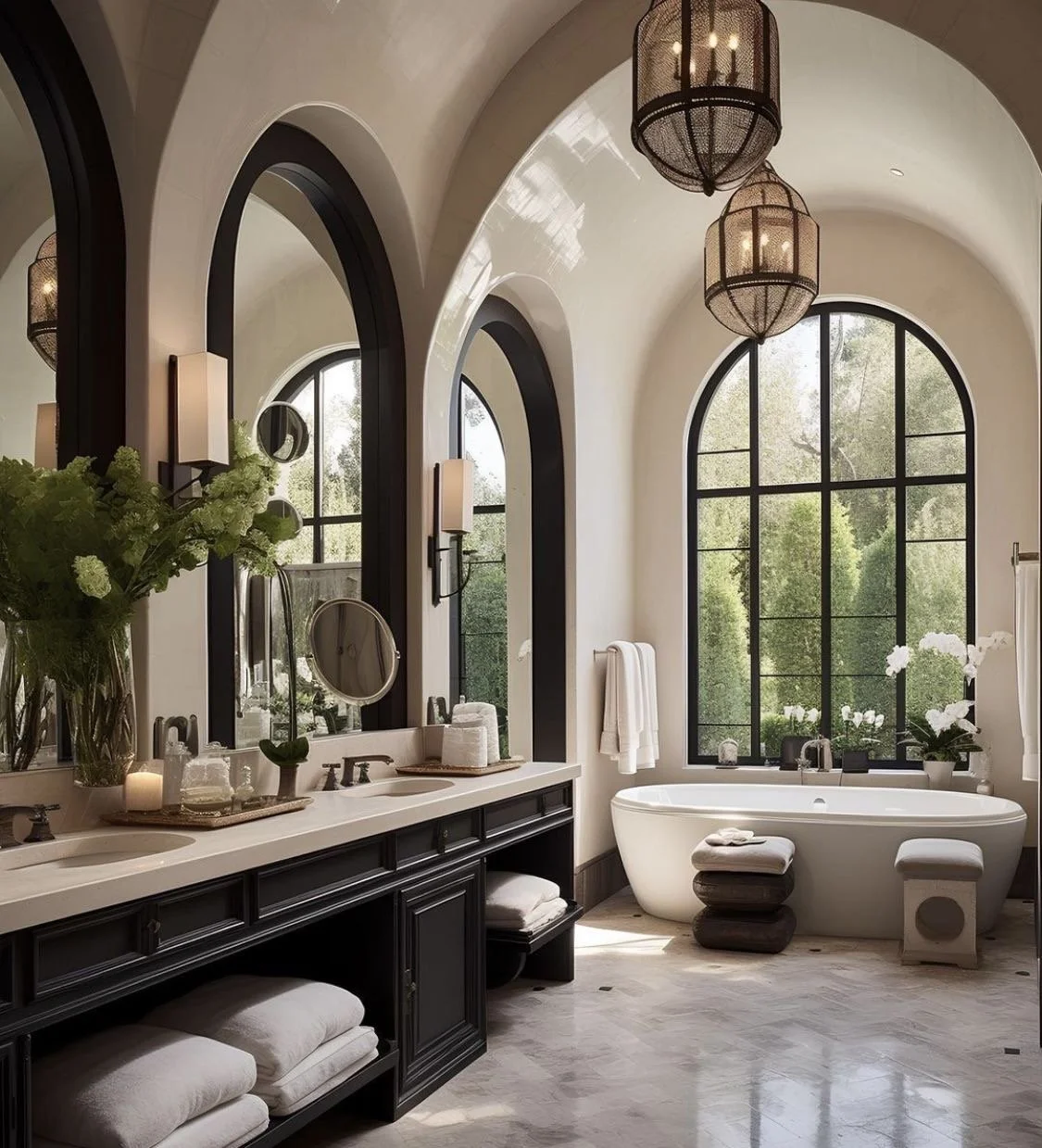
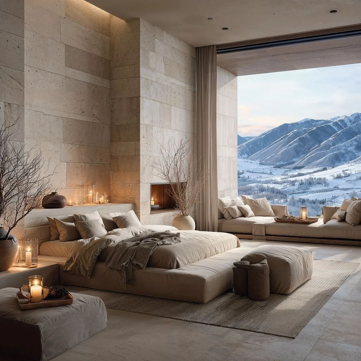
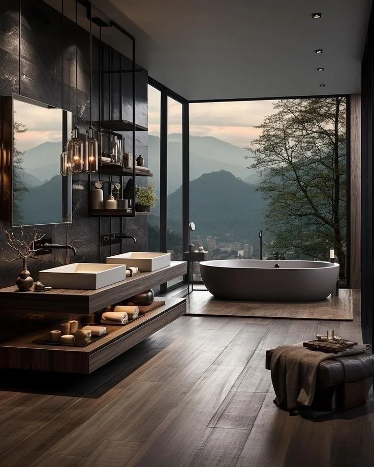
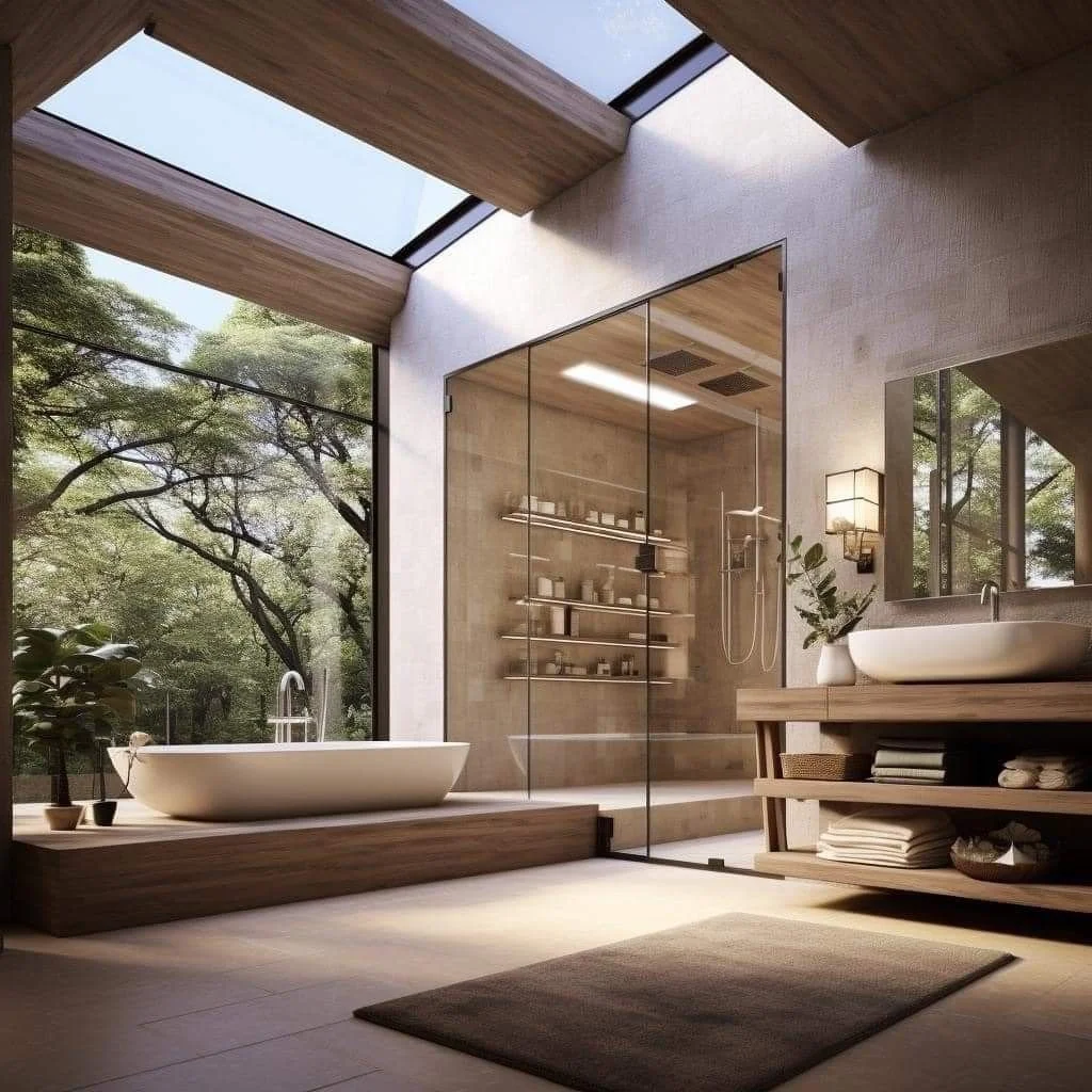
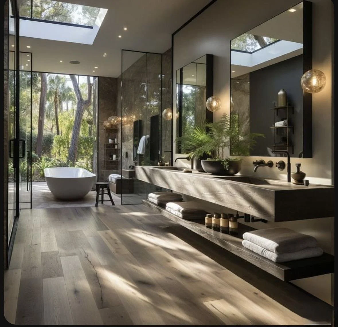
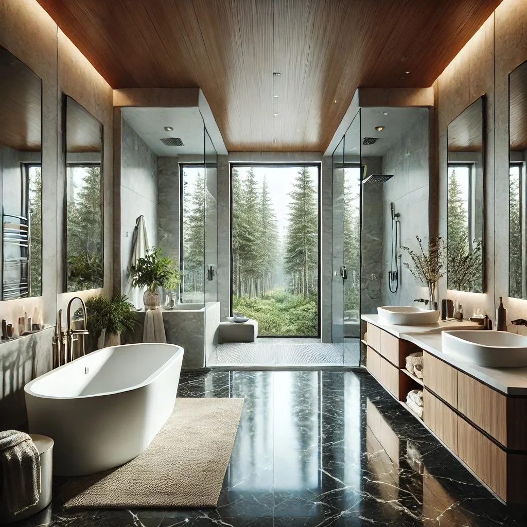
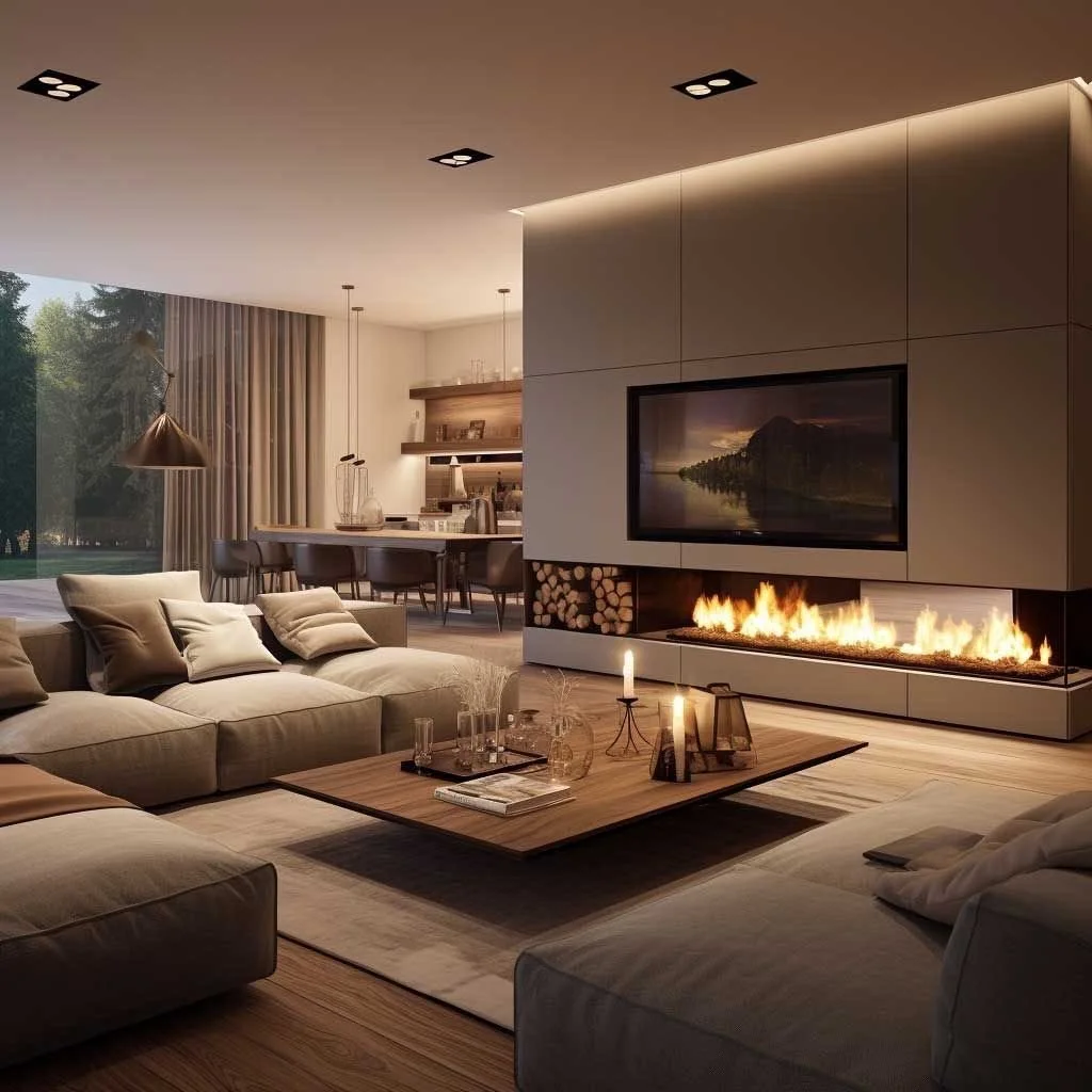
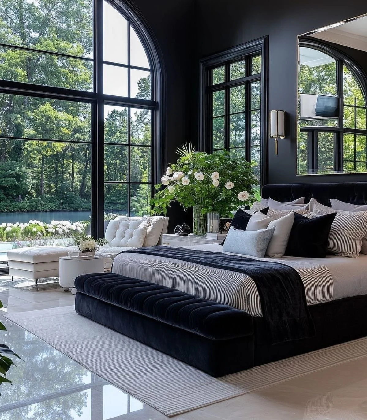
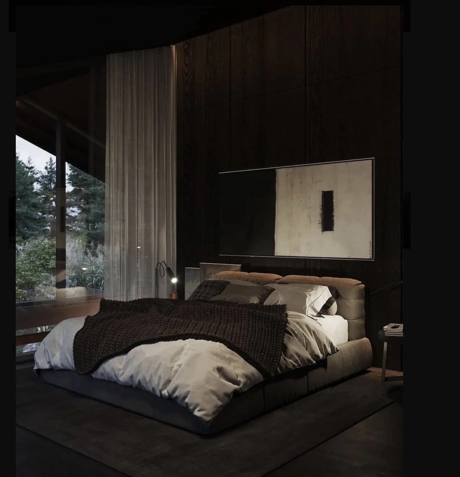
Step 4: Bring the Spa Home (Beyond the Bathroom)
True wellness design extends far past a soaking tub.
Resorts + vacation villas succeed because they engage the senses holistically.
Think in Layers:
Sound: integrated acoustics, water features, or quiet mechanical systems
Touch: heated floors, honed stone, hand-troweled plaster walls
Scent: natural ventilation, garden adjacency, subtle material aromas
👉🏾 Design Check:
Does your primary suite feel like a place to retreat-or simply sleep?
Wellness-focused residential design is about restoration, not excess.
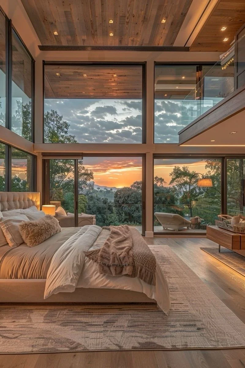
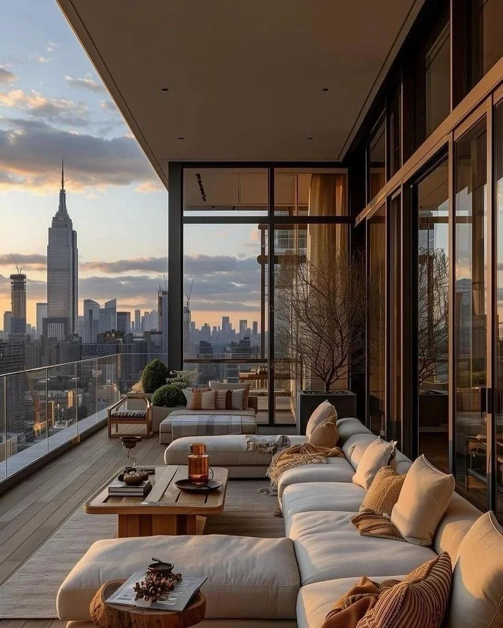
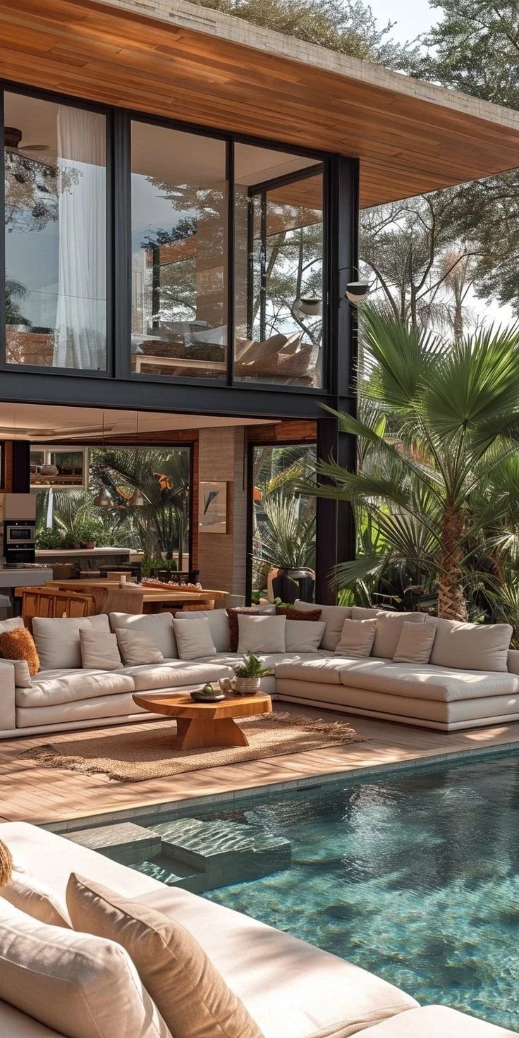
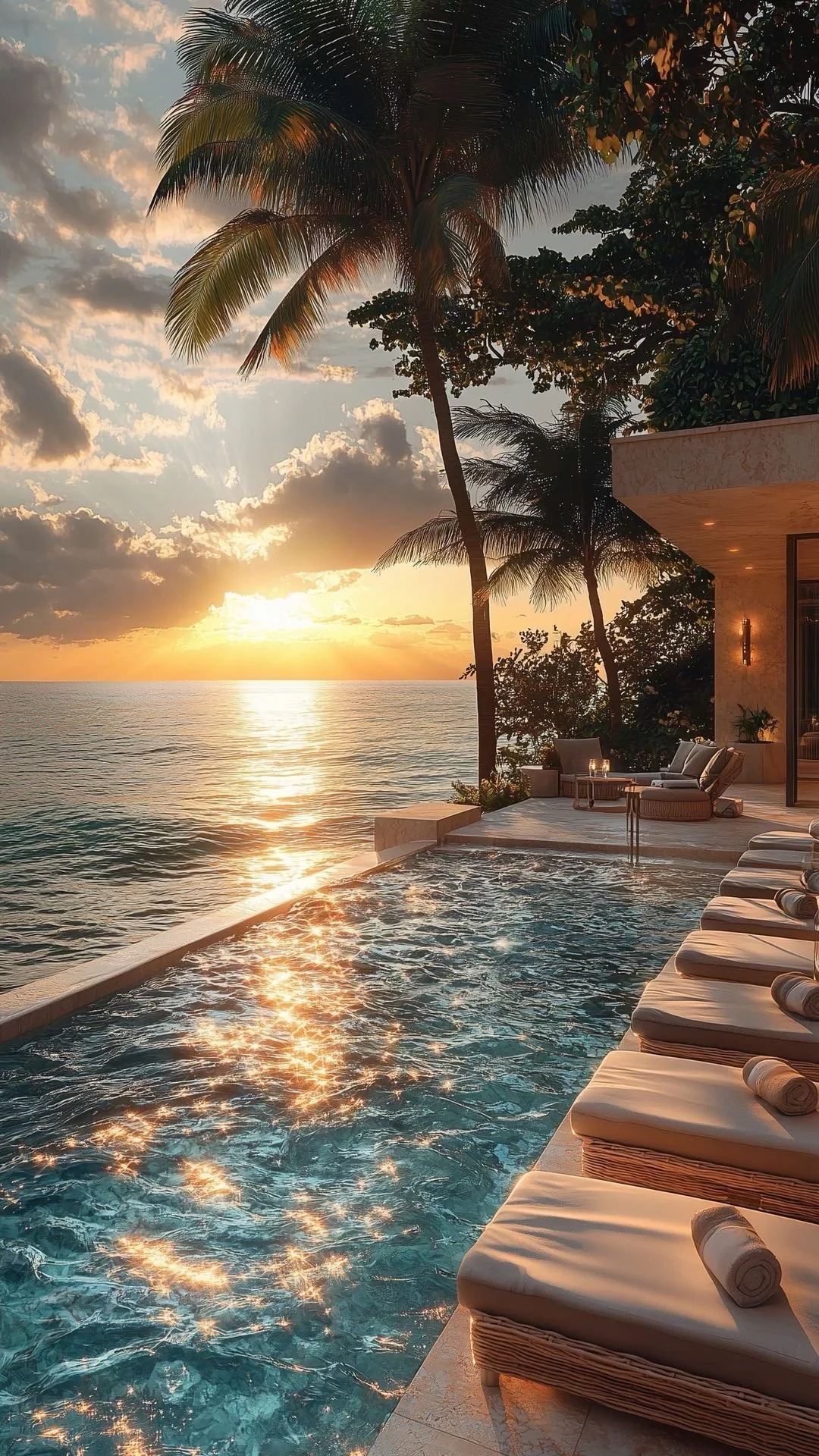
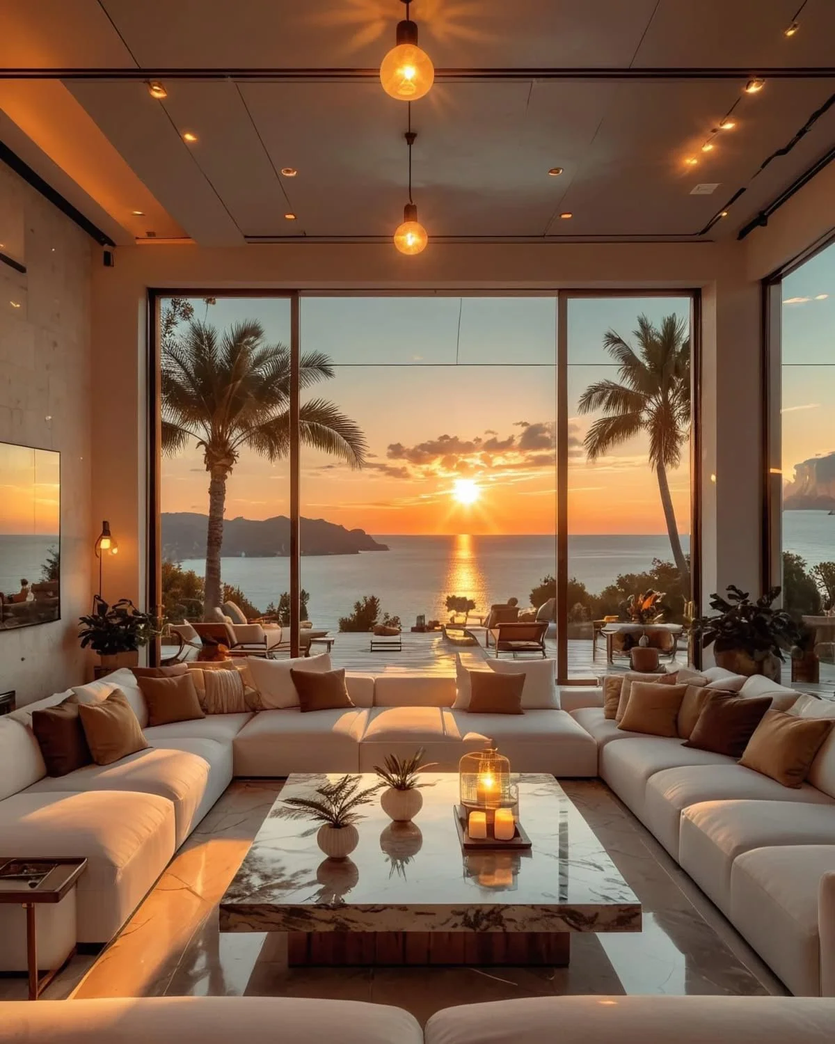
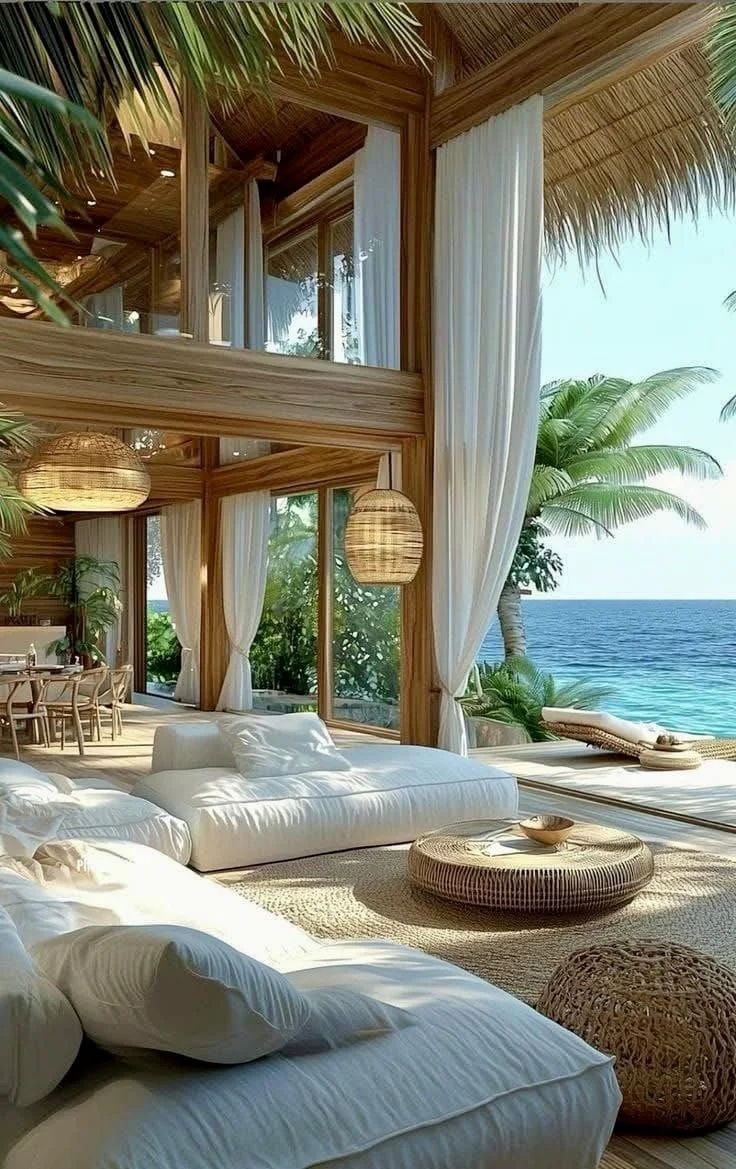
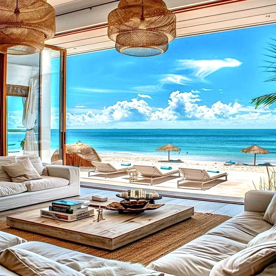
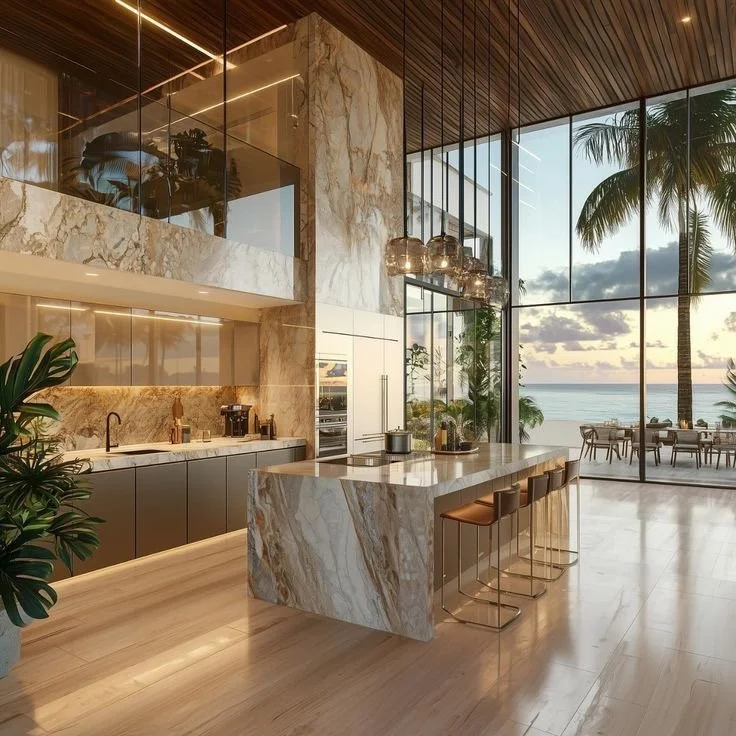
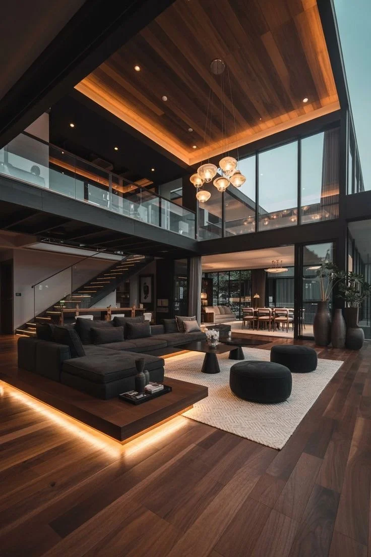
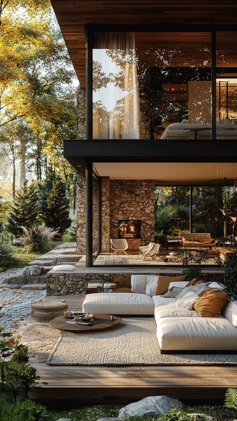
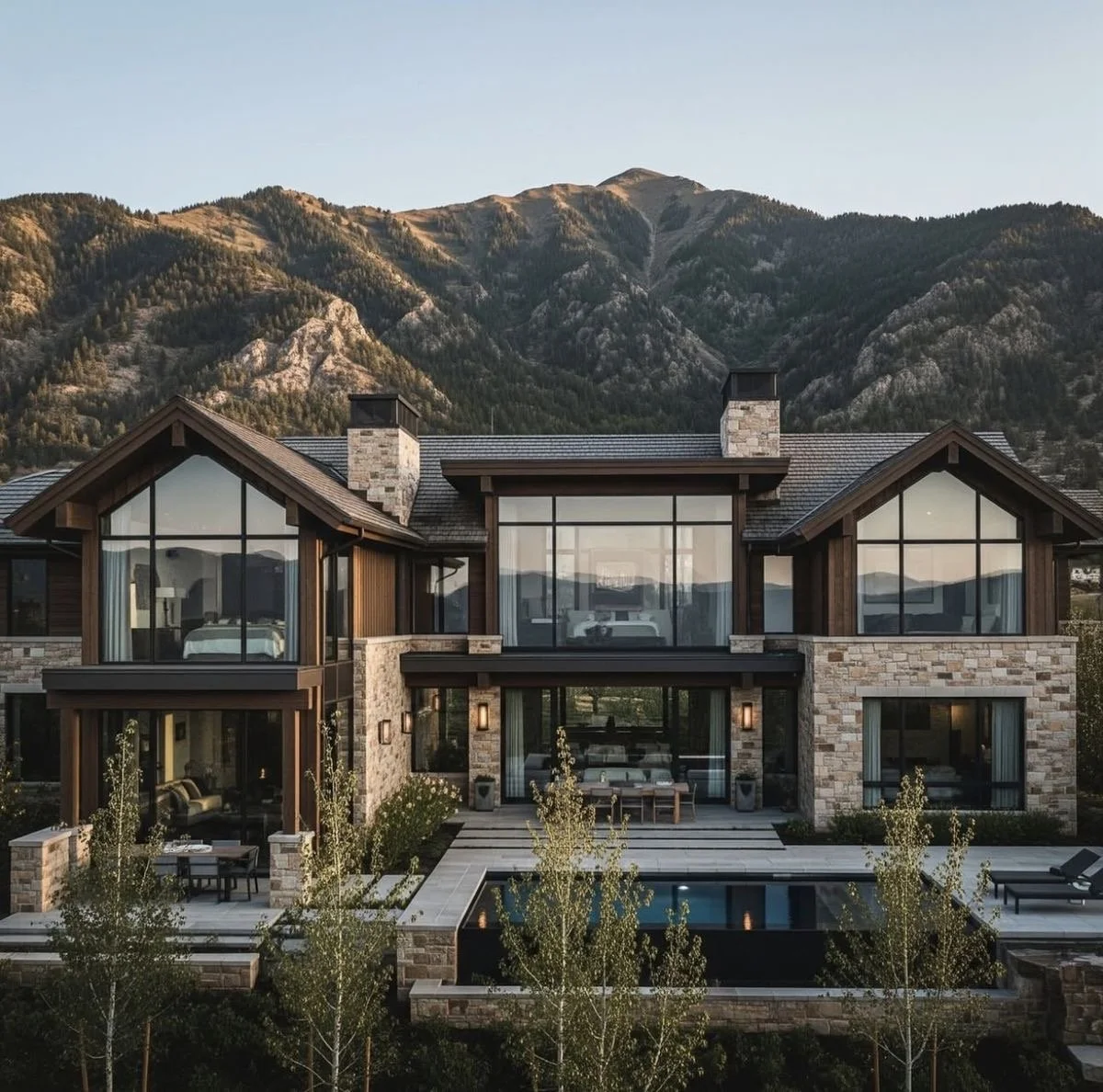
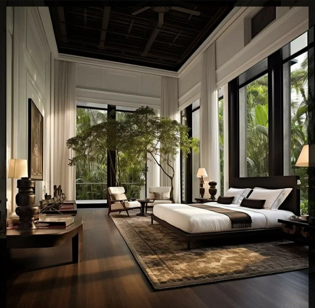
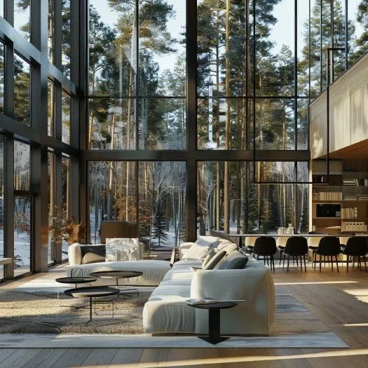
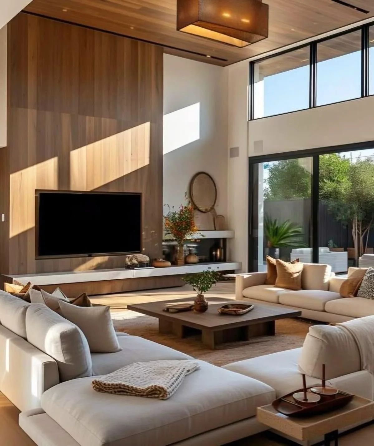
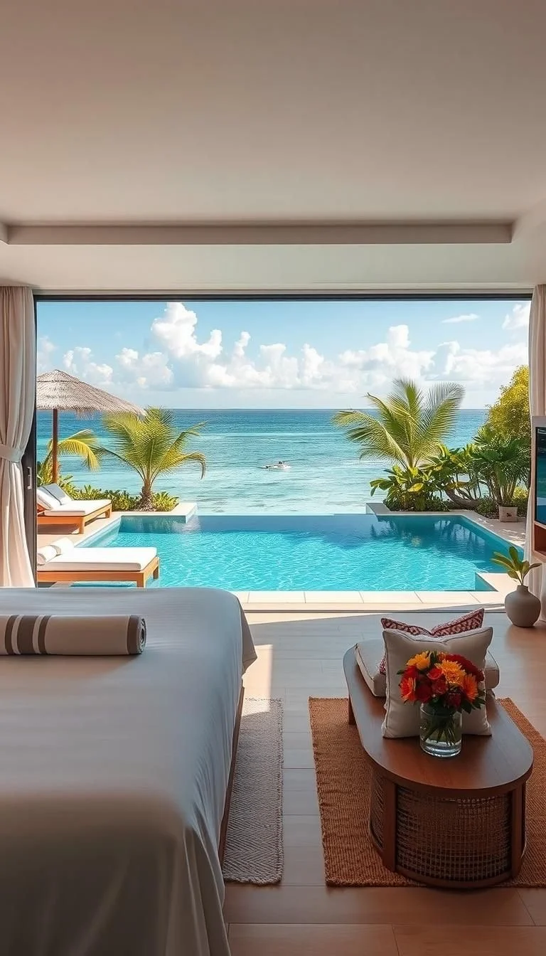
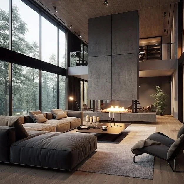
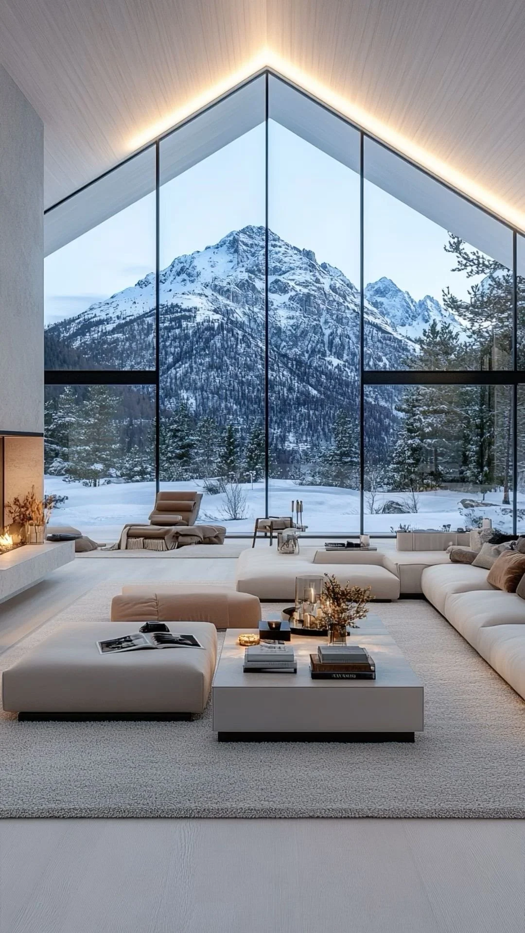
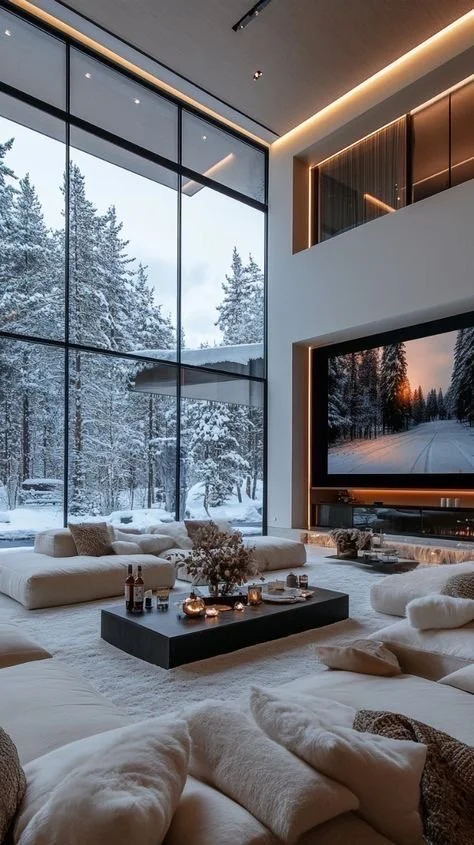
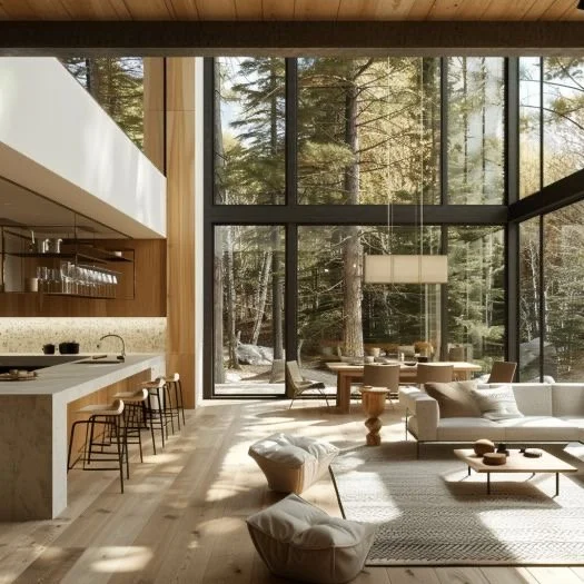
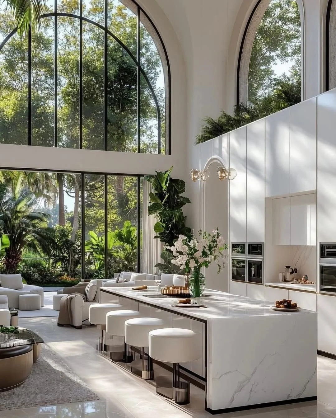
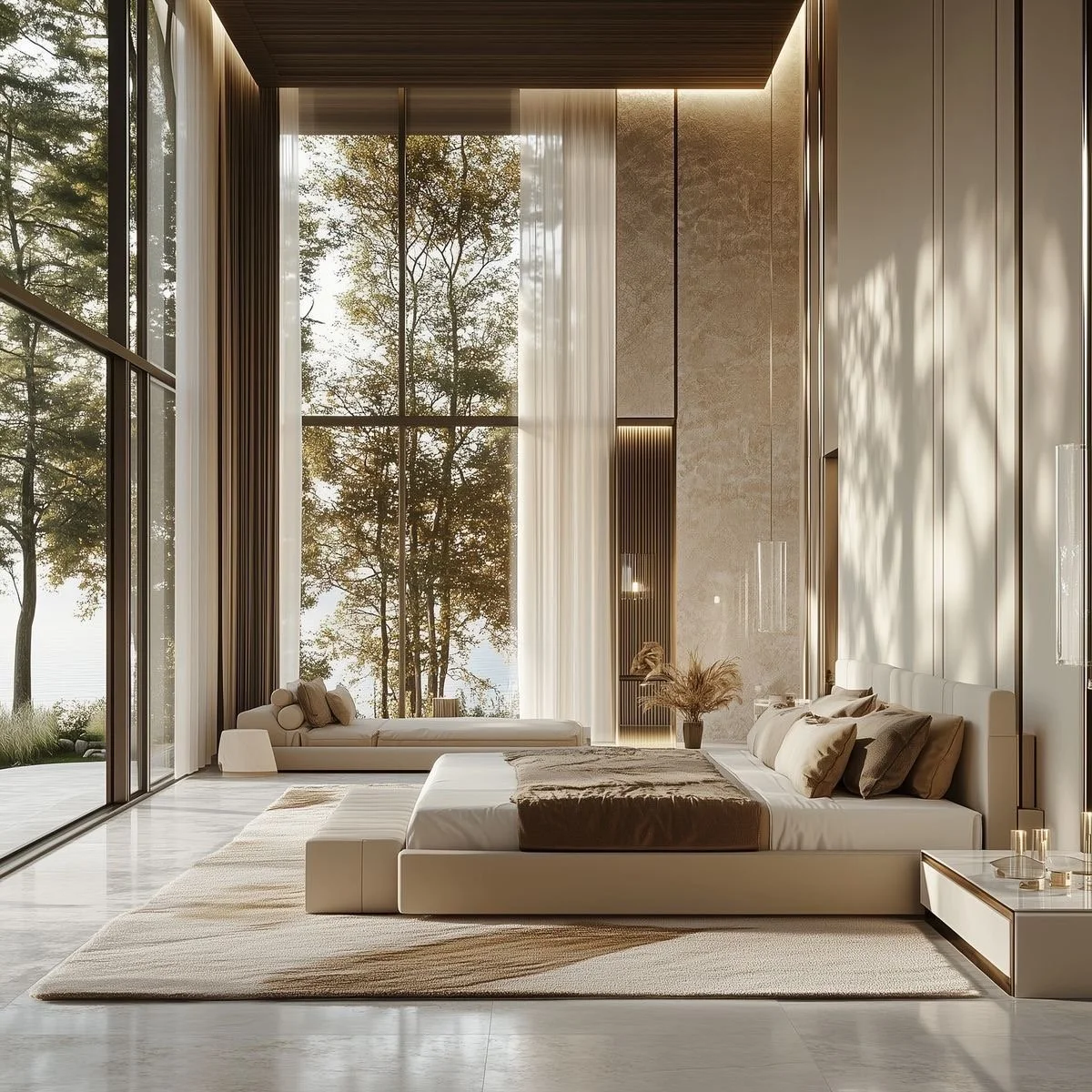
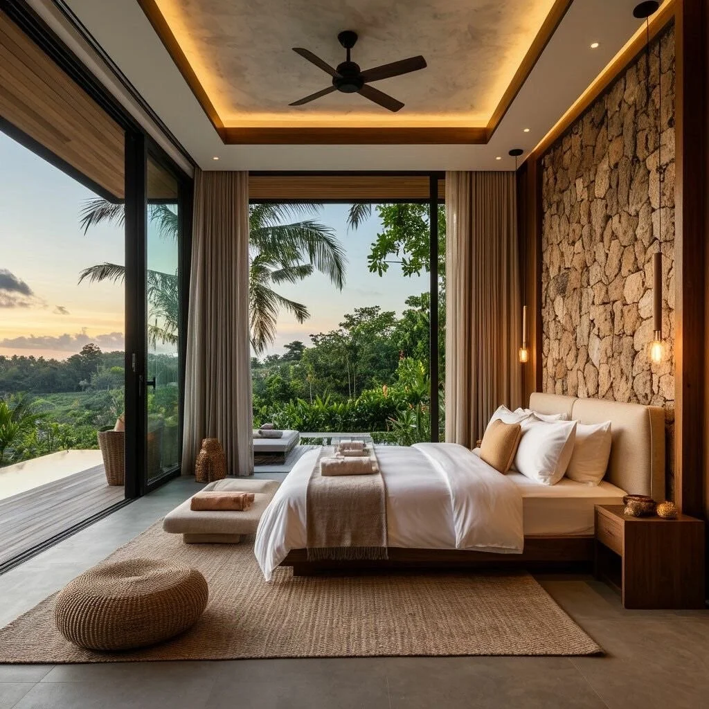
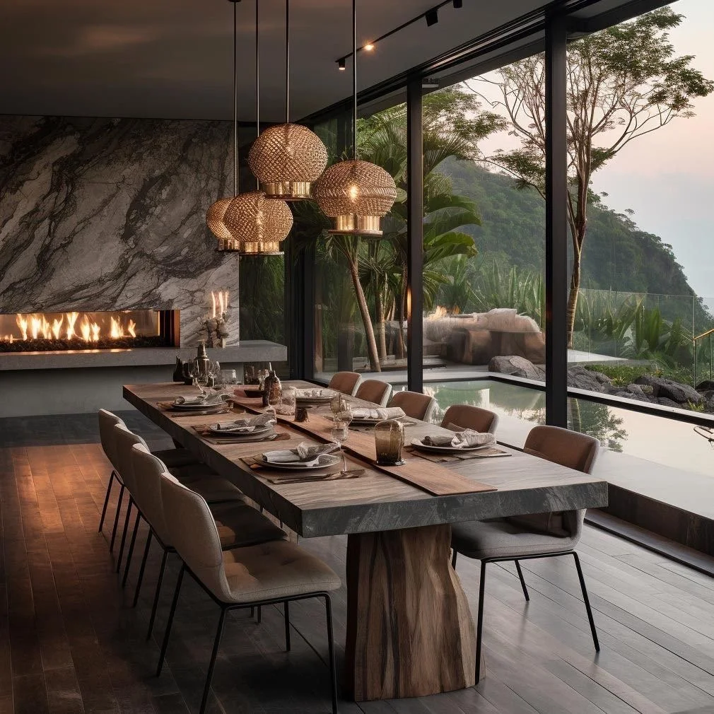
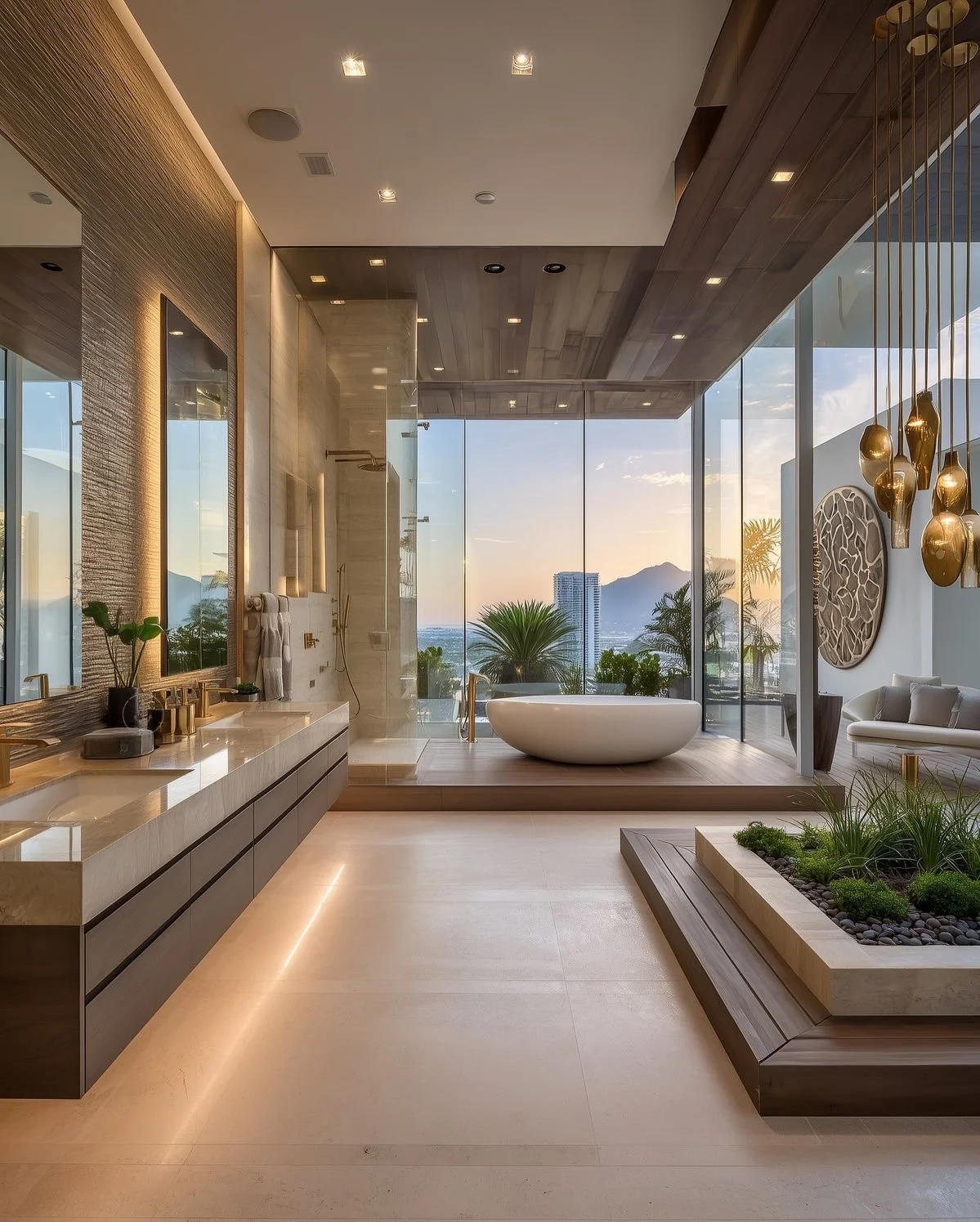
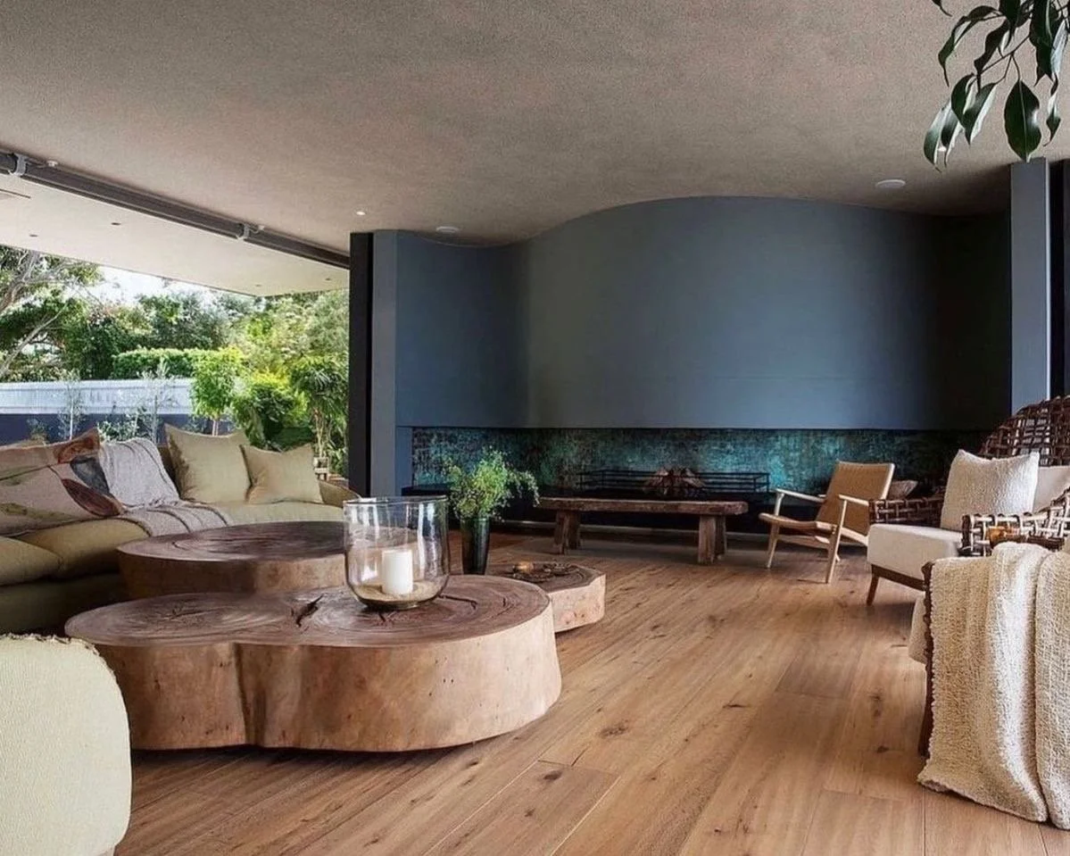
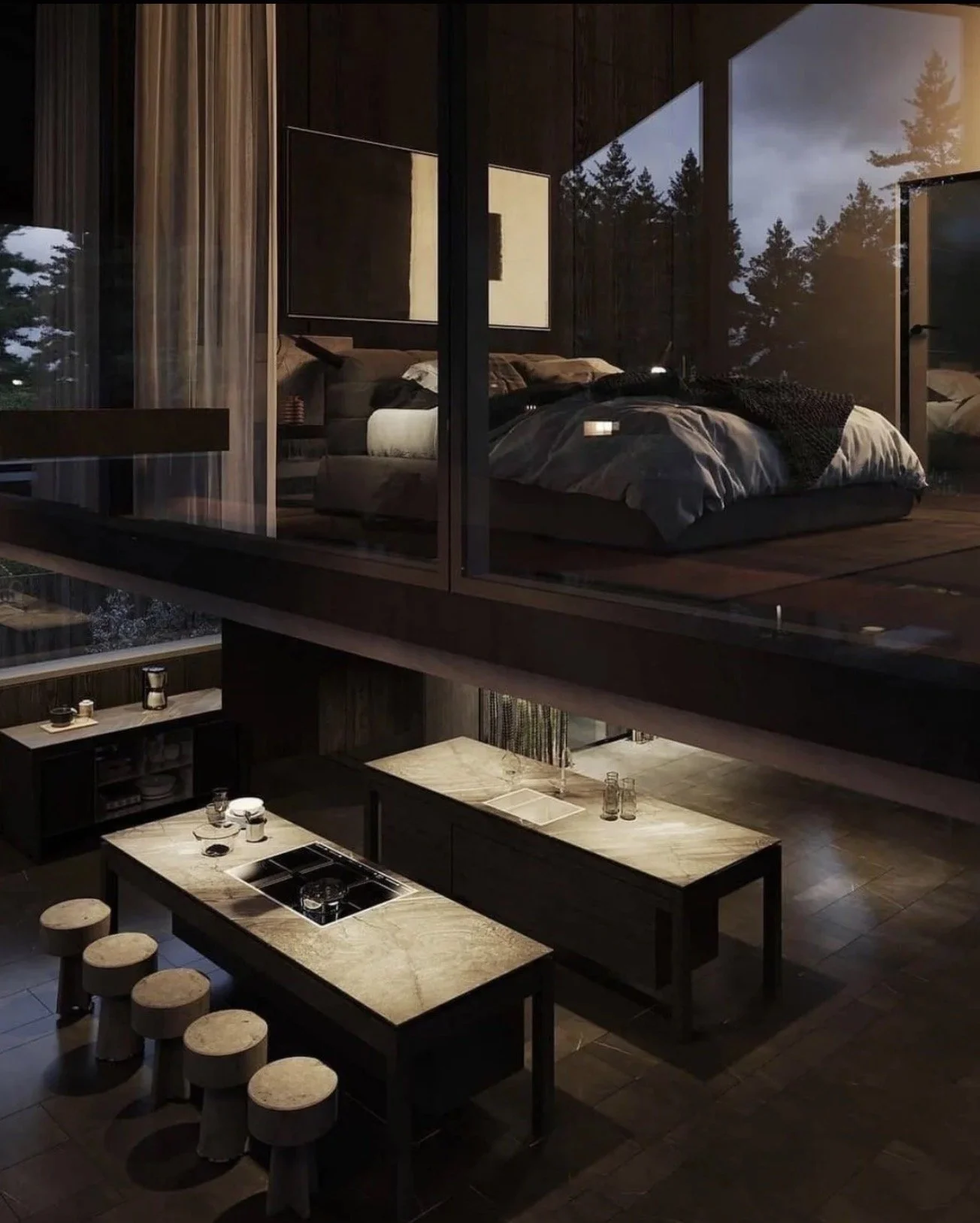
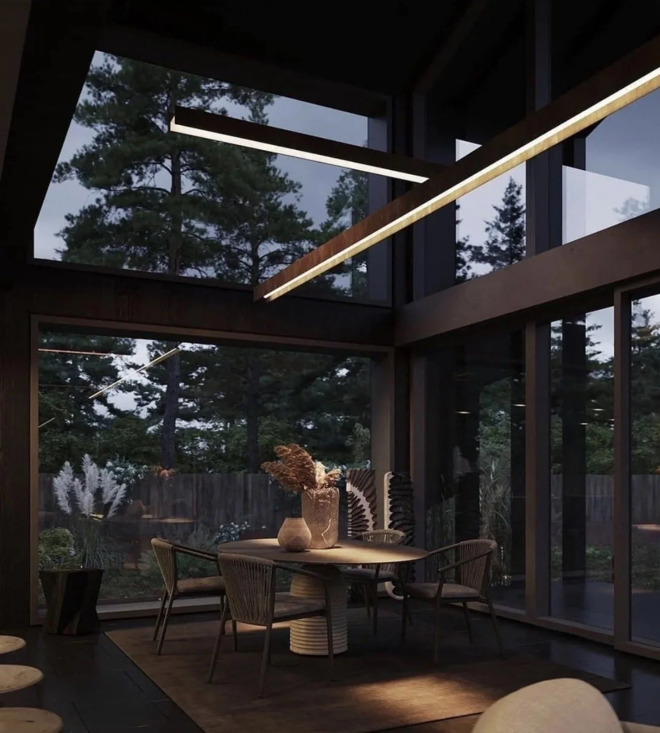
Step 5: Blur the Line Between Indoors and Out
One of the most powerful lessons from resort + luxury short-term design is connection to nature.
In high-end residential architecture, this often becomes the defining feature of a home.
Resort-Level Enhancements:
Large openings that fully dissolve walls to the outdoors
Covered exterior living rooms with the same finishes as interior spaces
Outdoor kitchens + fire features designed for year-round use
👉🏾 Imagine This:
What if your morning coffee felt like a terrace in Tuscany—or a cabana in Cabo?
That's not fantasy. It's architectural intention.
Step 6: Elevate the Everyday Rituals
Luxury isn't about grand gestures alone-it's about making the ordinary feel extraordinary.
Resorts + luxury vacation rentals obsess over small moments. Your home should too.
Truly consider:
A kitchen designed like a chef's prep space, even if you cook casually
A coffee or cocktail station that feels ceremonial
Thoughtful lighting scenes for mornings, afternoons, + evenings
👉🏾 Quick Reflection:
Which daily ritual would you most love to elevate?
That's where meaningful luxury lives.
Final Thought: Design a Home That Feels Like Coming Back, Not Coming Down
The most successful resort-inspired homes don't replicate a destination-they capture a feeling.
As an architectural designer, my role is to translate your experiences, travels, + aspirations into spaces that support how you want to live-not just how you want your home to look.
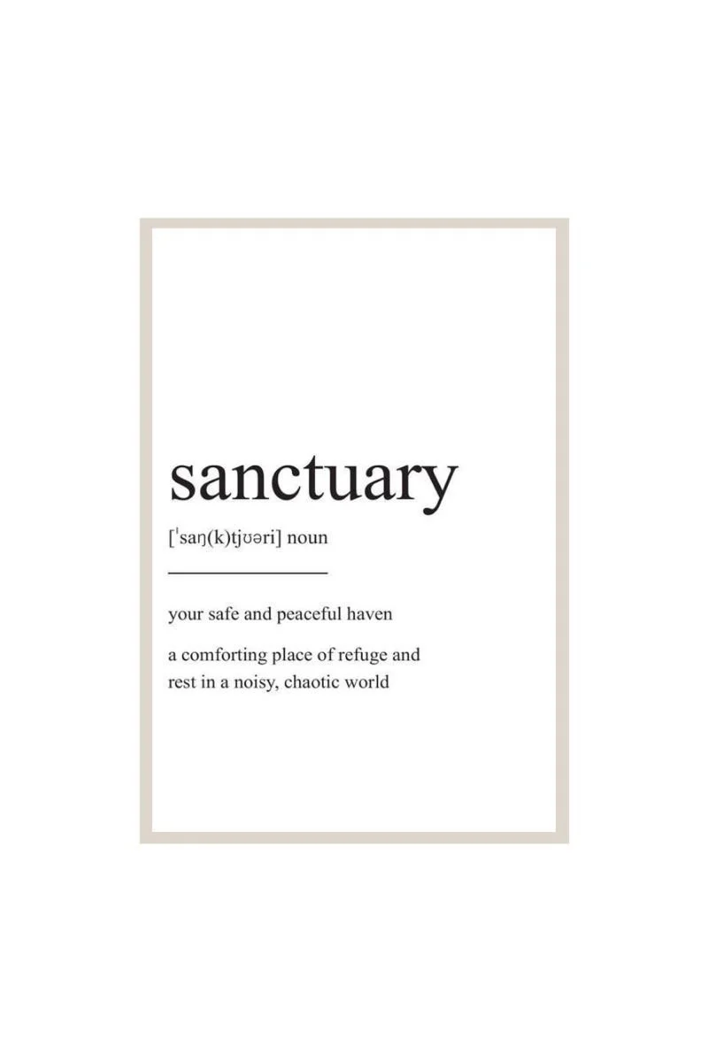
When done well, your home becomes:
A sanctuary
A retreat
A daily reminder of the life you've intentionally designed
And the best part?
You never have to check out.
“True story….that’s MY purpose!”

That part! I thoroughly enjoyed our time together as always. Your energy keeps pushing me + I will forever be grateful. 🙏🏾
Until next time…
Live.Love.Design.
xo Renae
(All pics are courtesy of my Pinterest)
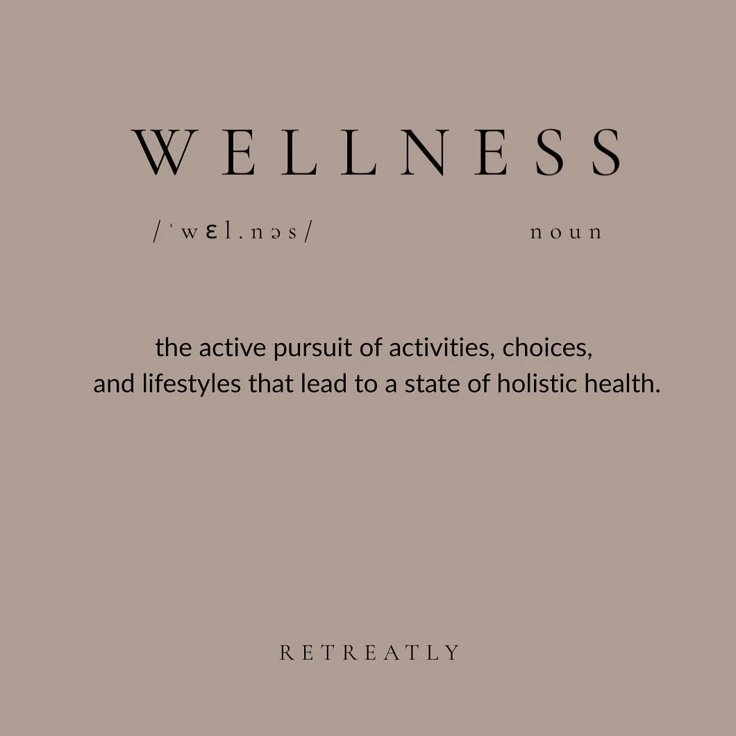
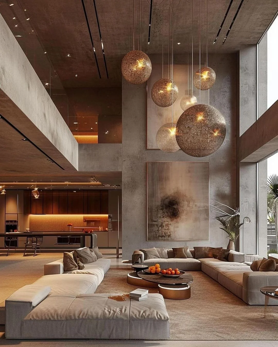
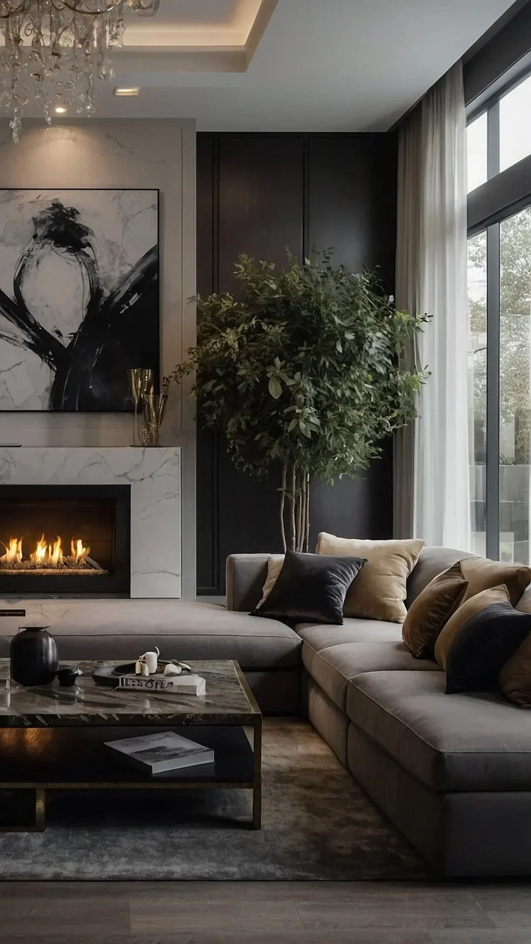
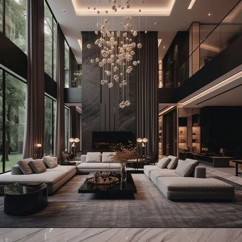
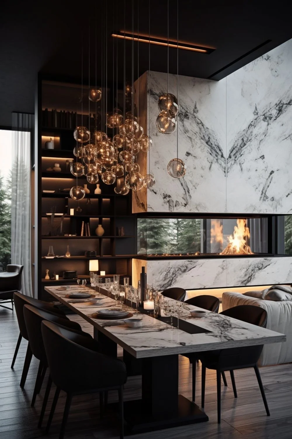
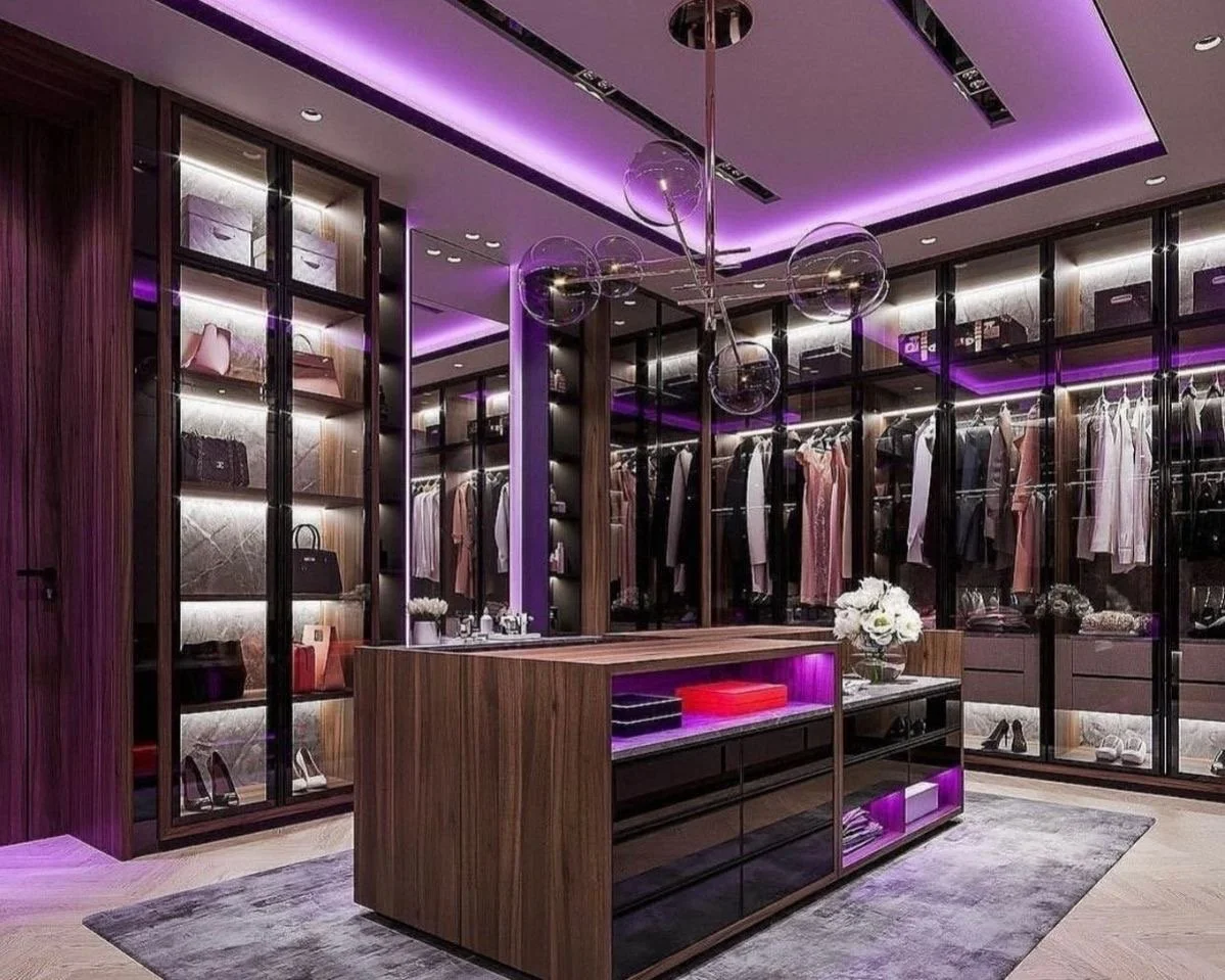
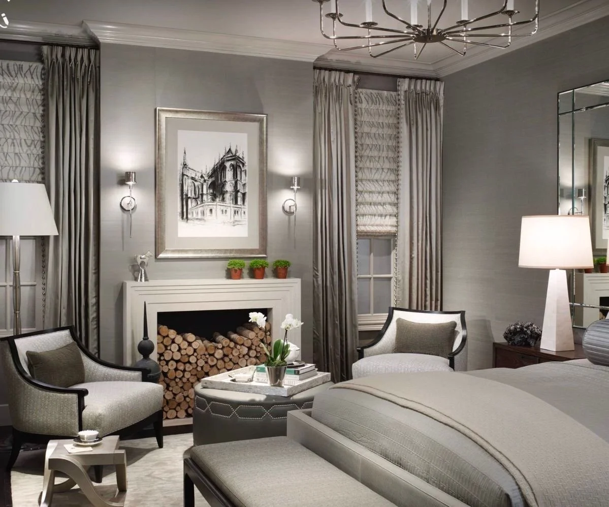
Designing for the Senses: luxury residential architecture that cultivates calm, comfort, + connection….
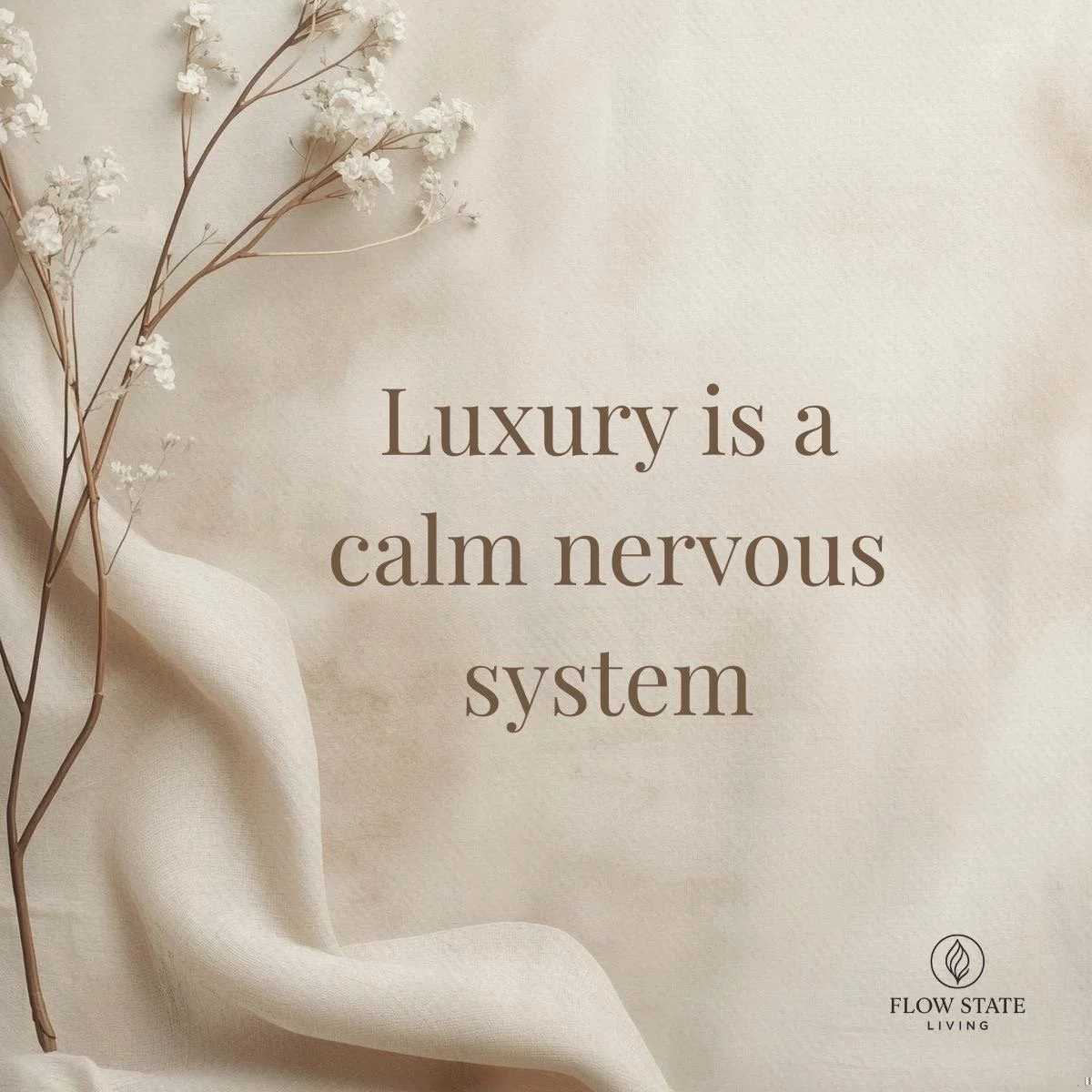
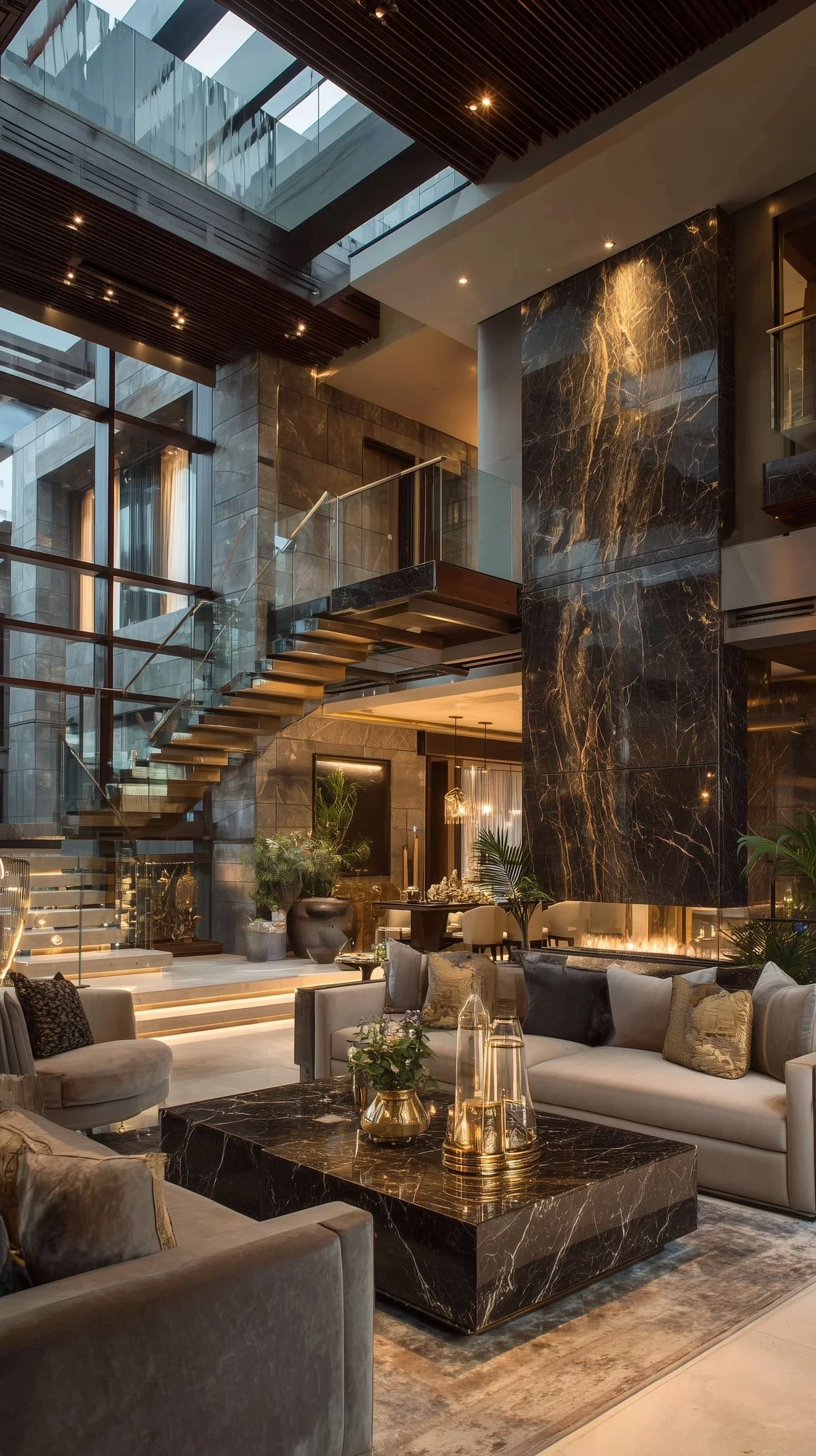
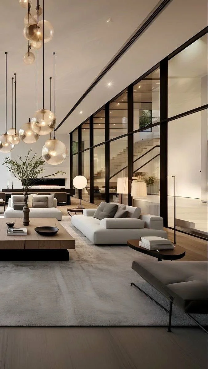
In today's most refined residences, luxury is no longer measured by size or spectacle alone. For discerning homeowners, the true hallmark of luxury residential architecture is how a home feels— how it restores calm, enhances comfort, + supports meaningful connection.
In today's most refined residences, luxury is no longer measured by size or spectacle alone. For discerning homeowners, the true hallmark of luxury residential architecture is how a home feels— how it restores calm, enhances comfort, + supports meaningful connection.
As a seasoned architectural designer specializing in high-end home design, l've seen a distinct shift: clients are no longer asking only for beautiful spaces; they are asking for homes that support well-being, longevity, + everyday ease. This is where wellness-focused design becomes essential—not as a trend, but as a philosophy. Our philosophy. Our authenticity. We are definitely listening + executing. #YesIndeed
The evolution of luxury: from visual impact to sensory experience:
Traditional architectural design often prioritizes visual appeal. Elevated residential design goes further, engaging all five senses to create homes that feel intuitive, restorative, + deeply personal. I know you’ve heard me repeat this time + time again; this is extremely imperative if you want the best outcome possible.
The most successful high-end homes:
Reduce stress the moment you arrive
Feel effortless rather than performative
Support both vibrant entertaining + quiet retreat
This is the foundation of wellness-driven luxury design. Each + every time. #TrustTheProcess
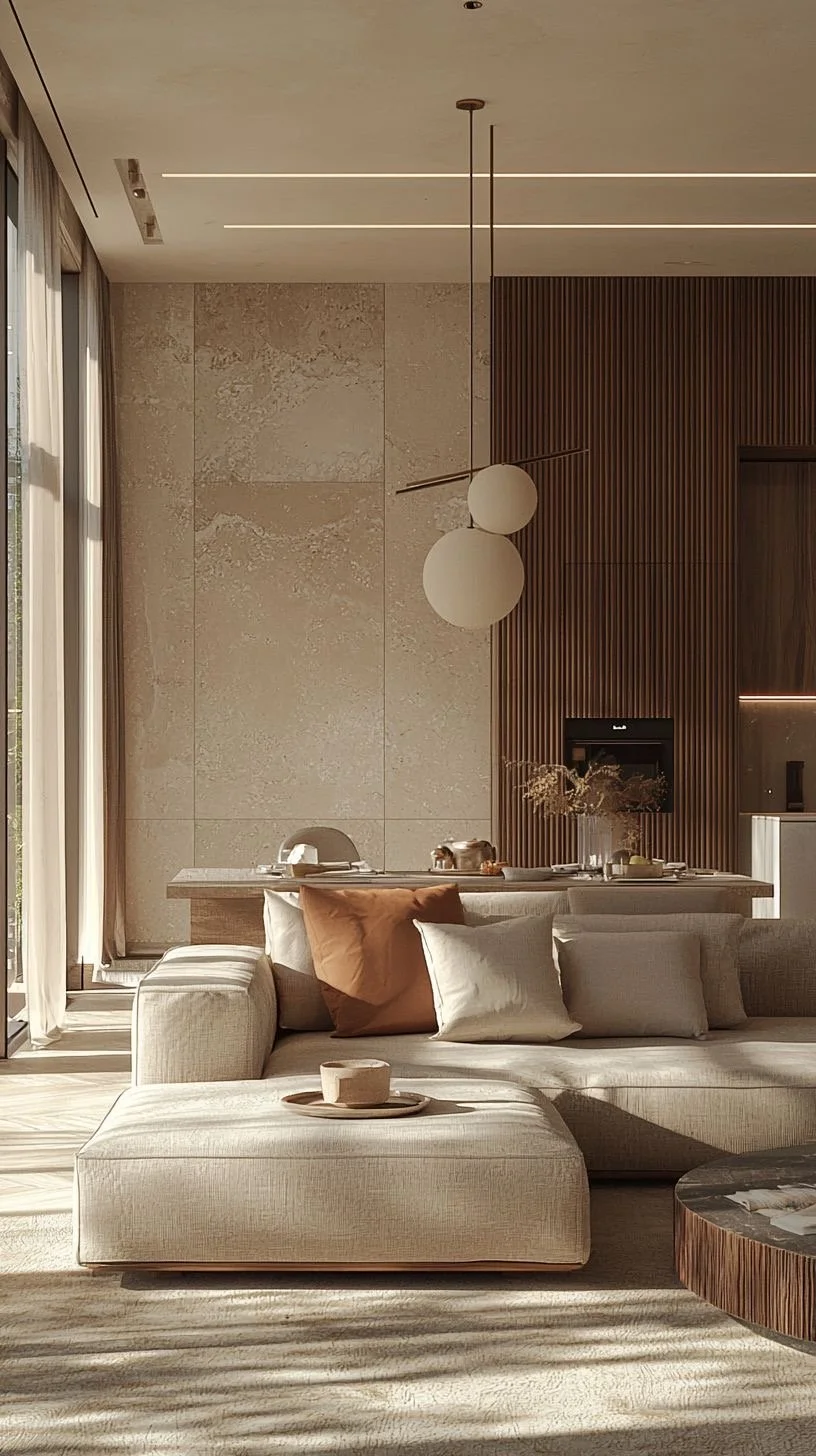
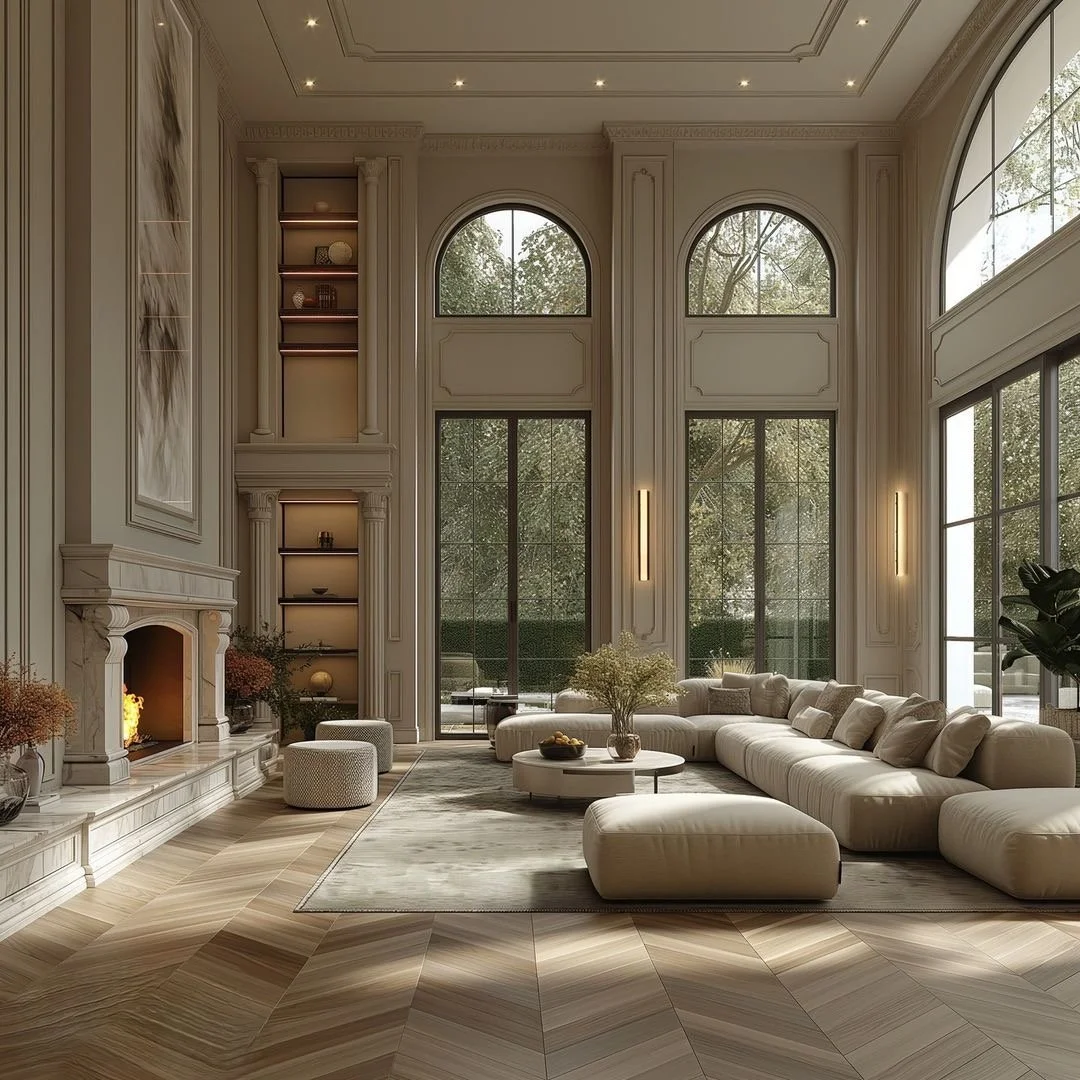
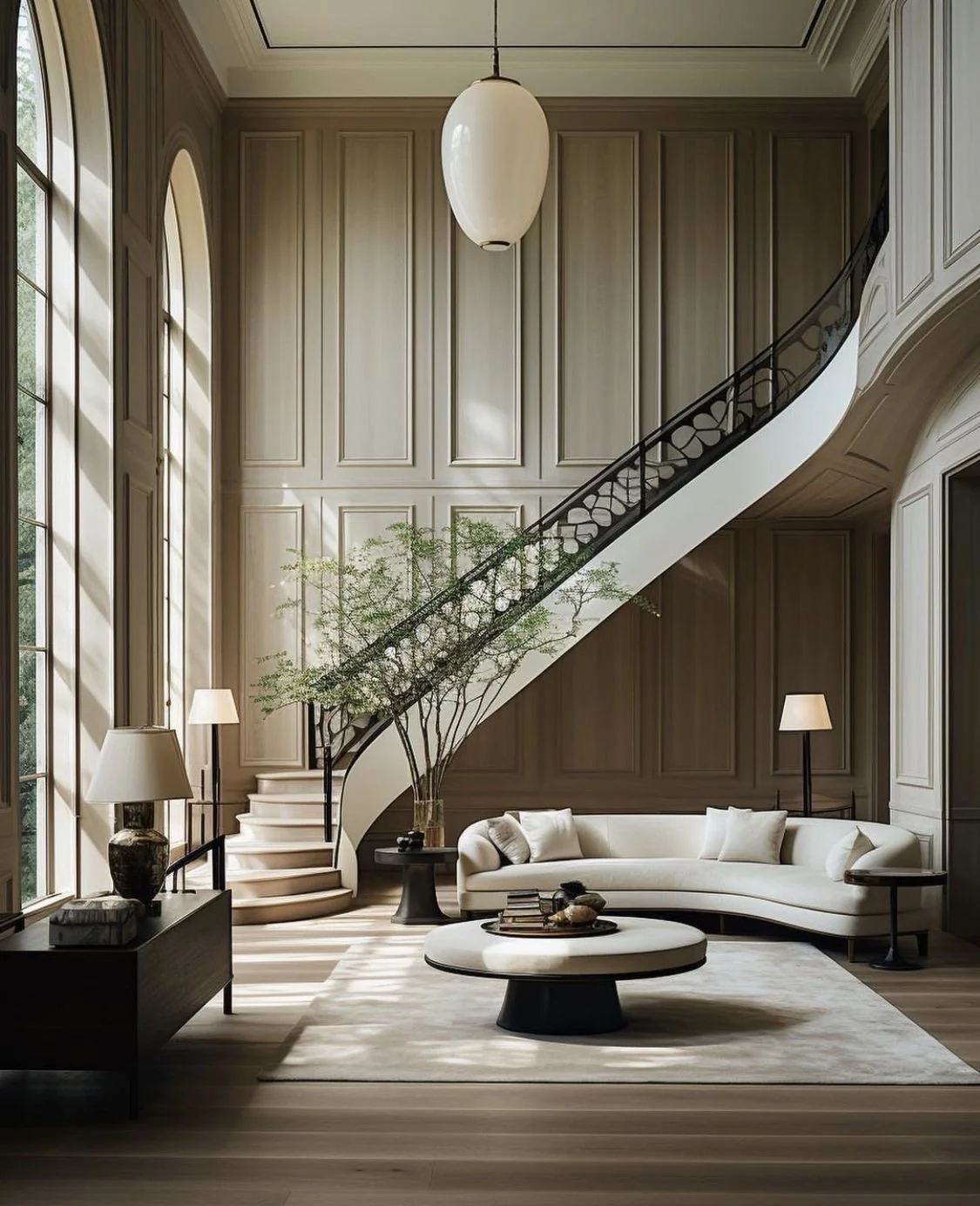
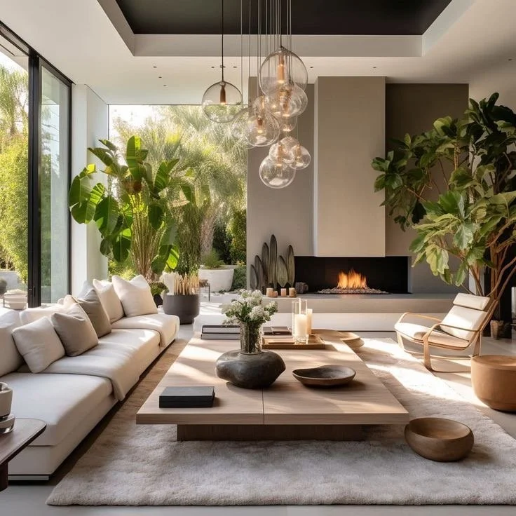
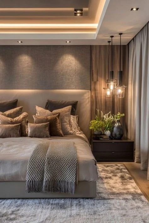
Visual calm in high-end home design:
In luxury residential architecture, visual comfort is achieved through restraint + intentionality rather than excess. Editing is our biggest helpmate within every project.
Key strategies include:
Thoughtful proportions that feel balanced + timeless
Layered natural light that evolves throughout the day
Cohesive material palettes that allow the eye to rest
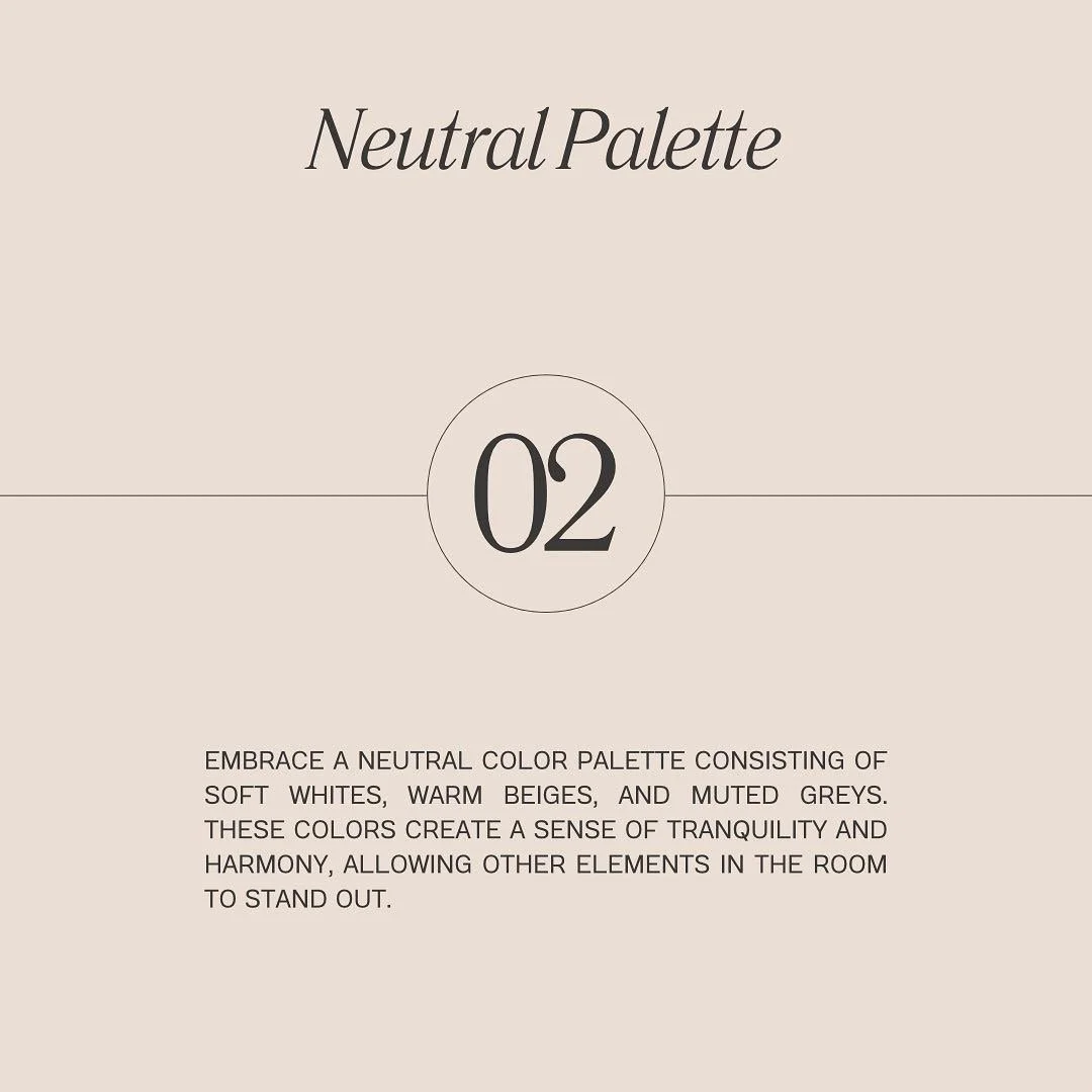
Neutral tones-warm stone, natural wood, soft plaster—create depth without visual clutter. When paired with clean architectural lines, they result in spaces that feel both elevated + emotionally grounding. That does not always mean light + airy as most would assume; dark + moody neutrals are creating visual comfort with balance + stunning layered lighting design.
True luxury is not overwhelming; it's calming.


Acoustic comfort- a quiet luxury:
Sound is one of the most overlooked elements of high-end home design, yet it has a profound impact on daily experience. I wholeheartedly stand by this principled design element in our residential + non-residential projects.
Wellness-focused architectural strategies include:
Integrated acoustic insulation + sound-absorbing finishes
Thoughtful spatial planning to separate active + private zones
Natural ambient elements such as water features or breezeways
When sound is controlled, a home feels serene, intimate, + private-qualities that define modern luxury living.
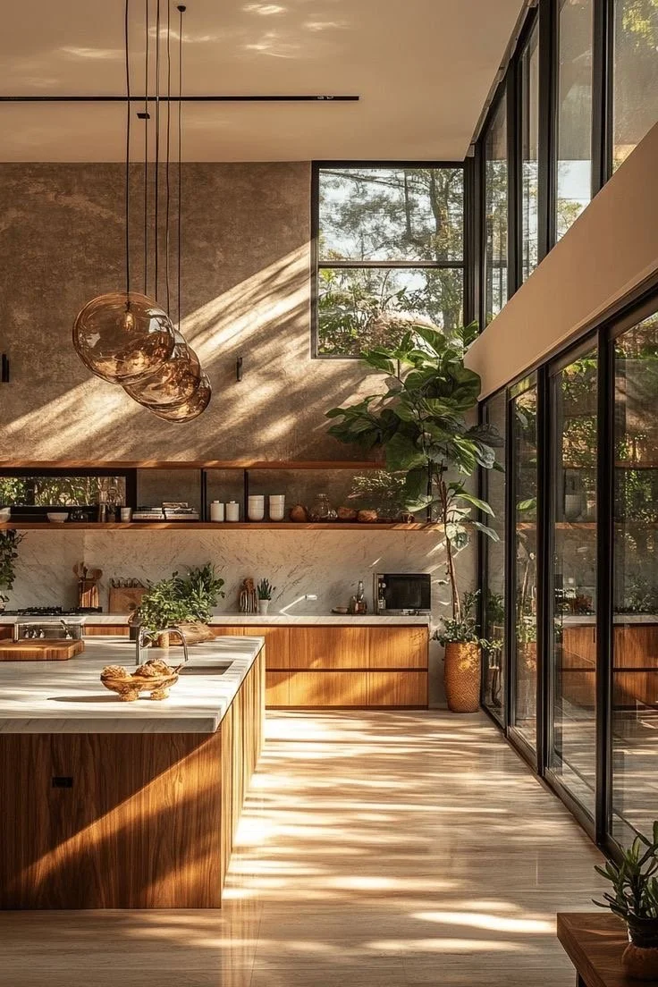
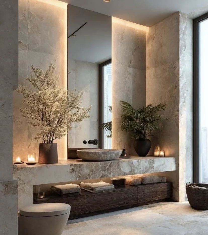
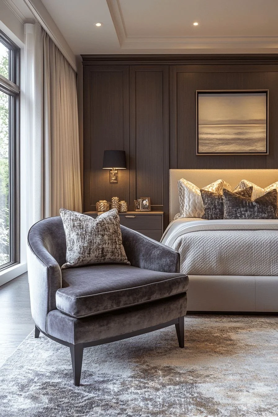
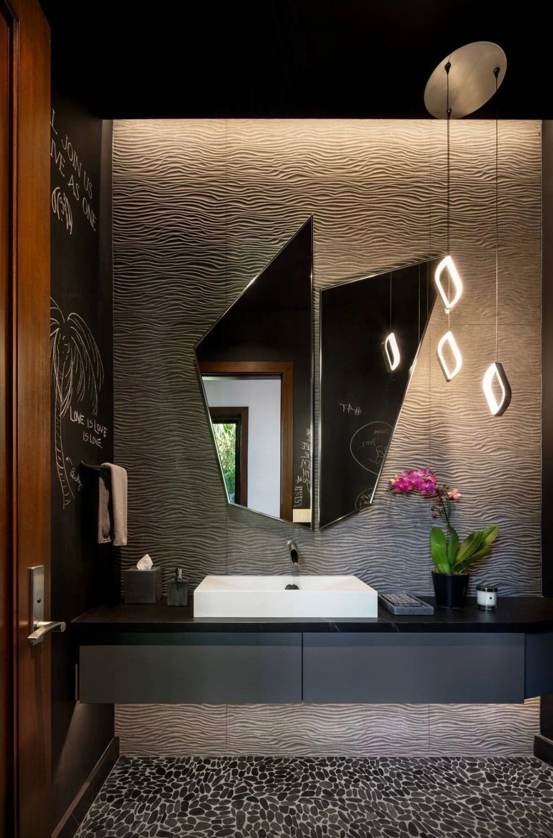
Tactile design- materials that invite connection:
Luxury is experienced through touch as much as sight; allow me to elaborate.
In refined residential architecture, materials are chosen not only for beauty, but for how they feel over time:
Honed stone instead of high-gloss finishes
Hand-finished wood that offers warmth + character
Soft, natural textiles that balance architectural precision
Every interaction-opening a door, walking barefoot across a floor, resting a hand on a railing—reinforces comfort + craftsmanship.
These details are subtle, however, they shape how a home is experienced every day.
Wellness-focused design through air, light, + scent:
Scent + air quality are powerful contributors to emotional wellbeing + are integral to wellness-focused design. Candles, diffusers, + incense are exemplary within the home’s atmosphere, however, from an architectural design standpoint, it is not quite what I mean.
Architectural solutions include:
Cross-ventilation that encourages fresh airflow
Seamless indoor-outdoor connections that bring nature inside
Natural materials that age gracefully + emit subtle, organic scents
Rather than relying on artificial enhancements, luxury architecture allows the home to breathe-creating a sensory environment that feels authentic + restorative.
Designing for connection- the heart of luxury:
At its core, exceptional luxury residential architecture is about connection. Most truly + intentionally. Connection to:
Family + guests, through inviting gathering spaces
Nature, through daylight, views, + outdoor living areas
Self, through private sanctuaries designed for rest + reflection
The most successful high-end home designs balance openness with intimacy. Grand spaces are complemented by quiet retreats.
Social zones flow naturally, while personal spaces provide refuge.
This balance is what transforms a house into a home that supports wellness + longevity.
The new standard of high-end home design:
Today's most desirable homes do not announce their luxury loudly.
Nope…instead, they reveal it through:
Calm rather than chaos
Comfort rather than excess
Connection rather than spectacle
When architecture is designed for the senses, beauty becomes lived-in, wellness becomes intuitive, + luxury becomes timeless.
For homeowners investing in a residence that supports not just how they live-but how they feel-wellness-focused luxury residential architecture is not optional. It is the future of high-end home design + we are so in that vibe.
My current frequency is alignment. Designing is my passion, yes, however, over the past few years, I’ve recommitted my passion through service by just loving + sharing. Honestly, it fuels me to keep engaging + educating discerning homeowners as well as small business owners like myself on the powerful impact-fulness of thoughtful architectural design in the built environment.
“Happy New Year from the Sola fam to you + yours! Wishing you a very blessed + prosperous year….blessings all year long!”

Yes, Lord….lead and I will follow. As always, you know I thoroughly enjoyed myself with you guys.
Until next time…
Live.Love.Design.
xo Renae
(All pics are courtesy of my Pinterest)

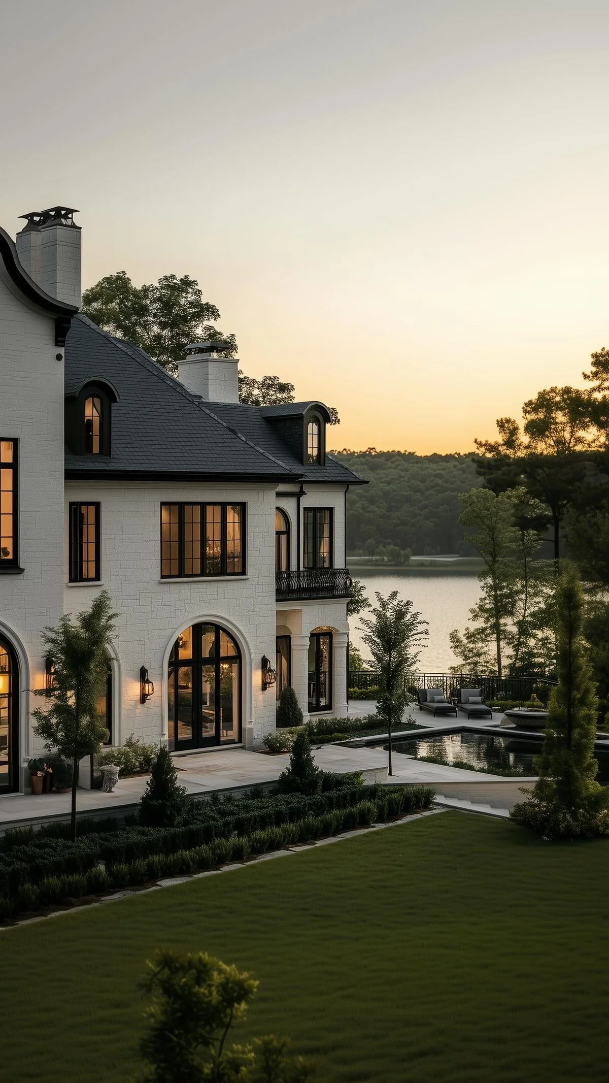
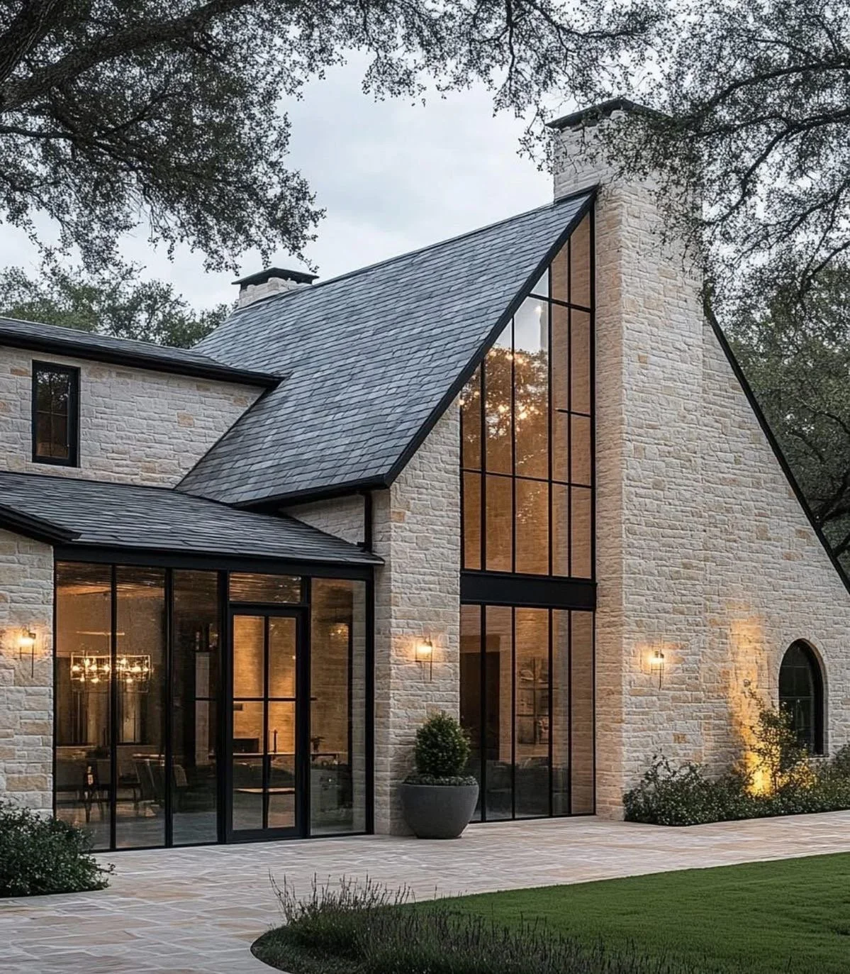
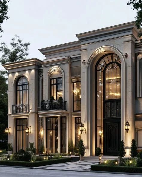
Balancing Heritage + Modernity: How to renovate a luxe classic home with timeless appeal….
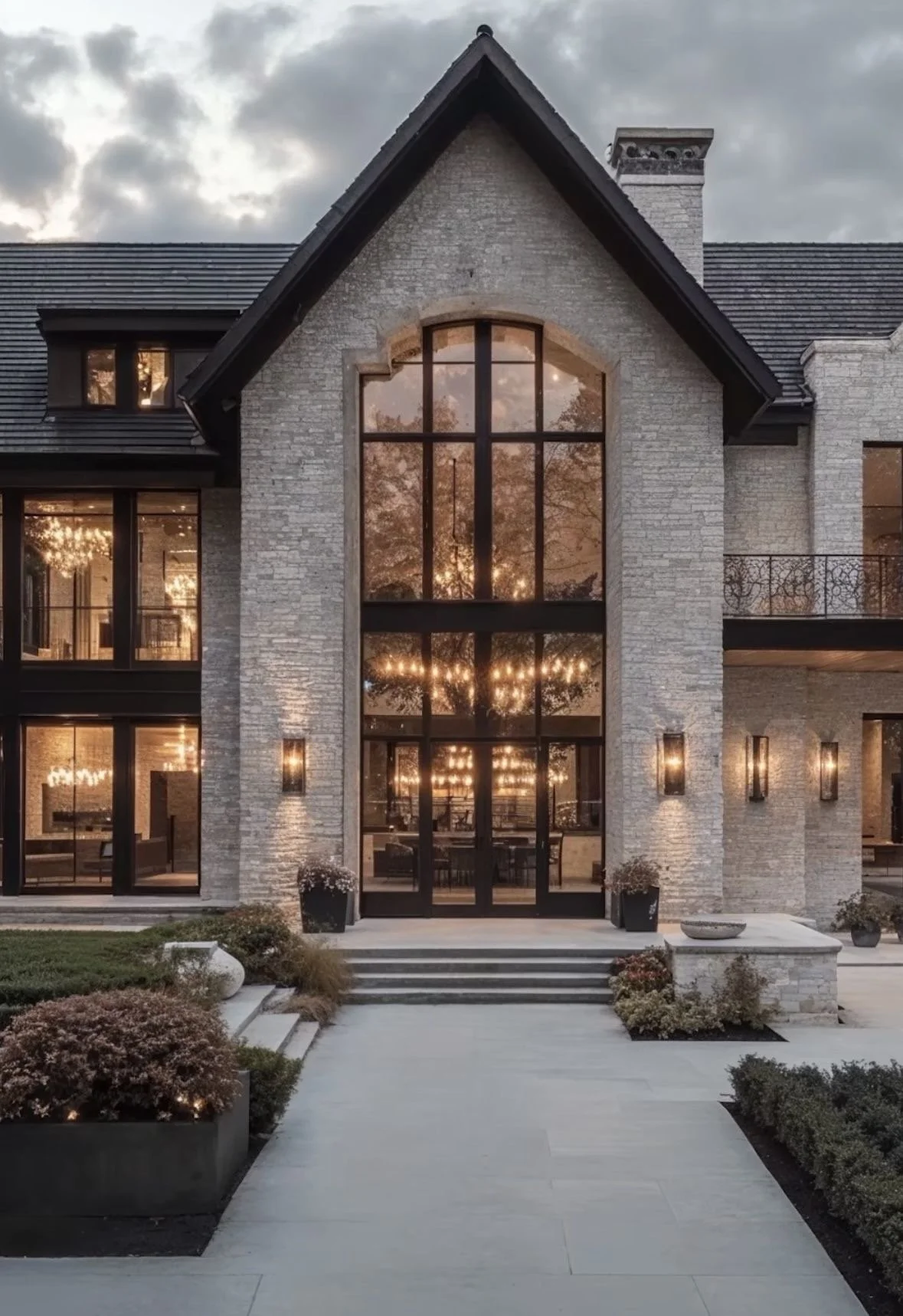
I get this request a lot from clients who want to respectfully renovate their homes but don’t know where to draw the line within the renovation as it relates to their home’s architecture. It’s definitely a line to be drawn from an architectural design standpoint. That intricate yet delicate trained line of balancing heritage or classicism with modernity. I’ve seen it done oh so beautifully, however, there are still some renovations that are unbelievably unbalanced and typically rely heavier on the modernity rather than fully embracing the architecture’s heritage, which is so unsettling in my opinion. I feel the urge to share a few tidbits on how to honor your home’s history while bringing it into today’s world with modern materials (exterior + interior) and subtle luxury.
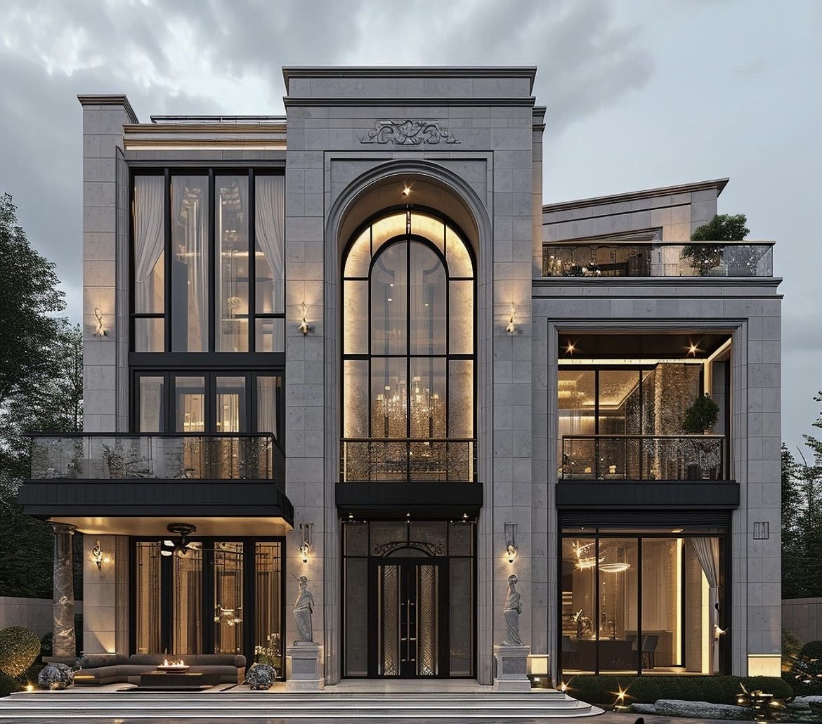
I get this request a lot from clients who want to respectfully renovate their homes but don’t know where to draw the line within the renovation as it relates to their home’s architecture. It’s definitely a line to be drawn from an architectural design standpoint. That intricate yet delicate trained line of balancing heritage or classicism with modernity. I’ve seen it done oh so beautifully, however, there are still some renovations that are unbelievably unbalanced and typically rely heavier on the modernity rather than fully embracing the architecture’s heritage, which is so unsettling in my opinion. I feel the urge to share a few tidbits on how to honor your home’s history while bringing it into today’s world with modern materials (exterior + interior) and subtle luxury. Let’s begin! Yeesss! This architecture is neoclassical revival with modern emphasis (peep the gorgeous windows, doors, arch, + balconies). This property is properly stunning utilizing lighting to highlight the asymmetry of the architecture….LOVE!
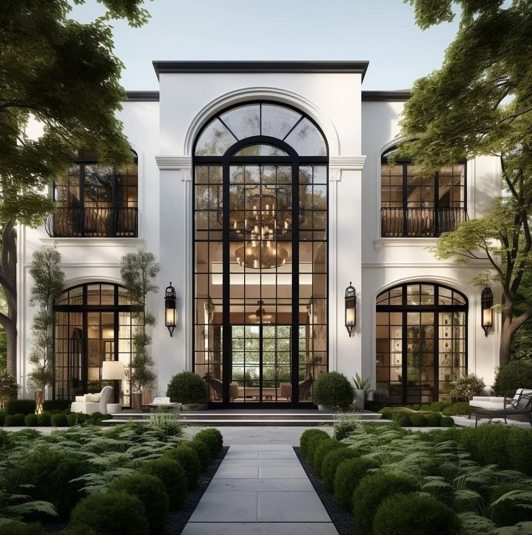
When planned out accurately, your renovation will marry the architecture’s heritage with modern technology advantageously. Not only will your home reflect you and your family well from an architectural design perspective, it will also create more value from a real estate perspective, which is a win-win! Let’s review a few more extraordinary case-studies to gain more insight on how a great balance of heritage + modernity should appear like!
Sublime examples…yesss! Ensuring that design principles + elements are present as well as embracing the home’s architecture goes a long way in finding great success in luxury home renovations. Those illustrations showcased notable exteriors, let’s journey into some fabulous interiors that also impressively balance heritage with modernism. Yes? Indeed!
Who doesn’t love wide plank herringbone wood floors and arched cased openings and dramatic two-story ceilings with equally dramatic and stunning windows + doors? I mean what is there not to love??? The curated lighting meets the intricate details of the railing as well as the treads and the risers with the dope ceiling details down to the potted plants and simplicity of the neutral color palette. This is one of many sensational interiors we will explore together….lovely, right?
Giving all the warm + fuzzies! Yesss! That’s exactly what great design exudes…
Love the holiday cheer in this space…classic yet plush with a modern touch!
There’s nothing like profound, thoughtful design choices to create a timeless feel…..wouldn’t you agree?
What I wholeheartedly appreciate about timeless design is how versatile + enduring it truly can be when done appropriately. A few minor refreshes every 8-10 years or even longer most times upholds the value of the investment a renovation undergoes. Embracing the home’s architecture with the personalities of the home dwellers as well as modern technology creates a balanced yet profound masterpiece. Old soul; modern spirit. That’s timeless design! I’m definitely here for that! You know, I will always remind you that selecting the right experienced and heavily trained design professionals is half the battle, so select well. I’ve totally enjoyed this lil’ journey and look forward to future chats.
Until next time….
Live.Love.Design.
xo Renae
(All pictures are courtesy of my Pinterest)

From Bland to Brand: Architectural Design Strategies for a Signature Vacation Rental Look…
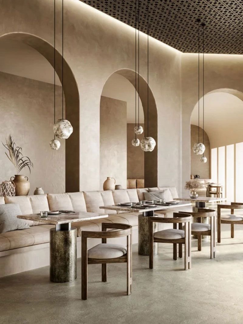
Many clients whom have jumped from owning ordinary vacation rentals to luxury vacation rentals keep repeating the same tune: Why oh why did I not think of doing this sooner? And I tell them the same thing that I will share with you; when you know, you know. Yes, as short-term vacation rental owners, you may already have successful bookings, however, what you truly desire, is longevity + originality. That usually requires thoughtful + resourceful strategy. I will share one of many strategies our studio utilizes to assist short-term vacation rental owners from being ordinary to extraordinary. Discover how to create a cohesive design identity that strengthens your rental brand and attracts premium guests.
Many clients whom have jumped from owning ordinary vacation rentals to luxury vacation rentals keep repeating the same tune: Why oh why did I not think of doing this sooner? And I tell them the same thing that I will share with you; when you know, you know. Yes, as short-term vacation rental owners, you may already have successful bookings, however, what you truly desire, is longevity + originality. That usually requires thoughtful + resourceful strategy. I will share one of many strategies our studio utilizes to assist short-term vacation rental owners from being ordinary to extraordinary. Discover how to create a cohesive design identity that strengthens your rental brand and attracts premium guests. Isn’t this dining room just spectacular? Yassssss!
Always leading with empathy…. I’m truly passionate about sharing and educating my savvy STR owners, especially when they want to reach the next level in their business. Help is on the way! The smallest tidbits could be the difference between ordinary and extraordinary; TRUST!
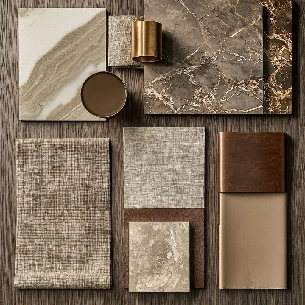
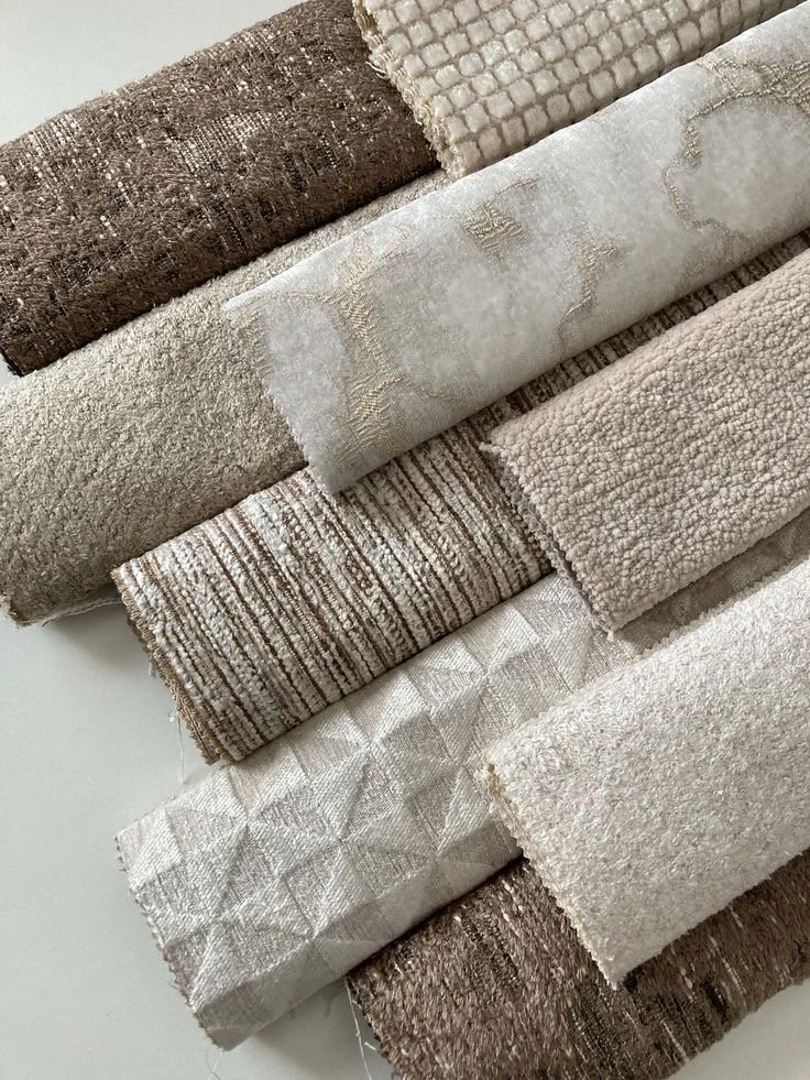
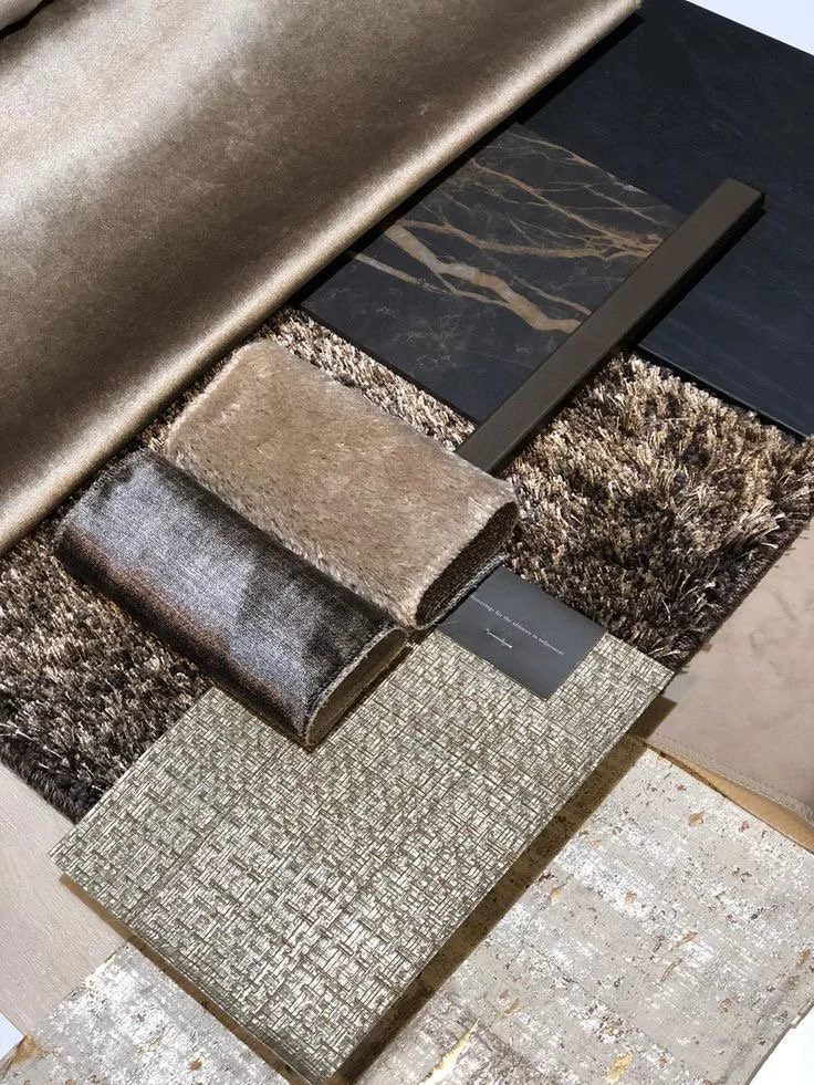
Let’s dive in…this is one of those details that many clients misinterpret when discussed in the preprogramming design stage. Attracting premium guests takes a curated eye and a myriad of detailed decisions that captivate + entice even the most comprehensively-thorough tasteful individual. Those guests expect luxe in many forms from spatial living, amenities, proximity to deluxe activities to varied textures, multiple finishes, layers of lighting, and statement pieces. The latter is our focused strategy this session….and it is sure to help solidify your signature look for your luxury vacation rental. Yesss, indeed.
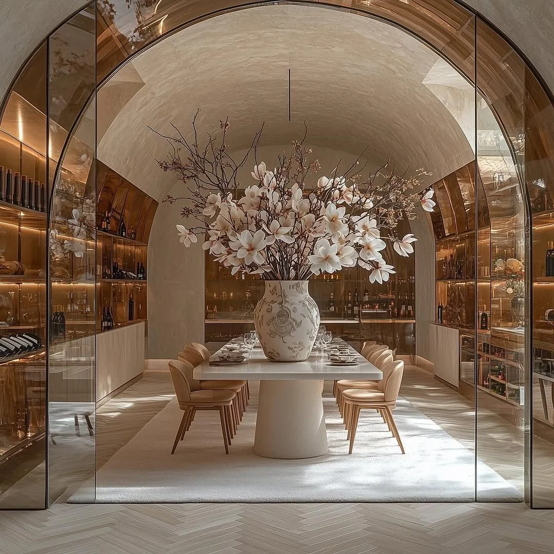
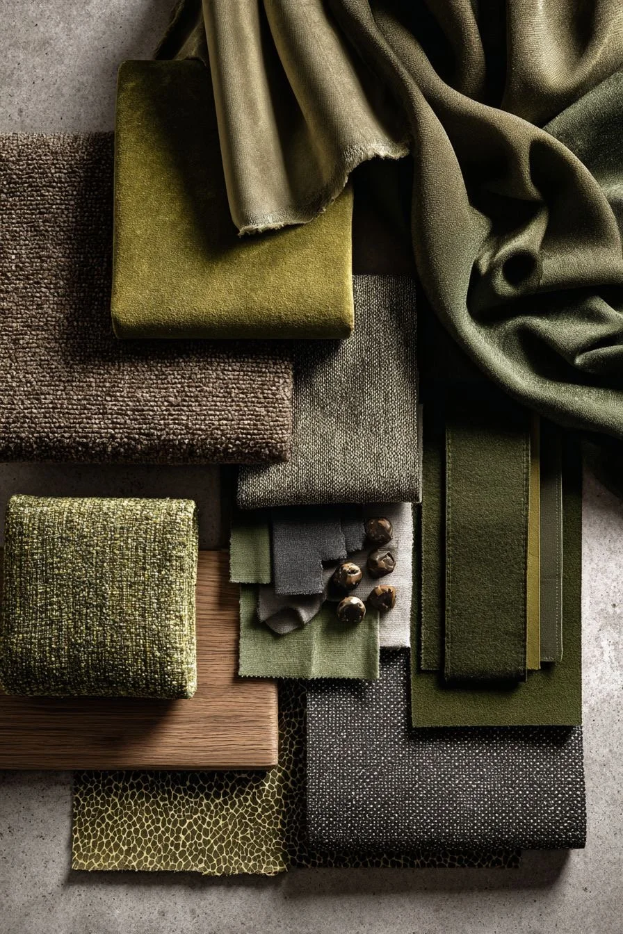
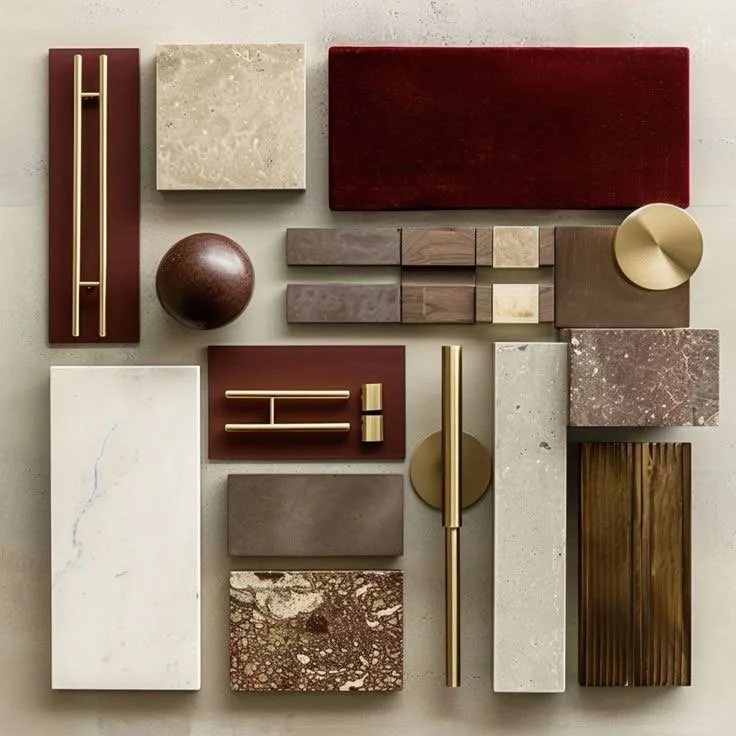
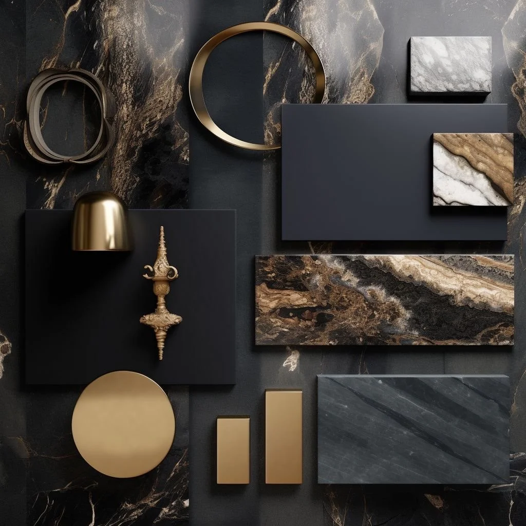
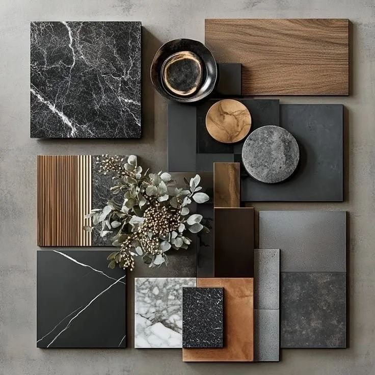
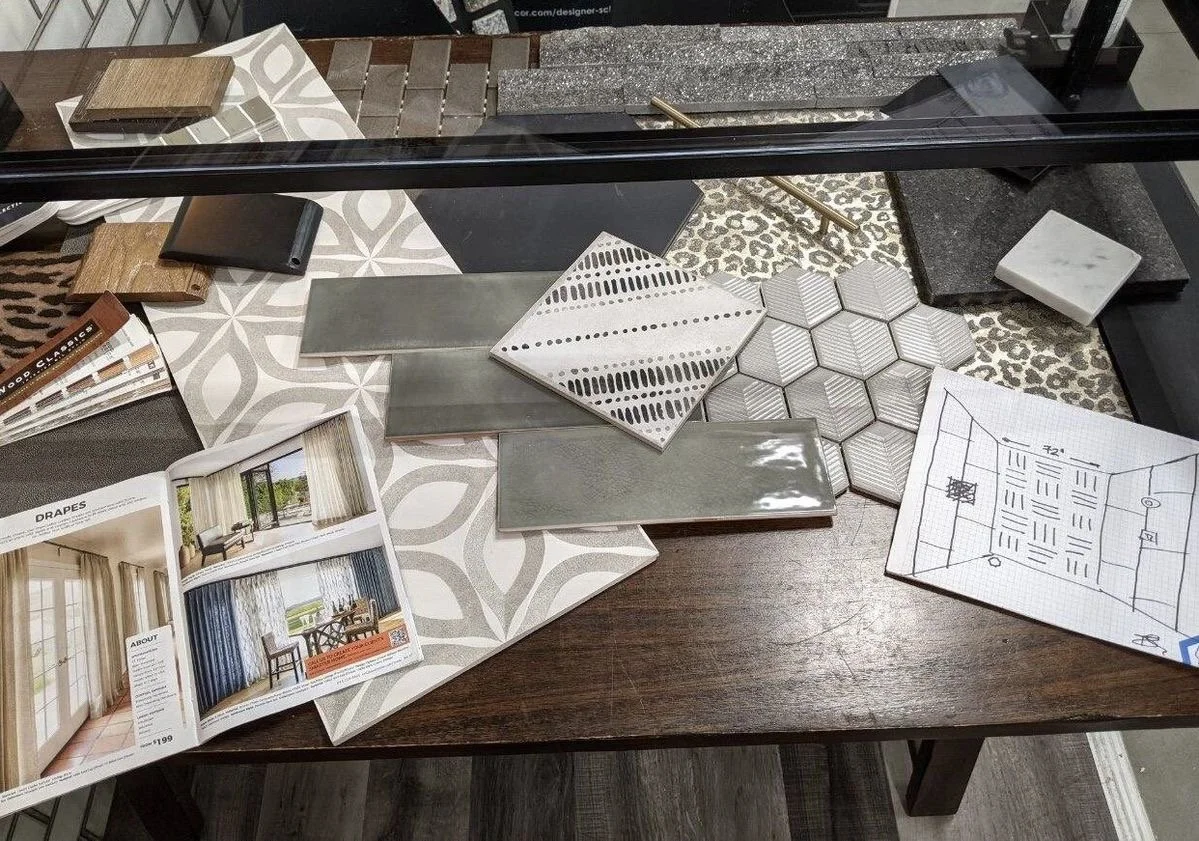
Ensuring spaces have layering textures, finishes, lighting, and statement pieces showcases just how special your luxury short-term vacation rental could be for premium guests who love to impress + entertain. Here are a few examples of various areas of villas where first impressions are imperative to entertaining with VIP guests! The architectural design features enhance the spaces utilizing design principles to reinforce the aesthetic beautifully. The intricate details of fabrics + materials used, furnishings, and the added accessories complement the spaces while accentuating the brand intentionally.
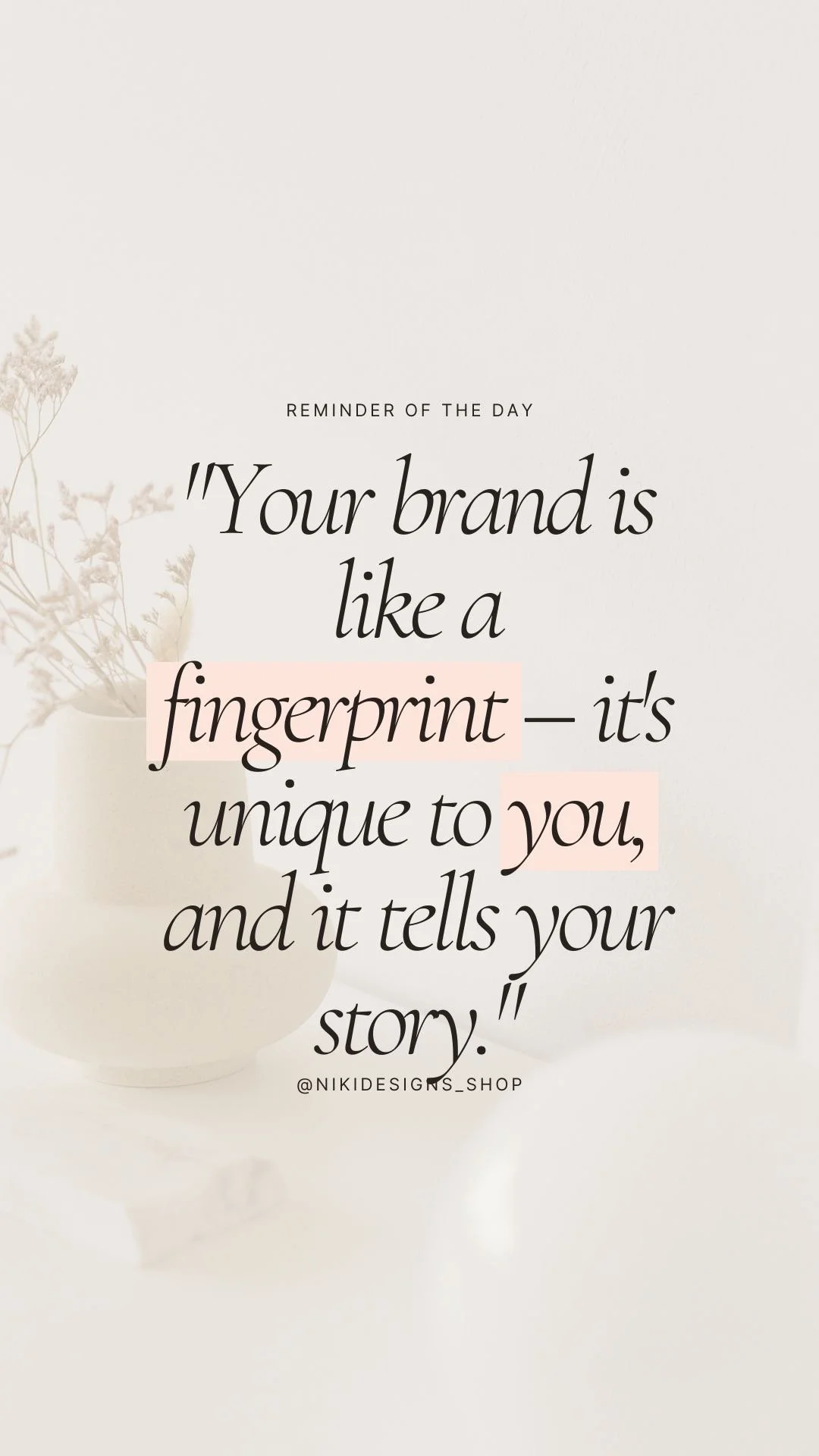
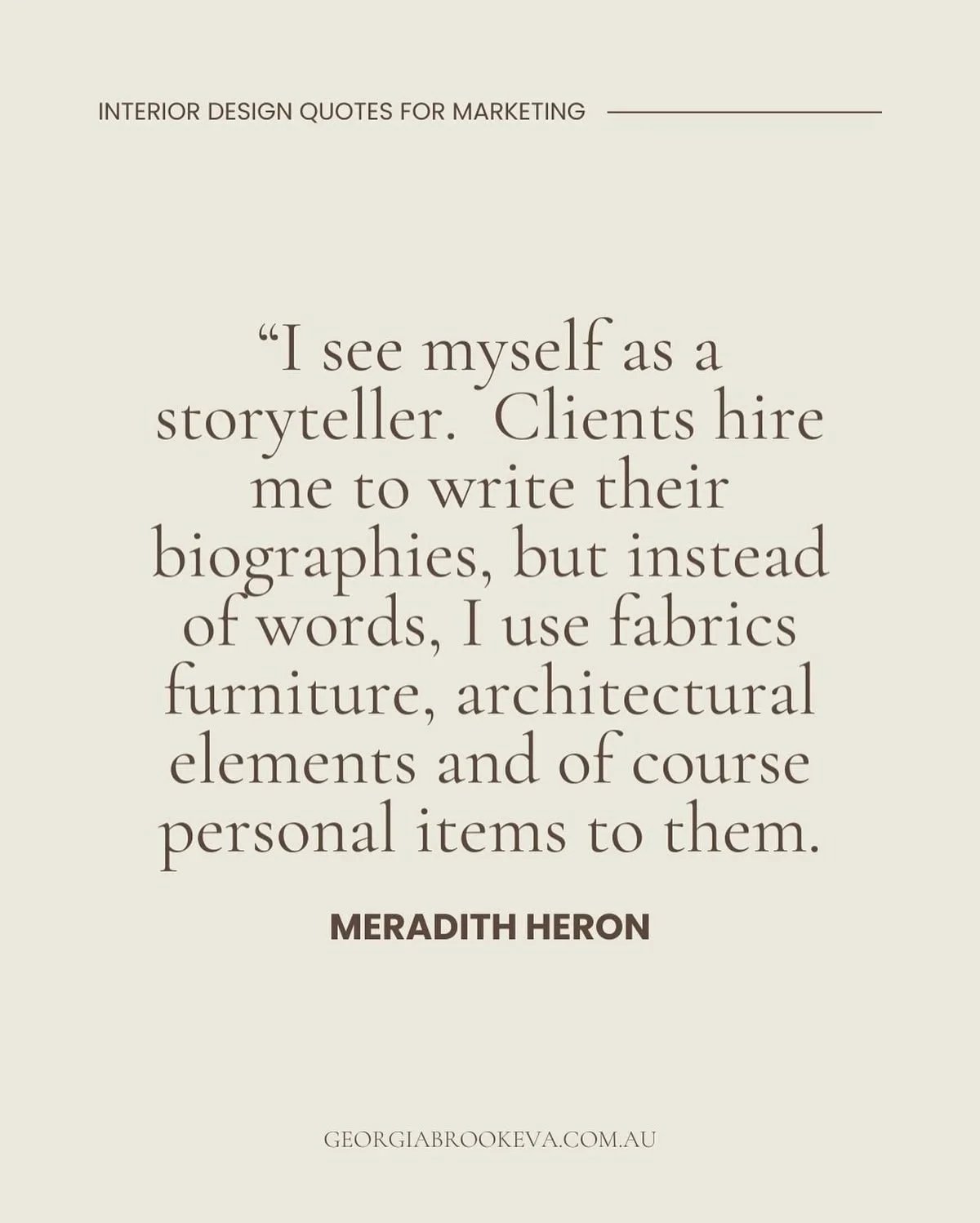
So true…as NikiDesigns says and I wholeheartedly agree: You must remember that YOUR brand is YOUR fingerprint. So allow your story to be uniquely you and to represent you well. As storytellers through architectural design, we strive in creating your unique fingerprint…the one that truly represents you as a brand identity. Details are our words, textiles are our pages, walls and ceilings are our books….
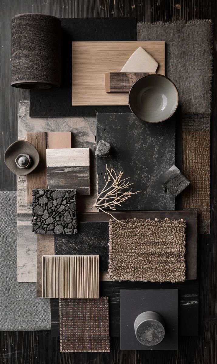
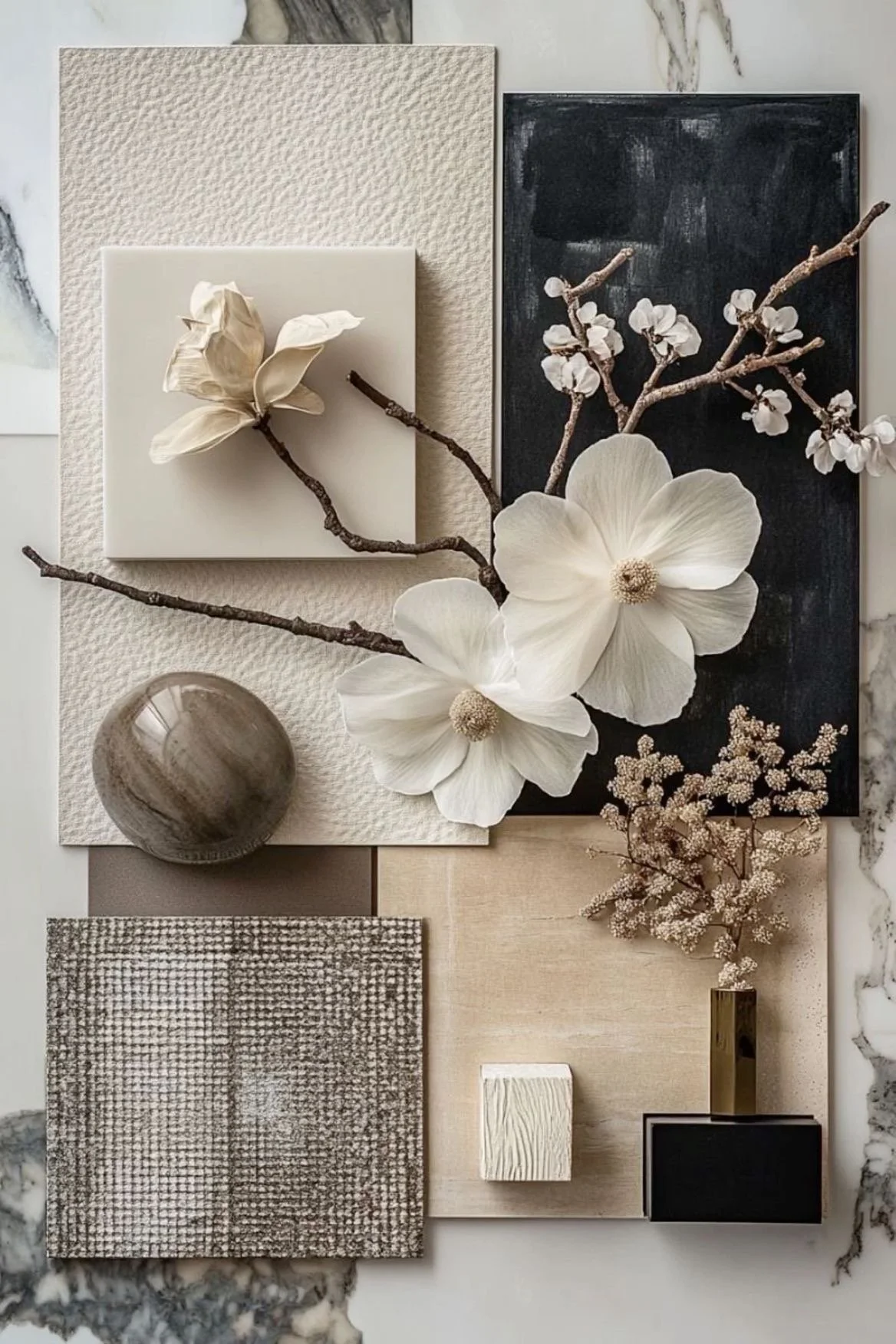
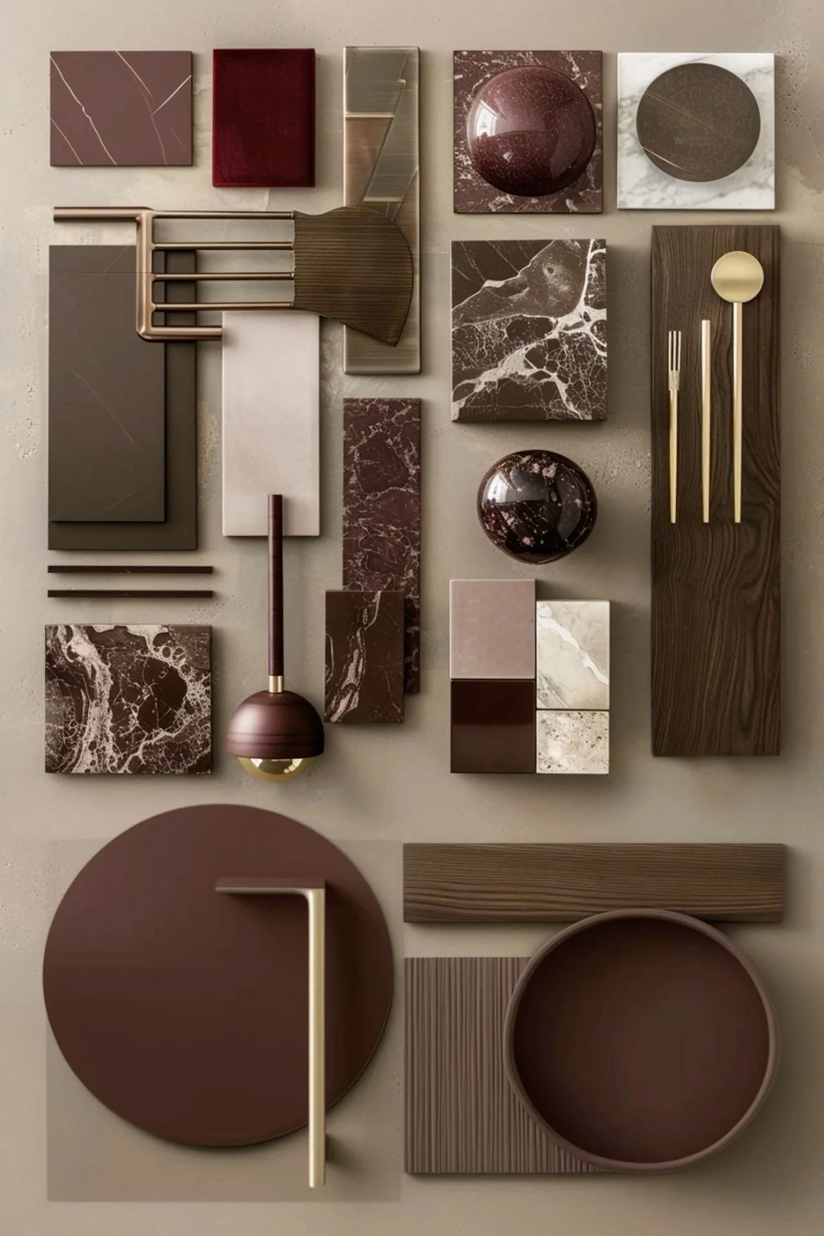
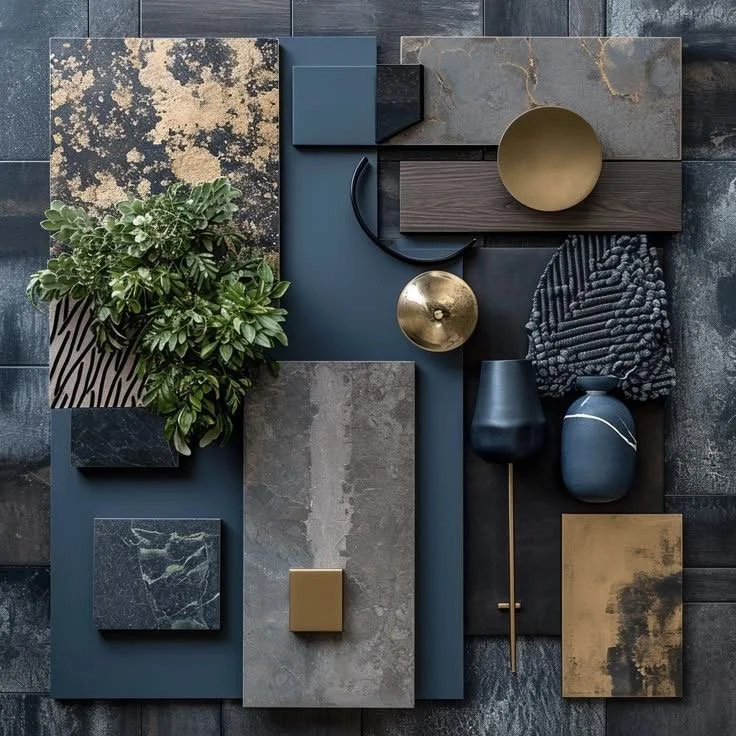
Here are a few curated mood boards detailed with robust + moody textiles and finishes to soft + romantic textiles and finishes that assist in storytelling the full potential of your luxury vacation villa or luxury vacation condo or luxury vacation chalet. The boards showcase all the delicate design decisions needed to plan and execute the experience desired for your premium guests. Every detail is thoughtful and profound and of course, intentional. Let’s review other examples. Remember, we are telling your brand’s story authentically.

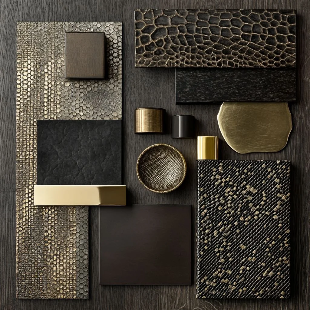
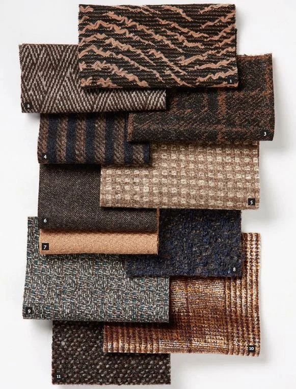
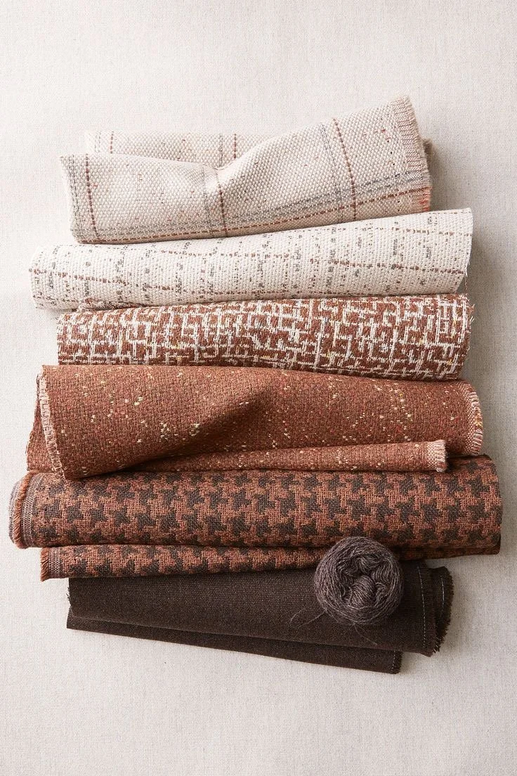
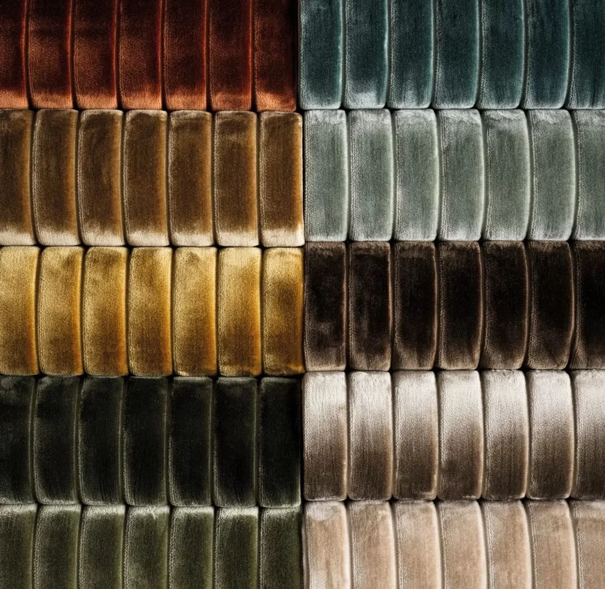
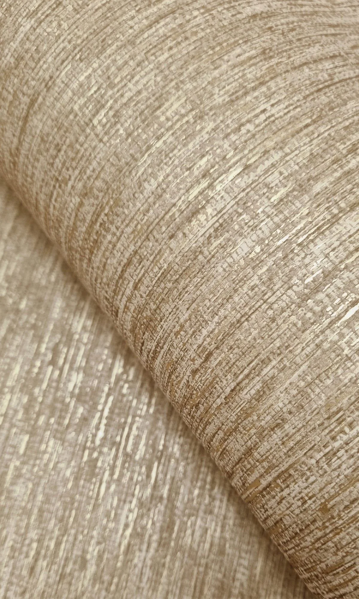
So many stunning examples of plush textures, intricate textiles, and glamorous finishes to curate those spaces from bland to brand.

“When you know, you know….”
Lastly, statement pieces like lighting can be the single statement a room needs to create that moment of joy, happiness, peace, or gratitude that a premium guest feels in your newly curated space of your luxury short-term vacation rental. I mean, let’s be honest, lighting is everything….and great lighting is the ultimate. So being strategic with statement lighting could be the spark you need to attract the sparkling guests you desire. Let’s dive into a few awesome examples that could be utilized in your villa or chalet.
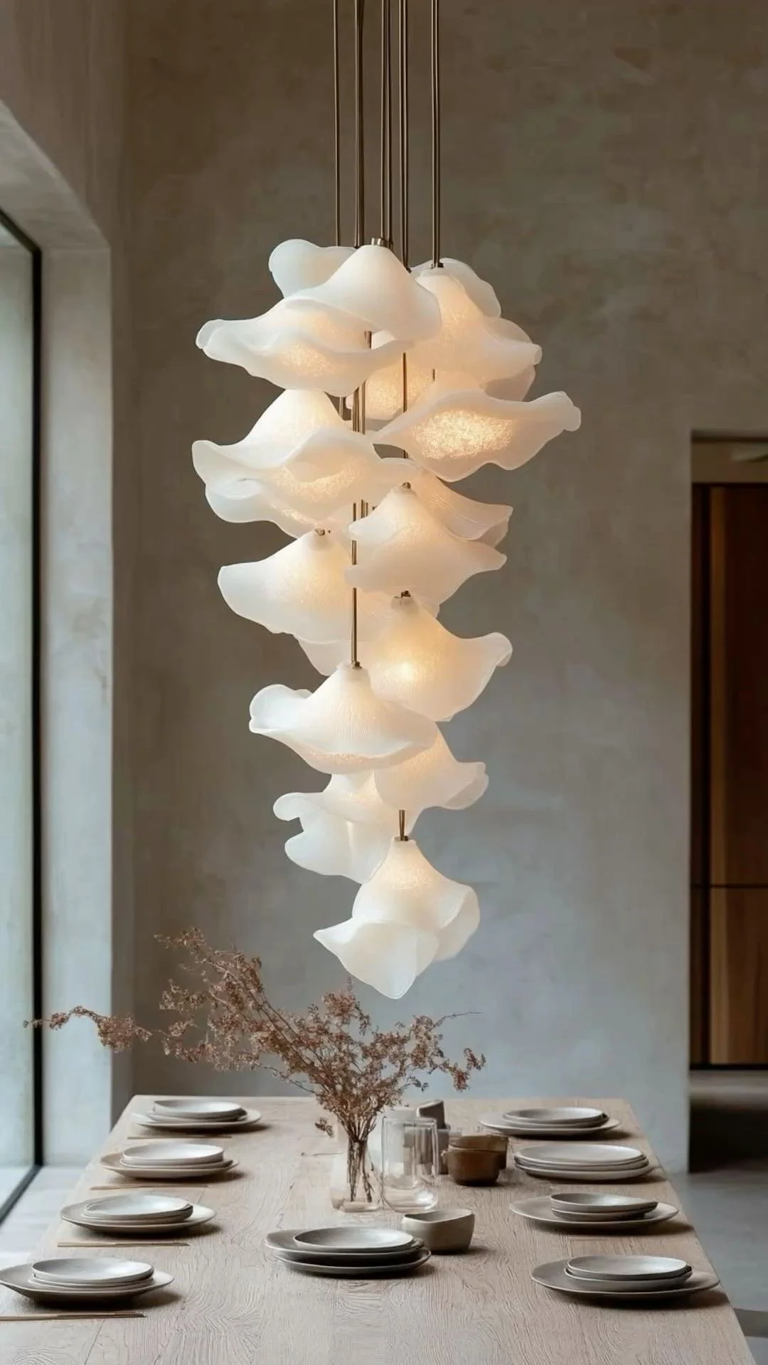
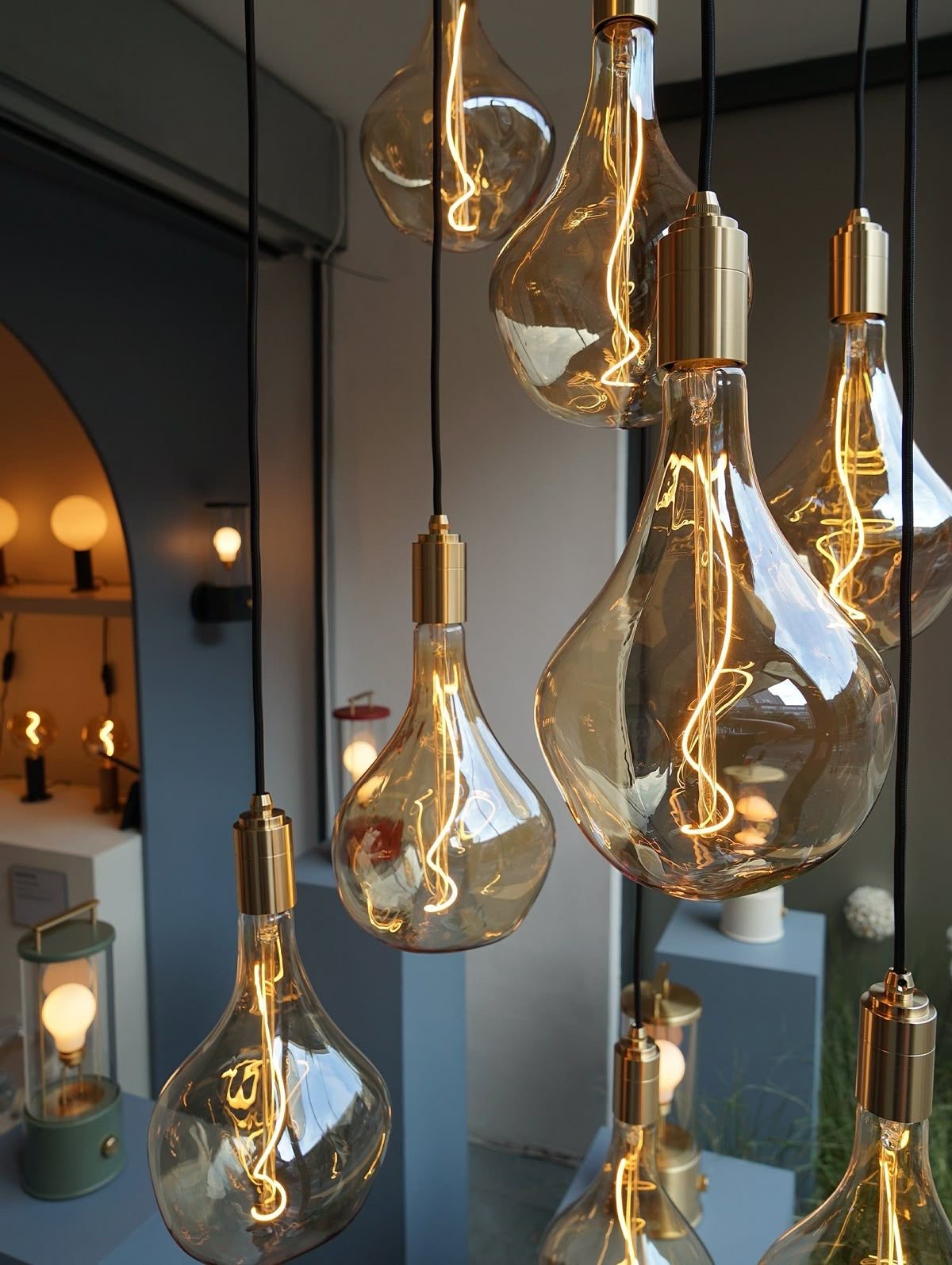
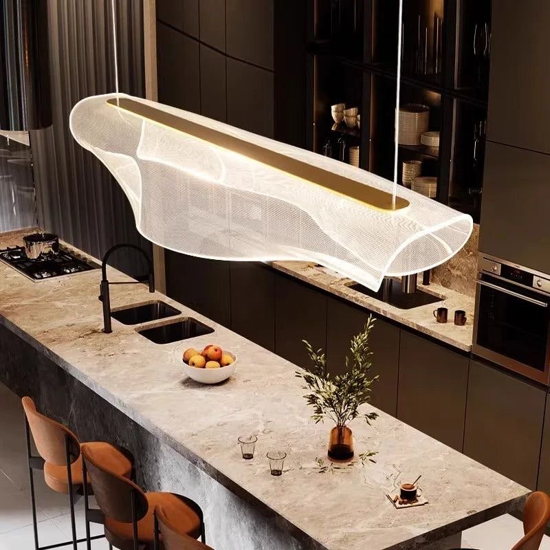
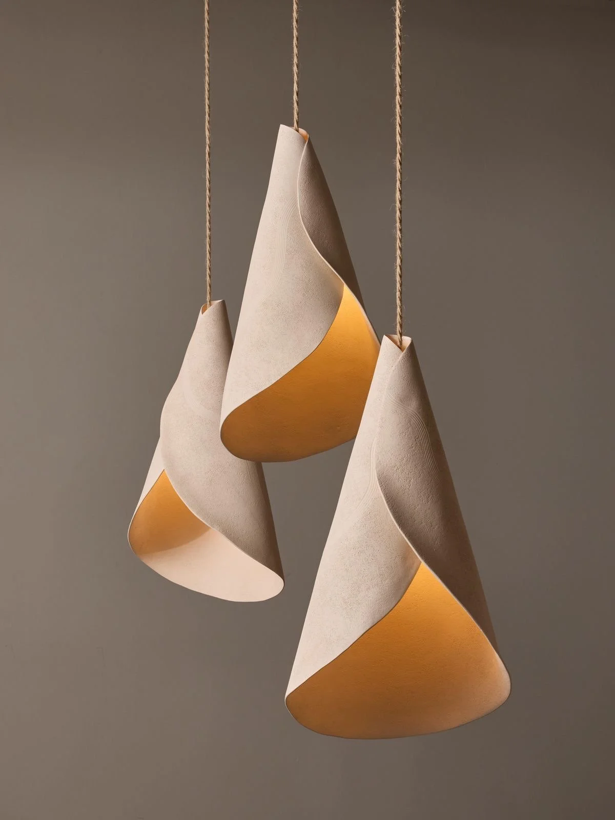
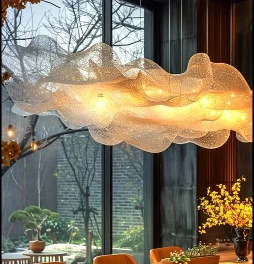
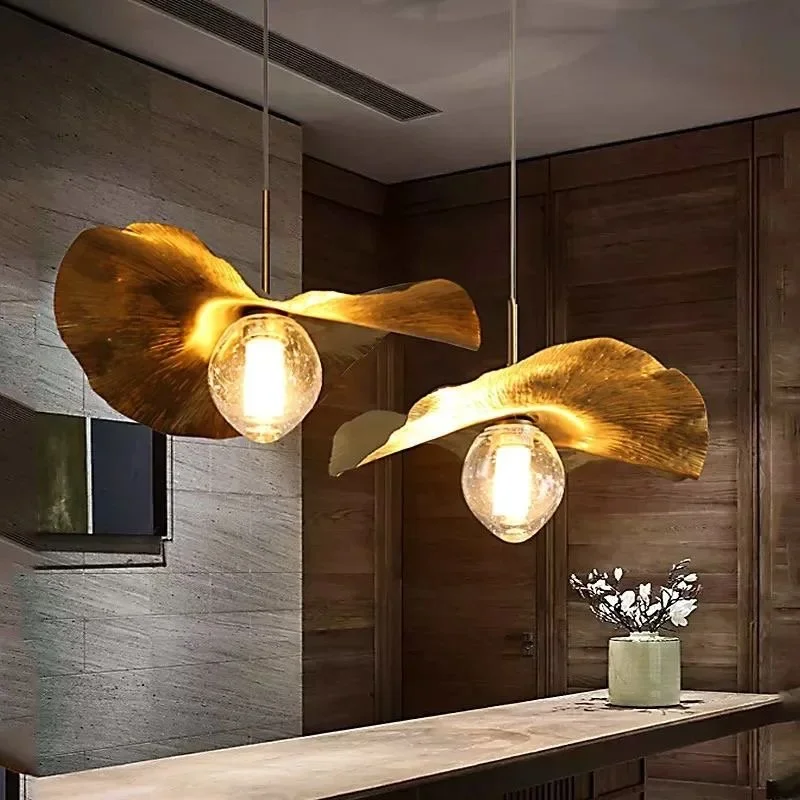
I couldn’t agree more…
One instrumental strategy is curating a textural, plush, and comfy experience that tells the story your vacation rental needs to tell. Your intended story for your intended guests. Those details are imperative + numerous, as you’ve seen through our journey, however, once implemented by thoughtful and experienced design professionals, you are sure to have a winning combination! Your space is your brand. Let’s make it unforgettable!
Until next time,
Live. Love. Design!
xo Renae

Architectural Design Secrets to Higher ROI in Short-Term Luxury Rentals…..Yes Indeed!
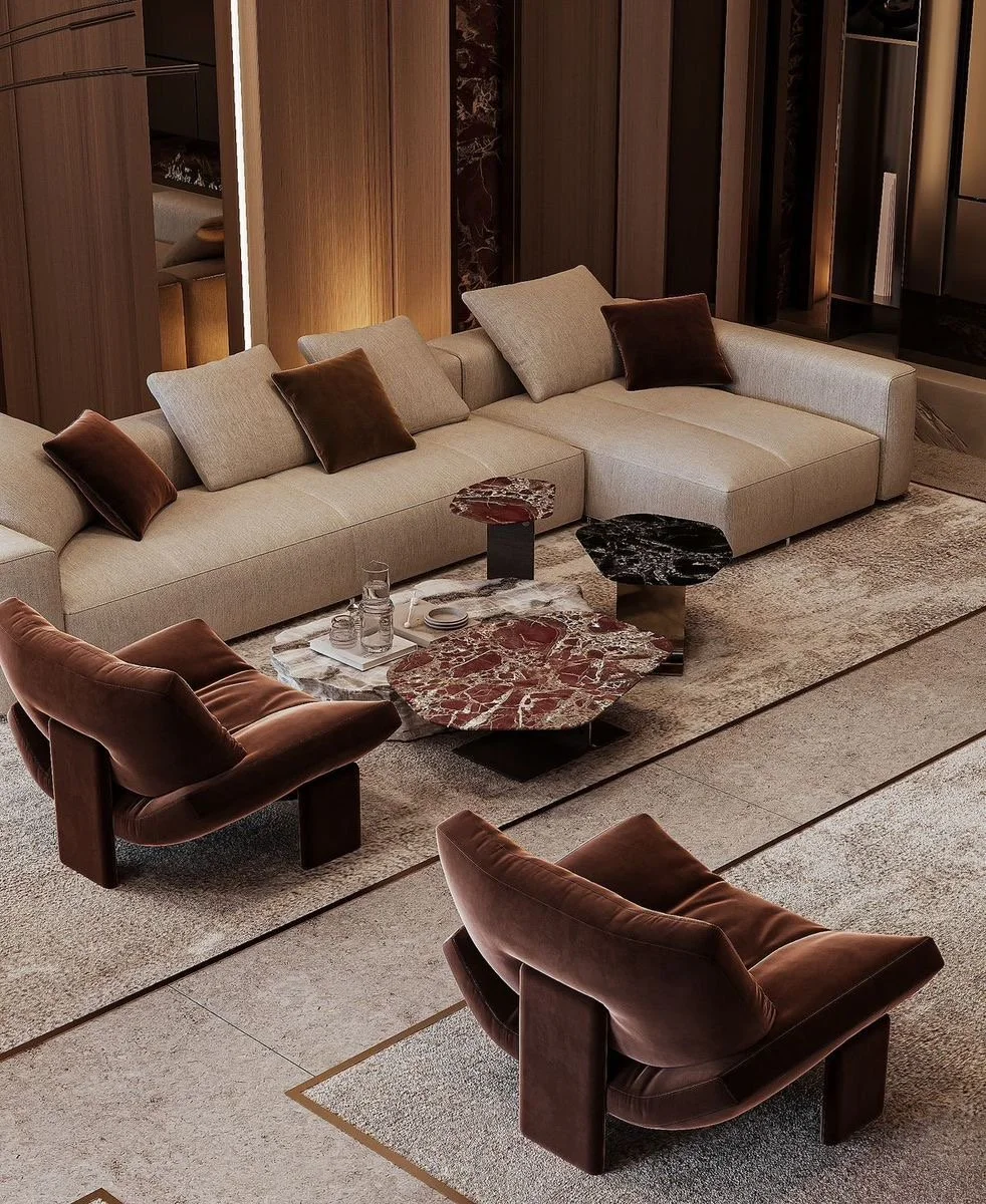
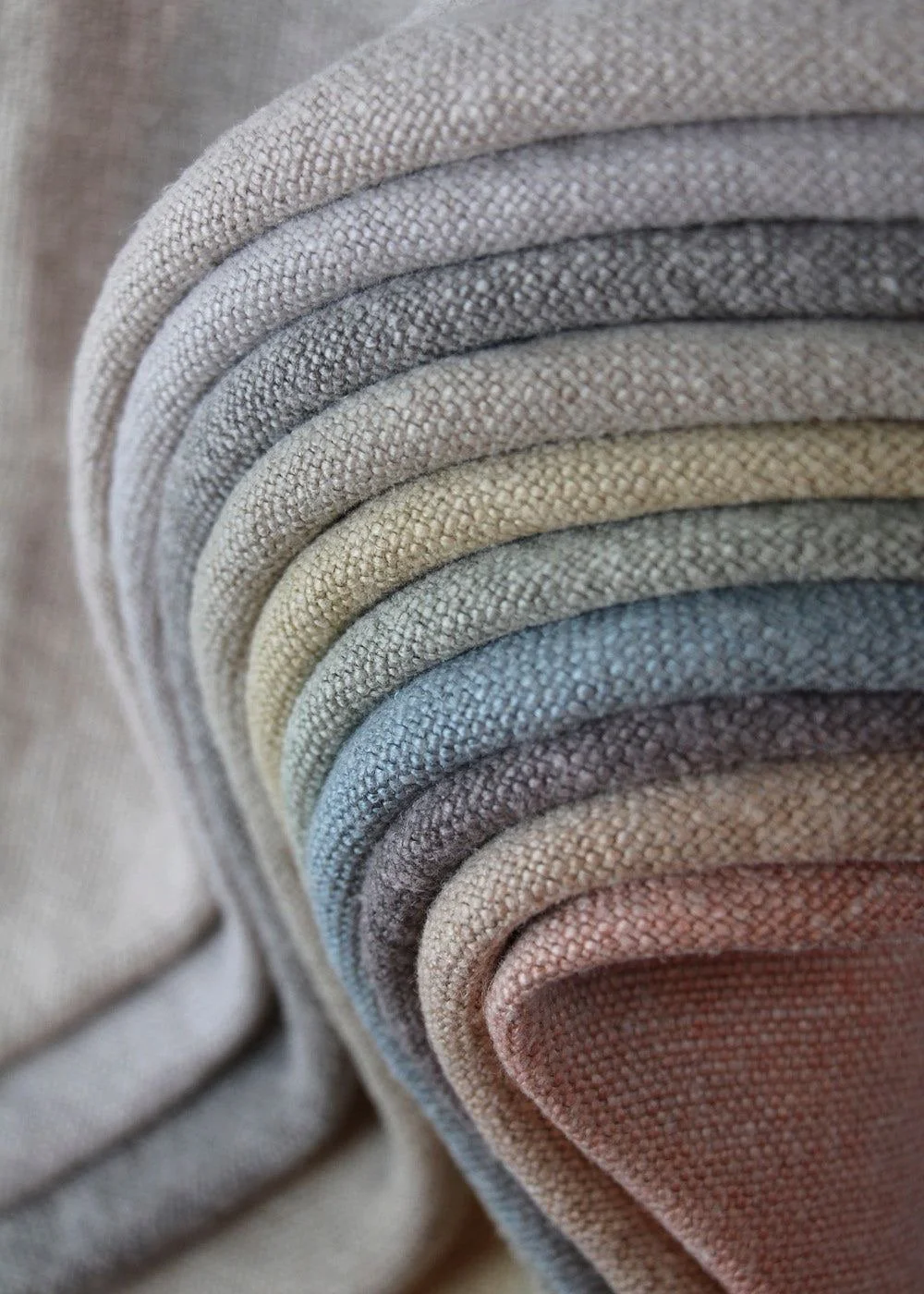
This has been the buzz phrase for quite some time now. Curating your luxury short-term rental around quiet luxury is ideal to appeal to the masses and the wealthy. The sophistication and refinement allows for comfortable elegance, which is always at the top of my list as a design professional. Plush fabrics, comfy upholstery, and various layers of lighting help set the tone.
Keeping it real…as within my habitual candor. Great design isn’t an expense- rather an investment. It’s all about the flow of the space, how the space reads + feels, and the dope materials utilized to help tell “the” story. I’m ready to spill the tea on some lil architectural design secrets to higher return on investment just for my owners of short-term luxury rentals. If you’ve been wondering what it takes to transform your ordinary vacation rental to extraordinary luxe accommodations using tangible measurables, well let me share some of my secrets with you. I got you!


Soooo, here’s the situation at hand: most STR (short-term rental) owners misinterpret how simple architectural design decisions, like for example, layout, lighting, and material selection can translate into measurable profit and 5-star reviews.
Now, we’ve already discussed how we, as design professionals, intentionally design for an emotional + unforgettable guest experience, which encourages repeat bookings. Yesss! However, you must first get guests to book that luxury accommodation with you. You ask, well how do I do that? That part is actually simple: hire an experienced luxury architectural designer! First secret is out! Now, why should I invest in an experienced luxury architectural designer when I’ve been getting bookings with my own design scheme? Hmmmm… let’s get into that, shall we?
From a design perspective, we can pinpoint the full potential of the short-term rental and maximize it to the fullest utilizing design principals + elements to intentionally promote wellness, unity, and rejuvenation while encouraging curiosity. Through thoughtful imaginative planning and curating of elevated materials, we create classic but rather unique spaces that flow effortlessly evoking a positive feeling of balance, harmony, + order. Those simple design decisions is the difference between a 3 star review and a 5 star review or repeat bookings annually versus no repeat bookings at all. Luxury is always in. Luxury is always plush. Luxury is always ideal. It’s a lifestyle. It’s in high-demand. You can have it for your short-term rental. Yes, YOU CAN!
This has been the buzz phrase for quite some time now. Curating your luxury short-term rental around quiet luxury is ideal to appeal to the masses and the wealthy. The sophistication and refinement allows for comfortable elegance, which is always at the top of my list as a design professional. Plush fabrics, comfy upholstery, and various layers of lighting help set the tone.
A neutral color palette mustn’t be boring or monotonous; the use of varied textures, patterns, and shapes create excitement while maintaining tranquility in the best sense. In the best purpose. Just for your VIP guests. These secrets are exactly how we translate the tangiable measurables for your ROI. Your villa is now known for the having the best spa bathroom in town or the best great room to get cozy with family and friends or the best outdoor space or the best kitchen to chef it up with friends….remember, you’re selling the experience and giving the luxe accommodation to partner that exclusive experience.
“AbsoFreakingLutely!”
I cannot stress this enough: quality will never fail you. Quality over quantity, dahling.
Ensuring that you’re strategically maximizing your architectural design potential with key decisions will separate you from the pack. Especially, if your villa or chalet or bungalow is not themed out, but rather classic, stylish, and plush. Those luxurious details will not be overlooked….and will highlight your investment in many ways for many years. Trust. I promised to share some secrets….and yes indeed I shared; let’s do a quick review:
Hire an experienced luxury architectural designer.
Curate around comfortable refined luxury aka quiet luxury.
Use textural neutral color palettes.
Utilize high quality materials.
As always, it is my complete joy to share my passion and educate as well. Hoping you guys enjoyed the spilling of the tea…I spilled some drops here and there. Most short-term rental owners really do not know what we do and how we do “it”, nevertheless, I love sharing and answering any questions regarding design processes and/or expectations. I wholeheartedly mean that. I’ve always felt that I was born to create, it’s in my blood…it’s my purpose.
Until next time,
Live. Love. Design.
xo Renae
(Pictures courtesy of my Pinterest)

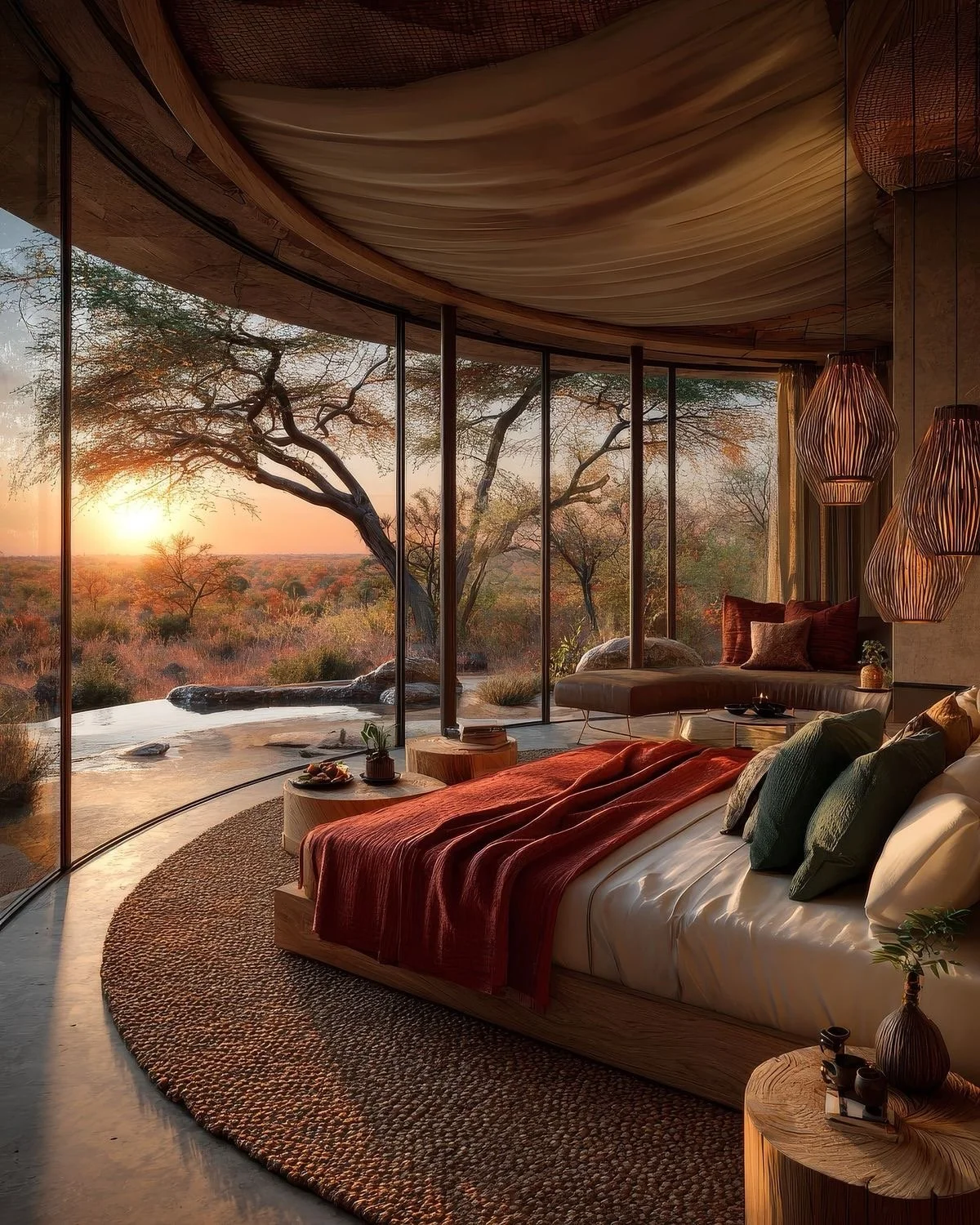
Designing for Experience: What Makes a Luxury Vacation Rental Unforgettable??
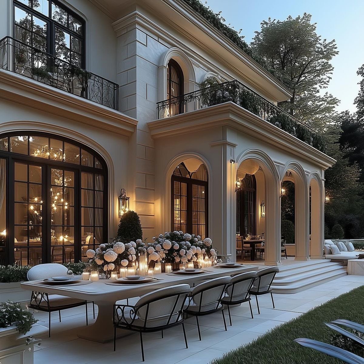
Let’s be honest, the guest experience is extremely critical for creating an unforgettable luxury vacation stay. Guests remember how a space feels. We absolutely cater to that emotion through storytelling; we design for emotion, not just aesthetics. This amazing view of a mountaintop private villa creates an ambient mood for rejuvenation + reconnection, while the Bali villas creates connectivity with romance + intrigue. The mood has been set through the intended design choices within the built environment. I’m so here for that. Let’s gallivant through distinct architectural design choices that are intentionally shaping guest satisfaction + repeat bookings.
Let’s be honest, the guest experience is extremely critical for creating an unforgettable luxury vacation stay. Guests remember how a space feels. We absolutely cater to that emotion through storytelling; we design for emotion, not just aesthetics. This amazing view of a mountaintop private villa creates an ambient mood for rejuvenation + reconnection, while the Bali villas creates connectivity with romance + intrigue. The mood has been set through the intended design choices within the built environment. I’m so here for that. Let’s gallivant through distinct architectural design choices that are intentionally shaping guest satisfaction + repeat bookings.
Here’s stunning examples of how architecture + design play a front-seat role in evoking emotions for luxury vacation stays worldwide and why guests keep coming back.
I agree with Coco, luxury must be comfortable, otherwise, is it truly luxury?? As a seasoned design professional, intentionality is not just a buzz word, but the thread of what we do. Comfortable luxury is a given with textiles, thread counts, plush seating, light control….all these elements play a major role when curating for luxury vacation rentals. Think soft, plush, and lavish.
Setting the ambience is imperative. This is a majestic example of a short-term luxury villa that exudes comfort, unity, and relaxation. I can imagine guests sitting fireside with cocktails watching the sunset with loved ones…so chill. Team decompress for the win!
Other gorgeous case studies of purposeful connection with nature, loved ones, and even oneself. I adore how the design really creates intimacy as well as community. Such a beautiful balance done with precision.
There are so many variations and meanings of what is luxury. To me, luxury is the ability to disconnect with the day-to-day hustle and bustle and reconnect with indulgence to my inner soul and loved ones in seclusion. What does luxury mean to you? It could mean opulent dining, exquisite shopping, and exclusivity. Or it could mean quality services that rejuvenate, privacy, and bespoke dining experiences. It is different for every guest. Our job, as design professionals, is to create an environment that evokes various emotions based on location, proximity, and each space within the villa or chalet or chateau or hacienda.
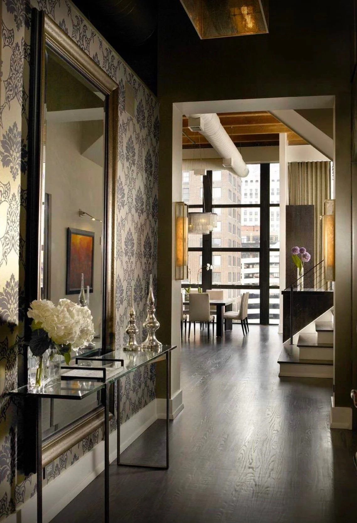
Let’s get into these spaces…spatial great rooms are definitely a gathering spot for family vacations or maybe multiple couples retreat. Having great architectural design features like gorgeous fireplaces, stunning ceiling details and heights, and breathtaking views through marvelous + stately windows help lend guests into creating fabulous memories and unforgettable experiences, which in turn means more bookings for short-term rental owners. That’s a great return on investment if done in a spectacular but profound way.
“Yassssssss!”
Now we are all aware that the kitchen is the heartbeat of the primary home, however, it remains true even in luxury vacation rentals. Fabulously designed kitchens actually book rentals quickly. Guests can either hire private chefs or gather together and cook for themselves, nevertheless, having the flexibility and functionality is key. Let’s wander through some beautiful examples of how great architectural design shapes guest satisfaction in a popular utilitarian space: the kitchen!
Depending on the type of vacation you’re embarking on or the vibe you’re creating, these are dope examples of various perspectives that will tickle your fancy! Love!
Impactful in so many ways! I’m here for all of it!
“Yes indeed!”
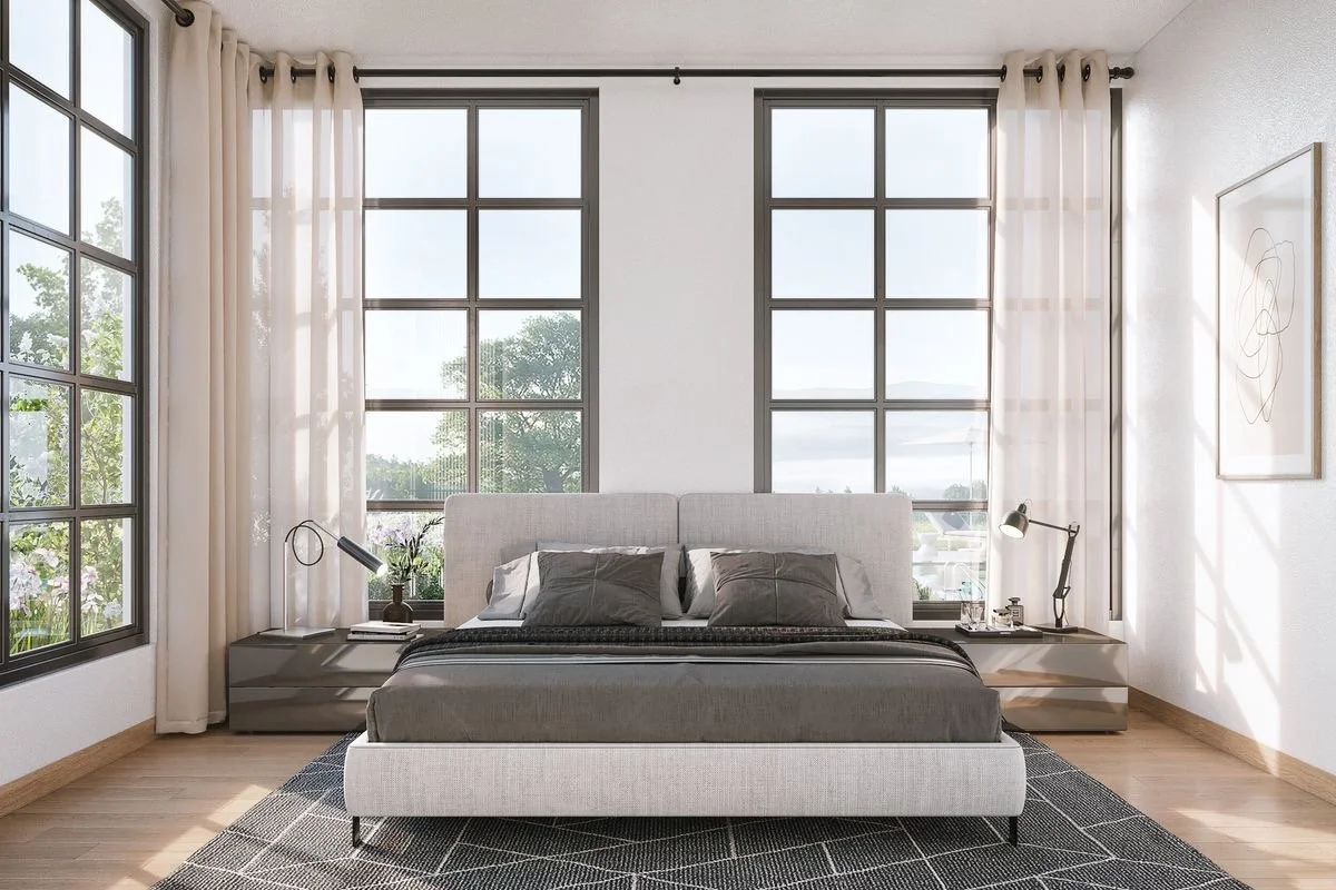
Moving into the guest bedrooms, where guests want to feel pampered and relaxed. They also want the comforts of home, but to be reminded they’re on vacay. A luxurious vacay. A memorable vacay. So every detail matters. I have some illustrations of what I call excellent amenities for guests from the romantic couples to the fabulous singles trip to the marvelous family getaways. I have a lil’ something something for just about everybody to indulge in. For the luxury vacation rentals owners, these sublime spaces is what keeps luxe guests coming back for more!
Especially when you are surrounded in indulgence + opulence!
I’m telling you….I’m drawing the vision and making it plain. Yes, indeed. This passion has created purpose for me…to curate thoughtful + livable spaces that intentionally promote wellness + encourage curiosity. That, to me, is what good architectural design is all about.
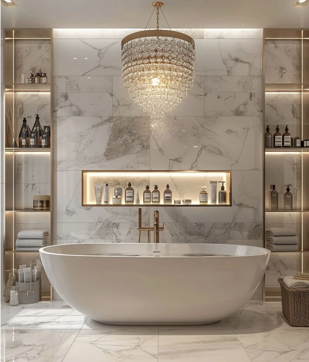
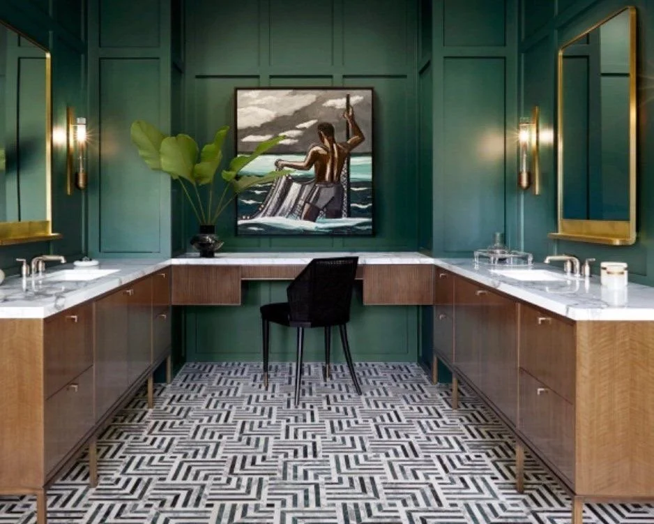
Please do not dismiss the impact of a spa-like bathroom to indulge in as guests….it’s the ultimate pampering experience. Soaking in bubble filled tub with a glass of bubbly or enjoying a steamy shower in the state-of-the-art shower system, the pampering limits are endless. So good! Oh so good!
Extremely true, which is why, investing in luxury vacations is good for the soul and on the other hand for the owner of luxury vacations rentals, it’s a good return on investment. The right team of professionals will curate that unique story so that guests really remember how unforgettable their vacay truly was. It’s the emotion for me. A win-win for all parties involved.
Also, worldwide travel allows for exploration of different cultures, civilizations, and cuisines: the world’s ultimate education. Now elevate that with premium living quarters and then you can really have the best of BOTH worlds. Culture + Luxe! Winning!
My inner self has this mantra on repeat…it’s what makes me ME.
I hope you enjoyed all the vibes of designing for experience as I did. It’s a niche of design that I cater to because vacations are so essential and absolute vital getaways in my opinion. Refreshing oneself or reconnecting with loved ones or splurging on yourself and family is one of many ways to unplug, decompress, and rejuvenate before going back to “life”. Life definitely has a way of “lifing”…so you deserve to be pampered. Let’s do it elevated. Yassss!
Until next time,
Live.Love.Design!
xo Renae
Relaunching of Website Alert + MY Top Architectural Design Trends in Luxury Home Renovations for 2025! Hello November!
Serving professional clients who value and appreciate the expertise + talent of design professionals is half the battle. Luxury architectural design is an art form as well as a science. There are, of course, the basic design principles along with design elements, however, the overall space planning and flow of how a family lives in that space is just as important if not more than the principles themselves. I stand by that. Curating the space to elevate + capture the spirit of the client is premium as well as respecting the architecture. Designing with intention. Designing to promote wellness + serenity. YES!
First, let me say…..HEY LOVES! I’ve wholeheartedly missed you guys and yes, we have lots to catch up on, nevertheless, I am excited to reveal the relaunching of our studio’s website! Welcome! Welcome! God is faithful. He provided me a voice + talent to share and betcha by golly wow, I will be in obedience and share with passion + purpose!

This last year has been a tremendous mindset shift for me. I’ve had to pivot my entire perspective and my business model as it relates to whom we serve. I had long deep talks with God for months and months and months. I’ve learned a lot about myself and honestly, still learning. This shift has become a re-emergence of my mind, body, soul, and business acumen. I’ve re-aligned myself completely with God’s will for my life and re-centered every aspect of my being. I’m humbly grateful of how God has used me. When I once thought I was buried, I was actually being planted…and although they initially feel the same, they’re actually quite the opposite. Yes, you are under the dirt + feel isolated, however, when you are buried, there is nothing but death and stagnation. On the contrary, when you are planted, yes, you are still under the soil + feel isolated, however, God is nurturing you, strengthening you, feeding you, watering you to grow + to completely surrender to Him. Eventually you will sprout beyond the soil and see the light again….so yesssss, I’m a working progress, but aren’t we all? Absofreakinglutely!

So I’m re-emerged and stronger than ever! Like I’ve said before, God is faithful. Our shift in our business model is not much of a shift to us, we are actually pivoting back to how we conducted business prior to Covid. Yup…Covid was overwhelming for our industry as a whole and most of us were booked + busy, but not in a positively healthy way. We were on serious BURNOUT, sometimes taking on clients we would NEVER take on prior to Covid. I’ve wholeheartedly learned my lesson of the power of “no” and I’m sure my colleagues worldwide have many fiery stories of lessons learned within their firms + studios….nevertheless, the saying holds true: what does not kill you, can only make you stronger.

Serving professional clients who value and appreciate the expertise + talent of design professionals is half the battle. Luxury architectural design is an art form as well as a science. There are, of course, the basic design principles along with design elements, however, the overall space planning and flow of how a family lives in that space is just as important if not more than the principles themselves. I stand by that. Curating the space to elevate + capture the spirit of the client is premium as well as respecting the architecture. Designing with intention. Designing to promote wellness + serenity. YES!

I couldn’t agree more with this quote from Albert Hadley.
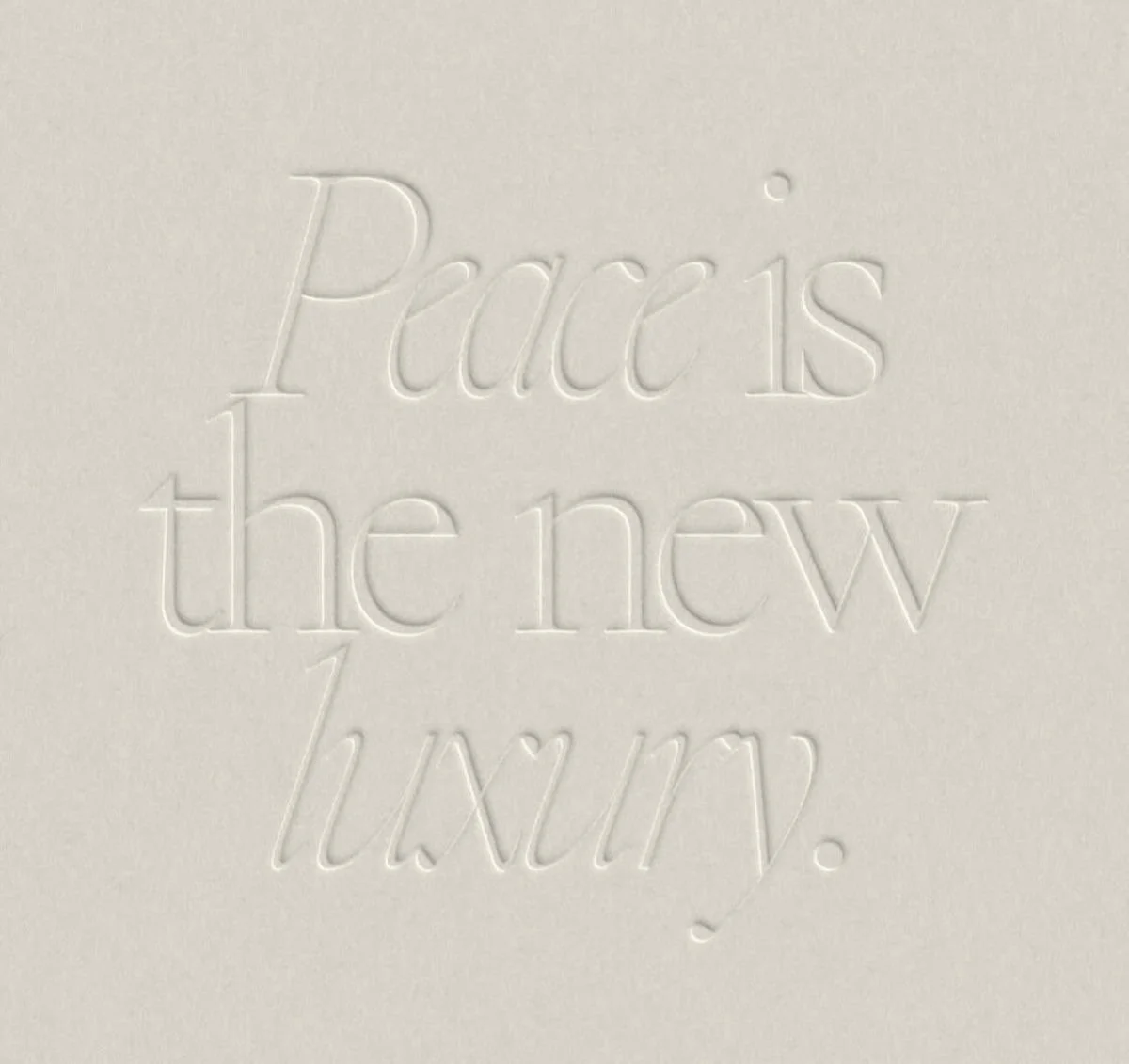
Which leads me to my top architectural design trends in luxury home renovations for 2025! Every home holds untapped potential…it just takes a visionary eye to reveal it. Smart sustainability, quiet luxury, and spaces that seamlessly blend sophistication with plush comfort, I am here to walk you through some fave trends we’ve been seeing this year and will continue to see in the coming year. Yessssss to this neutral bombshell! Highlighting architectural features such as the fifth plane (the ceiling) is always a must, especially if you have amazing ceiling heights. Capitalizing on natural light with the fabulous window/door combination allows your circadian rhythm to stay intact which promotes wellness. Utilizing natural materials enhances the overall warmth and aesthetics of the space, creating a sense of calm + peace. Let’s face it; peace is the new luxury. Can I get an AMEN?

This is absolutely correct for me!
Another stunning example of architectural design featured through window and door placement. So good. You will definitely continue to see this trend…it’s a classic.
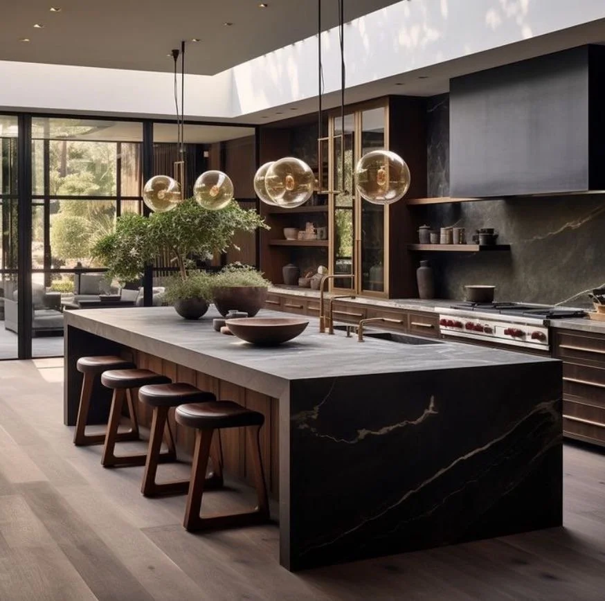
Again, the fifth plane allows for robust potential with lighting and defining spaces creatively. Natural lighting for the win! The artificial lighting is on point as well, let me add. All the details is what makes the design so essential, so layered, so luxe. We cater to those tiny and plentiful details. For example: one customized piece, whether it’s cabinetry, fabric, upholstery, lighting, etc. has a minimum of 101 check points of decisions and tasks that a design professional must complete.
So true, Charles Eames, so true!
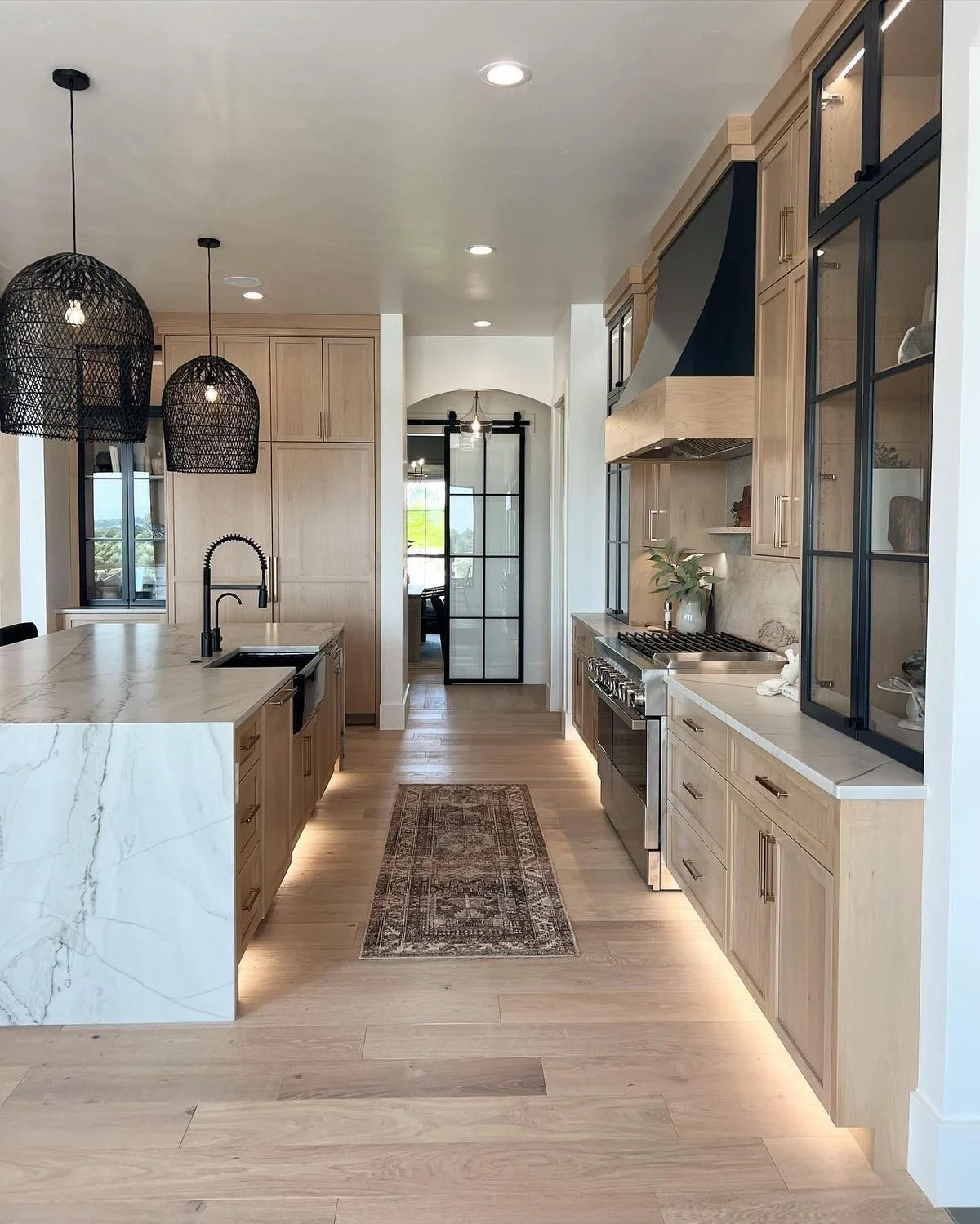
Luxury home renovations are uprising and stable, even in a down market. The kitchen typically is the starting point of the renovation, so making sure to capitalize on all untapped and most times hidden potential is crucial to creating value and longevity for the client and the luxury home resale market. It’s a win-win! Ensuring that you are winning is choosing wisely. The right team of professionals is key: the right luxury architectural design professional, the right architect, the right general contractor + the right landscape architect as well as the right luxury real estate agent if needed will make a huge difference in your before and afters. Trust!
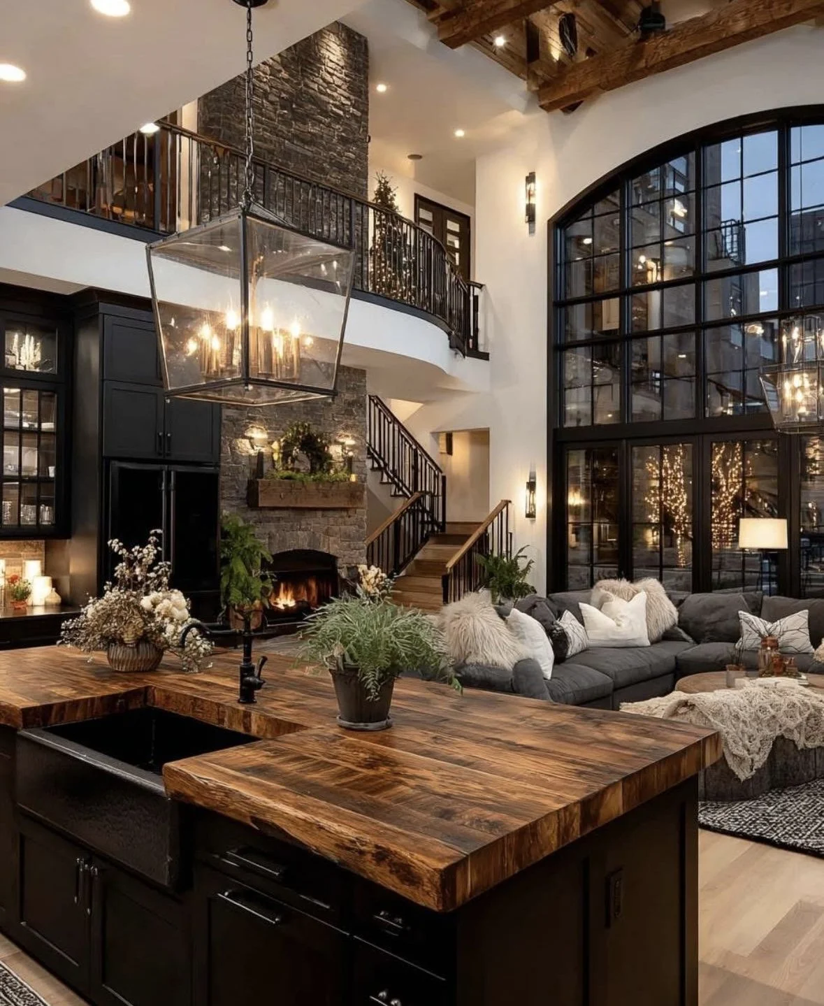
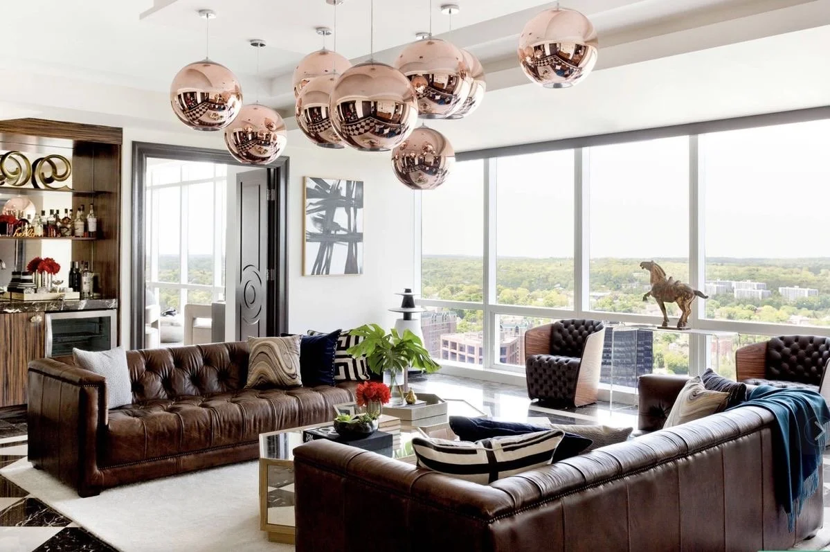
Gathering loved ones together creates unity and fond memories. I know that is the case for my family, and I bet that is the case for yours. A great family room has great flow, comfortable plush seating with layers upon layers of various fabrics + patterns, maybe even an awesome focal point of a sublime fireplace that centers the space, and dope layers of lighting to create a mood and experience for your loved ones to vibe in. There’s also fabulous layers of fabrics through draperies, rugs, and pillows that harmonize the space with saturated hues or graphic patterns or textural beauties. Accessories are the icing on the top. The minuscule details tell the story of a well-designed family room + dining room….your talented architectural designer will assist you with telling your family’s story. Here are a few stunning examples of great use of highlighting architectural features such as fireplaces, windows/doors, the fifth plane (ceilings), built-ins, and cased openings. Yessss!
Great views, plush seating, textural fabrics, majestic lighting, and a cozy feeling is the right mix of indulgence for me. What about you?
My top architectural design trends also extends to the exterior….as clients are definitely utilizing their outdoor spaces with intention. Collaborating with talented landscape architects and pool designers assist in telling the story of the interiors. The vision remains consistent and always intentional. Always intentional.
Remaining authentic to strategic design decisions and of course to myself is what grounds me + drives me. These exterior and landscape trends aren’t really trends, but classics and essentials to families. They allow for time together outside enjoying one another + creating more memories. That’s always my goal. Creating more memories with the people I love in a space that feels welcoming and creative and functional. Even if it’s the great outdoors! Those were awesome examples of strategically utilizing the landscape with the architecture of the home beautifully. Ohh la la.
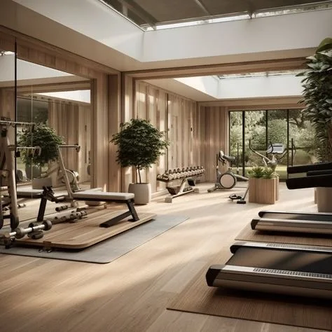
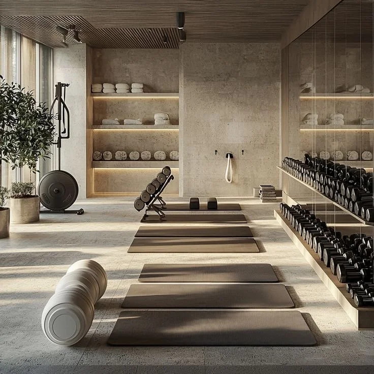
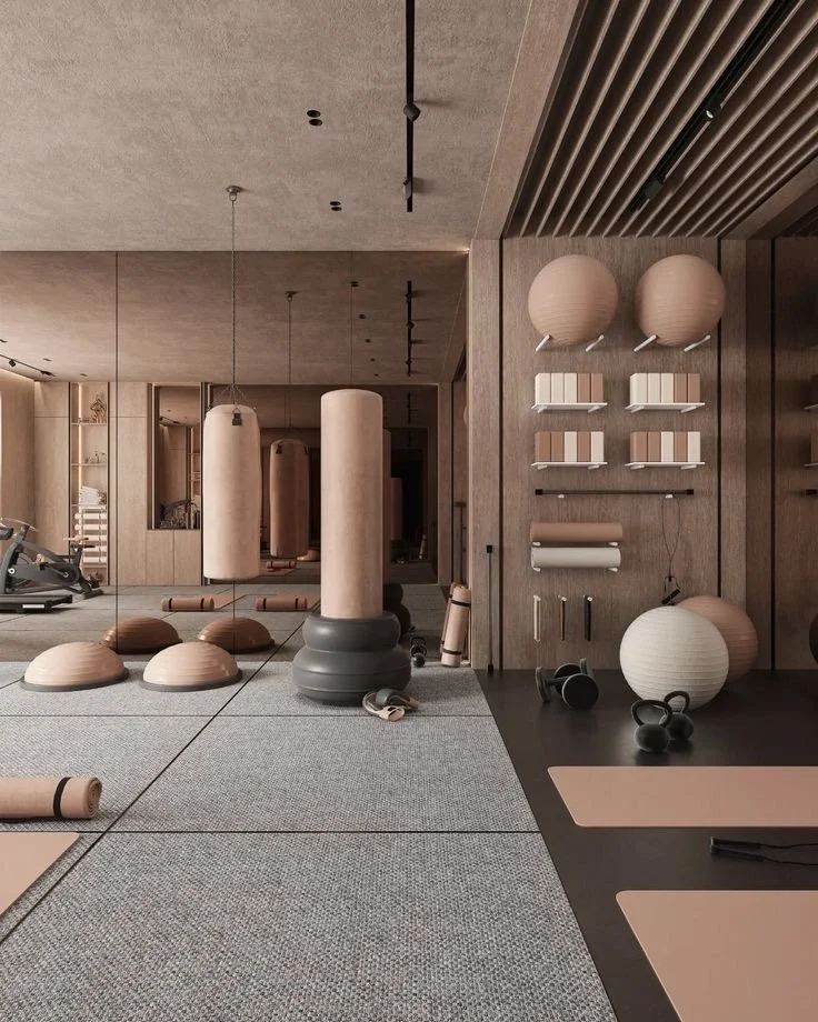
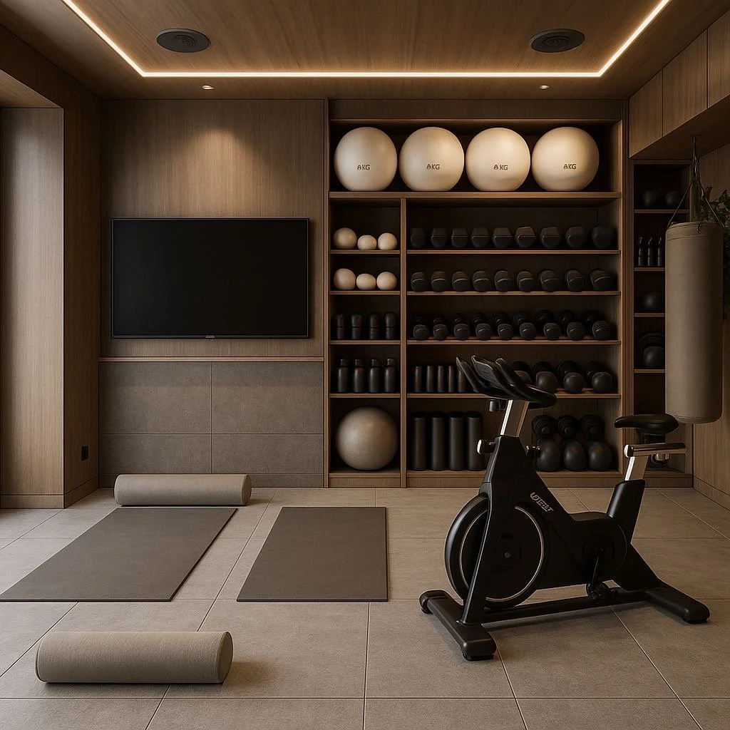
Of course, wellness is on the top of most of our minds, especially since COVID. My top architectural design trend for luxury home renovations include curated home gyms housing all the wellness bells + whistles: infrared light saunas, steam showers, ice plunges, meditation areas, natural light, greenery, etc. This is by no surprise, but definitely well-thought out spaces reflective of the needs and wants of our exclusive clients. Wellness is priority. It’s intentional. It’s wealth.

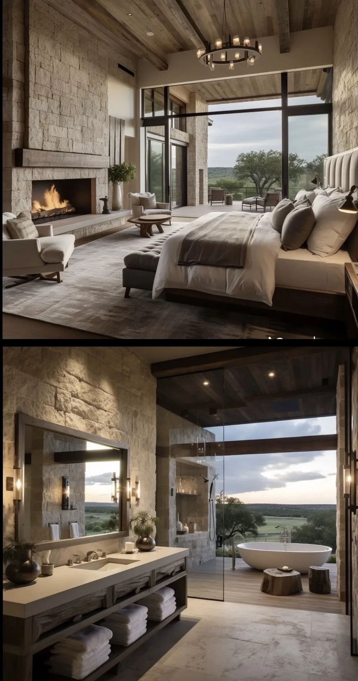
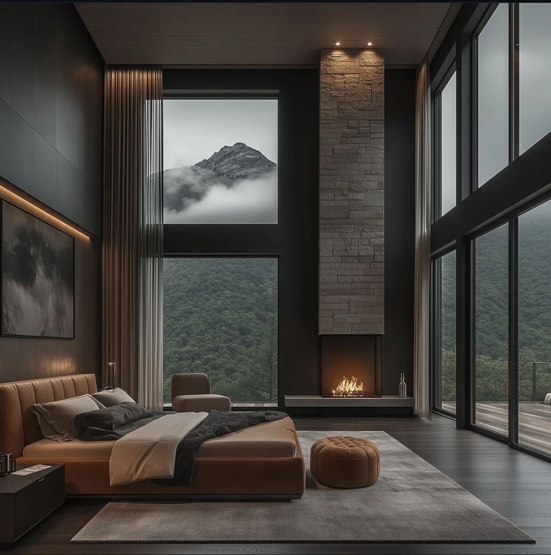
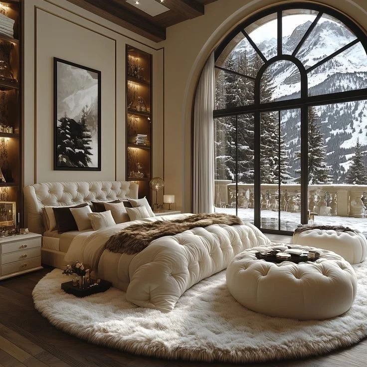
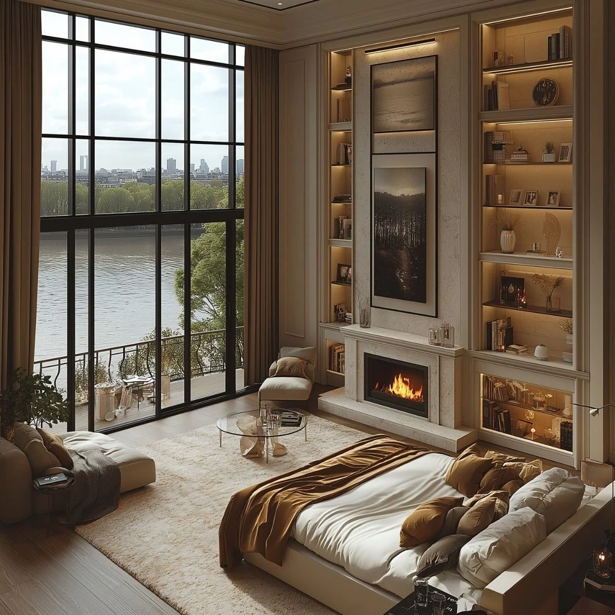
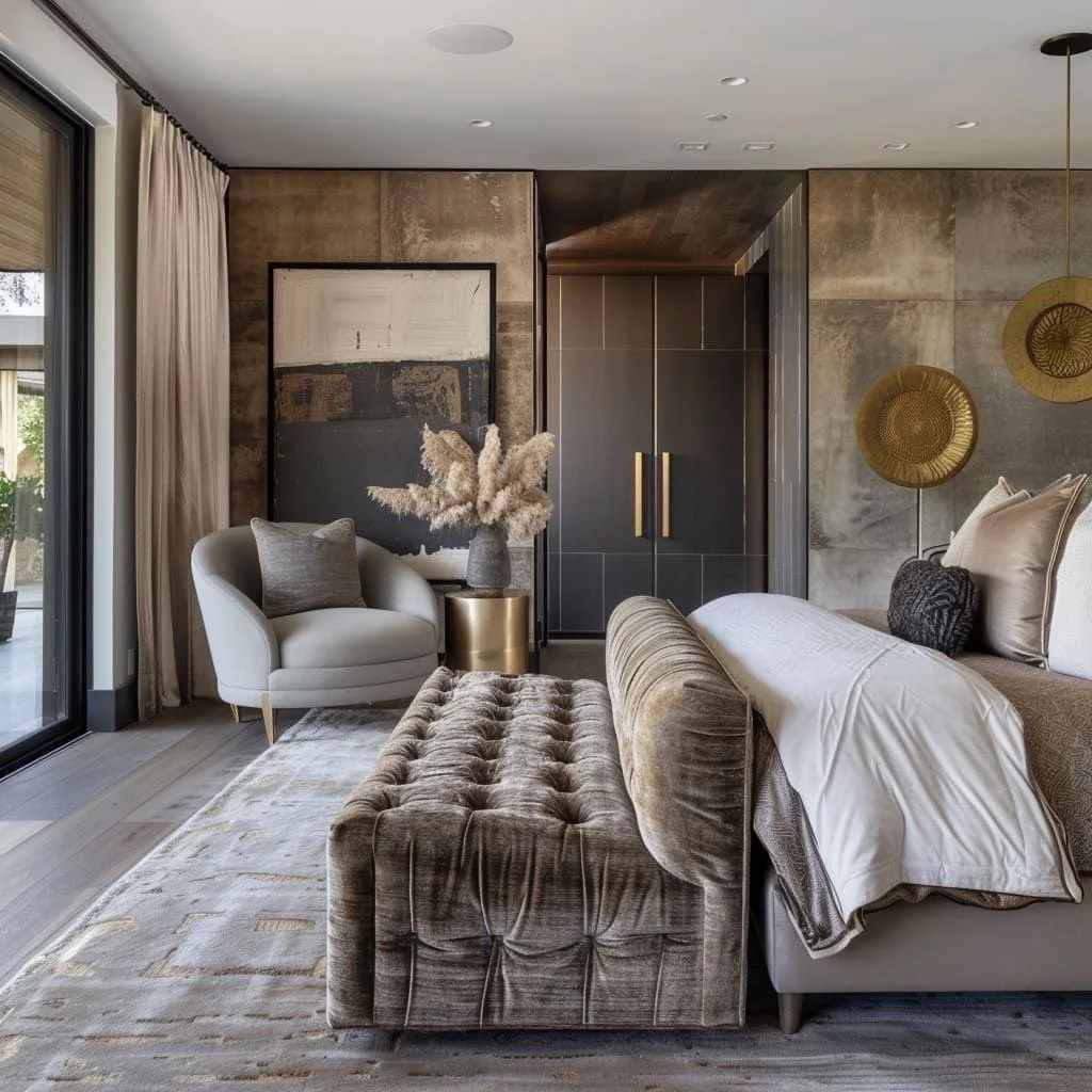
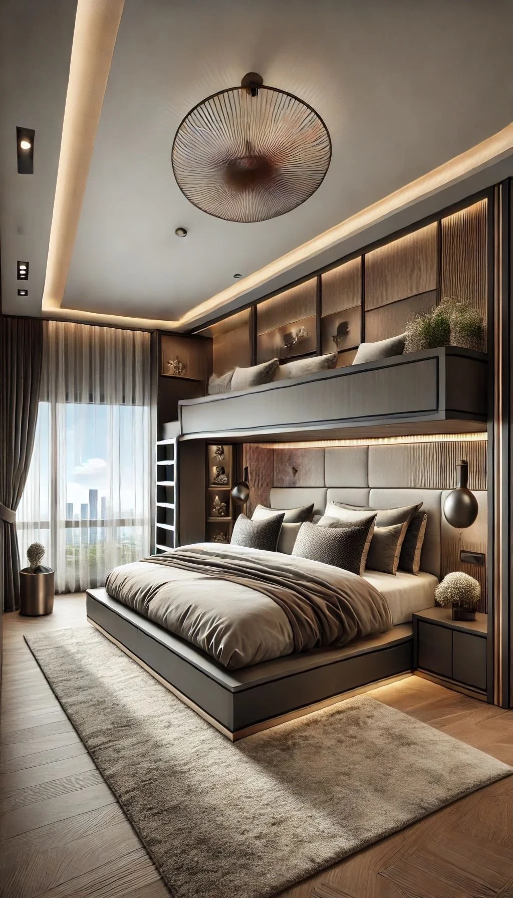
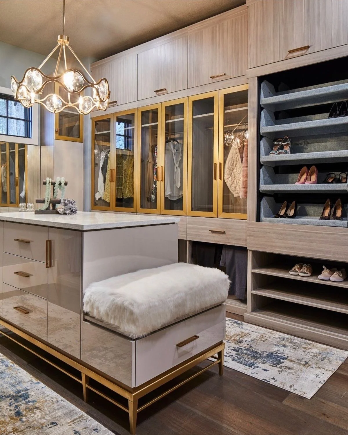
Primary suites are great investments for luxury home renovations included in 2025. The homeowners desire a refuge from the hustle and bustle of life’s busyness. Their suite becomes their sanctuary and deservingly so. Here are a few great examples of architectural design features that add value, but more importantly create restful dwellings utilizing bold designs. Elevated material choices + inspiring space planning create luxe primary suites to enjoy for years to come….and for me + our clients, that’s timeless + magnetic!
That’s a mouthful of truthfulness! Say that!
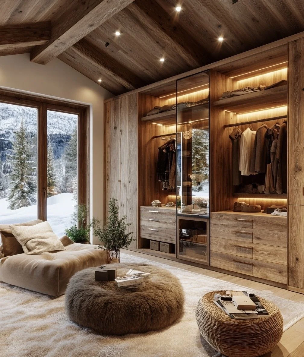
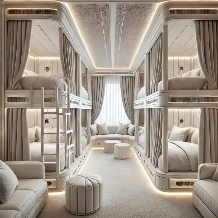
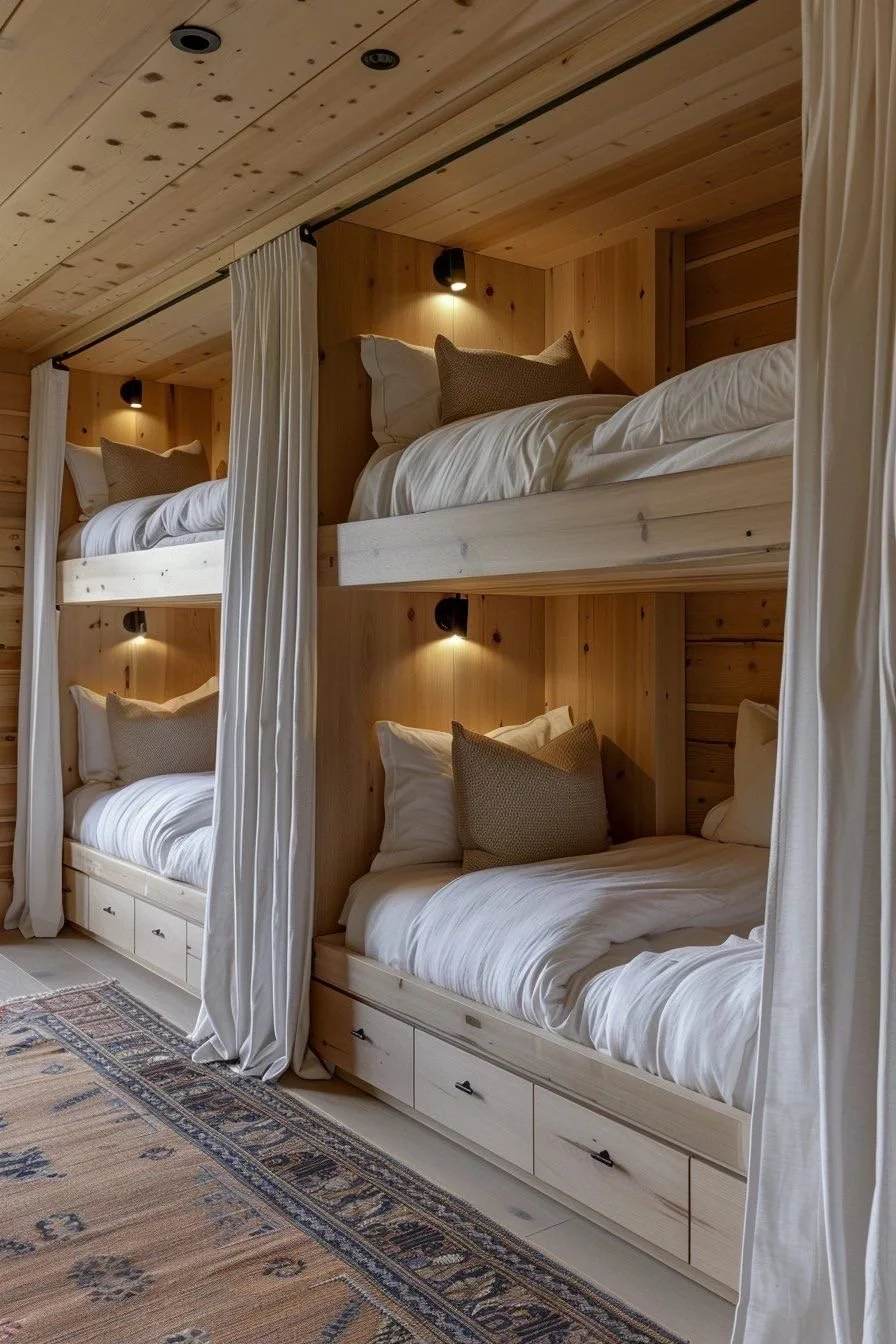
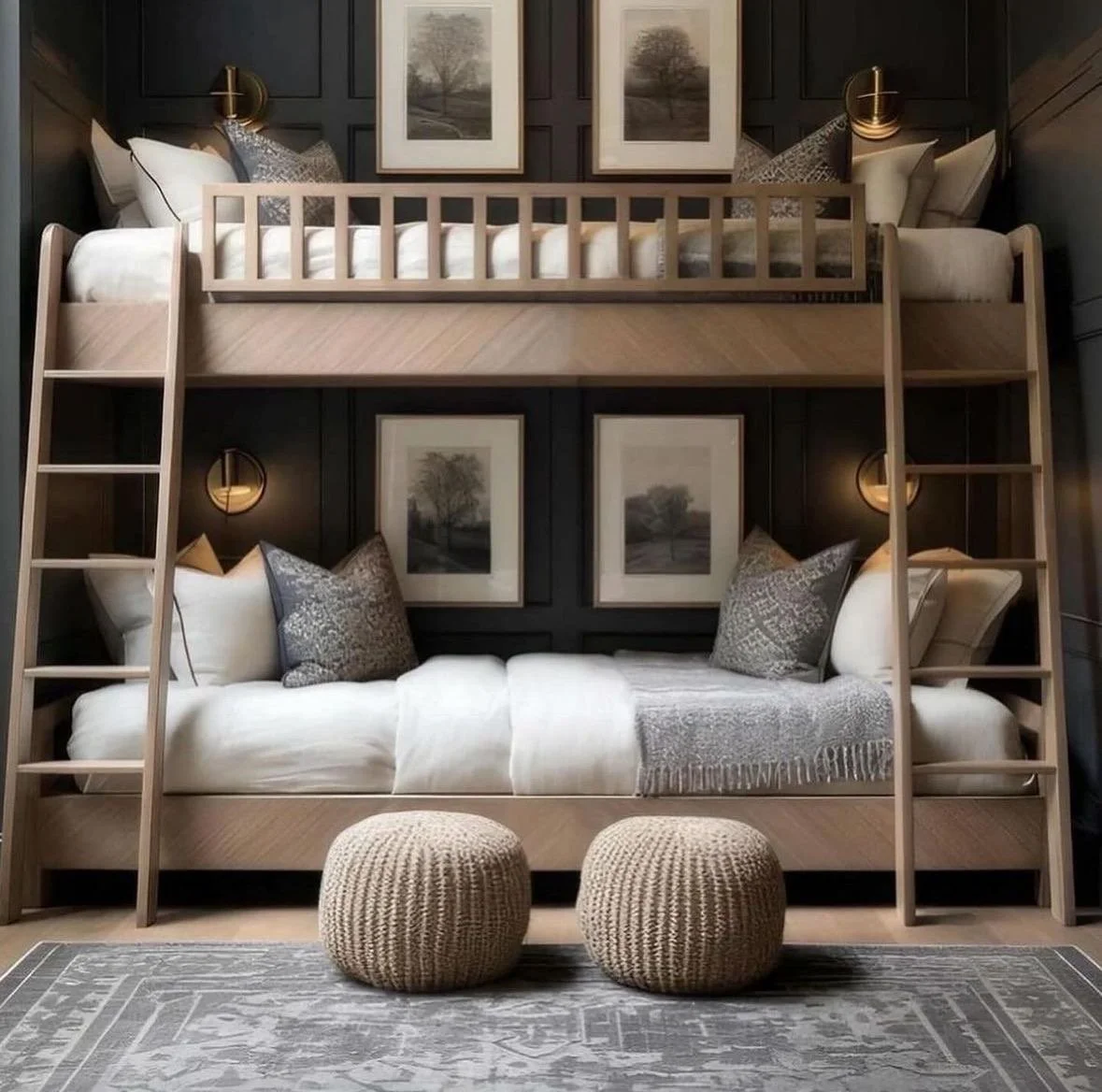
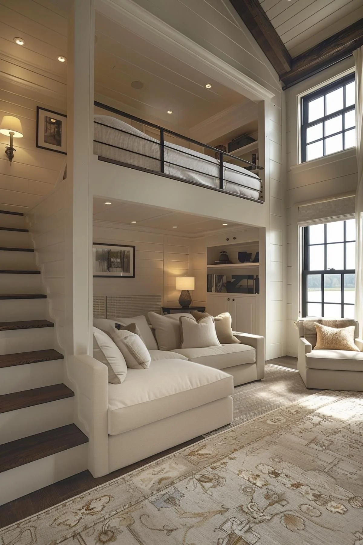
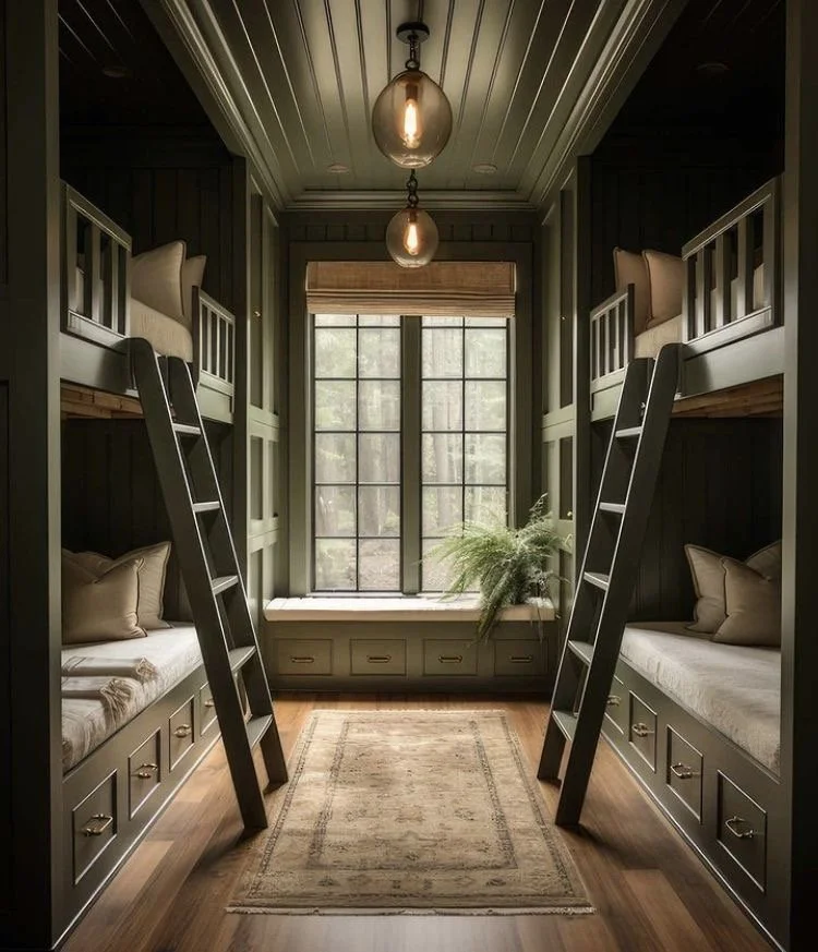
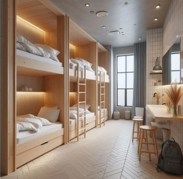
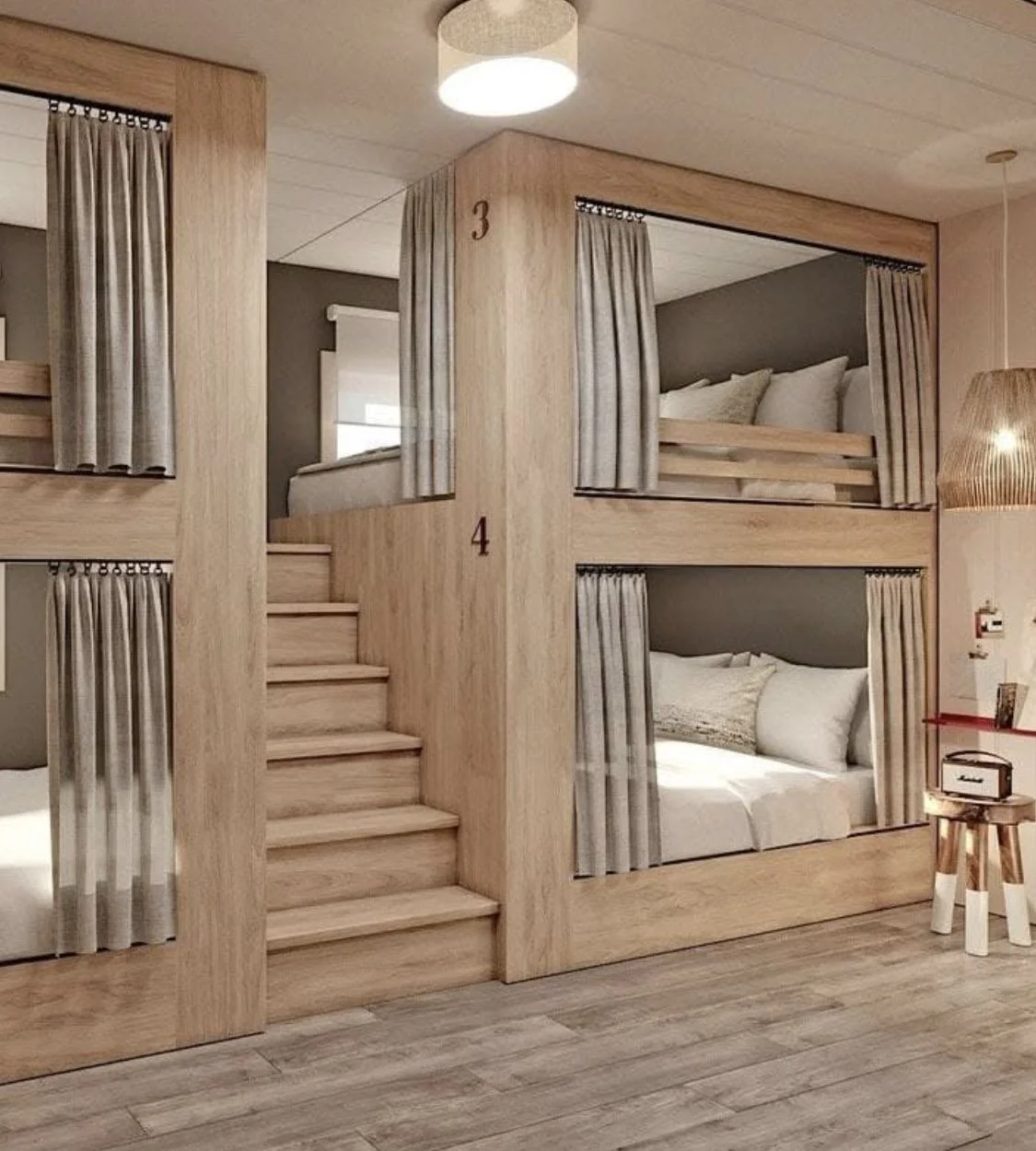
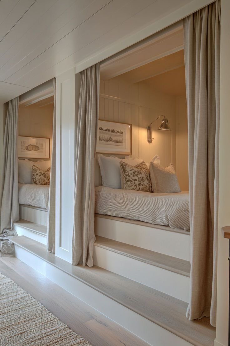
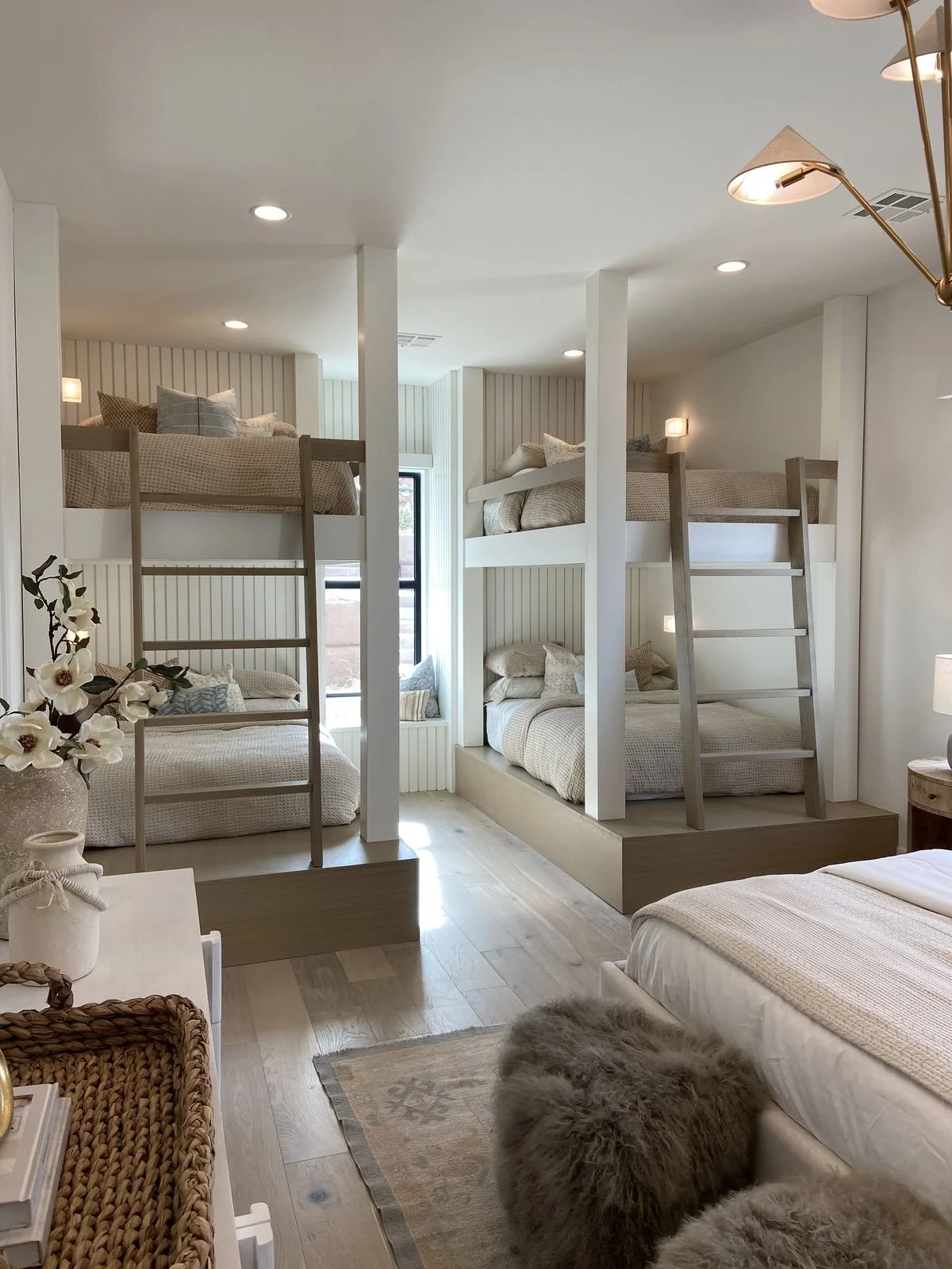
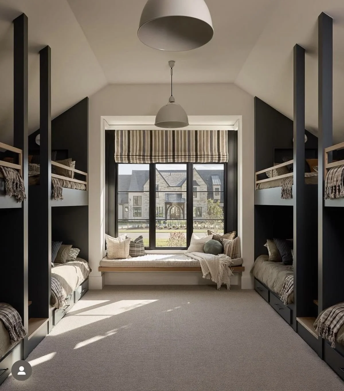
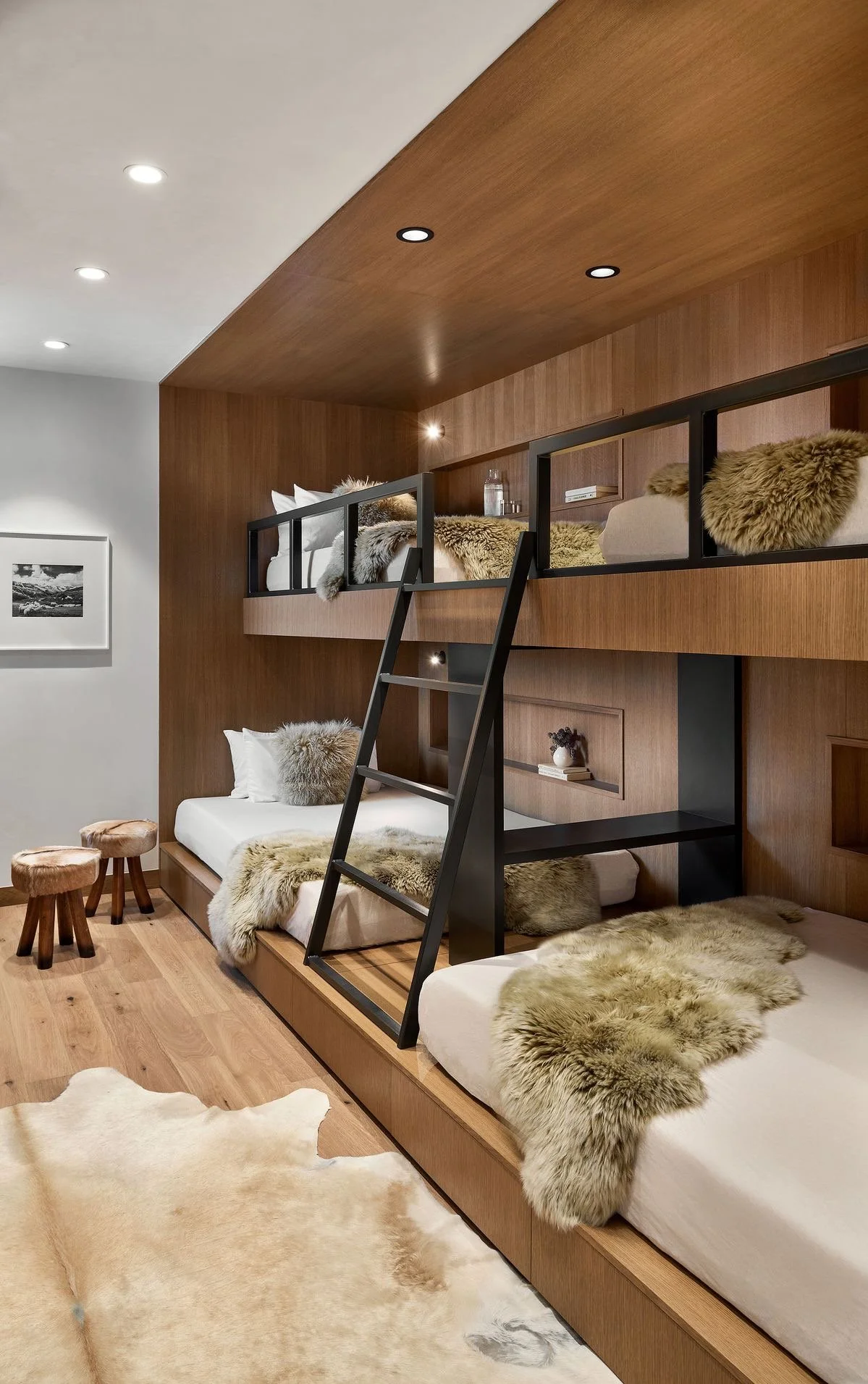
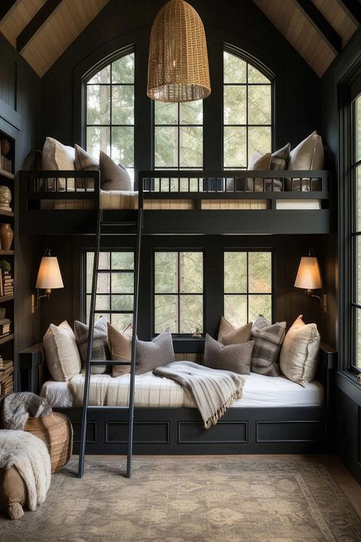
We cannot forget about our little ones in the top trends for luxury home renovations in 2025. I will say that I have noticed more focus in secondary bedrooms with secondary homes for our clients, like lake homes, beach homes, chalets, etc. Also we’re noticing more influx of projects with short-term vacation rentals within this area of secondary bedrooms, especially with bunk rooms. I did not want to disappoint in this well-sought out space that’s highly valuable to many residences. It’s an environment of playfulness, laughter, games, and pure enjoyment for children, teens, and even adults, young and mature. These elevated spaces are designed to incorporate the same character of the rest of the home with thoughtful design choices that highlight the architecture and promote unity within the environment. They add value with the built-in bunk beds and amenities. That’s a winning strategy for sure! Love!
Excellent, thoughtful design development is critical to achieve success in a project’s outcome. Our studio utilizes various techniques with design development, however, our most successful approach is through storytelling. We explore and curate around a diverse amount of details gathered from our clients, their lifestyle, and their architecture. Those conclusions are showcased to highlight our clients, their exclusive lifestyle, and their respective architecture in a harmonious + balanced way. An authentic way. An intentional way. A unique way that speaks to you. I love that about architectural design. It’s unique darling.
Not only in design, but within also. There’s only one of you. Remember that. I’m speaking from experience….
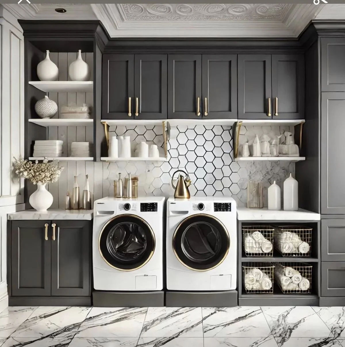
Lastly, let us not forget about our utilitarian spaces that are the workhorse of our homes. Great design extends to these necessary areas as well. Done with finesse. Done with boldness. Done with intention. I cannot say that enough. It’s a core value. Let’s take a look at some stunning examples of lavish laundry rooms for luxurious home renovations for 2025!
I like. I like.
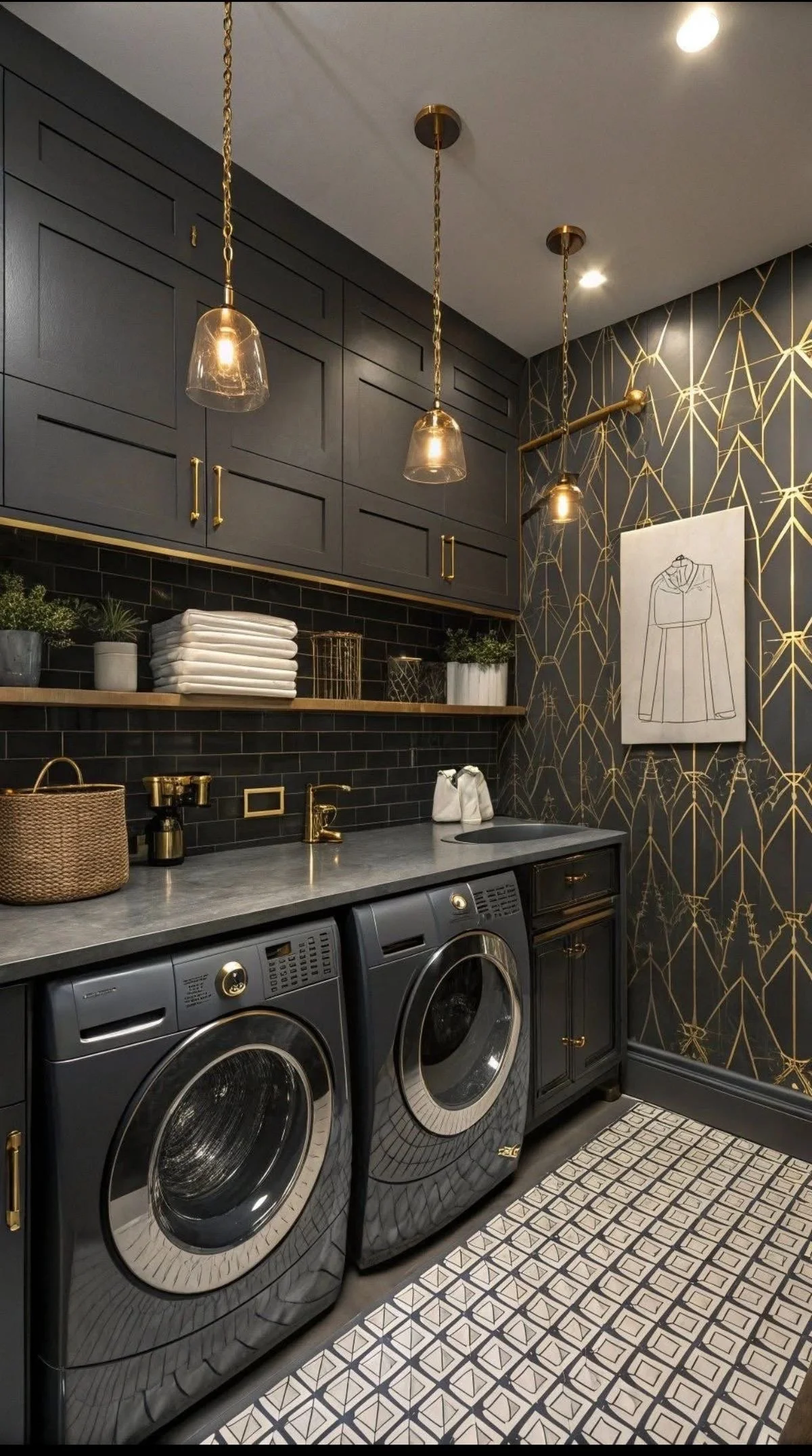
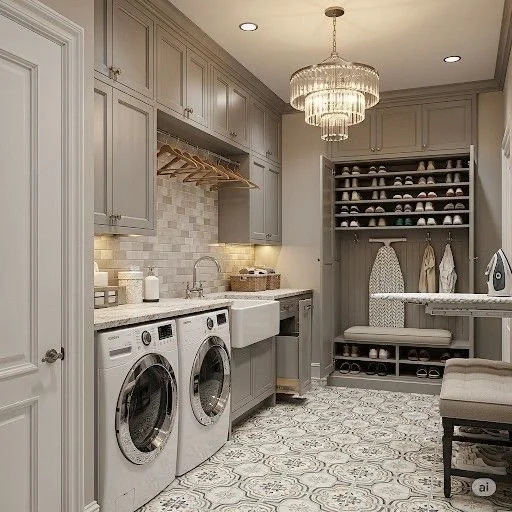
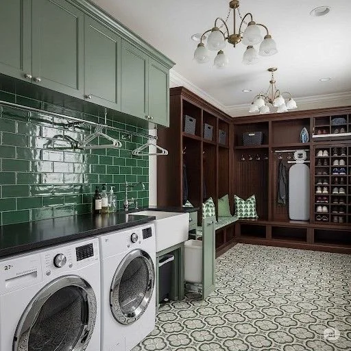
That rounds out my top architectural design trends for luxury home renovations for 2025. These vital spaces: kitchens, great rooms, outdoor living spaces, home gyms/wellness areas, primary suites, bunk rooms, and laundry rooms are in high-demand. They create value and promote wellness in myriad of ways exploring creativity, functionality, and indulgence. I’ve thoroughly enjoyed my time with you loves. I know it’s been a long break since last time we chatted, however, I’m genuinely back! God has big plans for me and I am wholeheartedly walking in obedience.

It’s the first week of November! A new month! New opportunities! New blessings! New mercies! I wanted to share a prayer that has gotten me through this year; hopefully, it can encourage you as well.
God, I am so grateful that I’m called by Your name. Even though I am imperfect, You still call me Yours. Each day, I want to live up to that calling and become the person You created me to be. Please help me to be more humble, to seek You more, and to turn away from things that are wrong. Thank You for Your willingness to forgive and restore. In Jesus’ name, Amen.
Until next time,
Live.Love.Design!
xo Renae
Pics courtesy of my Pinterest.

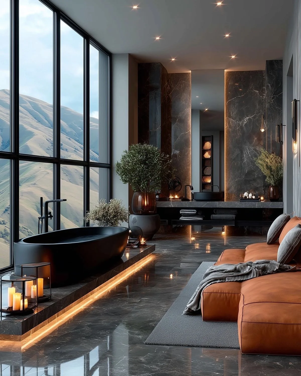
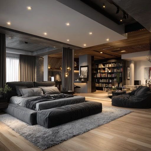
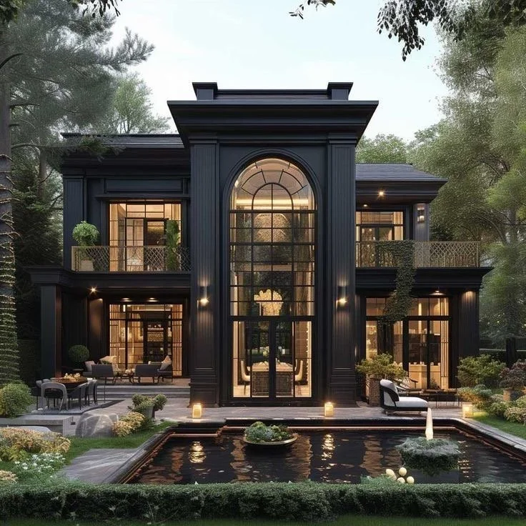
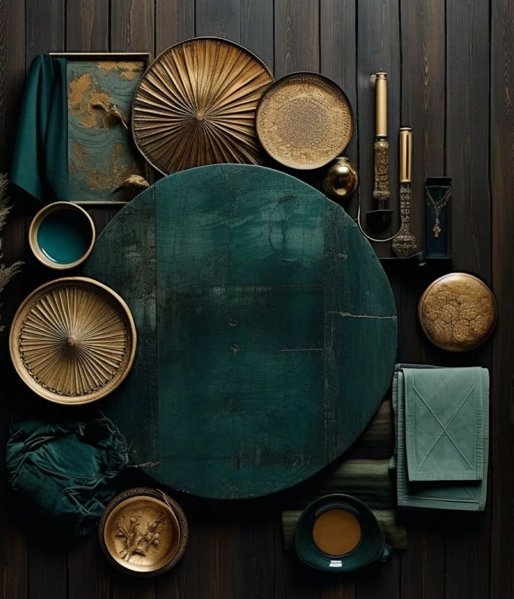
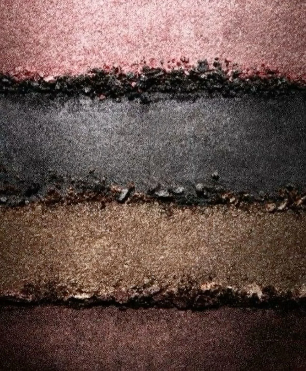
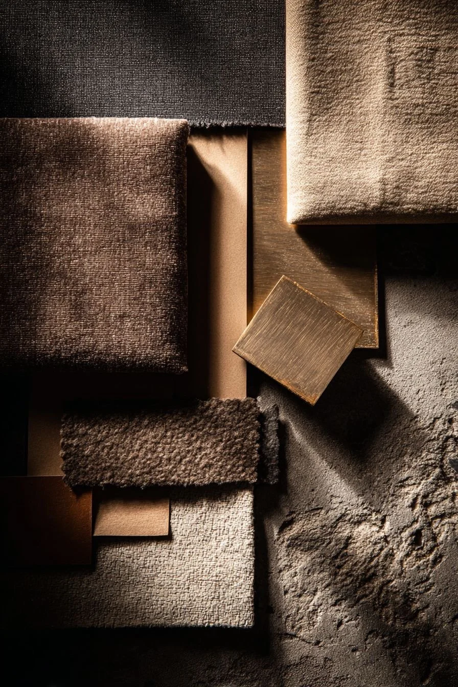
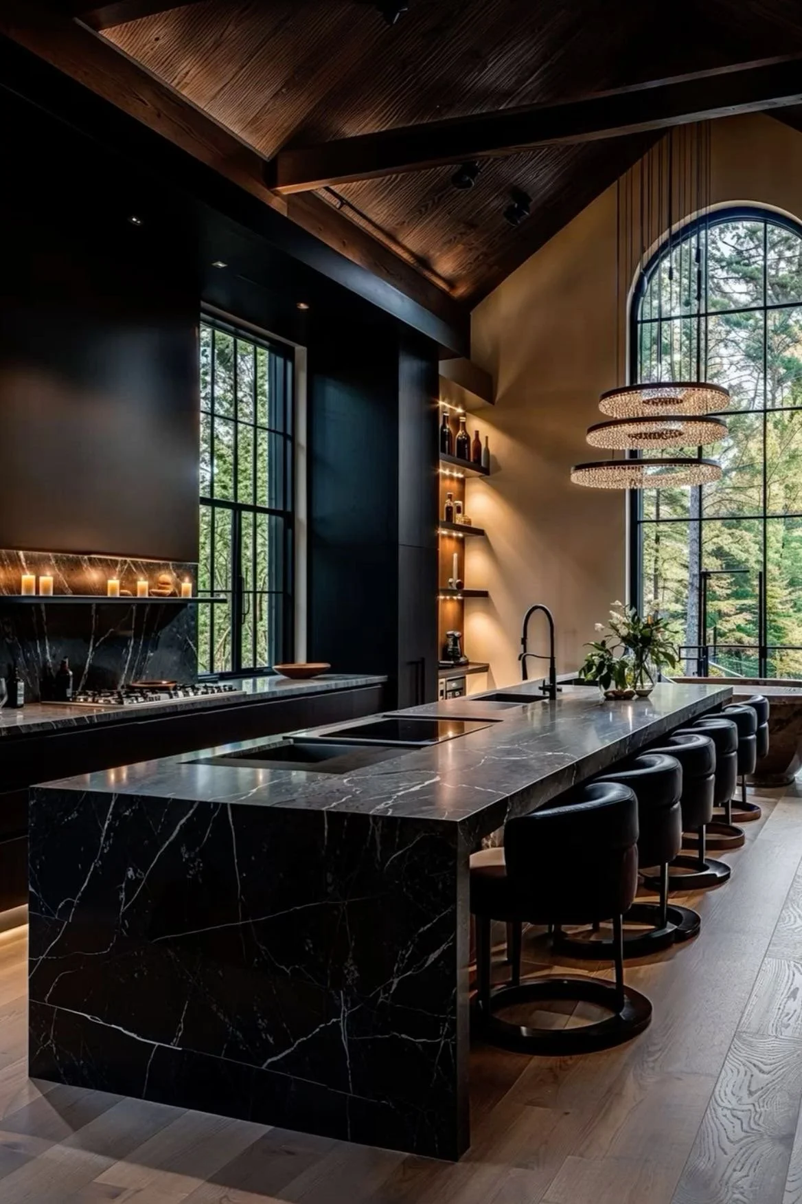
dark + moody….and oh so good!
Well, I hope you kinda shifted your perspective on what is ‘too dark’. However, if you haven’t, I’d like to add that just a touch can go a long way. You do not have to go to deep end to simply enjoy a dark + moody aesthetic, but you can definitely see that the amazing use of these customized color palettes can successfully impact different effects while creating the desired emotions in your space.
One thing I constantly hear as a professional architectural designer from many residential clients besides the need of transformation + change of course is what they think and perceive as being too dark as it pertains to their home’s color palette. I hear ‘that’s too dark’ sooooo much, that I just had to speak on it, plus completely provide another design perspective on just how beautiful and fabulous a dark + moody aesthetic can actually be in your dwelling. Just how appealing and comfortable and livable a dark + moody aesthetic can precisely deliver, is exactly the reason I want to share some inspiration your way.
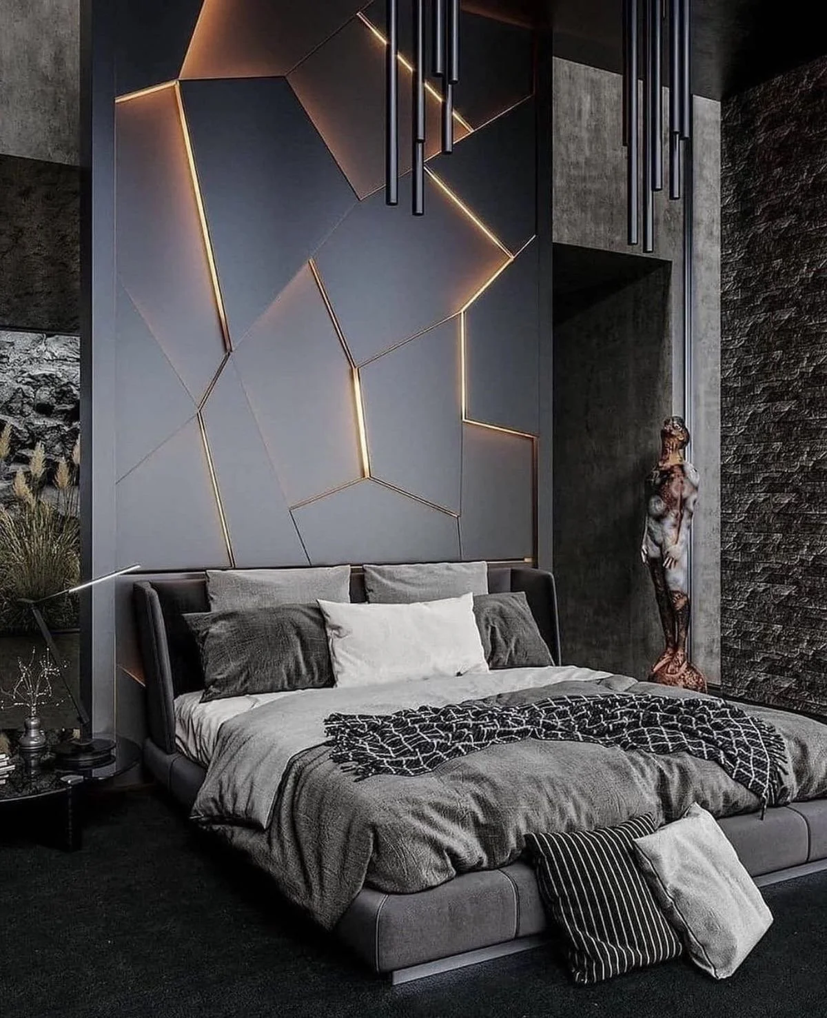
Yes, darkness is a mood. Issa vibe. But, did you know that with any and everything in life and beyond requires balance? Of course you knew! So with darker aesthetics, designers, including myself have to balance the space with lighting, contrast, movement to create an arrangement in a way that does not allow any one element to overpower another….and that is strategically accomplished through the design principles.
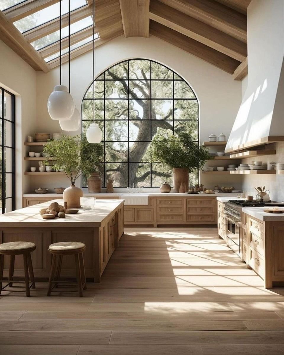
Let’s say bye bye to the all white kitchens. Yesssss! Even the most beautiful white kitchen needs some type of contrast to make it pop, make it sing, make it timeless. I mean let’s be completely honest, what exactly were we thinking, an all white kitchen is not even practical. But, I know that most love white kitchens, so what I propose is simply adding layers, contrast, and textures to give depth and set a mood. White upper cabinets will do the trick. It will help create a light and airy space, but ground that baby with darker base cabinets and if you have an island, try a dark + moody color to ground the island as well. Your cleaning routine will thank me later.
I mentioned textures + contrast before….when you are creating a dark + moody aesthetic, offset with mixing textures throughout the space as well as adding contrast with the furnishings to make the space pop.
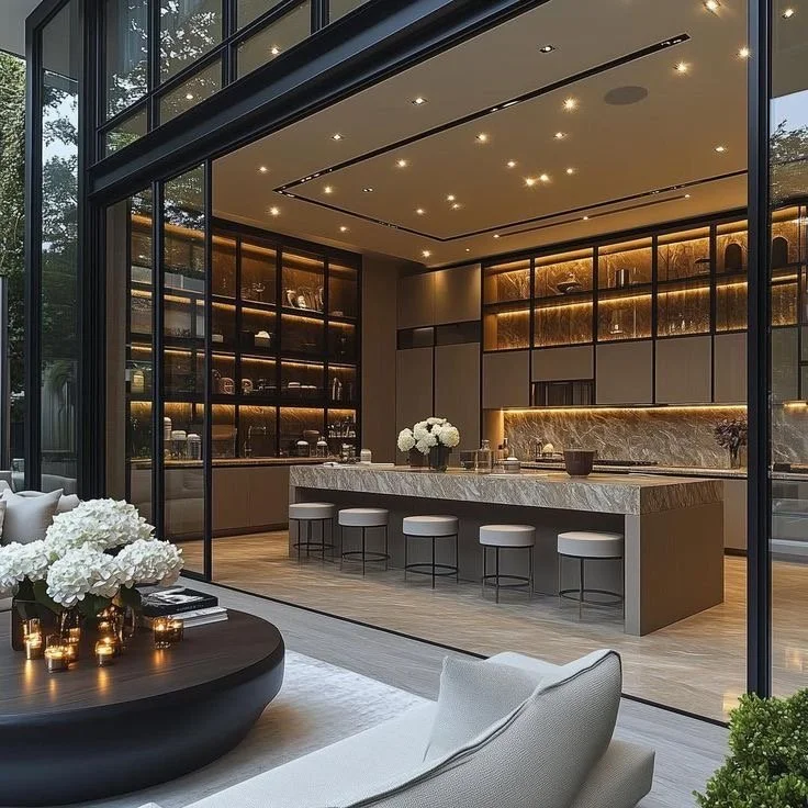
This also applies to the exterior of your home. Dark + Moody strikes again! #Yessssss
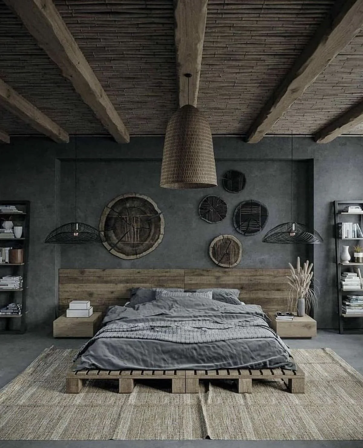
The energy that exudes from these darker hue palettes is calming, sensual, relaxing, chill….and I am hear for all of it! Grown + Sexy.
Would you live here?
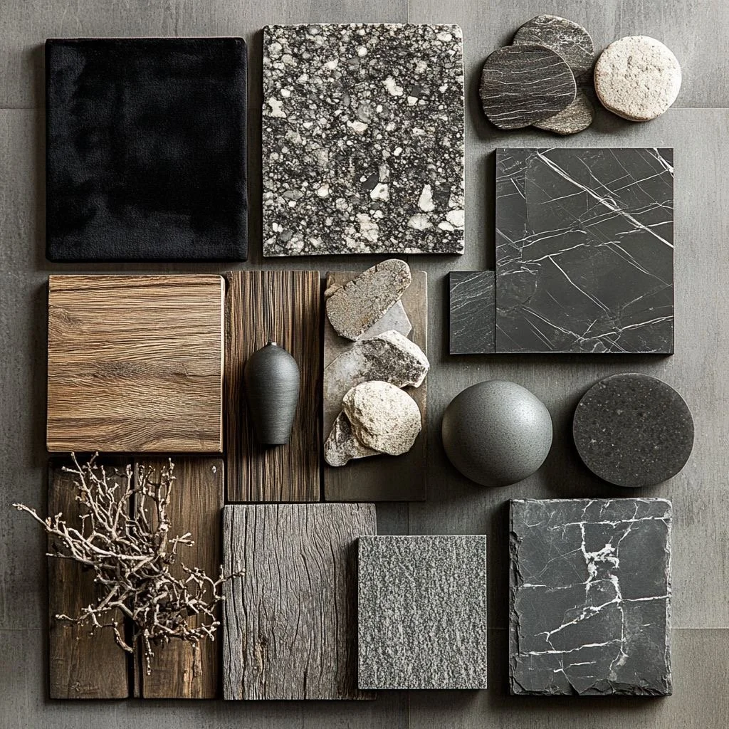
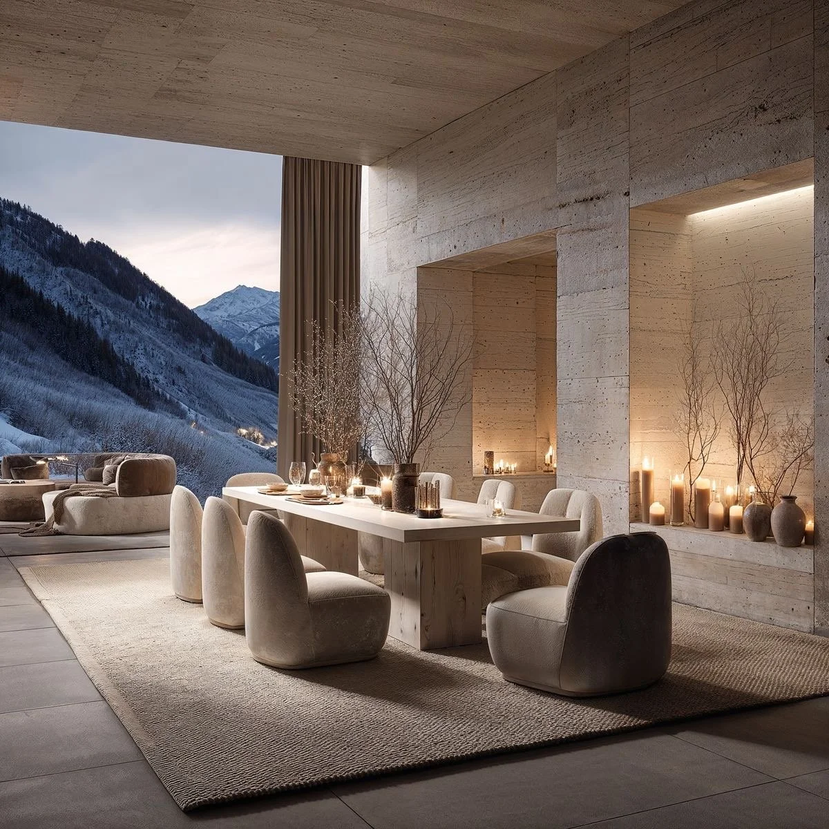
Ok, so when I create a custom color palette for my clients, I can specifically determine and curate where a dark + moody aesthetic can play well in your home. It may be in small batches, like furnishings or accessories, or on your trim and molding, or simply as an accent wall, but if you are open to creating drama using a darker hue, I will find the perfect solution for you. Oh snap! I rhymed.
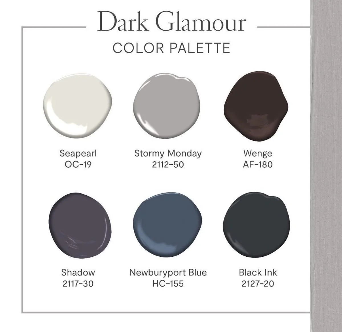
Color saturation, shades, hues, and tones all play critical roles in selecting your perfect dreamy moody palette for your space. Based on natural or artificial lighting, architectural features, existing interior materials, I will most definitely assist you with selecting the perfect color balance that will deliver that mood or that vibe you are seeking to achieve. In design school, color theory was extremely important and still is. I use the science of color theory every single day, because particular hues and colors can create different types of feelings, emotions, moods, etc. so I’m strategic in where and what intensity I propose the color to be utilized. As your design professional, I can set the mood you are wanting to achieve in the space and there is a darker hue for almost every mood, hence, dark + moody aesthetics. See, we are definitely going full circle.
Well, I hope you kinda shifted your perspective on what is ‘too dark’. However, if you haven’t, I’d like to add that just a touch can go a long way. You do not have to go to deep end to simply enjoy a dark + moody aesthetic, but you can definitely see that the amazing use of these customized color palettes can successfully impact different effects while creating the desired emotions in your space.

Say hi Jaedon!
Issa Vibe. Issa Mood.
Until Next Time,
xoxo
Renae

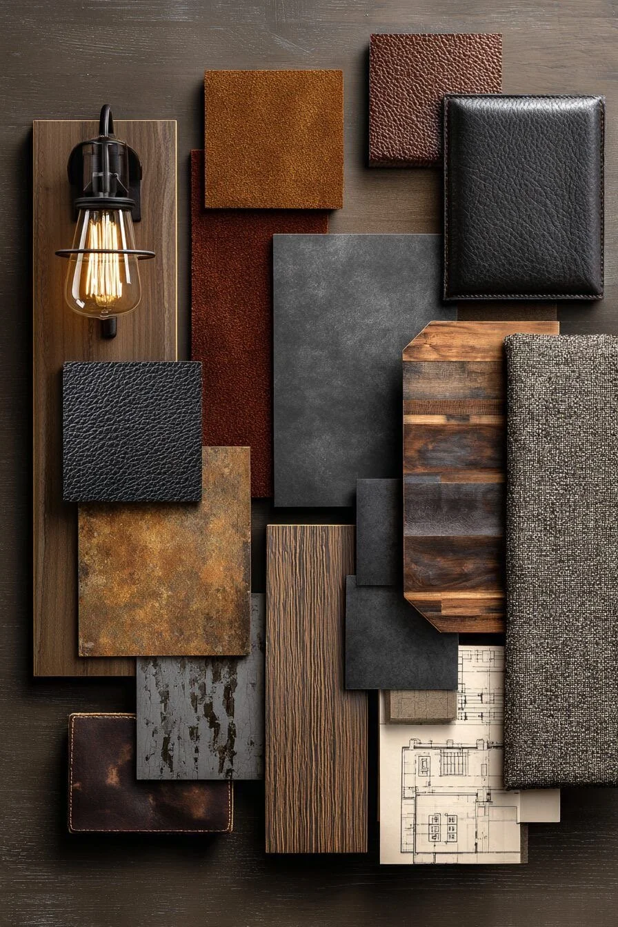
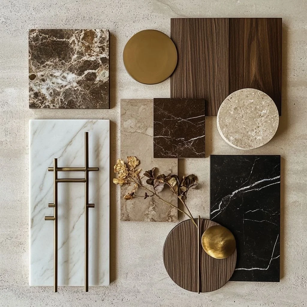
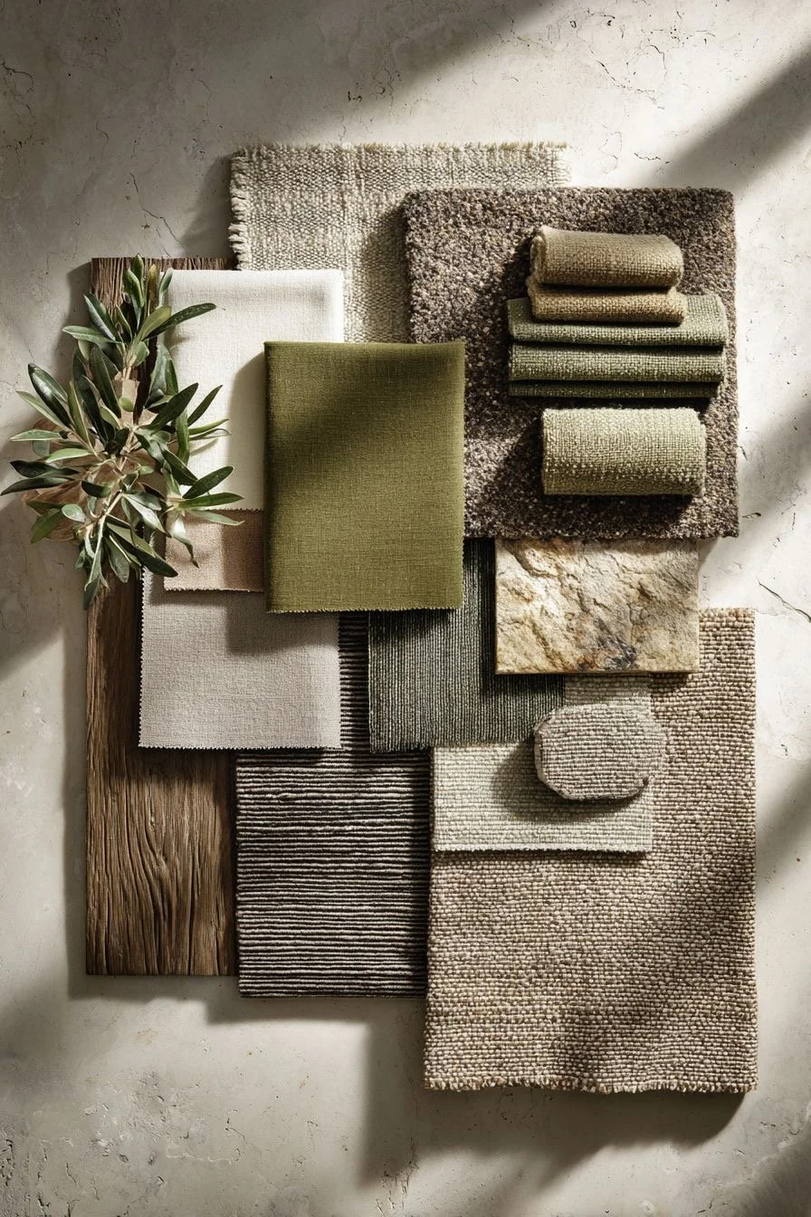
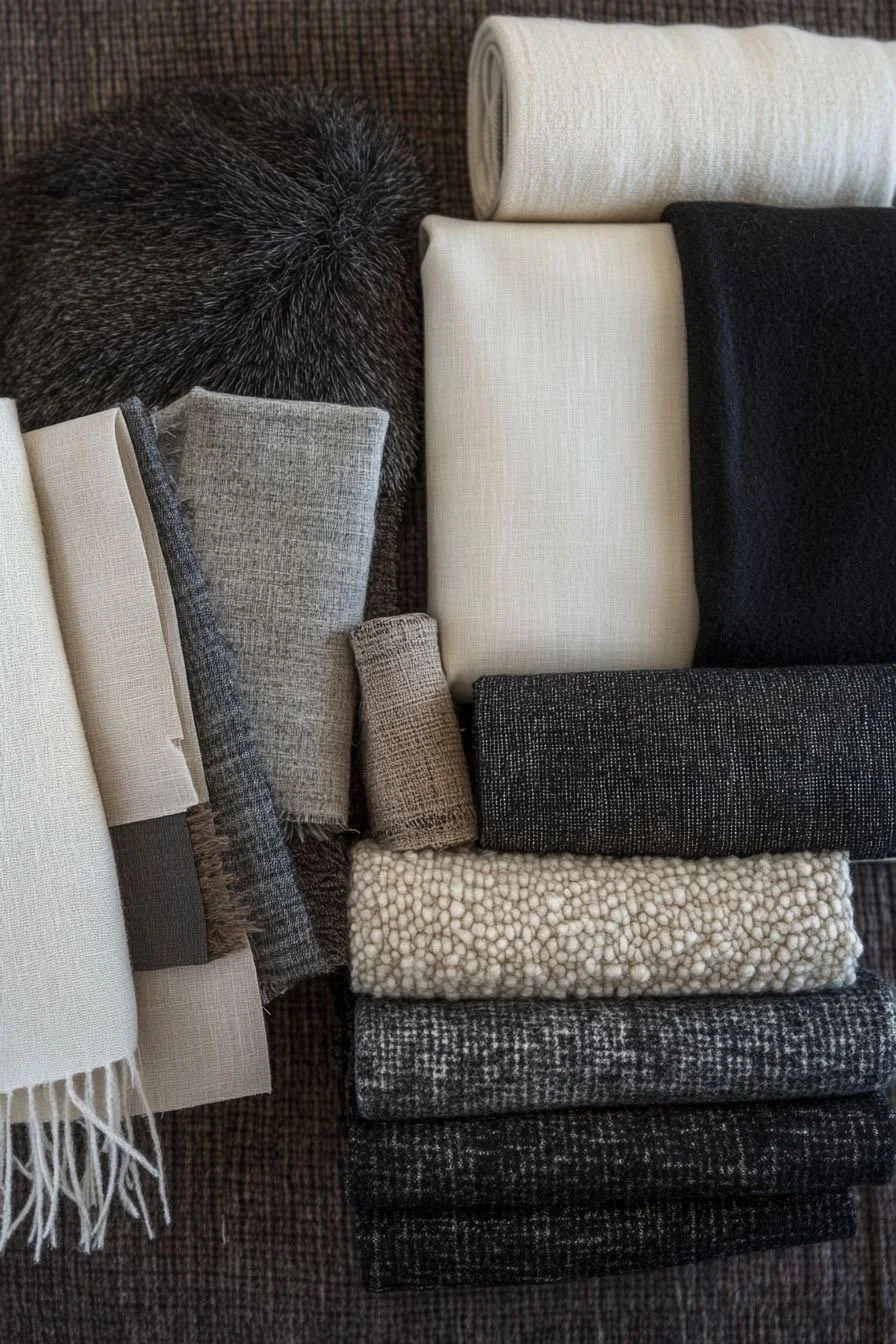
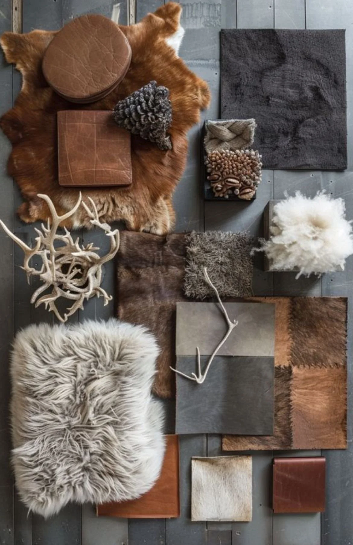
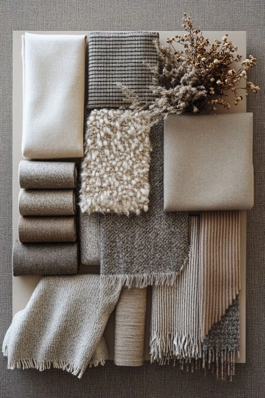
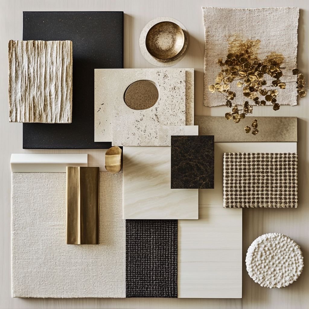
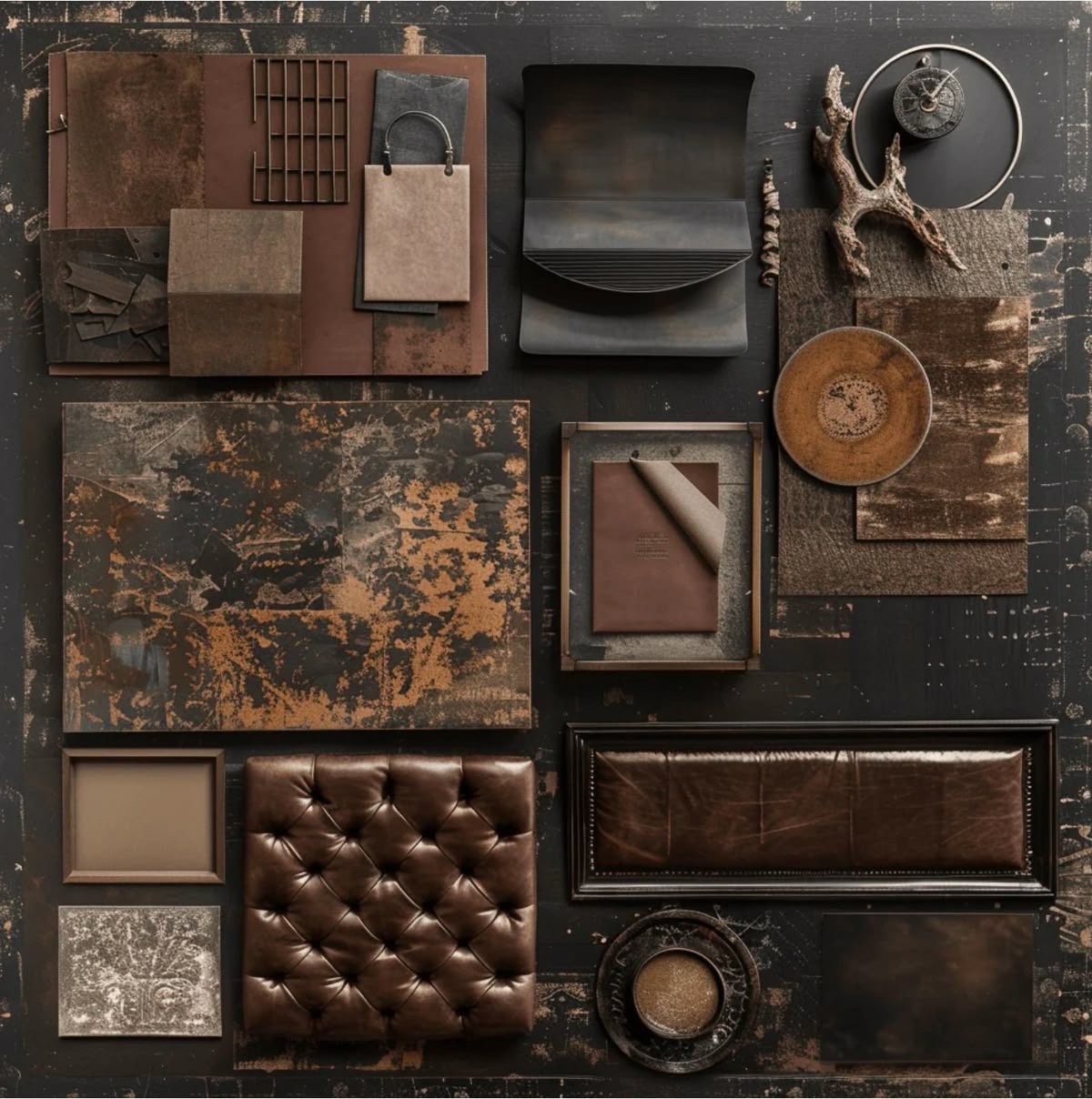
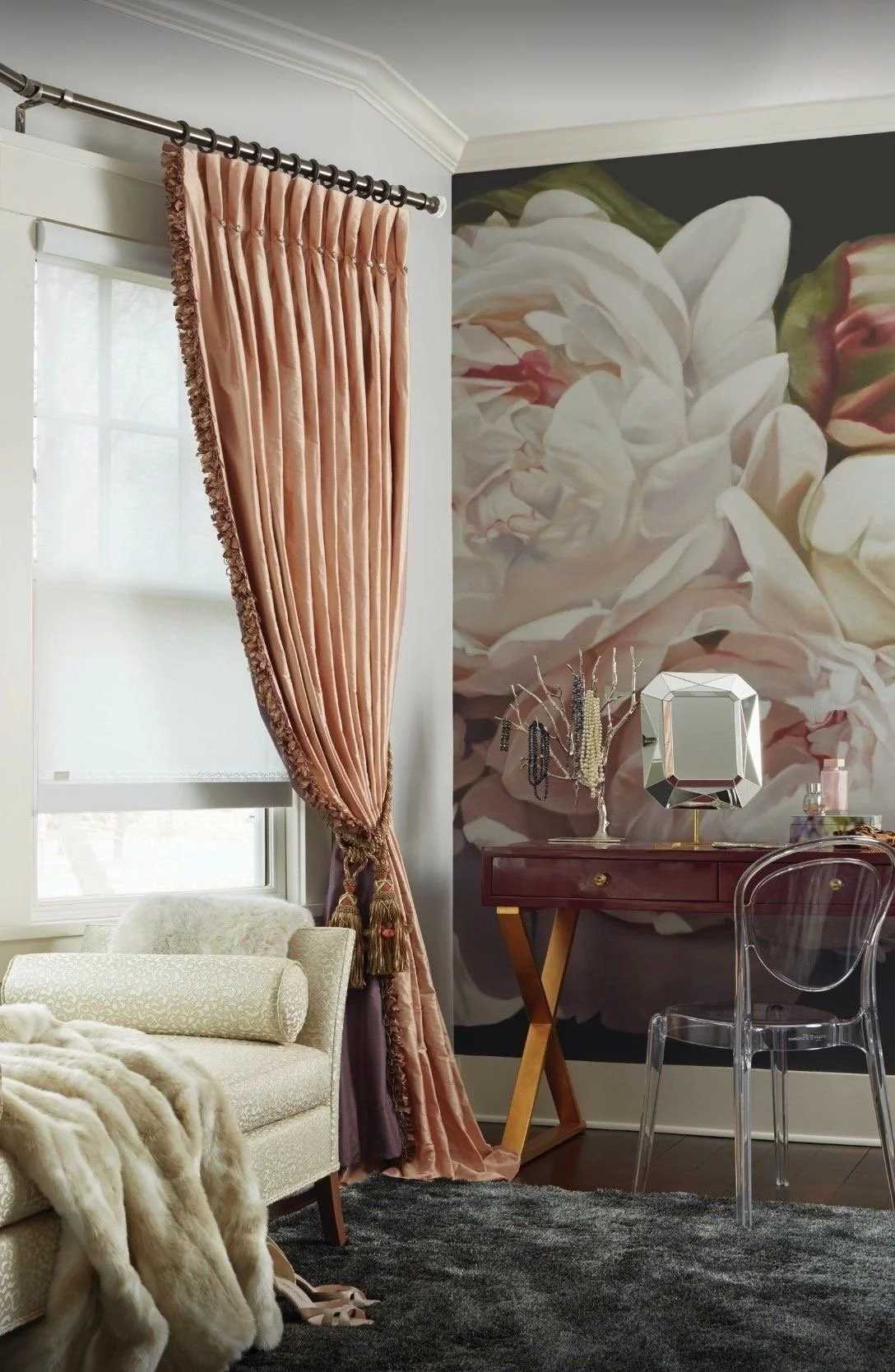
Harmony with the Three Ls: Layers + Luxe + Lighting!
Due to my detailed nature as it relates strictly to design, layering with luxurious textures can be highly impactful in a space. I loooovvvveeeee to touch, see, smell, + taste luxury. Honestly, it all started when I was about 8 years old and my Barbie dolls had to have the right features in their home with their specific clothes + outfits being just right and of course hair + makeup…of course! But honestly, what my parents noticed then at that moment was that I absolutely + wholeheartedly loved luxury. My dolls had fur coats, leather skirts, pearls, lace, silk, satin…you name it, Barbie had it. I did not want “the” Barbie dream house, I wanted to construct my own house that I thought was worthy of my Barbie dolls. So I begin with layering her actual dream house to ensure that life for Barbie was simple + chic. And let’s be honest, Barbie’s life was hella fab! I just enhanced it using design principles I had no idea of then. Fast forward to now, I have mastered the art of layering luxury. It is simple yet complex, and that to me is absolute thrill of it all! Just remember, if you ever have challenges with accessorizing and layering, always think of balance + harmony and if that does not work, your girl is a phone call away!
I live + breathe by true design principles + subjective layering with almost every single thing I do! Yes, more than likely you may too! And you may do it without actually thinking about it intentionally, well I know this is 100% accurate for me which ultimately stays true to my forever mantra: Live..Love..Design!
LAYERING is the one single component that can make or break the space. Too little feels stark + cold, too much feels cluttered + obsessive. That right balance, that right pop, that right contrast of textures + finishes will channel the most curated eye to attention to detail. It’s phenomenal, it’s eye-catching, it is design! And if you did not notice from the caption, it’s imperatively important!
“More smiling, less worrying. More compassion, less judgement. More love, less hate.”
“Whatever you do, be intentional + impactful. That’s layering on its own, if you ask me.”
I am a self-proclaimed maximalist! Yesss! For sure! And one primary step of being a great maximalist is balance. To have restraint when designing is an extremely delicate talent but oh so needed when layering a space, especially with lighting and luxurious textures + finishes. I tend to believe that added levels of textures, contrast, color, proportion, scale, and lighting will amplify your space in an extremely positive way but will also allow you to explore beautifully + organically using all your senses.
LAYERS: USING TEXTURES, COLORS, SHAPES, SIZES, + CONTRAST TO CREATE A HARMONIOUSLY COHESIVE SPACE.
Who doesn’t love luxury?
I mean helllllooooo. Luxury is what drives the senses in every way. So I love to use it to my advantage by making sure all of your senses: touch, smell, sight, hearing, and taste are embodied in all of my projects. I use a lot of various smell factors like candles + incense and fresh plants + flowers in a space to balance the space and layer the totality of your flow. I love luxury and ya know, luxury loves your girl. Please believe. By successfully utilizing the simplicity + complexity of layering, spaces always seem majestic and flow oh so beautifully.
Try your hand at layering by using contrast + textures while adding lots of lighting! Ok, we will definitely touch on that, because that single-handedly can positively impact the entire look and feel of a space with general lighting, ambient lighting, task lighting, and accent lighting. My husband used to joke that he knew I was home alone when he came around the corner and saw the house “glowing” up the hill. Ok, I will admit, I am extremely afraid of the dark, but only because I like to see what is exactly in those shadows. I primarily use various lighting methods to enhance spaces but also for function and security. And you should too! A true great design aesthetic should never eliminate the power of lighting and what it can do for you. That’s real talk.
Due to my detailed nature as it relates strictly to design, layering with luxurious textures can be highly impactful in a space. I loooovvvveeeee to touch, see, smell, + taste luxury. Honestly, it all started when I was about 8 years old and my Barbie dolls had to have the right features in their home with their specific clothes + outfits being just right and of course hair + makeup…of course! But honestly, what my parents noticed then at that moment was that I absolutely + wholeheartedly loved luxury. My dolls had fur coats, leather skirts, pearls, lace, silk, satin…you name it, Barbie had it. I did not want “the” Barbie dream house, I wanted to construct my own house that I thought was worthy of my Barbie dolls. So I begin with layering her actual dream house to ensure that life for Barbie was simple + chic. And let’s be honest, Barbie’s life was hella fab! I just enhanced it using design principles I had no idea of then. Fast forward to now, I have mastered the art of layering luxury. It is simple yet complex, and that to me is absolute thrill of it all! Just remember, if you ever have challenges with accessorizing and layering, always think of balance + harmony and if that does not work, your girl is a phone call away!
As always, thank you for rocking with Sola for all these years, stay safe + chat soon!

Until next time…
xoxo
Renae